
I. What is A Shopify Landing Page?
A Shopify landing page, in the simplest definition, is a landing page for your Shopify store - specially designed for products or services that you want to highlight or promote in marketing campaigns. The ultimate goal of these Shopify landing pages is to urge users to perform a specific conversion action, like filling out a form, making a purchase, or signing up for a service, right on the landing pages.
>>> Check out the Shopify landing page examples with helpful tips
In simple terms, it converts visitors into leads or buyers. It's like a trap that you set when your target audience enters a landing page on your Shopify store. The primary purpose of the trap is to get customers to "set foot" on the Call To Action button.
But how is it different from other pages like the homepage?
The homepage on your Shopify store can be used for many purposes, for such as brand introduction, product introduction, etc, while landing pages are used with a single focus - to drive up conversion rates of your online store, even though they are interchangeable most of the time.
Let's take a look at some examples of landing pages before we get down to the tutorial!


II. Types of Shopify Landing Pages
Create High Converting Mobile Landing Page With These 7 Tips (6 Examples Included)
At this point, it's a piece of common knowledge that landing pages can be pivotal to an online store's conversion rate. However, keep in mind the conversion goals vary depending on your business types, your business goals and your marketing funnels.
For example, if you're selling high-quality supplements that require a longer and more meandering buying process, your first conversion goal can be Email Submissions That Are Sales Qualified Leads (SQL), not Add To Cart Event and the corresponding landing page should be an email capture page.
Similarly, if you have a store selling dog toys - which are of low value and able to convert a visitor into a customer quickly, the Shopify landing pages should be built on Product Pages, or Collection pages, with conversion goals are either Add To Cart event, or Buy Now event.
Before we dive further into different types of Shopify Landing page and how to craft a high-converting one, check out this video guide:
01. Splash Landing Pages
Splash pages are the pages users land on after clicking ads - commonly used to make an announcement, or verify their age. Splash landing page for Shopify is usually a Coming Soon page - or a Password page.
A Splash landing page includes minimal copy, strong visual and catchy messaging to instantly plant a strong impression on users. Splash pages often precede a web page so they can be used at any stage of your marketing funnel, however, we'd advise that you use it at the top of your funnel to give your brand awareness a boost, given it's often designed for wow-factor. Let's take a look at how Zara used the Splash page to verify locations.

Here comes a few tips to help you build a better Splash page:
- Use a lightbox overlay: Instead of redirecting the visitor to another page, a lightbox overlay maintains them on the same page they were on when they first arrived. The translucent nature of the splash page built in the lightbox overlay method ensures that guests understand they are in the right place they expected to be.
- Send visitors back to the original page: When your web takes users to a splash page, it's important to keep track of where they come from in the first place so that they can be routed back there if they choose to ignore it.
- Avoid repetitive splash page display: If your guests miss your splash page the first time, there's a good chance they won't want to take the step you want them to take the next time you put it in front of them.
- Maximize loading speed: It's critical that you don't flood your splash page with, let’s say, autoplay video, which can slow down the page's loading speed.
- Make your splash page design responsive: Make sure your splash page is available to all users with different viewing devices. Can’t stress enough the importance of mobile-focused mentality nowadays!
- Exit-intent button available: It is important to remind users that they have the possibility of exiting the website, as this would reduce the probability of them leaving it. No one enjoys feeling as though they have no options, and having the skip button accessible helps to alleviate this issue.
02. Lead Generation Landing Pages
Back to our marketing funnel, Lead Generation landing pages are usually in the middle of the funnel - used for lead capturing. To create strong lead generation landing pages, you need to find the right balance, the equilibrium between the "asking" part , and the "reward" part. Basically, if you "ask" a visitor to leave their email or contact info, you have to "reward" them with an offer - which can be a Downloadable resource or a discount code.

To help you easily create this type of Landing page, Shopify has built-in Contact Form and Customer form which can easily be added to your Coming soon page, Password page, or a Lead Capture page. In this example, Nauto used the Lead Generation page to collect contact information and capture leads.
- Reassurance and personalization: It’s important to learn, and observe your audience to know what they like and dislike when purchasing your items. For example, personalization enables you to display a different page for each visitor segment or even each visitor.
- Keep your landing pages simple: Landing pages with a simple look allows visitors to navigate better and catch necessary information. This could be achieved with, let’s say, a short and sweet headline or keeping the number of form fields to a minimum.
- Pop-ups are the way to go: Pop-ups are a great way to get visitor attention immediately. Blur the page background, then show an information box that might interest your visitors in a new product, a sales campaign or newsletter registration. Impressive!
- Social proof is the best ally: Social proof matters, demonstrating that behind your product are actual clients who love it increases your chances to perform better. For starters, you can try adding some star ratings and testimonials to your site
- The button you choose for your page matters: Adding some benefit to your button increases your chances of success. Just by changing the wording of your button you might be more successful at intriguing your customers. “Download now”? No, scratch that. “Download now to get XYZ discounts” should be a better way to go.
- Special offers, and discounts: Offering something for free in exchange for something like an email is a no-brainer for the customer. It makes people feel heard and special.
Related article: Build The Perfect Event Landing Page With These 7 Tips (Examples included)
03. Sales Landing Page
Sales pages are often used at the bottom of the funnel - when you need to convert a regular shopper into a buying customer - hence these landing pages are harder to design and structure. To build sales landing pages, Shopify has Product pages and collection pages at your disposal - however, most of the theme templates consist of only Product Details sections, and a Products Recommendation sections so you'd need to customize the product page if you want to make it a sales landing page - which we'll cover the how-to right below.

A sales page can be long or short depending on your product and the amount of information you need to convince someone to pay or to click your precious Call-to-action Buttons. Generally, the more expensive or complicated your product or service is, the more questions your prospects will have about them, hence, the longer the page design, since the goal is to make your prospective buyers feel reassured enough to make a confident purchase right on the landing page.

Here comes a few tips to help you build a better sales page:
- Understand your audience: The more you know about your audience, the stronger your sales pages become. For example, a page that targets new moms should employ a tender language and soothing visuals, while products for a niche like motorbike riders might require an unyielding presentation.
- Structure your page in a clear and concise fashion: Don’t waste your customer’s time deciphering your message. Cut to the chase and make your headline an offer visitors can’t refuse. Lead with a benefit of the product or service, then mention what you’re selling.
- Make your copy convincing: Start by telling people what you want them to do. Use strong verbs and an authoritative voice. Focus on benefits instead of plain-jane features in your copy. For instance, instead of mentioning your racing bike’s wheel construction, explain what benefits buyers will derive from it.
- Describe your product benefits: One way to create more “breathing room” on your sales page is to break down information into bulleted or numbered lists. They attract attention and are more scannable.
- Prove visitors can trust you: It’s a great way to demonstrate that other people love working with us. You can post logos of companies you’ve worked with, testimonials from satisfied customers, or links to in-depth case studies.
- Use multiple calls to action: Remember that they should lead to the same conclusion. Make sure you’re adding content between them to give visitors a reason to continue reading.
- Make It Urgent: For instance, you could use a flash sale to encourage conversions. You’re offering a reduced price, but only if the visitor acts within X hours. You can also create urgency through desire by putting up a copy that says “Do you want to [...]? Why wait?”
- Handle objections: FAQs are also extremely useful. It’s a fast way to disseminate information without distracting your visitor from the conversion.
- Try exit-intent pop-ups: An exit-intent popup works extremely well when you want to give visitors a last chance to buy. You can use the popup to offer an exclusive discount or a bonus freebie — or simply to confirm that the visitor really wants to leave.
04. Thank You Page
Thank you pages are where someone is redirected to after they’ve made a purchase, entered in their information, or fill in the information. Thank you pages are often under-appreciated, designed with only a boring "Thank You" line, while your thank you page has the power to either move a lead further down the funnel, or set you up for increased Average Order Value with repeating customers.

Here comes a few tips to help you build a better Thank You page:
- The personal touch: The mere act of using a customer’s name on your thank you page endears them to your store as it makes them feel that little bit more important. You can also integrate a map onto your thank you page that shows the user’s shipping address, again, to seem a little bit more personal.
- An incentive to return: There are two really effective ways you can do this
- A discount - something like 20% or 30% off your next offer
- A loyalty program - whereby your customers can build points for repeat purchases and eventually claim rewards.
- ‘Share to social’ buttons: This is for your customers to spread the word organically about your product and leave their honest reviews on their social media.
- An incentive to refer: Referral programs are financial incentives for your brand’s best advocates, your customers, to share the message of your company with their friends.
- Link to a survey: Completed surveys are absolute gold dust for the future of your store. Finding out exactly what you’re doing right and what you’re doing wrong from the people who are actually buying your products.
- Tracking info: This is to help your customers overcome issues of trust and foster long-term relationships between your consumer and you.
- Trust badges: They’re visual symbols that portray important guarantees about the product your customer has just bought, encompassing free shipping, money-back guarantees and endorsements from third-party services.
- Internal and external linking: Always remember to loop your thank you page back to another part of your store. Along with this, you can link your thank you page to the pages outside of your store, primarily your social media pages on Facebook, Instagram, Pinterest, etc.
05. Seasonal Landing Pages
A seasonal landing page is an online store’s standalone page that attracts visitors and ushers them towards a seasonal/holiday sale.
There are 3 key things that every holiday landing page should have if they want to capture and convert customers with ruthless efficiency:
01. Great Design
- Make it festive: The aesthetic of the landing page should match the aesthetic of the holiday. There’s no use having a pumpkin-based design for a Valentine’s day landing page, or a egg-based design for a Father’s Day landing page
- Make it clear: Try and find the perfect balance of whitespace and color to emphasize the appeal of the headings, images and call-to-action buttons that you want your visitors to focus on.
- Remove the header and footer: It might seem counterintuitive for a landing page to not have the usual header and footer of the store it belongs to, but in reality, headers and footers are full of links that distract visitors to a landing page and pull them away from the call-to-action that you’re trying to promote.
- Stock scarcity: e.g. ‘Only 3 left in stock!’
- View counter: e.g. ‘6 people are currently viewing this item!’
- Countdown timer: e.g. ‘Just 4 days left on this deal!’
- Early buyer rewards: e.g. ‘First 100 buyers get a free plush toy!’
03. Discounts and Free Shipping
- Discounts: There are many types of discounts that you can employ for your store, including BOGO discounts, bundle discounts, bulk discounts and first time customer discounts.
- Free Shipping: Guaranteed free shipping is especially appreciated during the holidays, so even if you have to raise the price of your products to cover the shipping costs, or pay for shipping costs out of your own pocket, make sure shipping is free.
III. 07 Best Shopify Landing Page Examples
Other fellow Shopify stores can give you true inspirations for your Shopify landing pages.
I went to the Internet and checked out as many types of Shopify pages as I could, whether it be a home page, a product page or a thank you page. Here below are some of my exciting observations!
1. Master & Dynamic
Master & Dynamic product pages represent the true definition of “Bold,” “elegant,” and “luxe” . Close-up shots highlighting the details of the brand’s headphones show off the quality and care with which the item was made.

Now, this product page is different from a standard one. There’s no Add to Cart button at first glance or any detailed product information, just a recognizable image and descriptive product name. You have to scroll down to get to the main shopping cart.

As you scroll, you discover more about the detail-oriented design of the headphones—what they are made of, what advanced features they have, and how to control them.

The floating Add to Bag bar at the top of the page is subtle enough to not distract from the experience but still a constant reminder that you can make these headphones your own. You don’t have to scroll all the way back up and interrupt the experience if you want to buy them.
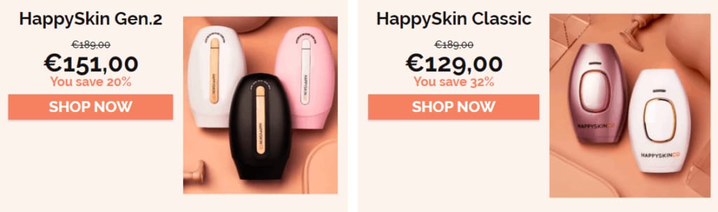
2. HappySkinCo
Selling hair removal handsets, HappySkinCo sure knows how to keep your look nice and clean on the web (literally!)
The imagery showcases their products in use, featuring young men and women who purchase a healthy lifestyle. What better way to speak to your target customers than this?

If you scroll down a bit on their homepage, you will see a lot of social proof again. By displaying social media images of their users, HappySkin not only updates customer reviews in real time but also creates a community of beauty lovers who might into their potential buyers.

Their store is only focused on a few products, so they’ve decided to add these shop buttons on their homepage. The discounts and call to action buttons are visually appealing!
3. Flow
Flow has seasonal landing pages where they share beekeeping tips. This tactic allows them to target specific visitors around the year.

The header bar with location customization allows Flow to get even closer to their customers around the world. Here below is a case study used as perfect testimonials.
Every scroll opens up an informative section and an engaging call to action button. Despite several calls to action and wordings, the messages and goals remain consistent.
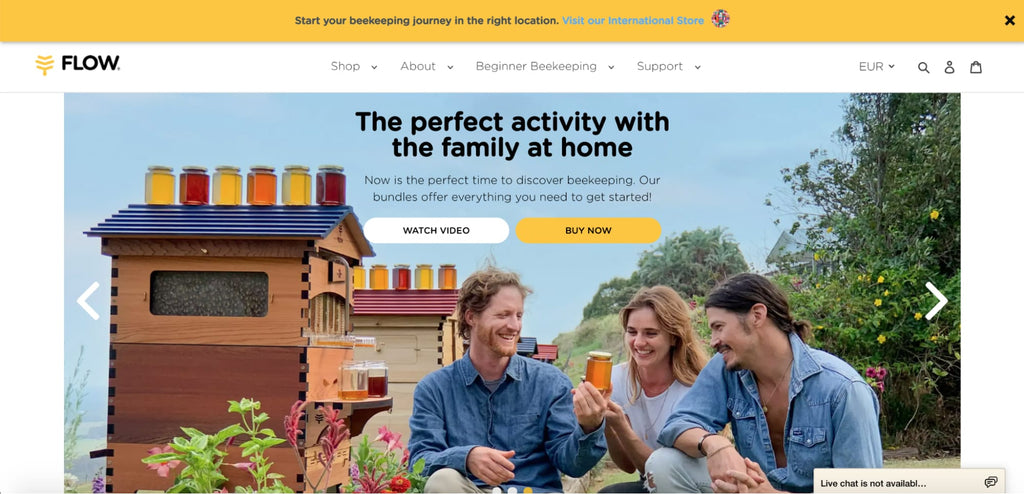

Use of images is a key weapon of Flow. By showing lively pictures of products in daily use, they highlight the connection between consumers and their natural goods. Plus, the lighting is really on point.
4. Luxy Hair
Luxy Hair sells hair extensions made from human hair, so it’s not a stretch to imagine that most of its customers are women. Since this product has many different variants, the shopper is taken on a journey toward the one best suited for them, first choosing the thickness of their hair, followed by the color, and answering more quiz-style questions.

After answering a series of questions, the shopper is brought to the specific product page containing (ideally) exactly what they’re been looking for.

The pop up notification uses discounts as a direct way to collect customer information. This will also help Luxy Hair play their personalization game at full blast later on.

Testimonials include big names in the beauty industry and photos of customers. What a great way to build trust!
The newsletter registration box at the footer is a sweet last touch on Luxy Hair homepage. Discounts and informative reads are quite hard to say no to for any beauty enthusiasts!

5. Shopify
Shopify’s free trial landing page is on a mission to get you to sign up. True to landing page best practices, there’s just one CTA button the whole page: “Start free trial.” This shows up once in the hero and then again at the very bottom.

The double CTA is an effective strategy. It’s clear and simple at the very top of the page for visitors who are ready to go. For those who need some more convincing, they can scroll through and see Shopify’s selling points. Once they get to the bottom, they’re reminded of the sole purpose of this page and given the opportunity to sign up without having to scroll back up.

6. Poo Pourri
PooPourri takes a fun approach to something most people wouldn’t want to discuss publicly - read on or visit their store and you’ll know why!
The product page uses a mix of concise product descriptions, recognizable images, and bold colors to give shoppers the necessary information to decide if they need a toilet spray.

A nice add-on is the related product recommendations, referred to as “Most Poopular Products.” This has become something customers expect when shopping online and can help them find another product in your store if they don’t want the current option.

PooPourri also includes a “How it Works” video showing how to use the spray. If you have any questions, you can click the chat window to talk to a customer service representative.
7. Monk Manual
Half of Monk Manual’s thank you page is devoted to their referral program. It clearly sets out the milestones that customers can reach and an end goal of 15 referrals, with all of the benefits that referrers can earn along the way. Laying out the full progression of the program in such a visual way is a great way to get customers on board.

Aside from building their customer base through referral, Monk Manual also adds social sharing buttons to the page. This is powerful because customers might want to flaunt their new purchase, which means more potential new customers for Monk Manual to reach.
IV. How To Build A Landing Page That Convert With Shopify Landing Page Builder
There are 02 ways to make a landing page on Shopify:
- Make a landing page by customizing Shopify pages - It can be Shopify Product Page, Shopify Collection Page or Even Coming Soon page.
- Use Shopify Landing page builder - most page builder apps allow you to intuitively drag and drop elements to build your page.
01. Make a landing page by customizing Shopify pages
If you wish to create landing pages that exist in Shopify default settings as primary pages, you can just choose to add the page and choose the page type in the theme editor. These page types include:
- Shopify About Us page
- Shopify product page
- Shopify password page
- Shopify collection page
- Shopify blog page
- Shopify shopping cart page
- Shopify 404 error page
- Shopify contact page


However, to create a more customizable page, we should play a little coding game with the Shopify theme editor.
Step 1: Prepare yourself before customizing your theme
- Duplicate your theme to create a backup copy. This makes it easy to discard your changes and start again if you need to.
- Make sure that you understand what level of support is available.
- Learn about the requirements and best practices for uploading images.
Step 2: Access your Shopify theme editor codes

Step 3: Edit your code
The code editor shows a directory of theme files on the left, and a space to view and edit the files on the right.


When you click a file in the directory on the left, it opens in the code editor. You can open and edit multiple files at once. Any files that you modify will show a dot next to the file name.
Familiarize yourself with HTML, CSS and Liquid then you’re good to go!
(*) Note: Shopify offers theme customization tutorials that are divided by the version of theme architecture they use. Learn how to identify your theme architecture version.
02. Build Shopify Landing Page with Page Builder App
Check out All You Need To Know About CSS Margin And Padding
Step 1: Install the PageFly page builder
Visit the PageFly page on Shopify App Store, click the Add App button and fill in your store’s URL to install the app to your Shopify store.
Step 2: Create a Shopify landing page with PageFly
In the Shopify admin sidebar, click Apps > PageFly – Advanced Page Builder. After that, you will be redirected to the PageFly Dashboard on a different page.
Click Create a page or the (+) icon on the left menu. Then you can choose the page type as your preference in Page Settings. PageFly has customizable primary page types for you to choose from, such as home page, product pages, etc. However, if you want to start building things from scratch, go with a regular page.

After your Page Settings configuration is done, you will be directed to a Template Library which lets you choose a template to start your store with.
Step 3: Add PageFly elements
The page editor offers PageFly basic elements and sections for you to drag and drop to the blank page. PageFly enables you to have fun with the store’s looks by structuring your page any way you want.
PageFly also provides limitless experiments with elements.
A more comfortable approach could be using 60+ high quality templates for your business in the page settings.
For a more detailed tutorial on how to create a Shopify landing page with PageFly, check out this tutorial:
Step 4: Preview or publish the page
Once you’re done building the page, hit Save. This option saves the page to a database but does not make it public yet. You can see the page preview via Preview.
The Publish button both saves the page and makes it public. You can see the live page via Live View. The page will link to your store with the address “your-shop-name.myshopify.com/pages/page-name”.
You can check the PageFly page in the Shopify database by going to Shopify home > Sales Channels > Online Store > Pages.

![Cheat Sheet On How To Create A Custom Shopify Product Page [The Easy Way]](http://pagefly.io/cdn/shop/articles/32_820x400_9b1776df-4170-4d18-a574-d12d096405af.jpg?v=1545367857&width=820)

![[Ultimate guide] How to Create a Custom Shopify Product Page Template](http://pagefly.io/cdn/shop/articles/local-store-owner-stands-proud.jpg?v=1681198020&width=4460)
![Shopify Thank You Page: How To Use It To Acquire More Sales? [With Video Tutorials]](http://pagefly.io/cdn/shop/articles/Shopify_thank_you_page.png?v=1698805682&width=820)


