

Design is an important part of any eCommerce venture. Especially if you have a unique business model or are operating in a small niche.
As part of our ongoing Shopify store reviews, we took to socials, encouraging merchants to come forward for advice. Kristian, the brains and brawn behind Brickslip Brothers spoke up, and after a quick review of his website, we thought it would be worth featuring.
BrickSlip Brothers use PageFly for their entire Shopify store - impressive considering how dense and information-rich their pages are. And to be honest, it was hard to spot any immediate holes in their design. So with that in mind, we made some minor suggestions that should help build trust, and make the user experience smoother, leading to more sales.
Check out the video review below.
BrickSlip Brothers Shopify Store Review

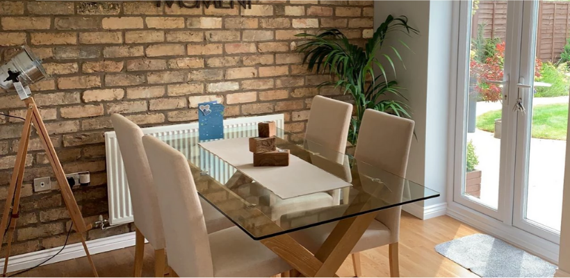
First impressions are great. The site has a wholesome, rustic feel to it, similar to what brick does to a home.
The logo is minimal in design, eye-catching, and the font gives a sense of luxury.
Despite how cool the overlays and borders look, it can be a little difficult to differentiate the buttons from the regular text as seen below.

Easily corrected by sharpening the borders of the buttons or vice versa to contrast with the heading and text.
There's also some mild grammar mistakes, so a quick proofreading session would help people trust in your brand. Perfect grammar isn't vital for sales, but it does help you look professional and credible.

More impressive use of PageFly's features. This product page really stands out from the crowd. Overall, no major suggestions except removing the payment badges.
I'm a firm believer that payment badges don't help your site convert, and can often make it look incongruent in terms of brand colors. Opt for leaving any trust badges at the bottom of the page if the prospect really needs to see them.

The next amendment would be to add more clarity and contrast to this information section. White text on this particular background is hard to read, and looks busy. Changing the transparent overlay to a darker tone would easily fix this.
Conclusion
As I stated before, this is an exceptionally designed store. We had to reach deep to really spot any minor improvements that could be made. It's also a testament to the power of PageFly for freedom of design.
Big thanks to Kristian and Brickslip for putting their faith in us. Looking forward to seeing what the future holds in store for Brickslip Brothers.


