


What does this mean for you as a Shopify merchant?
It means if you’re not optimizing your store with mobile users in mind, you are missing out on 57 percent of your potential sales opportunities.
You see, up until recently, conversions didn’t really occur on small screens. Users would likely browse on mobile, then complete the purchase later on desktop. But this has changed. Mobile has reached a tipping point and is now the primary eCommerce medium. Therefore, it’s now more important than ever to craft a greater mobile experience for customers visiting your store because:
- 53% of mobile shoppers will abandon a website if it doesn’t load in 3 seconds.
- Mobile media activity beats laptop and other forms of media
But don’t worry. We understand for those who might be new to the world of web development and mobile traffic, this can seem daunting and difficult. We are here to shed some light on the situation and give you the knowledge you need to start racking up the sales by optimizing your store for mobile.
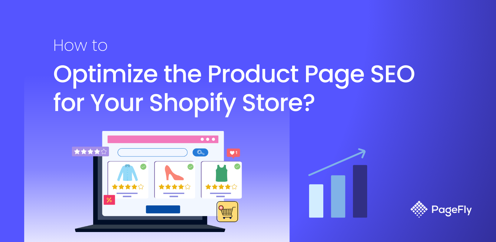
In this article, I’ll be showing you how to create highly mobile optimized Shopify pages with the PageFly app, as well as step by step tips to make sure your actual content is SEO friendly.
And of course, to close more sales.
Let’s begin.
What exactly is mobile optimization?

Put simply, mobile site optimization is the process of making sure visitors from mobile who land on your site have an experience that is optimized for that device. Therefore, site design, screen sizes and load times need to be taken into consideration to make sure the site is functional and just as easy, if not easier to use from a smartphone or tablet.
If these elements are ignored, your prospective customer will probably leave your site as quickly as they came, and bring their money with them. And for good reason. You wouldn’t tolerate a website that wasn’t built with you in mind.
Luckily, there are many ways you can optimize your Shopify page to give your customers the best shopping experience possible, all the way from browsing to checkout.
Mobile optimization best practices
Take these tips into consideration and implement them as soon as possible for best results.
Page speed
Mobile users are much less patient of long loading times and unresponsive links.
Start by checking your page speed with Pagespeed Insights from Google. Paste your website URL into the box and hit the ‘Analyze’ button. This will give you a breakdown of how your page is performing in terms of speed on mobile and desktop.

For example, we can see Forbes, the popular business magazine has a mobile speed score of 29, whereas their desktop speed holds strong at 89 out of 100. Let’s look at some adjustments we can make to improve on this number and get the mobile page speed up into the green.
Make text visible
One thing you want to avoid is forcing users to zoom or scroll to read the text on your page.

The best sites are responsive to the device being used, meaning they will detect if it’s mobile and adjust the scale automatically to match. The last thing you want is for your prospect to continually scroll horizontally to read your copy. PageFly Advanced Page Builder for Shopify does this for you - more on that later though.
Make it clickable
Clickability is important when optimizing for mobile. Remember, users won’t have a mouse, and will instead be using their fingers which will vary in size from person to person. Buttons should be larger, and you might want to limit the use of drop-down menus unless it works well from a mobile standpoint.


Check out how Khara Kapas modified their Shopify store to be mobile friendly by adjusting the menu to open from the side with easy to click buttons.
Optimize your images
Faster loading images mean faster page speeds for your site. Before you upload images to your online store, optimize them using tinypng. This will compress the image size without reducing quality. Tinypng lets you add up to 20 images at a time then download them into a zip file which you’ll then need to extract the images from.
Alternatively, as a Shopify merchant, you have a ton of apps at your disposal for optimizing images. We recommend SEO Image Optimizer - a free Shopify app that will help you rank higher in Google searches by optimizing your images. This Shopify SEO app is your best bet for speedy image loading times. Check out our Best Shopify apps blog post for a closer look at how to increase conversions with the right apps.
You also need to consider choosing the right image format for the web.
- PNG format is the best choice for storing line art, icon graphics, logos and text-heavy images at small file size.
- JPEG format is good for realistic photographs and is a common choice on the web because it is compressed.
- GIFs generally have performance problems on the web, although they can be optimized for slightly better results.
Avoid pop-ups
Pop-ups can be great for capturing emails and promoting sales. You are however best to disable these on mobile devices. If you think about it, pop-ups can be annoying enough on desktop, but having to deal with these on mobile is even harder due to smaller screens and the high chance of pressing the wrong thing when trying to exit it.
There’s no need to make your prospects experience this - everything should be as smooth and hassle-free as possible.
Optimize cart, checkout and payment
This is vital. It’s no good providing a streamlined browsing experience if the customer has trouble adding the product to the Cart, navigating through Checkout and making the payment. Add To Cart buttons are your call to action, make sure they’re large, clear and contrasting in color from the rest of the page. Look at the process as a whole from browsing to check out and make sure it flows as smoothly as possible.


From landing page to product page, right through to cart, Crazybaby makes sure there is no hesitation with bold red CTA’s that contrast from their minimal site design.
Put mobile first
Most businesses take an existing website and shorten it for accessibility on mobile. But as times are changing, so must this habit change with it. To have an edge over the competition you really should be building your pages specifically for mobile.
Rearrange your columns vertically, make your buttons finger clickable, remove the pop-ups, redesign all interactive functions for use on small screens. If you do this, your audience will be met with a streamlined site built specifically with them in mind, and they should reward you with repeat visits as a result.
Pro tip: to check the layout of your site from a mobile standpoint, follow these steps.
- Open your website you wish to preview on mobile
- Open developer console window on Chrome by pressing Ctrl + Shift + C
- Inside the developer window, navigate to the top toolbar and hit the window resizer to preview your site on mobile. The result is as below.

Use PageFly templates
If you’re not familiar with PageFly, it’s a powerful page builder app that lets you drag and drop to create fully custom Shopify product pages. PageFly has over 40 templates that have been carefully optimized for web and mobile, which makes them a great choice for making sure they rank in Google and get traffic to your store.
By visiting the PageFly site and browsing through their templates, we have an opportunity to test their speed for ourselves. Let’s take the popular template Carona and run it through Google pagespeed.

We can see a score of 96 out of 100 for mobile speed. Now naturally, when you use these templates and add your own images and content in, the page speed will be affected. Make sure you always optimize your images with tinypng mentioned above. Photos with a large file size will slow your site down.
After adding your images and customized copy, run the test again. Google built in a feature that offers a list of suggestions to further optimize your page after running the test. You can find it directly below your result under “Opportunities” and “Diagnostics”.

Read more: Overlooked Factors When Building Mobile-friendly Store
Let's watch this video to make your Shopify store mobile-friendly with PageFly's tools.
Conclusion
Let’s recap:
- Test your page speed
- Make text visible
- Make it clickable
- Optimize your images
- Optimize Cart, Checkout, and Payment
- Put mobile first
- Use pre-optimized PageFly templates
By following these steps you should be able to create mobile pages that kick ass and take cash. Always keep in mind just how many consumers are purchasing through handheld devices now and make mobile optimization your priority. If you do this, you’re guaranteed to increase conversions on your Shopify online store.
Are you using landing pages to increase sales? Check out our eCommerce landing page best practices guide to learn how to use one of the most effective marketing tools for driving traffic to your site. And of course, take mobile site optimization seriously and implement these tips today to gain an edge over the competition.


