Setting up a Shopify contact form doesn't have to be complicated. Many store owners find themselves puzzled by this seemingly simple yet crucial feature. The good news? It's much easier than it looks.
But why is a contact form so important?
It's all about opening lines of communication with customers. A good contact form shows shoppers that the store is ready to help, builds trust, and can even boost sales. Plus, it saves time by reducing those repetitive "Do you ship to...?" emails.
This guide breaks down the process of creating a Shopify contact form into just 5 straightforward steps, with no technical expertise needed. Ready to make it easier for customers to get in touch? Let's dive in!
How to Add a Contact Us Form on Shopify In 5 Steps
Here's how you can create a Contact Us page and form on Shopify in under 5 steps:
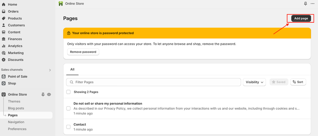
Step 1: Create a new page

- From your Shopify admin, go to Online Store > Pages.
- Click Add page.
Step 2: Set the page title:

- In the Title box, type a title for your contact page, such as "Contact Us" or "Get in Touch."
Step 3: Add content (optional):

- In the Content box, add any text you want to appear above the contact form.
- You can include a friendly message, your store's address, or contact information.
Step 4: Choose the contact template:

- In the Online store section, select 'contact' from the Theme template dropdown menu.
Step 5: Save and publish:
- Click Save to create your new contact page with the form.
And that’s all! You have successfully created a contact form page for your Shopify store.
Adding a Contact Form Using the Shopify Theme Editor
The Shopify Theme Editor lets you add a contact form to your storefront and customize it further.
Here's a more detailed look at the process:
- Step 1: From your Shopify admin, go to Online Store > Themes.

- Step 2: Find your current theme and click the Customize button.
- Step 3: In the theme editor, use the top dropdown menu to select Pages > Contact.
- Step 4: Look for a section called "Contact form" or something similar (names may vary by theme).

- Step 5: If the contact form section isn't already on your page, you can create a new template.
- Step 6: Explore the settings available for the contact form in your specific theme.
- Step 7: Make any desired adjustments to the form's appearance or layout.

- Step 8: Remember to click Save when you're done to apply your changes.
Customizing the Shopify Contact Form Fields
Customizing your contact form fields to your business needs can improve the quality of inquiries you receive.
Here's how to customize your form:
- Step 1: In the theme editor, locate the contact form section.
- Step 2: Look for options to customize form fields. Common fields include:

- Name (often split into First Name and Last Name)
- Email Address
- Phone Number (optional)
- Order Number (if relevant to your business)
- Subject or Reason for Contact (can be a dropdown menu)
- Message
- Step 3: Decide which fields should be mandatory and which can be optional.
- Step 4: Add any additional custom fields that are relevant to your specific business.
- Step 5: Customize the labels for each field to match your brand's tone.
- Step 6: Adjust the order of the fields if needed.
- Step 7: Customize the submit button text (e.g., "Send Message" or "Get in Touch").
Remember to keep your form concise. While it's tempting to gather as much information as possible, long forms can discourage customers from reaching out.
Setting Up Email Notifications for Form Submissions
To ensure you never miss a customer inquiry, set up email notifications for form submissions:
For basic Shopify contact forms:

- Step 1: Go to Settings > General in your Shopify admin.
- Step 2: Scroll to the "Store details" section.
- Step 3: Verify the email address under "Sender email" is correct for receiving notifications.
- Step 4: To change it, click Change email, enter the new address, and click Save.
If using a third-party form app:
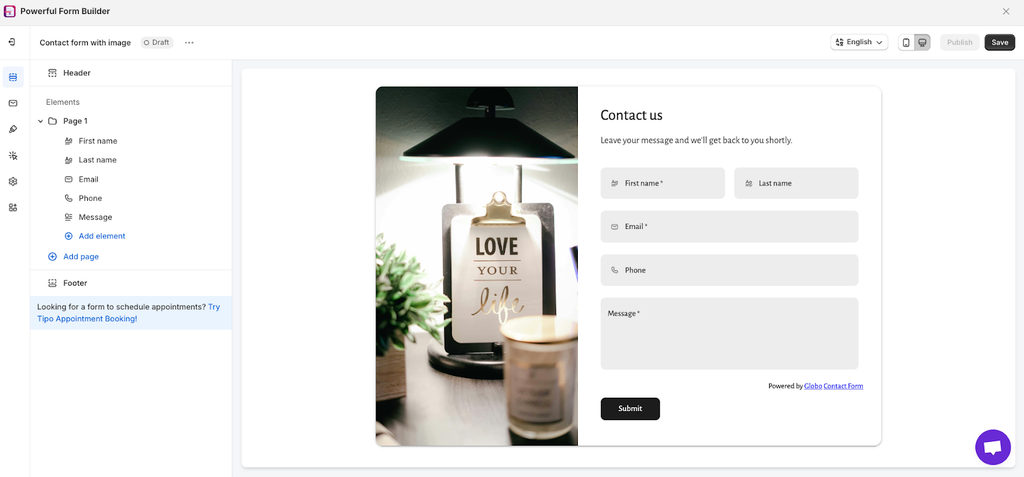
Note: For this example, we have used Powerful Contact Form Builder to create a custom contact form.

- Step 1: Navigate to Apps > Forms in your Shopify admin.

- Step 2: Click on the form you want to manage.
- Step 3: In Email notifications settings, check "Send an email for each submission to this form." This could differ depending on the app you are using.

- Step 4: Enter the email address for notifications.
- Step 5: Save your changes.
Testing the Contact Form Functionality
Before considering your contact form complete, thorough testing is crucial:
- Visit your store's contact page as a customer would.
- Fill out the form with test data and submit it.
- Verify that you receive the email notification with the correct information.
- Test all validation features (required fields, email format, etc.).
- Try submitting with missing required fields to check error messages.
- Test the form on various devices (desktop, tablet, mobile) for responsiveness.
- If possible, ask someone else to test the form as well.
If you encounter any issues, double-check your settings in the Shopify admin and theme editor. Most problems can be resolved by ensuring all fields are properly configured and email settings are correct.
By following these steps and guidelines, you'll create a functional, customized contact form. A Shopify contact form like this enhances communication with your customers and potentially boosts sales and satisfaction.
Why Add a Shopify Form Contact to Your Store?

Source: Canva
Adding a contact form to your Shopify store isn't just a nice-to-have – it's a must-have feature that can significantly impact your business.
Let's break down the 5 key reasons why:
- Customer Communication:A contact form provides a direct channel for customers to reach you, making them feel heard and valued. It shows you're not just a faceless online store but a business that cares about its customers' needs and concerns.
- Customer Support: A custom contact form streamlines your customer support process. It helps organize inquiries, allows you to prioritize urgent issues, and ensures no customer query gets lost in the shuffle.
- Customer Experience: When a shopper has a question or concern, the last thing they want is to hunt for your contact information. A readily available Shopify contact form enhances the overall shopping experience by providing an easy way to get in touch.
This convenience can be the difference between a completed purchase and an abandoned cart.
- Leads and Inquiries:Your contact form isn't just for fielding questions – it's a great tool for lead generation. By capturing visitor information, you're building a valuable database of potential customers.
- Trust and Credibility: In the sometimes impersonal world of online shopping, a Contact Us page or a Shopify contact form adds a human touch to your store. It signals to visitors that you're transparent, accessible, and committed to customer satisfaction.
Best Practices to Follow While Adding a Contact Form on Shopify
When adding a contact form to your Shopify store, following these 6 best practices will enhance user experience and improve form effectiveness:
- Keep it Concise and Clear: Focus on essential information to avoid overwhelming users. Stick to basic fields like name, email address, and a message box.
Use clear, concise labels and avoid requesting unnecessary details that might deter users from completing the form.
- Use Clear and Actionable Call-to-Actions: Make your CTA button prominent and easy to find.
Use strong, clear language like "Submit" or "Send Message" to guide users. Ensure the button text accurately reflects the action users will take upon submission.
- Optimize for Mobile Devices: In our mobile-first world, ensure your form is responsive and adjusts to different screen sizes. Use large, easy-to-tap buttons for mobile users and create an intuitive layout for a smooth experience across all devices.
- Ensure Fast Loading Times: Slow loading can significantly impact conversion rates. Minimize heavy elements on your contact page and opt for a clean, efficient theme.
Fast loading times contribute to a better user experience and can improve form submission rates.
- Handle Form Submissions Efficiently: Set up automated email notifications for new submissions to enable prompt responses.
Consider implementing a system to categorize and prioritize inquiries, streamlining your workflow and ensuring faster response times.
- Privacy and Security Considerations: Build trust by clearly displaying your privacy policy and explaining how you handle user data. Use secure methods to transmit form data and prevent unauthorized access.
Remember, your contact form is often the first point of direct customer interaction with your business. So, making it as smooth and trustworthy as possible is important for building positive relationships with your audience.
If you are wondering what you should add to your Shopify contact form, here are 6 must-haves for a Shopify Contact Us page:
- Contact Form: An easy-to-use form for customer inquiries.
- FAQs: Common questions and answers to reduce repetitive inquiries.
- Alternative Contact Methods: Phone number, email address, and physical address (if applicable).
- Business Hours: Clear information on when customers can expect a response.
- Social Media Links: For additional ways to connect.
- Privacy Policy Link: To build trust and comply with regulations.
Best Shopify Contact Form Examples to Learn From
Exploring well-designed contact pages can provide valuable insights for improving your own.
Let's examine 4 exemplary contact pages from successful online retailers on Shopify:
Gymshark (www.gymshark.com)

Source: Gymshark
Gymshark is a fitness apparel and accessories brand, hugely popular among young fitness enthusiasts. Known for their stylish workout gear, they've built a strong community through social media and influencer partnerships.
Best aspects of their Contact Us page:
- Comprehensive FAQ section categorized for easy navigation.
- Chat widget for immediate assistance, available 24/7.
- Clear explanation of contact methods and response times.
- Friendly, on-brand copy with a touch of humor ("seamless" pun).
- Detailed guidance on what information to include in inquiries.
Hiut Denim (www.hiutdenim.co.uk)

Source: Hiut Denim Co.
Hiut Denim is a small, premium denim brand based in Wales. They're known for their commitment to quality craftsmanship and sustainable practices, focusing on making the best jeans possible.
Best aspects of their Contact Us page:
- Clear display of multiple contact methods (address, phone, email).
- Transparent communication of business hours for phone support.
- Information about their factory shop, adding a personal touch.
- Unique building signage mentioned, reinforcing brand values.
- Waitlist sign-up option for exclusive product releases.
Buster and Gracie (www.busterandgracie.com)

Source: Buster & Gracie
Buster and Gracie is a pet accessories brand that offers stylish and functional products for dogs and cats. They focus on combining fashion with pet-friendly designs.
Best aspects of their Contact Us page:
- Clean, minimalist design that's easy to navigate.
- Expandable FAQ sections to keep the page uncluttered.
- Search function to quickly find relevant information.
- Contact form strategically placed after FAQs to encourage self-service.
- Brand-consistent styling that enhances the overall user experience.
Ban.do (www.bando.com)
 f
fSource: Ban.do
Ban.do is a lifestyle brand known for its playful, colorful designs in stationery, accessories, and gifts. Their products often feature fun patterns and positive messages.
Best aspects of their Contact Us page:
- Visually appealing design with colorful vintage telephone images.
- Friendly, conversational copy that aligns with brand personality.
- Prominent "CHAT WITH US!" feature for immediate customer service.
- Clear contact form with fields for personal details.
- Overall design that makes the contact process feel inviting and approachable.
Conclusion
Your Shopify form contact isn't just a feature—it's the perfect tool for business growth. It's your direct line to customers, a trust-builder, and often the first impression of your customer service. Don't let a poorly designed form be the weak link in your customer experience chain.
Now's the time to take action. Evaluate your current form against the best practices we've discussed in this article.
Is it concise and user-friendly? Mobile-responsive? Does it reflect your brand's personality? If not, it's time for an upgrade.
Remember, every improvement to your contact form is an investment in customer satisfaction and your bottom line. Don't underestimate its impact—a great form can turn inquiries into sales and first-time buyers into loyal customers.
So, don't wait – improve your Shopify contact form today. Your future customers are waiting—make it easy for them to reach you!
![How to Create a Shopify Contact Form In 2025? [Only 5 Steps]](http://pagefly.io/cdn/shop/articles/shopify-contact-form.jpg?v=1726799167&width=1640)


