I. What is A Splash Page: An Ultimate Definition
01. What is a Splash Page?
When starting an online business, what matters the most is how you create the best first impressions for your customers when they first enter your site. In the setting where customer’s expectations are getting higher and higher, it’s even more important to make sure you maximize all touchpoints, especially in the first stage of your sales funnel which usually sees the most traffic. That’s where splash pages can be a handy tool to enhance these early stages.
A splash page is a welcoming screen that a customer sees as they first arrive at your website. Simply put, if there’s any information your guests need to know more before they reach your site, a splash page might be a great choice to do just so.
02. What’s the purpose of a Splash Page?
Slash pages have quite versatile functions for the following purposes:
- Communicate key information to visitors (like a disclaimer or warning)
- Verify your visitors’ age or their preferred language
- Collect visitors’ contact information or other personal details
- Promote an event or sale you’re running, or offer visitors a discount
- Prompt visitors to do something before entering the website (for example, there’s a background video or music that you want them to hear)

03. What does a Splash Page contain?
3.1. Visuals
Your graphics must be compelling enough to entice the website users to stop and view the content instead of bouncing from the first place. Simple background pictures, individual product photographs, or even a video or animation may be used as great graphic design features for a splash page.

3.2. Copy
The importance of actionable copywriting cannot be overstated. You only have one or two sentences to illustrate a case and inspire your guests to go on. It’s crucial to carefully consider what kind of content may resonate with your audience and make sure that it aligns with the rest of the content of your website afterwards. Together combined, you’ll be creating a harmonic message delivery for your business.

3.3. Call-to-action
A dedicated splash page should include a call-to-action. It should benefit your customers more than it detracts from their primary reason for visiting your site. They weren't planning this step in the process, so keep it quick – and maybe even enjoyable. Age authentication, content alerts, email subscription, event information, and new product releases are all examples of splash screen call-to-actions.
In addition to the CTA, the splash screen should have an exit intent in case people don't get what you're doing. People will abandon your platform if you don't have a convenient way to quit.

04. What’s The Difference Between Splash Page and Landing Page?
Splash pages and landing pages are not the same thing, considering their resemblance in presentation. Splash pages are small windows that have limited (but necessary) information before a guest reaches a website; landing pages, on the other hand, are standalone web pages mostly used for lead generation.
In publicity or promotional campaigns, landing pages are used to persuade users to take a certain action. Users that arrive on the page after clicking a link in an email, a social media message, or even another website. In other words, landing pages are meant to be high-converting, while splash pages act as a greeter at a superstore.
II. Building A Splash Page That Convert: Best Practices
01. Use a Lightbox Overlay Instead Of Redirecting Users To A Separate Page
When users visit a website and see a splash tab, they can be frustrated when they are redirected to other sites that they are not interested in seeing. Instead, a lightbox overlay that stops this from occurring should be used. The translucent nature of the splash page built in the lightbox overlay method ensures that guests understand they are in the right place they expected to be.
Instead of redirecting the visitor to another page, this approach maintains them on the same page they were on when they first arrived.
02. Send The Visitors Back To The Original Page
When your web takes users to a splash page, it's important to keep track of where they come from in the first place so that they can be routed back there if they choose to ignore it. Try not to take users back to the home page, as this can be very inconvenient and lead to them leaving your web.
03. Avoid Repetitive Splash Page Display Every Time They Visit
If your guests miss your splash page the first time, there's a good chance they won't want to take the step you want them to take the next time you put it in front of them.
For a period of 7 days, you can give your users some time between showing them the splash tab.
04. Maximize Loading Speed Of The Splash Page
The site's speed is an important element in its performance. As a consequence, it's critical that you don't flood your splash page with autoplay video, which can slow down the page's loading speed.
This will assist you in lowering the number of users who leave your website without finishing it.
05. Make your splash page design responsive
As previously mentioned, mobile devices account for more than half of all web page visits, so make sure your splash page is available to all users. To ensure that your splash page corresponds to each visitor's screen width, consult with your designers or use a responsive template in your site builder.
06. Exit-intent Button Available
It is important to remind users that they have the possibility of exiting the website, as this would reduce the probability of them leaving it.
This will encourage visitors in maintaining an interaction with the website, which will lead to a conversion.
No one enjoys feeling as though they have no options, and having the skip button accessible helps to alleviate this issue.
III. 12 Splash Page Examples + Analysis
01. Collect Information
1.1. Gimme Some Oven
Everything is straightforward with Gimme Some Oven, giving you big and enticing images of three recipes to exactly represent what the site is.
Call-to-actions are also clear and short, offering a recipe newsletter if you share your email.

1.2. Tom Ford
The Tom Ford site is extremely well-optimized on both desktop and mobile versions. All of the images used are fitting and can be adapted to the portrait ratio of smartphones. This places an emphasis on optimizing for mobile users, which are quickly accounting for the majority of all web page views.
Apart from the images showing different Tom Ford’s lines of products, there is only one simple prompt for customers’ email addresses placed at the bottom. It is unobtrusive, clean and elegant, reflecting the brand’s own style.

1.3. Digiday
Digiday, similar to Puma, gives the visitors options to its newsletters. Other than the daily stories, Digiday’s visitors can also choose whether to receive info about its extra programs and events. The options expand to exiting the overlay as well, in case the visitors are not interested.
The language used in the splash page is also simple and concise, written in clear sans serif font with a contrasty black and white color scheme, which evokes a classy and trustworthy feel.

02. Verify Age/Preferred Language
2.1. Zara
As a global brand, Zara really prioritises their users’ experience. That carries through to their splash page, which prompts you to choose your region and language. This enables their customers to see exactly the regional availability of Zara’s collections, in the language of their choice. The disclaimer for cookies usage is also neatly presented in the lower left corner, right below said region and language selector. Apart from that, the site does not burden the user with any other unnecessary information and only shows a vibrant image along with Zara’s logo.

2.2. Design Stub
Design Stub has made use of this age verification feature effectively to ensure the content is intended to the right age group. The combination with the background has demonstrated clearly why this prompt is vital to the user browsing experience.
Furthermore, they have gone for another step when asking for the customer’s specific date of birth, this will serve as an excellent tool for their nurturing activities later on.

2.3. Tito’s
Tito’s splash page satisfyingly reflects its handmade, Texas root with rugged textures and images, accompanied by old school fonts. As a liquor brand, the site does what it is supposed to do - asking for the customers’ age.
The question is shown in a big and high contrast font with no other prompts. Any other actions can be left until after the age verification to ensure that Tito’s is serving the right customers.

04. Offer Discount
4.1. Puma
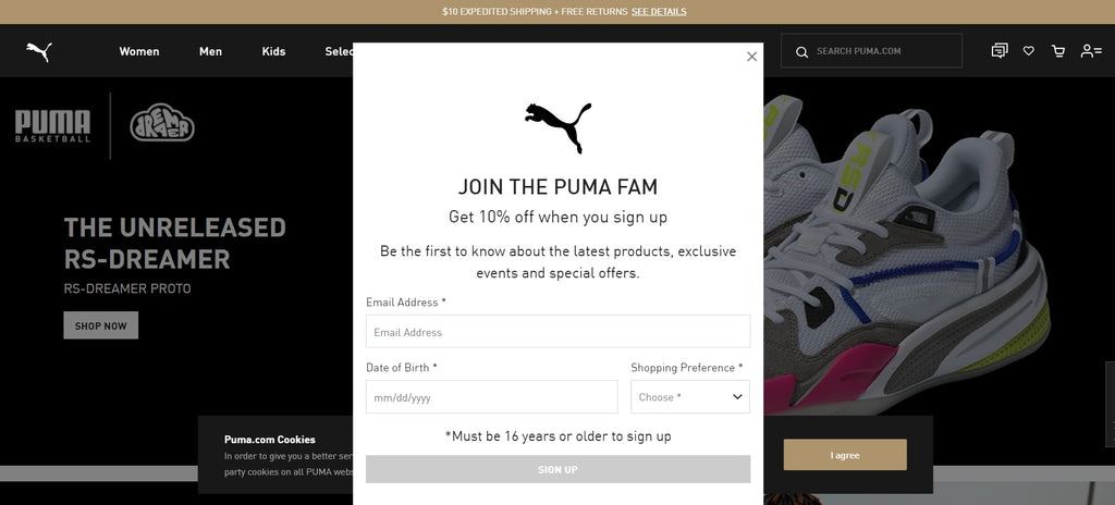
Visitors of the Puma website will be presented with a multi-purpose window. A discount will be offered in exchange for the customers’ email and date of birth. Visitors will also be able to choose their shopping preference for men’s or women’s attire in this window. Should they are not interested, however, the window can be dismissed to make way for the Puma home page.

4.2. J.Crew
The strong point of J.Crew can be directly seen in its vibrant and friendly images that show its latest collections. The hospitable feel is also expressed in the site’s language, using natural and informal phrases as CTAs.

Promotions are also presented neatly without obstructing the main view, offering easy and clear dismissal buttons as well. That gives the customers the option to consider their offers, or go back to browsing the items on the site.
05. Call-to-action
5.1. Ikea
Immediately upon clicking the Ikea website, you are presented with a strong grid layout that logically points you to the main block. This part contains a friendly greeting and asks you to choose an Ikea region store near you. Ikea wastes no time at all to get their website visitors straight to shopping for items they can get in their region.

The easy-to-read grid design is also shared between this splash page and Ikea’s homepage, offering the visitors a uniform experience throughout the online shopping experience. Ikea also utilized clear call-to-action buttons and headlines as a seamless guide to browsers, making this an ideal user experience.
5.2. Schmoll
Unlike other pages listed before, Schmoll Creative uses its splash page to send a message to its customers, reflecting the creative nature of the design brand. With only a few words, Schmoll immediately conveyed its playful nature and offered a direct CTA button underneath.

The blue and white color scheme also provides a pleasant and professional look to the page, creating trust in first-time visitors to encourage further discovery of the site.
Simple. Concise. And effective.
5.3. Mrcthms
As more of a personal site, Marc’s splash page acts as a quick digital business card to serve a few purposes.

One, introducing who he is and what he does. Two, a short description showing the project he is currently working on and the prominent partners he has worked with in the past. Third, a CTA to tell visitors to get in contact. Finally, should they want to see more about Marc, his social media accounts are well present in the bottom portion of the page.
5.4. Garrison Footwear
Garrison Footwear’s splash page is shrouded in a black and white filter, reserving the spotlight for the brand name and a short title in the center. A telephone number is also present in the upper right corner for a more immediate method of contact. The CTA button is then located in the lower part of the page, signifying more content below and ready the customers for more information.

Conclusion
In conclusion, with such a range of purposes and variety in design, splash pages can be the key to better communications on your website. It focuses the visitors’ attention to one single window which can quickly convey a promotion deal or prompt an interactive action.
It also breaks the monotony of having a simple collage of text and images for a website, as a splash page can be where you interact with your customers without coming in direct contact with them. It is the first impression your customers have of your page, making it the ideal vessel to send a message like Schmoll Creative, offer your customers options like Puma or customizing the user experience to them like Zara. Either ways, splash pages are an efficient way to add a dynamic touch, encouraging your customers to interact more than the traditional reading and watching.


