

Most Shopify campaign traffic is lost on pages that ask the visitor to do several things at once. A landing page earns its lift by what you remove, not what you add.
A Shopify landing page is a standalone page built for one campaign and one action. This guide covers what separates it from a regular Shopify page, the six landing page types worth building, four live landing pages we re-checked on 1 October 2026, the templates you can start from, and five optimization fixes. If you want the click-by-click build instead, our dedicated guide on how to build a Shopify landing page that converts walks through it end to end.
Key takeaways
- A landing page has one job. Strip the navigation, keep one call-to-action, and repeat it rather than adding a second offer.
- Six types cover almost every campaign: splash, lead generation, sales, thank you, seasonal and webinar registration.
- There are three build routes: Shopify’s built-in pages and theme templates (free, limited design), custom Liquid (developer required), or a page builder such as PageFly (drag-and-drop, template library).
- We opened every example on this page again on 1 October 2026. Two from the previous version could not be verified and were removed; the four that remain are shown as they look today.
- PageFly’s free plan covers 1 published page or section, 10 AI credits a month and access to 320+ page & section templates; the Builder plan is $24/month for 5 pages or sections and 80 AI credits (pricing page, read 1 October 2026).
What is a Shopify landing page?
A Shopify landing page is a standalone page on your store built around a single campaign and a single action — buy this product, claim this discount, join this list — with the elements that normally help people browse deliberately stripped out. Unlike a regular Shopify page (homepage, product page, collection page), which serves several purposes at once and encourages exploration, a landing page keeps one primary call-to-action and removes the competing paths away from it. You can build one with Shopify’s native page editor and theme sections, with Liquid code, or with PageFly, a Shopify page builder that adds drag-and-drop layout control and a template library on top of your existing theme.
Why Shopify landing pages convert better than general pages
A landing page converts better than a general page for one structural reason: it removes the choices that compete with the offer. Four things follow from that.
- Fewer exits. No header menu, no footer link blocks, no “you may also like” row. Shopify’s own free-trial page (below) shows zero navigation links in its header.
- One measurable goal. A single conversion (purchase, signup, download) can be tracked per campaign and compared against your store’s conversion rate, instead of being diluted across every page type.
- Less to load. A landing page carries far fewer sections and app scripts than a full homepage, so there is less between the click and the offer.
- Testable. With one headline and one button there is something clean to test. See how Shopify A/B testing works before you change anything.
Shopify Landing Page vs Regular Shopify Page: Key Differences
Understanding the difference between landing pages and regular Shopify pages is crucial for your marketing strategy:
| Aspect | Landing Page | Regular Shopify Page |
|---|---|---|
| Purpose | Single conversion goal (signup, purchase, download) | Multiple purposes (browse, learn, explore) |
| Navigation | Minimal or no navigation menu | Full navigation menu and footer |
| Content Focus | One specific offer or product | Various products, information, links |
| Call-to-Action | One primary CTA repeated strategically | Multiple CTAs for different actions |
| Traffic Source | Targeted campaigns (ads, email) | Organic search, direct traffic, general browsing |
| Customization | Highly customized for each campaign | Consistent template across site |
| Measurement | One conversion goal, tracked per campaign | Traffic, engagement and assisted conversions across the funnel |
In simple terms: Regular Shopify pages help visitors explore your store, while landing pages convert them into customers or leads. That is why your homepage and your product pages should keep their navigation — exploration is their job.
Resist the urge to compare the two on a generic “average landing page conversion rate” figure. If you are deciding between the two for a campaign, our breakdown of landing page vs homepage goes deeper. Benchmark against your own store instead: our breakdown of the average Shopify conversion rate and how to improve it is a more useful baseline than a number pulled from another industry.
Shopify landing page examples: what we re-checked on 1 October 2026
An example is only useful if it still exists. Before updating this guide we opened every store it cited, read the live page, and kept only what we could see for ourselves. Here is the result.
| Example | What we saw on 1 Oct 2026 | Status |
|---|---|---|
| Shopify free-trial page (shopify.com/free-trial) | One offer (“Start for free, keep building for $1/month”), an email field in the hero and again lower down, no header navigation | ✅ Kept, rewritten |
| Flow Hive (honeyflow.com) | Shopify store (theme “Turbo”, heavily customised). Seasonal “Fall Starter Bundles, save up to $200” bar and hero; a market switcher for the US, Australia, Europe, UK and Canada | ✅ Kept, rewritten |
| Flow Hive Refer-A-Friend (/pages/refer-a-friend) | A single-purpose referral page: friend gets $50 off, referrer gets a $50 reward, one sign-up form | 🆕 Added |
| Luxy Hair quiz (/pages/hair-extensions-quiz) | Shopify store (theme “Luxy [Production]”). The quiz opens with one question about the goal, with six answers | ✅ Kept, corrected |
| Skin Discovery Rewards | The store domain did not load from our test machine, so we could not confirm the page or the “built with PageFly” claim | ❌ Removed |
| Monk Manual thank-you page | The store is live, but a thank-you page is only visible after a purchase and no referral programme is linked from the storefront today | ❌ Removed |
Two PageFly templates, Cookie Easter and SmartNest Mother’s Day, stay in the templates section further down. They are templates you can install, not live stores, and we label them that way. For whole-store inspiration rather than single pages, see our roundup of the best Shopify store examples.
Types of Shopify Landing Pages
Shopify landing pages are versatile tools designed to guide visitors toward specific actions, such as making a purchase or signing up for a newsletter. Each type serves a distinct purpose in the funnel. Below is an in-depth look at the six most common types, with tips and real-world examples — and if you want broader inspiration, our roundup of the best Shopify store examples covers whole stores rather than single pages.
Splash landing pages
A splash page sits in front of the store to do one small job before the visitor continues: confirm their age, pick a region or language, or announce a launch. It works at the top of the funnel because it asks for almost nothing.
- Use an overlay, not a redirect. A lightbox over the page they were already on tells the visitor they arrived in the right place.
- Remember the answer. Show it once. A splash page that reappears on every visit becomes an obstacle.
- Always offer a way past it. A visible skip or close control keeps the visitor from bouncing.
- Keep it light. No autoplay video; export artwork at the right size using our Shopify banner size cheat sheet.
Flow Hive’s market switcher, covered below, is the useful version of this idea: a visitor in Canada is not shown US prices.
Lead generation landing pages
A lead generation page trades an incentive for contact details: a discount code, a guide, early access. It sits in the middle of the funnel, and the whole design is a balance between what you ask for and what you give back.
- Ask for one field. Email first; collect the rest after the visitor has received something.
- Name the reward on the button. “Get 10% off” tells the visitor what happens next; “Submit” does not.
- Put proof beside the form. A star rating or a short testimonial does the same job it does on the best Shopify product pages.
- Use Shopify’s built-in forms first. The theme’s newsletter and contact forms already store the email against a customer record.
Flow Hive’s Refer-A-Friend page (below) is a lead page in all but name: one form, and a reward stated in dollars on both sides.
Sales landing pages
A sales page is built to close one product or bundle, usually for paid or email traffic, and it is often long because it has to answer every objection on the page itself. Most theme product templates hold only product details and recommendations, so a sales page usually needs more sections than the template offers. Our guide to Shopify product page customization covers the options.
- Lead with the benefit, then the product. The headline is the offer.
- Answer objections in order. Price, fit, delivery, returns, in the order buyers actually raise them; an FAQ block handles the last few, and most themes let you add one as one of their Shopify sections.
- Repeat one CTA. Several buttons are fine if they all lead to the same place, with content between them that gives a reason to keep reading.
- Use urgency only when it is real. A countdown to a sale that actually ends; a stock count that is actually low.
- Keep the buyer on the page after add-to-cart. A cart drawer confirms the add without sending them away from the offer.
Thank you pages
A Shopify thank you page is where a buyer lands after checkout or a signup. Most stores leave it as a receipt, but the visitor’s attention is at its highest right after they have committed.
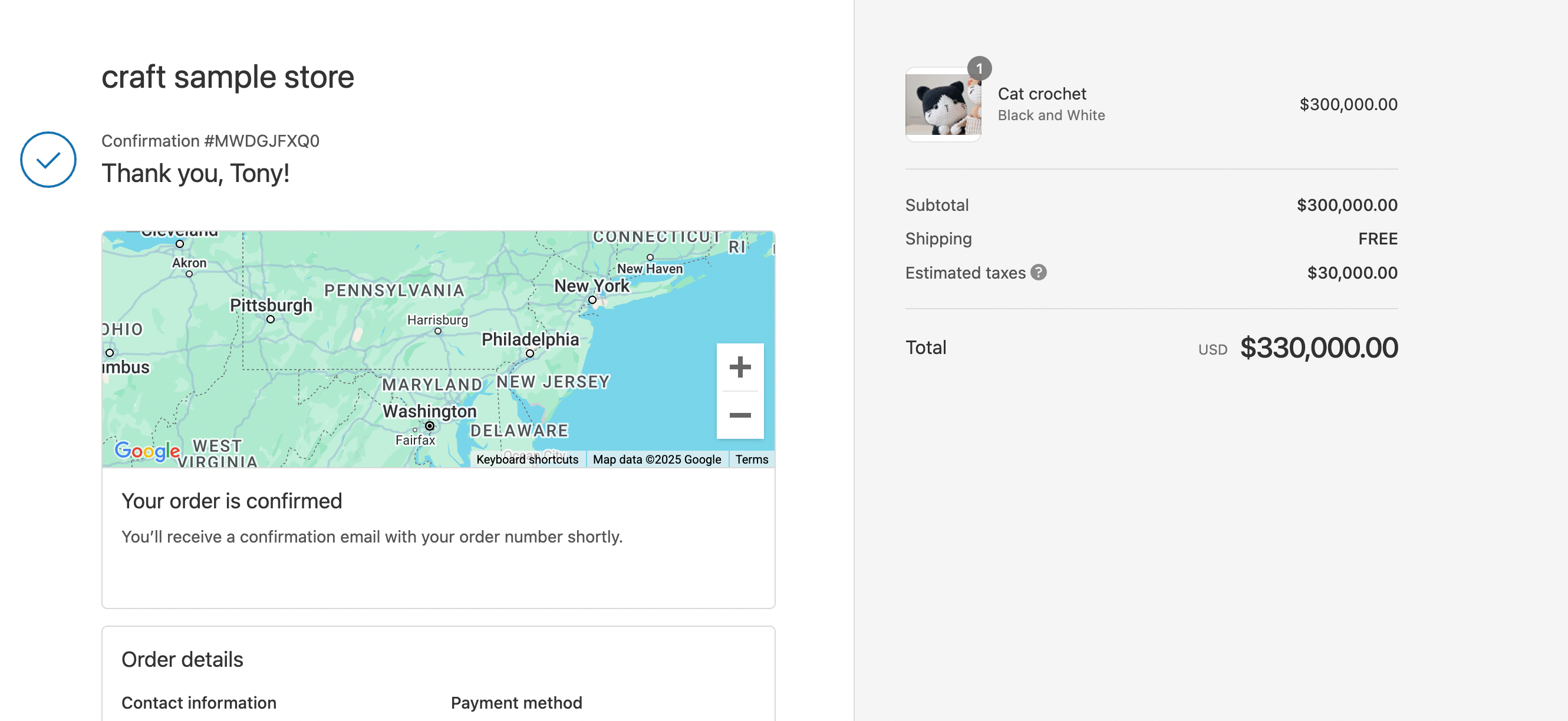
- Give a reason to come back. A next-order discount or loyalty points, stated as a number.
- Ask for a referral while the purchase is fresh. Spell out what the friend gets and what the buyer gets.
- Set expectations. Delivery estimate and tracking link first; these reduce “where is my order?” emails. The same logic applies one step earlier, on your Shopify checkout page.
- Link back into the store once. One relevant collection, not the whole menu.
Seasonal Landing Pages
Seasonal landing pages capitalize on holidays or special events with themed promotions and discounts, using urgency and festive design during a limited-time campaign. For the November peak, our BFCM checklist covers the prep. The same urgency mechanics also work on high-performing product pages, but here they carry the whole page.
Key tips to boost sales from seasonal landing pages:
- Make It Festive and Clear: Use holiday-themed designs while maintaining readability with balanced whitespace.
- Create Urgency with FOMO Tactics: Add countdown timers or stock scarcity indicators like “Only 5 left!” messages.
- Highlight discounts and free shipping offers: emphasize the deals that actually matter to holiday shoppers, and start from a seasonal layout in the PageFly template library rather than building from scratch.
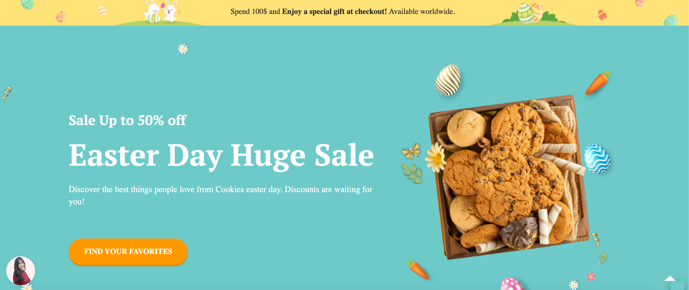
For example. this PageFly's Easter landing page template features bold “50% Off” banners, countdown timers, and free shipping offers, creating sense of urgency and drive actions:
Webinar Registration Landing Page
Webinar registration pages are ideal for brands offering educational content or live demos that engage audiences while capturing attendee details. By that, businesses can easily monitor and manage the numbers of registration and attendee.
Key Tips:
- Highlight Event Benefits: Explain what attendees will gain from participating (e.g., exclusive insights).
- Use trust signals: add expert endorsements or testimonials from past attendees, the same proof pattern that lifts collection and category pages.
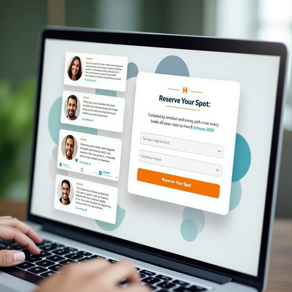
Illustration: the layout above is a mock-up, not a specific store: one clear CTA (“Reserve Your Spot”), proof from past attendees, and nothing else on the page competing with the form.
Three ways to build a Shopify landing page (and when each makes sense)
There are three routes: Shopify’s built-in page editor and theme templates, custom Liquid code, or a page builder app. Choose the built-in route for a simple announcement, Liquid if a developer already owns your theme, and a page builder if the page has to look different from your theme and ship this week. For the full click-by-click walkthrough — section order, mobile checks and publishing — follow our dedicated guide on how to build a Shopify landing page that converts; what follows here is the trade-off between the three, so you can choose before you start.
Free Shopify Landing Pages: Built-in Method for Budget-Conscious Entrepreneurs
Perfect for solo entrepreneurs and micro businesses with limited budgets, Shopify’s built-in page creation costs nothing beyond your existing subscription — you are simply limited to the sections your theme ships with. This method works best for simple landing pages: “Coming Soon” announcements, basic lead capture forms and straightforward product promotions.
✅ Pros for new merchants:
- Completely free (no additional app costs)
- No learning curve for complex tools
- Automatically matches your theme design
- Built-in SEO fields — the same ones covered in our Shopify page SEO guide
- Mobile-responsive by default
❌ Limitations to consider:
- Limited design customization options
- No advanced conversion optimization features
- Cannot create complex layouts or animations
- No A/B testing capabilities
- Basic form functionality only
To create a free Shopify landing page using built-in tools, navigate to Online Store > Pages, add content with the theme editor, and fill in the SEO fields. If you have never used that part of the admin, our explainer on what Shopify pages are and how to add them covers it.
Steps by Steps Guide:
1. Create a new template in Shopify theme editor
 2. Design by inserting content using Shopify’s Theme editor (images, text, videos).
3. Add page by going to Online Store > Pages in your Shopify admin dashboard.
4. Click Add Page and enter a title for your landing page (e.g., “Holiday Sale”).
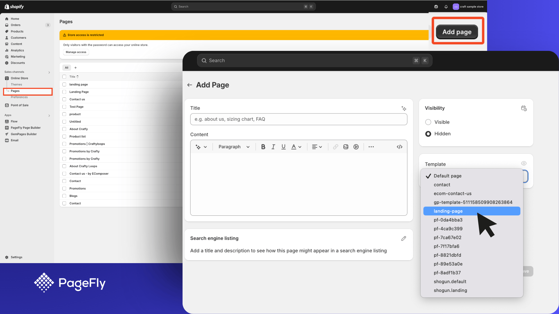
5. Save and publish the page, then link it to your store’s navigation menu.
*You can also set up page SEO information like page title, meta description, etc.
Key Tips:
- Use Shopify’s page editor: go to the “Pages” section in the admin to create a new page, then add text, images and video.
- Enable Contact Forms: Add Shopify’s built-in contact form for lead generation or customer inquiries.
- Optimize SEO Settings: Use the “Search engine listing preview” section to add meta titles and descriptions for better search visibility.
- Link pages strategically: connect the landing page to menus or promotional banners — or, for campaign traffic, to nothing at all, so the only way forward is your CTA.
- Keep the design simple and focused on a single conversion goal (e.g., email signups or product purchases).
- Use high-quality visuals and compelling headlines to grab attention instantly.
- Make sure you test page speed and performance before launching
Using Liquid Code (For Advanced Users)
To create or customize a Shopify landing page using Liquid code, you can go to Online Store > Themes > Actions > Edit Code in Shopify admin.
Why use this method? Liquid is Shopify’s templating language, and it lets advanced users customize themes and build highly tailored landing pages. It is only worth it if you have coding knowledge or a developer — the same trade-off we cover in our guide to Shopify product page customization methods.
Step by Step Guide:
- Go to Online Store > Themes > Actions > Edit Code in your Shopify admin dashboard.
- Locate the “Templates” folder and open the relevant file (e.g., page.landing-page).
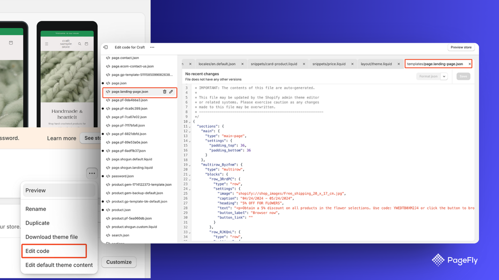
- Add custom Liquid code to modify layout or insert dynamic elements like product recommendations or social proof widgets.
- Save changes and preview your landing page before publishing.
Pro Tips for customizing landing pages using code:
- Understand Liquid Syntax: Familiarize yourself with Liquid tags, filters, and objects for dynamic content creation.
- Back up your theme files: duplicate the theme before you change anything. If you are not sure which theme you are editing, our free Shopify theme detector will tell you.
- Add Custom Sections: Create unique sections like testimonials or countdown timers directly within the theme code.
- Test Responsiveness: Ensure your customizations work seamlessly across devices.
(*) Note: Shopify offers theme customization tutorials that are divided by the version of theme architecture they use. Learn how to identify your theme architecture version.
Customize and Create Shopify Landing Pages With A Page Builder App
Shopify landing page builders like PageFly are the easiest and most flexible route; PageFly’s pricing page says it is trusted by 230,000+ Shopify merchants. These Shopify apps replace theme editing with drag-and-drop layout control and a library of conversion-oriented templates. If you want to weigh the options first, we compare them in our roundup of the best Shopify landing page apps.
PageFly holds a 4.9 rating from 5,897 reviews on the Shopify App Store (read 1 October 2026), and sits between the two extremes: more design control than the native editor, no developer required. Our wider comparison of Shopify page builder apps explains where each one fits.
First, choose the app. Here are the three most common page builders side by side.
Overview of page builder apps
We read each app’s Shopify App Store listing on 1 October 2026. Ratings and prices change, so treat this as a dated snapshot and check the listing before you install.
| App | What stands out on the listing | Free plan | First paid plan | Rating (reviews) |
|---|---|---|---|---|
| PageFly | Drag-and-drop editor, 320+ page & section templates, AI credits, built-in dashboard analytics | Yes: 1 page or section, 10 AI credits/month | Builder, $24/month (5 pages or sections, 80 AI credits) | 4.9 (5,897) |
| Shogun | Visual page editor; A/B testing is sold as a separate app (Shogun AB Testing) | Yes | Build, $39/month | 4.8 (1,966) |
| GemPages | Sales funnels with upsells and A/B tests; GemAI turns an image into a page layout | Yes: 1 published page | Build, $29/month | 4.9 (4,255) |
The previous version of this table said Shogun was paid-only and had native A/B testing. Neither is true of the listing today, so both were corrected. For the full field, see our Shopify landing page app comparison.
We use PageFly for the walkthrough below. Its free plan lets you publish 1 page or section, includes 10 AI credits a month, and gives you access to all 320+ page & section templates, enough to test one campaign before you pay anything.
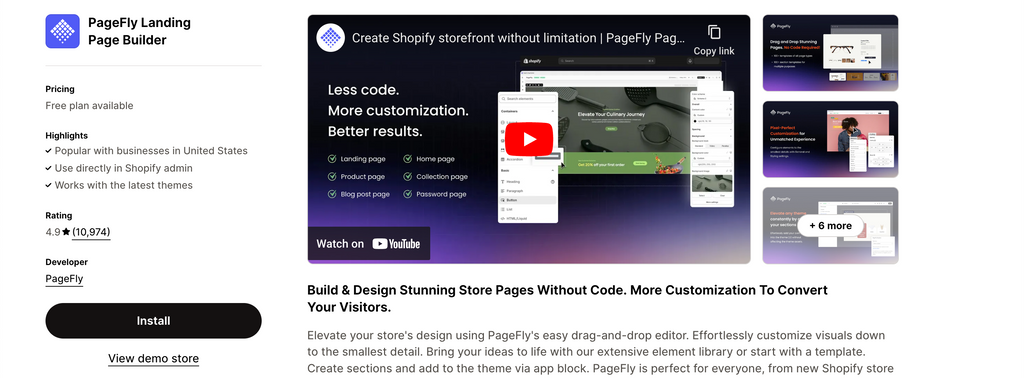
Step 1: Install the PageFly Landing Page Builder
Install PageFly from the Shopify App Store, then open it from Apps in your Shopify admin. If you would rather compare it against the alternatives first, start with our list of Shopify landing page apps.
Step 2: Create Shopify landing pages with PageFly
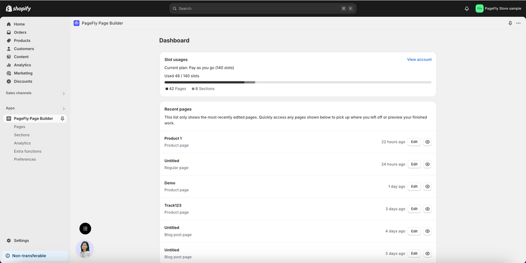
In the Shopify admin sidebar, click Apps > PageFly – Advanced Page Builder. After that, you will be redirected to the PageFly Dashboard on a different page.
In the Pages dashboard of the PageFly App, Click Create a page or the (+) icon on the left menu. Then you can choose the page type as your preference in Page Settings.
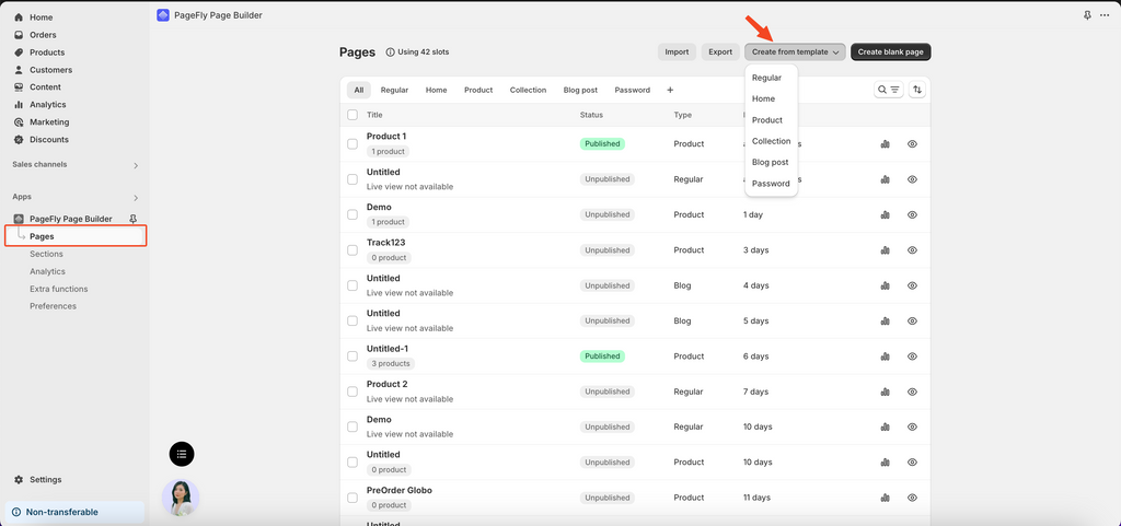
PageFly provides page types built for Shopify landing page work: home, product, collection, about, lead capture and seasonal campaign pages. This Shopify page builder works on top of your existing theme, and its visual editor gives you layout control the default page editor does not have.
After configuring your landing page settings, you reach PageFly’s template library — 320+ page & section templates, including Shopify landing page templates grouped by industry and campaign goal. You can browse the same library of landing page templates for Shopify before installing anything.
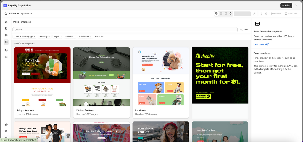
However, if you want to start building things from scratch you can choose create with the blank page.
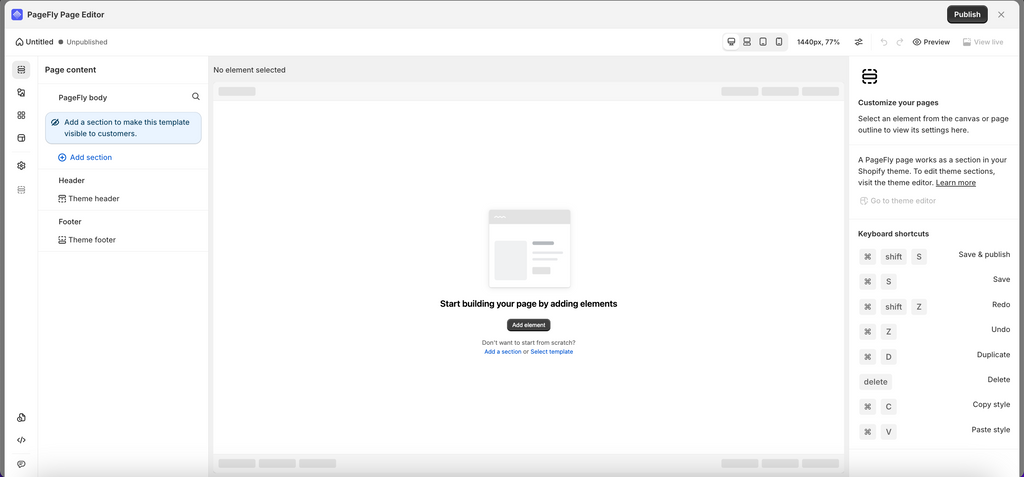
Step 3: Add Elements
The page editor gives you PageFly and Shopify elements and sections to drag onto the blank page, so you can structure the layout however the campaign needs it — including patterns borrowed from your homepage or your collection pages.
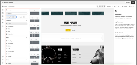
PageFly also provides limitless experiments with elements.
A faster approach is to start from one of PageFly’s 320+ page & section templates in page settings and delete whatever your campaign does not need.
For a more detailed tutorial on how to create a Shopify landing page with PageFly, check out this tutorial:
Step 4: Preview or publish the page
Once you’re done building the page, hit Save. This option saves the page to a database but does not make it public yet. You can see the page preview via Preview.
The Publish button both saves the page and makes it public, and Live View shows it at “your-shop-name.myshopify.com/pages/page-name”. Before you publish, fill in the page title and meta description — our Shopify page SEO guide covers what to write in them.
You can find the PageFly page in Shopify itself under Shopify home > Sales Channels > Online Store > Pages, alongside every other one of your Shopify pages.
Shopify landing page templates: which one to start from
The fastest way to create a landing page in Shopify is to start from a template and remove what the campaign does not need. PageFly’s library holds 320+ page and section templates — you can browse them on the PageFly templates page — and the free plan gives you access to all of them with 1 published page or section.
Filtering the library by page type is faster than scrolling it: the Page tab lists 129 page templates, and selecting Landing page narrows them to 29. The same filter covers Homepage (46), Product page (27) and Collection page (8), so you can open the PageFly template library and go straight to the set that matches the page you are building.
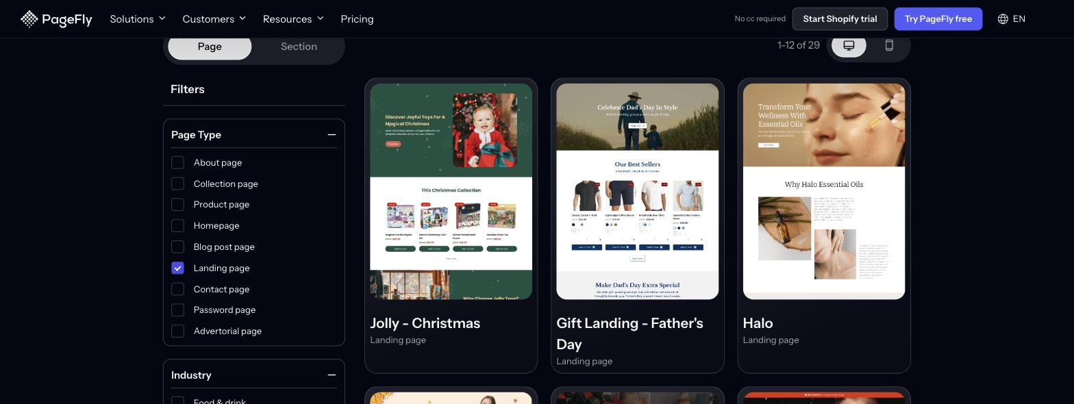
Use the table below to pick a starting point against the four constraints that usually decide it: the campaign type, the skill level required, what it costs, and how quickly it can be live.
| Starting point | Best for (campaign type) | Skill level needed | Cost | Time to live |
|---|---|---|---|---|
| Cookie Easter template (PageFly) | Holiday and flash-sale campaigns with a countdown | None — drag-and-drop | Free plan covers 1 published page or section | Same day — the layout is already built |
| SmartNest Mother’s Day template (PageFly) | Gift-led occasion campaigns | None — drag-and-drop | Free plan covers 1 published page or section | Same day |
| Any of PageFly’s 320+ page & section templates | Product launches, lead capture, sales pages, seasonal offers | None — drag-and-drop | Free plan (1 page or section, 10 AI credits/month); Builder $24/month for more | Same day |
| PageFly blank page | Brand-specific campaigns no template matches | Comfortable with a visual layout tool | Same plans as above | Hours rather than minutes |
| Shopify built-in page + theme template | Coming-soon pages, simple announcements, basic lead capture | None, but you are limited to your theme’s sections | Included in your Shopify plan | Same day |
| Custom Liquid template | Bespoke pages tied to theme logic or custom data | Developer | Depends on your developer’s rates | Days to weeks, depending on availability |
The two seasonal templates in that table are covered in detail below. Both are the clearest illustration of the principle: they win by leaving things out.
| Template Name | Key Features | Best For | Pricing |
|---|---|---|---|
| Cookie Easter | Festive design, countdown timer | Seasonal promotions | Free with PageFly |
| SmartNest Mother’s Day | Elegant visuals, urgency elements | Holiday campaigns | Free with PageFly |
Cookie Easter Shopify landing page template - Built by PageFly
The Cookie Easter Shopify landing page template, built with PageFly, is a visually engaging and conversion-focused design tailored for seasonal promotions.
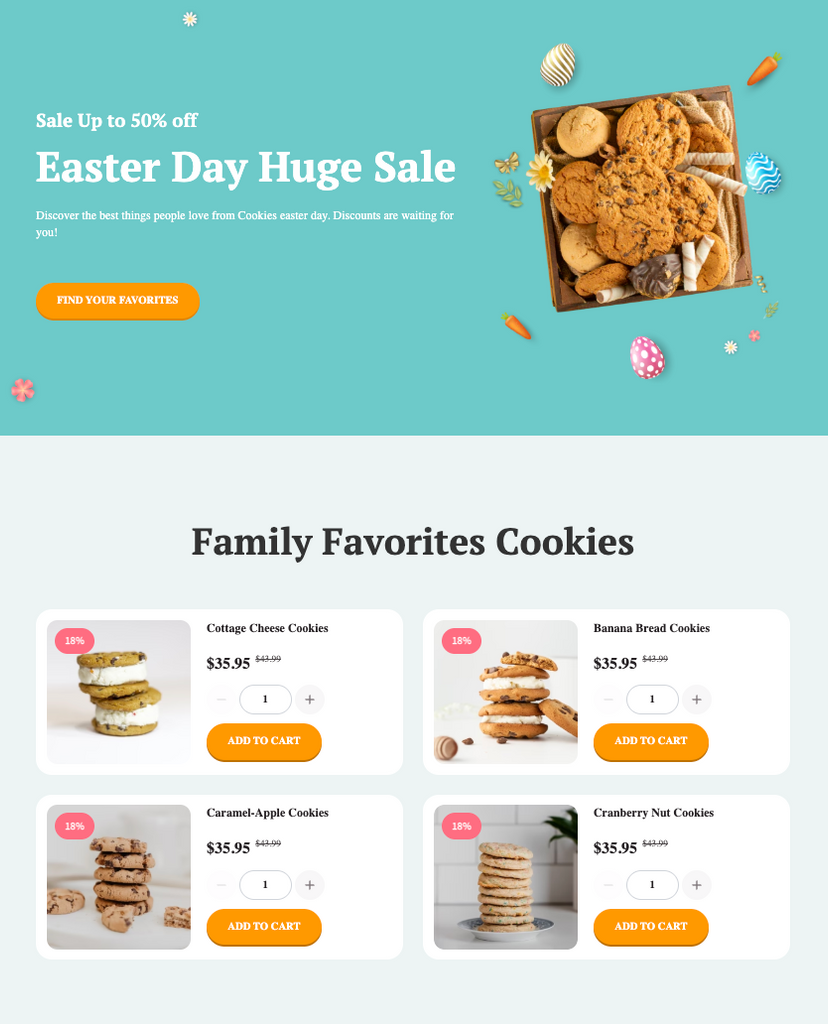
The landing page excels in seasonal design, incorporating vibrant colors, Easter-themed visuals, and playful typography that immediately resonate with the holiday spirit. This creates an emotional connection with visitors and aligns perfectly with the theme of the promotion.
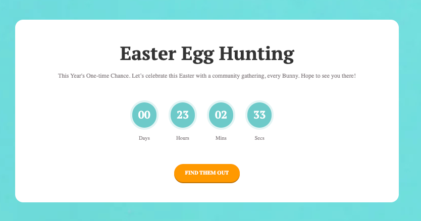
The layout is clean, with ample whitespace that emphasizes key elements like product images, discounts, and countdown timers. These features create a sense of urgency and focus attention on the promotional offer.
Additionally, the page is mobile-optimized, ensuring a seamless browsing experience across devices. Its use of high-quality visuals and concise copy enhances user experience while maintaining fast loading speeds.
By combining festive design elements with effective CTAs and responsive functionality, this landing page template successfully captures visitor attention and drives conversions.
SmartNest Mother’s Day Shopify Landing Page Template - Built by PageFly
The SmartNest Mother’s Day Shopify landing page template, built with PageFly, is a compelling example of a seasonal landing page designed to drive holiday sales. Its success lies in its strategic use of festive design, clear messaging, and effective call-to-action (CTA) placement.
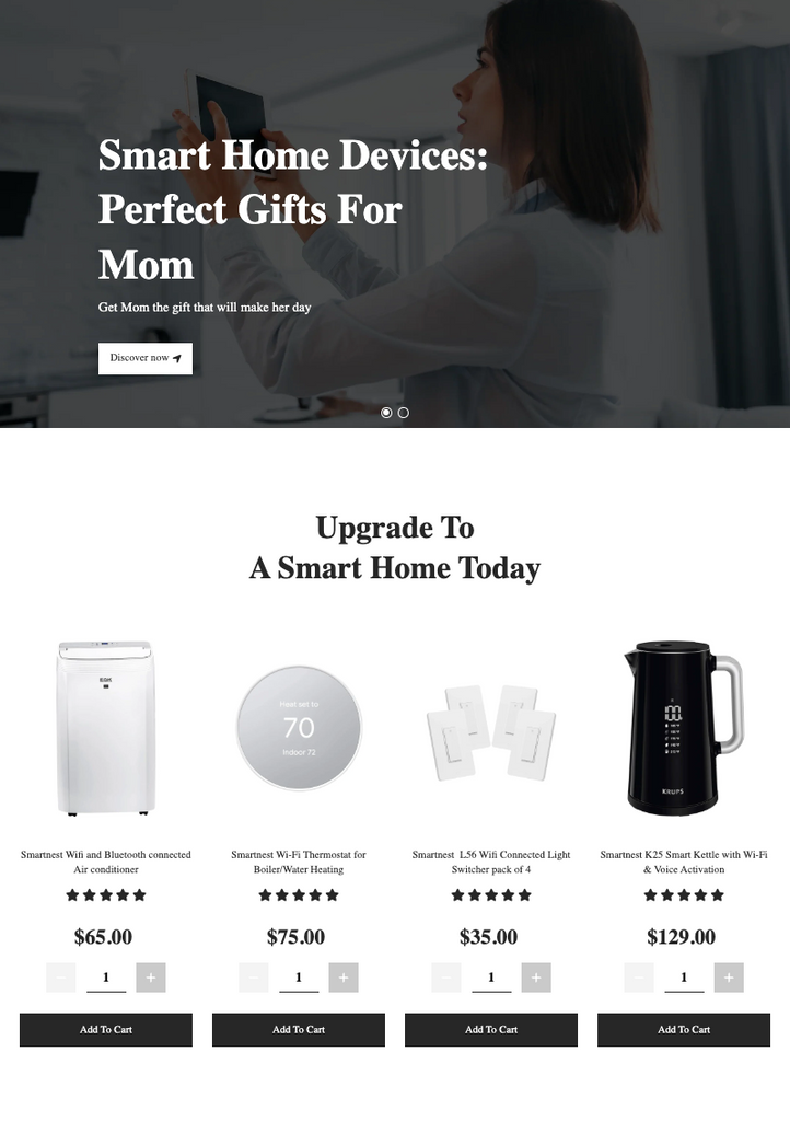
This landing page captures attention with its Mother’s Day-themed aesthetic, featuring soft colors, elegant typography, and heartfelt visuals that resonate emotionally with visitors. The design creates an immediate connection with the holiday spirit, making it highly engaging.
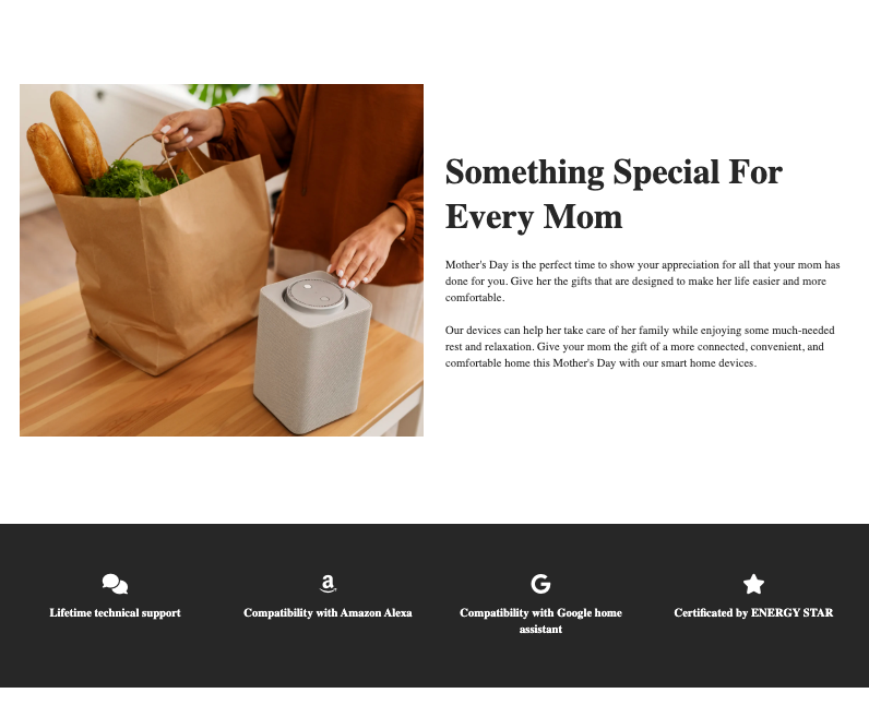
The page emphasizes urgency through countdown timers and stock scarcity messages like “Only X left in stock!”, encouraging quick purchases. Additionally, discounts and free shipping offers are prominently displayed, making the value proposition irresistible to customers.
The layout is clean and mobile-optimized, and every breakpoint stays editable in the PageFly visual editor. By combining emotional appeal with a clear CTA and honest urgency, the template does the seasonal job without extra sections.
4 live Shopify landing pages, re-checked on 1 October 2026
Every screenshot in this section was captured on 1 October 2026 from the live page. Each example wins on one thing, and that one thing is what to copy.
Shopify’s free-trial page: one offer, one field, no menu
Shopify’s own trial page is the cleanest landing page on this list because it does so little. On 1 October 2026 the hero carried one offer, “Start for free, keep building for $1/month”, a secondary line about earning up to $7,000 in credits, and an email field with a single “Start for free” button. The header had no navigation links at all.
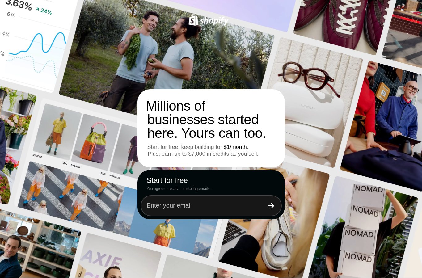
Further down, each section (themes, subscription credits, the Sidekick assistant, selling channels) answers one objection, and the page ends with a second email field: the same action, offered again to the people who needed convincing.
Copy this: put your primary button in the hero, then repeat the same button after your main proof block. Then confirm it with an A/B test rather than assuming.
Flow Hive: a seasonal offer carried by the whole page
Flow Hive sells beehives on Shopify (the page source names a heavily customised “Turbo” theme). In early autumn the store does not build a separate microsite; the seasonal offer runs through the existing pages. A rotating bar reads “Save up to $200 on Fall Starter Bundles”, and the hero repeats it under the headline “Harvest honey straight into your jar”.
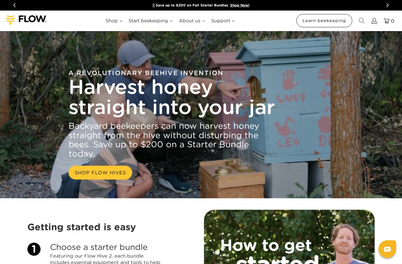
Two details are worth stealing. The first section after the hero is “Getting started is easy”, a numbered path that starts with choosing a starter bundle, so the offer and the next step are the same thing. And the footer has a market switcher (United States, Australia, Europe, United Kingdom, Canada), so the price in the offer matches where the visitor is.
Copy this: for a seasonal campaign, a bar plus a hero plus one bundle often beats a new page. If the season needs its own page, start from one of the Black Friday landing page templates we tested and keep the same single offer.
Flow Hive Refer-A-Friend: a referral page that states both rewards
Flow Hive’s referral page is a lead-capture page in miniature. It opens with a short “Sign up, Share, Receive” video, then says it plainly: your friend gets $50 off their first Flow Hive, Flow Super or Flow Frames, and you get a $50 reward. Below that is one sign-up form that issues a unique link.
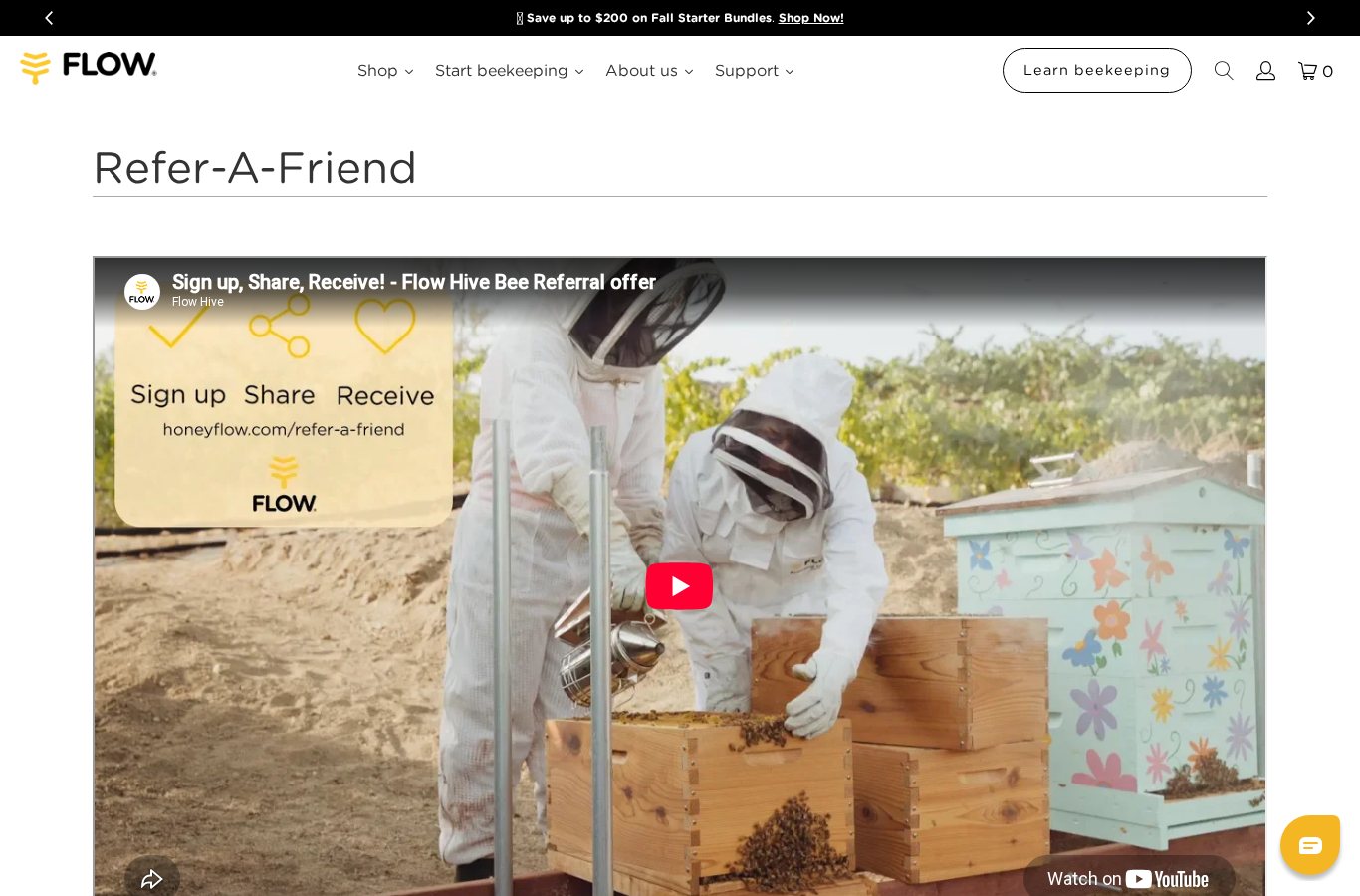
The page also handles two failure points most referral pages ignore: it tells visitors to turn off an ad blocker if the form does not appear, and tells them to check spam if the referral email does not arrive.
Copy this: state both sides of the reward as a number, in the first screen. If you link to it from your thank you page, you ask at the moment the buyer is happiest.
Luxy Hair: a quiz instead of a variant grid
Luxy Hair sells clip-in hair extensions on Shopify (theme “Luxy [Production]”) in many lengths, weights and colors. Instead of asking a first-time buyer to compare them all, the store routes them through a quiz. On 1 October 2026 it opened with a single question, “What would you like to achieve with hair extensions?”, and six answers: add volume, add volume and length, add extra length, add color, cover thinning areas, and add quick styles.
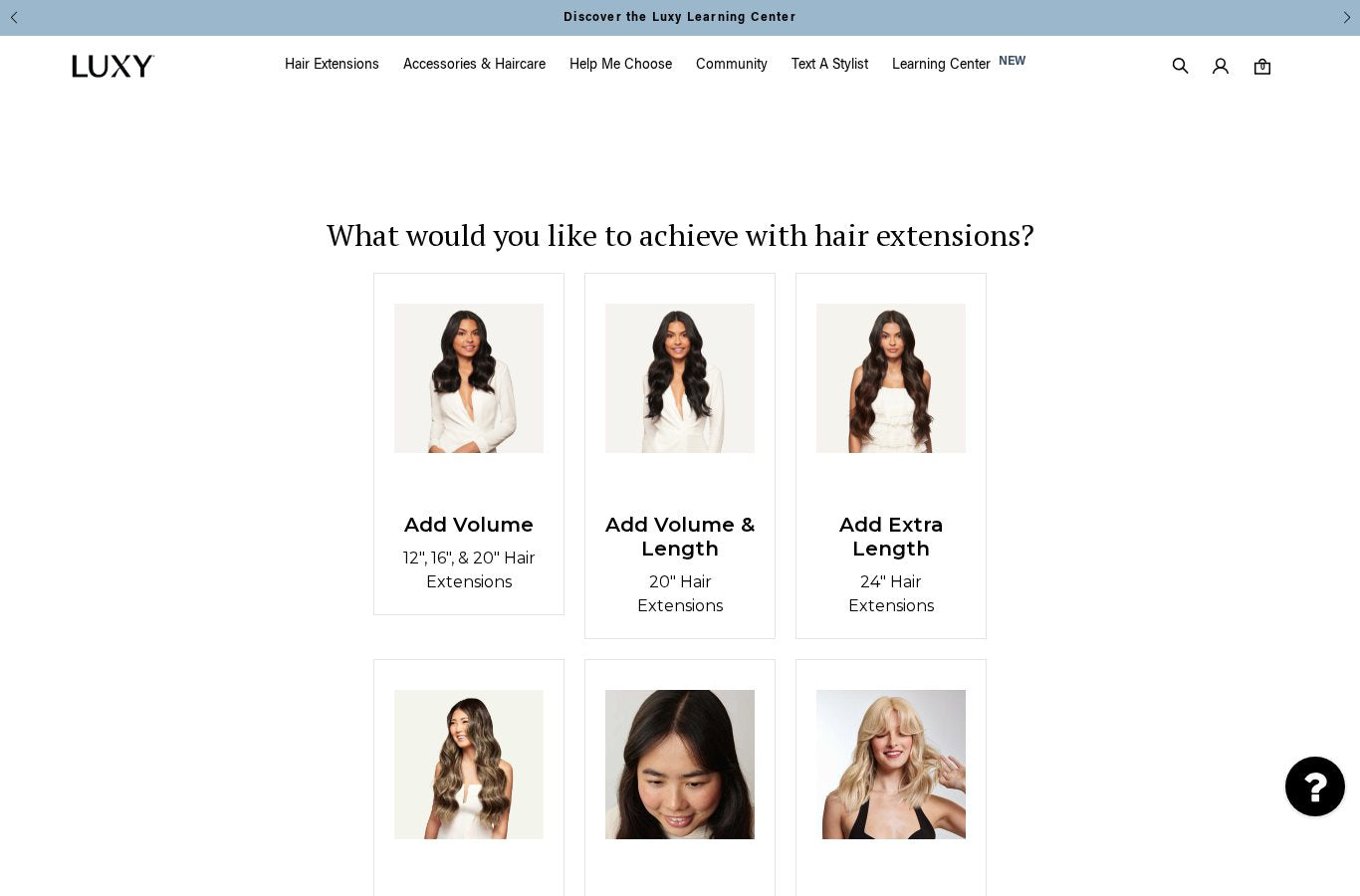
The first question is about the shopper’s goal, not product attributes. (The previous version of this article said the quiz started with thickness and then color. That is no longer how it works, so we corrected it.)
Copy this: if your catalog has more variants than a shopper can compare, a goal-first quiz is the landing-page version of good filtering, and it does the job a size chart does for apparel. Our guide to Shopify Search & Discovery covers the on-site equivalent.
Two examples we removed
The previous version also featured a Skin Discovery rewards page and Monk Manual’s referral thank-you page. On 1 October 2026 the Skin Discovery domain did not load from our test machine, so we could no longer confirm the page or that it was built with PageFly. Monk Manual’s store is live, but its thank-you page is only visible after a purchase and the storefront no longer links to a referral programme. We would rather show four examples we could check than six we could not.
Shopify landing page optimization: 5 fixes that move conversion
Shopify landing page optimization is mostly subtraction. Every element you keep has to justify itself against the one action the page exists for, so work through these five in order before you touch the headline.
- Remove the second exit. Strip the header menu, footer link blocks and any “you may also like” row from the template. Any link that does not serve the campaign is a way out of the page — keep browsing on your collection pages, where exploration is the goal.
- Cut the form to the fields you will actually use. Each field you delete removes a reason to abandon. Ask for the email now and collect the rest after the conversion.
- Repeat one CTA instead of adding a second offer. Use the same button in the hero and again after your main proof block — exactly what Shopify’s own free-trial page does with its two email fields.
- Move proof next to the decision. Reviews, guarantees and trust badges belong beside the button, not in a testimonials section at the bottom that most visitors never reach.
- Trim page weight before you tune copy. Oversized hero art and unused app scripts cost more than wording does. Export images at the correct dimensions using our Shopify banner size cheat sheet, and remove anything the page does not need.
Then change one thing at a time. Shopify A/B testing tells you which version wins; our data on the average Shopify conversion rate tells you whether the winner is actually good.
If discovery rather than conversion is your bottleneck — people arriving and not finding the offer — that is a different fix, and our guide to Shopify Search & Discovery is the better starting point.
Conclusion
Start Creating High-Converting Shopify Landing Pages Today
Shopify landing pages work because they narrow the choice, not because they add features. Whether you use Shopify’s free built-in pages for a simple campaign or a landing page builder like PageFly for full design control, the point is to ship one, measure it, and remove what is not pulling its weight.
Your next steps:
- Choose your method: built-in Shopify pages for basic needs, or a page builder app for template-led design control
- Start with one high-impact page: Focus on your best-selling product or highest-value lead magnet
- Test and optimize: use A/B testing to improve conversion rates continuously
- Scale what works: Apply successful elements across multiple landing pages and campaigns
Remember: dedicated landing pages pay off most for campaigns, product launches and paid traffic sources — places where the visitor arrived with one intention. PageFly’s free plan covers 1 published page or section with access to 320+ templates, which is enough to test the idea properly. If you want the build steps, start with how to build a Shopify landing page that converts.
Ready to build your first Shopify landing page? See how the PageFly visual editor works, or browse the 320+ page & section templates before you commit to anything.
Shopify Landing Page FAQ
Yes. You can build a landing page in Shopify three ways: with the built-in Pages section and your theme's sections, with custom Liquid code, or with a page builder app such as PageFly, Shogun or GemPages that adds drag-and-drop layout control and a template library.
The difference is purpose. A landing page is built for a single conversion goal with the distractions removed, while a regular Shopify page (homepage, product page, collection page) serves several purposes and encourages browsing. Landing pages usually drop the navigation menu and keep one repeated call-to-action; regular pages keep full navigation and multiple paths.
The four we re-checked live on 1 October 2026 are Shopify's own free-trial page (one offer, one email field, no menu), Flow Hive's seasonal homepage offer (a fall bundle carried by the bar and the hero), Flow Hive's Refer-A-Friend page ($50 for the friend, $50 for the referrer, one form) and Luxy Hair's goal-first quiz. Each wins on one thing, and that one thing is what to copy.
Optimizing a Shopify landing page is mostly subtraction. Remove the header menu and footer link blocks, cut the form down to the fields you will actually use, repeat one CTA instead of adding a second offer, move reviews and guarantees next to the button, and reduce page weight before you rewrite copy. Then change one thing at a time and A/B test it.
There are three routes:
- Built-in: Online Store > Pages > Add page (free, limited to your theme's sections).
- Liquid code: edit the theme template directly (developer required, full control).
- Page builder app: install PageFly or similar and start from a template (fastest, no code). Our guide on how to build a Shopify landing page covers the steps in full.
Shopify's own theme templates are free but limited in design. PageFly's free plan gives you access to all 320+ page and section templates, 10 AI credits a month, and 1 published page or section; to publish more, paid plans start at $24/month (Builder: 5 pages or sections, 80 AI credits).
Yes. Custom Shopify landing pages can be built with Liquid code for complete control, or with a page builder such as PageFly for visual customization without coding. Either way you can tailor the page to a specific campaign, product or customer segment.
A landing page focuses on a single conversion goal (email signup, purchase, download) with the distractions removed, while a product page shows product details inside your store's normal navigation. The landing page is built for one campaign; the product page has to work for every visitor who finds it.
It depends on the route you choose:
- Shopify's built-in pages: no extra cost beyond your Shopify plan, but you are limited to your theme's sections.
- A page builder app: PageFly has a free plan (1 page or section, 10 AI credits a month, 320+ templates); paid plans start at $24/month (Builder). Shogun's first paid plan is $39/month and GemPages' is $29/month (App Store listings, read 1 October 2026).
- Custom development: a one-off cost that depends entirely on your developer's rates.