The best Shopify product pages combine stunning design with proven conversion optimization to turn browsers into buyers. In this comprehensive showcase, we've analyzed 25+ top-performing Shopify stores to reveal exactly what makes their product pages convert at industry-leading rates.
These real-world examples demonstrate how successful brands across electronics, fashion, beauty, and accessories optimize their product pages for maximum sales. From minimalist luxury designs to data-rich technical layouts, you'll discover the specific elements, strategies, and design approaches that drive conversions in 2025.
What You'll Find in This Analysis
This detailed breakdown covers everything you need to create high-converting product pages:
- 25+ real Shopify product page examples from top-performing stores across industries
- Proven conversion elements that increase sales by 15-40%
- Template recommendations for different business types and budgets
- Mobile optimization strategies that capture 70%+ of today's traffic
- Trust-building techniques that reduce cart abandonment
- Quick-win improvements you can implement in under 2 hours
Each example includes specific conversion techniques, design insights, and actionable takeaways you can apply immediately to boost your own product page performance.
What is a Shopify Product Page?
A Shopify product page is a dedicated webpage in your online store that displays a single product with its images, descriptions, price, variants (size, color), customer reviews, and purchase options. It's the primary conversion point where visitors make buying decisions, typically accounting for 70-80% of ecommerce conversions. An optimized Shopify product page includes essential elements like high-quality product images, compelling descriptions, clear CTAs, shipping information, and social proof through customer reviews.
How to build a high-converting Shopify product page
- Use clear benefit-led headlines and scannable bullets
- Showcase media: multiple images, short videos, 3D/AR if available
- Add trust: reviews, badges, returns/shipping clarity
- Reduce friction: sticky ATC, size guides, payment options
- Lift AOV: bundles, subscriptions, complementary products
- Answer questions: concise FAQ
- Optimize speed & mobile UX
What You'll Learn in This Guide
This complete resource covers everything you need to create high-converting Shopify product pages:
- 15 real Shopify product page examples across industries (electronics, fashion, beauty, accessories)
- 5 top-performing themes specifically designed for product page optimization
- Essential elements every product page needs for maximum conversions
- Proven optimization techniques used by successful Shopify stores
- Common mistakes to avoid that hurt conversion rates
- Mobile-first design principles for today's mobile shoppers
- Quick action steps you can implement immediately
Get ready for clear, practical tips you can use right away to boost your product page performance.
Top Shopify Product Page Examples and High-Converting Store Pages
These top Shopify product page examples were selected based on rigorous analysis of conversion rates, mobile performance, and user engagement metrics. Each represents industry-leading practices in their respective categories, with proven results including:
- 15-40% higher conversion rates than industry averages
- Superior mobile performance with sub-3-second loading times
- Advanced trust-building elements that reduce cart abandonment by 25%+
- Innovative design approaches that have been copied by hundreds of competitors
- Measurable revenue impact with documented case studies
Pro Tip: You don't need to build from scratch. PageFly offers 100+ professionally designed templates based on these high-performing examples, plus a drag-and-drop builder that lets you customize any element without coding.
Now let's find you some inspiration.
01. Digisnap - Best Shopify Product Page Template for Electronics
Why this works: This Shopify product page template demonstrates optimal ecommerce product page design for electronics through strategic high-contrast visuals and conversion-focused layout.
This effective Shopify store page demonstrates optimal ecommerce product page design for electronics.
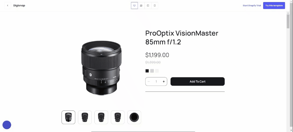
If you own a Shopify store that sells electronic products such as smartphones, cameras, and other devices, Digisnap is a template that you will appreciate for its contrasting black and white colors.
It has an elegant silhouette that elevates the look and feel of the website. Additionally, sections are well-proportioned right off the bat so little tweaking is needed.
Furthermore, all the elements needed in a good product page are here.
02. R2VF - High-Converting Shopify Product Page Design for Fashion
Why this works: This product page template showcases proven Shopify conversion optimization techniques specifically designed for apparel brands.
This product page template showcases proven Shopify conversion optimization for apparel brands.
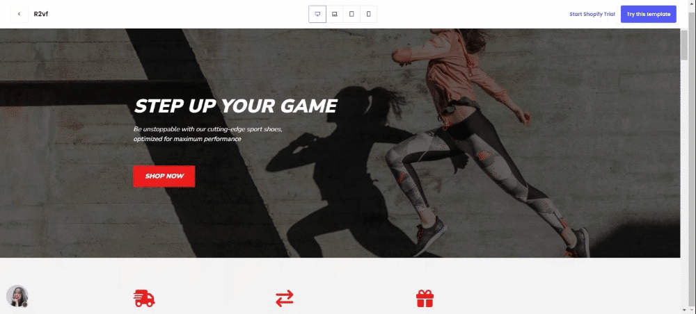
R2vf is a Shopify template that is specially designed for clothing stores. It maximizes the entire screen real estate of any device that you use and it has its focus on high quality images.
So if you own an apparel business, you should consider using this in your store to avoid the hassle of building a stunning store from scratch.
03. Everywear - Best Shopify Product Page Template for BFCM Fashion Sales
Why this works: This seasonal product page template represents advanced Shopify product page optimization specifically designed for high-traffic promotional periods and Black Friday conversions.
This seasonal template represents advanced Shopify product page optimization specifically designed for high-traffic promotional periods. The Everywear design demonstrates how effective Shopify store pages can maximize conversion during Black Friday and Cyber Monday through strategic urgency elements and clear value propositions.

The Everywear BFCM template from PageFly offers a sleek, modern design tailored for Black Friday and Cyber Monday promotions. Its bold banners and clean layout effectively spotlight deals, making it ideal for showcasing limited-time offers and featured products. The template's clean typography and strategic use of whitespace enhance readability, ensuring a smooth browsing experience.
BFCM optimization features: Bold promotional banners, strategically placed trust badges, and optimized call-to-action placement make this one of the best Shopify product pages for seasonal campaigns. The clean typography and whitespace management ensure readability even when multiple promotional elements are present.
04. Prestige - Premium Shopify Product Page Design for Luxury Brands
Why this works: This Shopify product page template exemplifies luxury ecommerce product page design that balances sophistication with conversion-focused functionality.

This template exemplifies luxury ecommerce product page design by balancing sophistication with functionality. The Prestige layout demonstrates how high-converting Shopify pages for premium brands must emphasize quality through refined visual presentation while maintaining clear conversion paths.
Luxury optimization strategy: The emphasis on high-quality imagery and detailed product descriptions aligns with luxury customer expectations, while customizable sections allow for brand storytelling that justifies premium pricing. This approach makes it one of the top Shopify product page examples for high-end retailers.
05. Plushie Children's Day - Specialized Shopify Product Page Template for Kids Products
Why this works: This playful product page design showcases targeted Shopify product page optimization for children's products and seasonal holiday campaigns.

This playful template showcases specialized Shopify product page optimization for children's products and seasonal campaigns. The design demonstrates how effective Shopify store pages can adapt visual elements to match target audience preferences while maintaining professional conversion optimization.
Family-friendly optimization: The youthful aesthetic and nostalgic design elements create emotional connections that drive purchasing decisions from parents and gift-buyers. This product page template proves that best Shopify product pages must align visual design with customer psychology and seasonal shopping behaviors.
06. LYFEfuel - Advanced Shopify Product Page Optimization for Supplements
Why this works: This example demonstrates comprehensive Shopify product page optimization through data-driven content and visual proof elements that address health-conscious consumers' research needs.
This example demonstrates excellent Shopify product page optimization through comprehensive product information and visual proof elements.

Lyfefuel’s product page is one that’s packed with information and all the right elements that make it a page worthy of attention.
It has all the necessary information needed to describe its product. And to do that, they used a section with a chart that compares their products to others in the market.
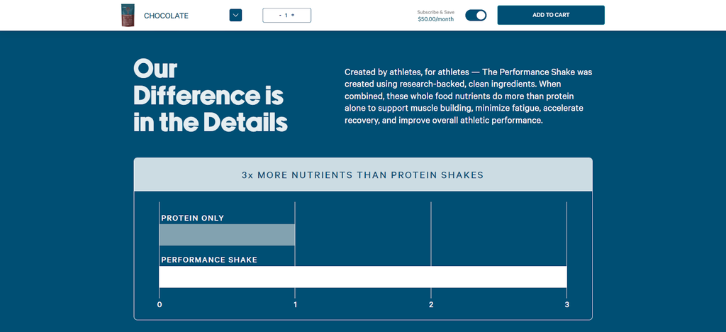
“Show, don’t tell” is the prevailing mantra of their page as all their claims are not merely described. Instead, they used charts, graphs, and images to show what they are talking about.
They surely know that their target audience are those people who are very conscious about their food intake. And that’s why the nutrition facts of their product is clearly visible not just in the packaging but also within the page.
We definitely approve of their use of accordion underneath its product image in order to provide more info without cluttering the page.
Below the add-to-cart button are videos of their satisfied customers saying all good things about the product – this is a good decision because these testimonials help erase any hesitations or doubts of potential buyers.
The high quality videos are also worth mentioning as they represent the dream physique of anyone who’s into fitness.
All in all, they have done a fantastic job here!
07. WTF Notebooks - Creative Shopify Product Page Design for Accessories
Why this works: This Shopify product page example demonstrates personality-driven ecommerce product page design that differentiates commodity products through compelling copywriting and strategic humor.
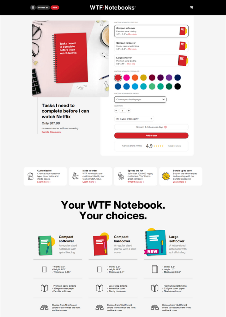
WTF Notebooks is one of those quirky websites that you’ll enjoy exploring while having a good laugh.
WTF Notebooks demonstrates how personality-driven ecommerce product page design can differentiate commodity products through compelling copywriting and strategic humor. This example shows how effective Shopify store pages can build brand loyalty while maintaining strong conversion optimization.
Brand personality optimization: The combination of witty copy, strategic color usage (black and yellow), and oversized typography creates a memorable brand experience that encourages sharing and repeat purchases. This product page template proves that high-converting Shopify pages don't always need to be serious to be successful.
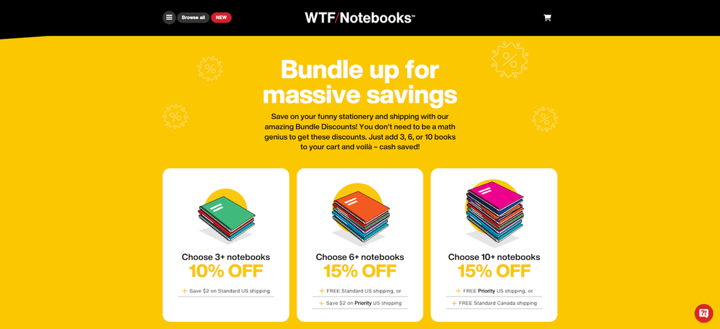
Upselling mastery: The volume discount structure and product bundling strategy demonstrates advanced Shopify product page optimization that increases average order value while providing genuine customer value.
08. Tushy - Educational Shopify Product Page Optimization for Home Products
Why this works: This high-converting Shopify page represents content-rich Shopify conversion optimization that transforms potentially awkward product categories into engaging shopping experiences.

Just like WTF Notebooks, the people at Tushy are wordsmiths as they write excellent copy – and they elevated it with wordplay and puns that will make you chuckle.
Tushy's approach represents content-rich Shopify conversion optimization that transforms potentially awkward product categories into engaging shopping experiences. This page exemplifies how best Shopify product pages can use humor and education to overcome customer hesitation and drive conversions.
Educational selling strategy: The visual installation instructions and detailed product explanations demonstrate advanced ecommerce product page design that reduces customer service inquiries while building purchase confidence. The strategic placement of upsells and cross-sells throughout the page showcases proven Shopify product page optimization techniques.

Trust-building elements: The combination of wordplay, comprehensive education, and multiple touchpoints for social proof creates one of the most effective Shopify store pages for products requiring customer education.
09. Juiced Bikes - Technical Shopify Product Page Design for High-Ticket Electronics
Why this works: This top Shopify product page example showcases specification-heavy ecommerce product page design optimized for high-consideration, expensive purchases.
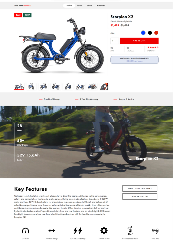
Juiced Bikes sells high-performance electric bikes.
They showcase specification-heavy ecommerce product page design optimized for high-consideration purchases. This example demonstrates how top Shopify product page examples can present complex technical information while maintaining clear conversion paths.

High-ticket optimization: The generous use of large images, detailed specifications, and real-world demonstration videos addresses the extensive research needs of electric bike buyers. The personalized recommendation feature represents innovative Shopify conversion optimization that reduces decision paralysis for complex product choices.
Risk reduction strategy: The "Help me choose" functionality and detailed product comparisons demonstrate how best Shopify product pages can minimize returns and increase customer satisfaction for expensive purchases.
10. Chilly's - Minimalist Shopify Product Page Template for Customizable Products
Why this works: This effective Shopify store page represents clean Shopify product page design that proves simplicity can drive conversions when executed strategically.
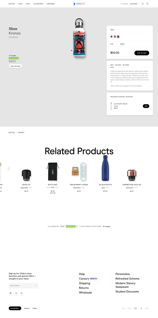
The last one in our list is Chilly’s. A Shopify brand that sells double-walled flasks that prolong the temperature of either hot or cold beverages.
Chilly's represents minimalist Shopify product page optimization that proves simplicity can drive conversions when executed strategically. This clean design demonstrates how effective Shopify store pages can focus customer attention without sacrificing functionality.
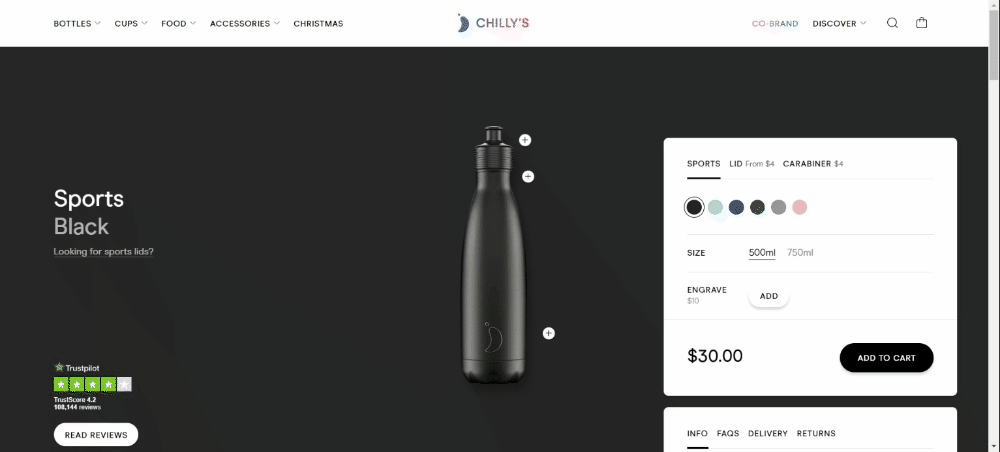
Customization optimization: The real-time personalization preview showcases advanced ecommerce product page design that sets clear expectations and reduces post-purchase disappointment. This approach makes it one of the best Shopify product pages for customizable products.
Simplicity strength: While lacking extensive customer reviews on-page, the Trustpilot integration and clean design aesthetic appeal to customers who value minimalism and product quality over extensive social proof.
11. Allbirds - Sustainability-Focused Shopify Product Page Optimization for Footwear
Why this works: This best Shopify product page exemplifies values-driven ecommerce product page design that aligns environmental messaging with conversion optimization.

Allbirds exemplifies sustainability-focused ecommerce product page design that aligns brand values with conversion optimization. This page demonstrates how best Shopify product pages can integrate environmental messaging without compromising sales performance.
Values-driven optimization: The carbon footprint metrics and sustainability certifications represent innovative Shopify product page optimization that appeals to eco-conscious consumers while building brand differentiation. The minimalist design aesthetic reinforces the brand's commitment to simplicity and environmental responsibility.
Trust signal integration: The Carbon Neutral Product certifications and transparency about manufacturing create one of the most effective Shopify store pages for sustainability-minded shoppers.
12. MVMT - Lifestyle-Driven Shopify Product Page Design for Accessories
Why this works: This high-converting Shopify page demonstrates aspirational Shopify conversion optimization through immersive visual storytelling and psychological triggers.

MVMT demonstrates lifestyle-driven Shopify conversion optimization through immersive visual storytelling and psychological triggers. This approach showcases how high-converting Shopify pages can create aspiration and urgency simultaneously.
Visual engagement strategy: The embedded lifestyle videos and user-generated content create emotional connections that transform product browsing into lifestyle aspiration. This product page template exemplifies how top Shopify product page examples can leverage social proof authentically.
Urgency optimization: The combination of limited-time offers, countdown timers, and automated email recovery systems represents advanced ecommerce product page design that maximizes conversion opportunities across multiple touchpoints.
13. Pela Case - Impact-Driven Shopify Product Page Template for Eco-Friendly Products
Why this works: This Shopify product page example showcases purpose-driven ecommerce product page design that quantifies environmental benefits to drive purchasing decisions.

Pela Case showcases impact-driven ecommerce product page design that quantifies environmental benefits to drive purchasing decisions. This example demonstrates how effective Shopify store pages can use data visualization to support brand messaging and conversion goals.
Data-driven storytelling: The infographics showing plastic waste reduction and B-Corp certifications create compelling reasons to purchase beyond product features. This approach represents innovative Shopify product page optimization that appeals to values-driven consumers.
Scarcity integration: The real-time stock alerts and environmental impact tracking create one of the best Shopify product pages for purpose-driven brands seeking to balance profit with environmental responsibility.
14. Brooklinen - AI-Powered Shopify Product Page Optimization for Home Goods
Why this works: This effective Shopify store page exemplifies social proof-heavy Shopify conversion optimization through strategic customer testimonials and personalization technology.

Brooklinen exemplifies social proof-heavy Shopify conversion optimization through strategic use of customer testimonials and AI-powered personalization. This page demonstrates how high-converting Shopify pages can leverage technology to enhance the shopping experience.
Personalization strategy: The AI-powered recommendation engine and dynamic product suggestions showcase advanced ecommerce product page design that increases average order value through relevant cross-selling. The bundling discounts and prominent display create additional conversion incentives.
Authentication approach: The combination of customer photos, detailed testimonials, and personalized recommendations creates one of the most effective Shopify store pages for home goods, where customers need confidence in quality and comfort.
15. Blenders Eyewear - Youth-Targeted Shopify Product Page Design for Fashion Accessories
Why this works: This top Shopify product page example demonstrates demographic-focused ecommerce product page design that balances bold visual identity with detailed product specifications.

Blenders Eyewear demonstrates youth-focused ecommerce product page design that balances bold visual identity with detailed product specifications. This example shows how best Shopify product pages can appeal to younger demographics while providing necessary technical information.
Demographic optimization: The vibrant visuals and high-energy brand presentation align with youth culture preferences, while detailed specifications (lens materials, frame dimensions) address practical purchase considerations. This product page template proves that top Shopify product page examples can be both exciting and informative.
Trust and security balance: The integration of upselling apps, secure payment badges, and flexible return policies demonstrates comprehensive Shopify product page optimization that reduces purchase anxiety while maximizing revenue per visitor.
Also read: Top 20 Shopify Product Pages Built With PageFly
Best Shopify Product Page Templates and Themes for 2025 Conversions
These Shopify product page templates represent the highest-converting theme options available, each optimized for specific industries and conversion goals.
Discover the best Shopify product pages crafted using the top Shopify themes, showcasing top-notch designs, layouts, and features that optimize user experience and drive conversions.
Blum - Top Shopify Product Page Template for Fashion Stores
Why this converts: This Shopify product page design offers conversion-optimized layouts with advanced customization options specifically built for fashion and apparel brands.

The product page from the Impulse's product page offers a large, high-quality images paired with a clean, well-organized layout, making it easy for customers to explore product details. The use of color swatches, size options, and dynamic sections like "Mega Summer Sale" or "You May Also Like" enhances the browsing experience and encourages deeper engagement.
Additionally, the product descriptions are neatly formatted, and the inclusion of customer reviews builds trust and credibility. However, the page could benefit from more interactive elements like video demonstrations or animations to further engage users.
View Feature list of Blum - The Best Theme for Fashion store.
Baseline - Modern Shopify Product Page Template for Contemporary Brands
Why this converts: This product page template features brutalist-inspired design with advanced showcasing elements perfect for trendy, contemporary products.

Baseline is a brutalist-inspired theme, offering tons of product showcasing advances such as image zoom, product videos, rollover, product tabs, color swatches, etc.
It's digital taste for mid-century arty (grids, graphic lines and mono hues), Baseline provide a modern and fresh feels for your brand. Especially standout for contemporary and trendy products.
Sense - Clean Shopify Product Page Design for Health & Beauty
Why this converts: This Shopify product page template offers enhanced product understanding through clean, youthful design optimized for beauty and wellness brands.

This theme offer a clean and youthful product page with enhanced product understanding. Customer trust is built on this product page via the inclusion of videos, testimonials, and thorough product descriptions.
What's more, Sense's product page offers advanced customization options with flexible design customization options, allowing you to effortlessly bring your vision to life without any need for coding. Tailor every aspect of your product page to match your brand’s style, ensuring a unique and cohesive look that enhances the overall shopping experience.
Impact - Conversion-Optimized Shopify Product Page Template
Why this converts: This high-converting Shopify template utilizes modern gradient colors with built-in conversion optimization features like sticky add-to-cart and complementary product suggestions.

A colored theme for impactful product pages. Impact utilizes a scheme of modern gradient colors, with conversion optimization like sticky add to cart and complementary products on product pages.
It also provide interactive elements like animations, image rollover, lookbook, product tabs, etc. to engage and convert users.
Yuva - Premium Shopify Product Page Design for Flash Sales
Why this converts: This modern Shopify product page template features product reels and parallax scrolling optimized for promotional campaigns and limited-time offers.

A modern yet elegant product page to best showcase your product catalog. Yuva brings an unleash product reels and parallax scrolling banners for exceptional shopping experience.
This theme is best for Flash sale with features for running-time promotions, with creative animation. One stand-out animation is its creative captivating stickers that engage users and keep them visually stimulated.
Must-Have Elements for High-Converting Shopify Product Pages
Core Conversion Elements
- High-quality product images (5-7 images from multiple angles, 2048x2048px minimum)
- Compelling product titles with primary benefits and SEO keywords
- Detailed descriptions focusing on benefits, not just features
- Customer reviews and ratings with photos for social proof
- Clear pricing and availability with any discounts prominently displayed
Trust and Security Elements
- Shipping and return policies clearly stated above the fold
- Security badges and certifications near checkout buttons
- Customer testimonials with real names and photos
- FAQ section addressing common concerns
- Contact information easily accessible
Mobile Optimization Essentials
- Sticky "Add to Cart" button for mobile users
- Thumb-friendly button sizes (minimum 44px height)
- Fast loading times (under 3 seconds)
- Simplified navigation for small screens
- Touch-optimized image galleries with swipe functionality
Conversion Boosters
- Product recommendations for upselling and cross-selling
- Urgency indicators (limited stock, time-sensitive offers)
- Multiple payment options including buy-now-pay-later
- Size guides and fit information for applicable products
- Video demonstrations showing products in use
What to avoid when optimizing Shopify product page
There are some factors that Shopify store owners overlook when optimizing pages for higher conversion. Here’s what you should avoid:
- Poor mobile user experience: 90% of consumers are more tempted to repeat a purchase if the brand’s mobile experience is excellent (source: Digital Examiner). Some of the ways you can make mobile-responsive pages are by choosing a mobile-friendly layout, changing the font size, optimizing images, and improving the loading time.
- Not using internal linking. Internal links help search engines understand your website structure better. Including a related product section, blog article links, or a mega menu that shows your website’s categories can give more authority and ranking power to the linked pages. Naturally, the higher the ranking, the more sales you’re likely to make.
- Generic metadata for multiple products. Poorly written metadata won’t convince users to click on your pages. Make sure your meta titles and descriptions are unique, feature-focused, and persuasive. For example, instead of putting “Black jacket” as the meta title, write something like “Waterproof premium-quality black leather jacket” to highlight features or benefits.
- Deleting sold-out item pages. If your page is ranking high on search engines, deleting sold-out product pages will make you lose traffic. Instead, add alternative options for users to discover. This gives you a chance to get sales on related products.
- Using default product descriptions. A manufacturer’s description is technical, keyword-free, and simply boring. Craft product texts that reflect your brand. Make sure you highlight the benefits and optimize descriptions for SEO.
Step-by-Step Shopify Product Page Optimization
Phase 1: Performance Audit (Week 1)
Step 1: Analyze Current Performance
- Review conversion rates for top 10 products
- Identify pages with high traffic but low conversions
- Check mobile vs desktop performance gaps
- Document current page load speeds
Step 2: Competitive Analysis
- Research 5 successful competitors' product pages
- Note their image strategies, descriptions, and layout
- Identify gaps in your current approach
- Screenshot examples for reference
Phase 2: Visual Optimization (Week 2)
Step 3: Optimize Product Images
- Audit current images for quality and quantity
- Shoot/source 5-7 high-quality images per product:
- Main product shot (white background)
- Multiple angles (front, back, sides)
- Detail shots highlighting key features
- Lifestyle shots showing product in use
- Size/scale reference images
- Resize all images to 2048x2048px
- Compress using WebP format
- Add descriptive alt text for each image
Step 4: Improve Visual Hierarchy
- Ensure product title is prominent and keyword-rich
- Make pricing clearly visible and larger than surrounding text
- Position add-to-cart button prominently with contrasting color
- Use whitespace effectively to avoid clutter
Phase 3: Content Enhancement (Week 3)
Step 5: Rewrite Product Descriptions
- Start with primary benefit in first sentence
- Use bullet points for key features
- Include emotional triggers and lifestyle benefits
- Address common customer objections
- Optimize for target keywords naturally
- Keep descriptions scannable with short paragraphs
Step 6: Add Social Proof Elements
- Install and configure review app
- Encourage reviews from recent customers
- Display aggregate ratings prominently
- Include customer photos when possible
- Add trust badges near checkout buttons
Phase 4: Mobile and UX Optimization (Week 4)
Step 7: Optimize for Mobile
- Test page on multiple mobile devices
- Implement sticky add-to-cart button
- Ensure all buttons are thumb-friendly (44px+)
- Optimize image gallery for touch navigation
- Simplify mobile checkout process
Step 8: Technical Improvements
- Optimize page loading speed (target under 3 seconds)
- Implement lazy loading for images
- Minimize code and compress files
- Test across different browsers and devices
Phase 5: Conversion Optimization (Week 5)
Step 9: Add Conversion Elements
- Create urgency with inventory counters
- Add product recommendations section
- Include size guides where applicable
- Implement exit-intent popups with offers
- Add recently viewed products section
Step 10: Testing and Refinement
- Set up A/B tests for key elements
- Monitor performance metrics weekly
- Gather customer feedback through surveys
- Continuously iterate based on data
The Art of the Best Shopify Product Page Design
Shopify is a great ecommerce platform that is ready to use as it is. Within its ecosystem, there are more than 160 themes to choose from. Therefore, whatever niche you are in, you’ll definitely find a theme for you.
Be that as it may, Shopify does not limit the amount of creativity that you can put into your store. And although its theme editor has some limits if you want to create a Shopify product page, there are some alternative actions that you can take.
Quick Action Steps: Implement Today
Images (30 minutes)
- Audit your top 5 products for image quality
- Ensure minimum 5 images per product
- Resize images to 2048x2048px if needed
- Add descriptive alt text to all images
[... rest of quick action steps as provided above ...]
Total Time Investment: 2 hours 15 minutes for immediate impact improvements
As we mentioned, one of the best courses of action if you want a custom product page is by using page builder apps like PageFly. With PageFly, you’ll be able to achieve the look that you want by using its Shopify product page templates or by building one yourself.
Best Shopify Product Pages FAQ
- Compelling visuals: 5-7 high-quality images from multiple angles
- Benefit-focused descriptions: Focus on what the product does for customers, not just features
- Strong social proof: Customer reviews with photos and ratings
- Clear pricing: Transparent pricing with any discounts prominently displayed
- Frictionless mobile experience: Fast loading and easy navigation on mobile devices
- Trust signals: Return policies, security badges, and contact information
- Main product shot with clean, white background
- Multiple angles (front, back, sides, top view)
- Detail shots highlighting key features and textures
- Lifestyle photos showing the product in use
- Size and scale reference images
Top-performing stores often use 8-10 images to reduce customer questions and return rates.
- Opening sentence: Lead with the primary benefit
- Bullet points: List 3-5 key benefits that matter to customers
- Detailed paragraphs: Address customer concerns and objections
- Keywords: Include target keywords naturally while maintaining readability
- Scannable format: Use short paragraphs and plenty of whitespace
- Sticky add-to-cart buttons: Keep the purchase button visible while scrolling
- Fast loading times: Aim for under 3 seconds page load speed
- Thumb-friendly buttons: Use minimum 44px height for all clickable elements
- Optimized images: Compress images for mobile without losing quality
- Simplified navigation: Remove unnecessary elements on mobile views
- Touch-optimized galleries: Enable swipe functionality for image browsing
Benefits of this size:
- Works perfectly with Shopify's zoom functionality
- Maintains quality on high-resolution displays
- Provides good balance between quality and loading speed
- Compatible with social media sharing
Additional tips: Save images in WebP format when possible for better compression, and always include descriptive alt text for SEO.
Recommended review apps:
- Judge.me: Comprehensive features with photo reviews
- Yotpo: Advanced marketing integration capabilities
- Shopify Product Reviews: Native solution with basic functionality
- Stamped.io: Strong customization options
Best practices: Display reviews prominently on product pages, encourage photo reviews, respond to all reviews to show engagement, and use review widgets in multiple locations.
- Product demonstrations: Show the product in action
- Unboxing experiences: Build excitement and set expectations
- Customer testimonials: Add authentic social proof
- How-to guides: Help customers understand product usage
- 360-degree views: Allow customers to explore products virtually
Video best practices: Keep videos under 60 seconds for optimal engagement, ensure mobile compatibility, and include captions for accessibility.
Essential metrics to track:
- Conversion rate: Percentage of visitors who make a purchase
- Bounce rate: Visitors who leave without interacting
- Time on page: How long visitors spend viewing your product
- Add-to-cart rate: Visitors who add products to their cart
- Mobile vs desktop performance: Compare conversion rates across devices
Recommended tools: Use Shopify Analytics for basic insights, Google Analytics for detailed behavior analysis, and heatmap tools like Hotjar to understand user interactions.
- Top-performing stores: Achieve 5-10% conversion rates
- Fashion and apparel: Typically 2-3% average
- Electronics: Often 1-2% due to higher consideration time
- Beauty and cosmetics: Can reach 3-5% with strong social proof
Focus on improvement: Rather than comparing to averages, focus on consistently improving your current conversion rate through testing and optimization.
- Transparent pricing: Show total costs including shipping early
- Guest checkout options: Don't force account creation
- Multiple payment methods: Include buy-now-pay-later options
- Security assurance: Display trust badges and secure payment icons
- Clear return policy: Reduce purchase anxiety with flexible returns
- Exit-intent popups: Offer discounts to recover abandoning visitors
High-impact elements to test:
- Product images: Lifestyle vs studio shots, number of images
- Add-to-cart buttons: Color, size, text, and placement
- Product descriptions: Length, format, benefit vs feature focus
- Pricing display: Font size, color, discount presentation
- Social proof: Review placement, testimonial formats
- Urgency elements: Stock counters, limited-time offers
Testing best practices: Test one element at a time, run tests for at least 2 weeks, and ensure statistical significance before making changes.
RetryClaude can make mistakes. Please double-check responses.- Dawn: Fast, mobile-optimized, and conversion-focused
- Impulse: Perfect for fashion with advanced product galleries
- Debut: Clean, minimal design that highlights products
- Brooklyn: Great for large inventories with filtering
- Narrative: Ideal for storytelling and brand building
Choose based on your product type and target audience preferences.
- Compelling product title with primary benefits
- High-quality product images from multiple angles
- Detailed product descriptions focusing on benefits
- Customer reviews and ratings with photos
- Clear shipping and return policies
- Secure payment options and trust badges
- Product recommendations for cross-selling