
According to Forbes, mobile commerce played a significant role in overall eCommerce growth last year. With more than 6.5 million mobile users today, the popularity of these devices cannot be denied.
That said, it should not come with many surprises that mobile commerce sales from smartphones alone is set to reach $432.24 billion in the U.S. this year. Its ubiquitous influence can be felt in almost every aspect of our daily lives, including shopping.

In fact, 51% of consumers say that they use mobiles to find and research brands and products, accounting for at least half of the internet traffic. From a business point of view, the earlier you recognize and adapt your store according to the latest mobile trends, the higher your chances to increase conversions and boost sales.
As more and more shoppers become heavily reliant on mobile devices, here is everything you need to know about mobile landing pages and how to make the most out of them.
Outline
- What Is A Mobile Landing Page?
- Why Do You Need a Mobile Landing Page?
- 7 Best Strategies for High Converting Mobile Landing Page
- Use a Competent Landing Page Builder
- Use Single-Column Layouts
- Keep the Copy Short and Sweet
- Implement Sticky Navigation
- Add a Click-to-Call Button
- Optimize Forms
- Make it Fast
- 6 Examples You Can Learn From
- Conclusion
I. What Is A Mobile Landing Page?
Mobile devices are arguably fuelling the next internet revolution. In eCommerce, these wireless devices are working to solidify the overall retail experience by making shopping more convenient through click-to-order features.
With smartphone users predicted to reach more than 5.5 billion by 2025, mobile user experience quickly becomes one of the most integral determinants of eCommerce success. And that is where your mobile landing page comes in.

A landing page refers to a standalone website page that your visitors "land" on when they click an online ad or search engine result bearing a digital location to your store. Ideally, landing pages often have a single purpose or call-to-action and very minimal design to prevent distractions.
In other words, these pages often encourage visitors to take specific actions like joining an email list or buying a product.
Therefore, a mobile landing page refers to a mobile page specifically built as the desired destination when a mobile visitor clicks on an ad or search result link on their mobile device. It is an important digital marketing tool that mainly converts visitors into subscribers, buyers, members, or followers.
Think of it as a typical web page designed for mobile visitors to land on when they click or tap a link in your mobile marketing, ads, or any other type of campaign. But keep in mind that the best mobile landing pages are usually designed to suit mobile devices specifically.
Instead of stripping down the desktop version of your landing page, create mobile-specific landing pages that will guarantee a stellar mobile experience to all mobile device users. So, be sure to focus on creating high converting mobile landing pages and strive to hit all the right notes while at it.
If you are still not convinced, here is more on why you need a mobile landing page for your online store.
II. Why Do You Need a Mobile Landing Page?

By now, we can all agree that having the best mobile landing page for your online store is no longer a nice to have feature but rather a basic necessity in eCommerce success.
Since a typical mobile user only takes 0.05 seconds to make an opinion about your store, creating great mobile landing pages for your eCommerce store website can help build brand awareness and enhance customer loyalty.
A visually appealing and responsive landing page often works to enhance the overall mobile experience for smartphone users. According to mobile marketing statistics, a simple bad mobile experience could mean that 57% of mobile site visitors might not recommend your store, and you risk losing 62% of potential customers to your competitors.
Yes, landing pages (for both mobile and desktop users) are important in any inbound marketing campaign designed to capture leads and boost sales.
Typically, they can be part of an existing multi-page store website or a standalone web page with a unique URL. As a rule of thumb, these pages often require web visitors to complete a single action without forcing them.
That is why many excellent examples commonly have easy to follow copy and a CTA button to encourage them into taking the desired action. Others might feature a short contact information form for lead generation purposes.
Some key points to keep in mind as to why businesses need a landing page and why you should care are as follows:
- They often have minimal navigations and are free from distractions
- You can create one to present a specific service or product
- They help announce special events and collect important user information
- You can use them to test your selling propositions
- They speak the specific market language and can help connect with target audience segmentation
Adobe further highlights that optimizing your digital experience across different channels and successfully engaging with your customers online could mean millions in revenue for your store. The fact that you can make different landing pages for different occasions gives you a unique opportunity to optimize the overall online customer experience and make your eCommerce business more profitable.
But with the proliferation in the global mobile market share compared to desktop computers, here are some key mobile landing page best practices for better mobile conversions.

III. 7 Best Strategies for High Converting Mobile Landing Page
Mobile landing pages work to enhance business success, but Google reports that most businesses are having a hard time designing mobile landing pages that convert.
But before we get to the flesh of the meat in this section, you should note that the only difference between mobile vs desktop landing pages is pegged on user intent and customer journey. In other words, a desktop landing page caters to the specific needs of desktop users while the mobile version caters to specific mobile user needs.
To help you not lose out on tons of businesses, here are the seven best strategies to create a high converting mobile landing page for your online business.
01. Use a Competent Landing Page Builder
Gone are the days when you had to do everything manually. To create truly high converting mobile landing pages, it would be best if you first choose to use a competent landing page builder like PageFly.

The PageFly Landing Page Builder features a drag and drops editor that is easy to use and does not require prior coding experience. With it, you can quickly create a responsive landing page from a wide variety of mobile-first designs.
Depending on your preferences, you can choose to create one from scratch or a pre-made template. The best part is that it is designed to create a seamless online customer experience across all devices and includes zero bloats or any other element that might affect page load times.

What's more, they have a free plan, and you can use it to create your first mobile-ready landing page without any time or feature-specific restrictions. Also, it includes an analytics feature that you can use to track overall page performance and optimize accordingly.
02. Use Single-Column Layouts
Mobile devices often have small screens compared to desktop computers. This means that mobiles do not have enough space for multiple column web pages.
Using such a design will make your mobile landing pages feel clunky and cumbersome to navigate when a mobile user scrolls through. That leaves us with a single column as the best option for designing mobile landing pages.
Multiple columns don't work with mobile websites because users only have about three by five inches of screen pace to navigate around your mobile site.
That is why scrolling through the official government website for the state of Alaska on a mobile device feels unnatural and crowded.
On the other hand, the official mobile landing page for the government state of Alabama uses a single column layout and is much easier to navigate around.
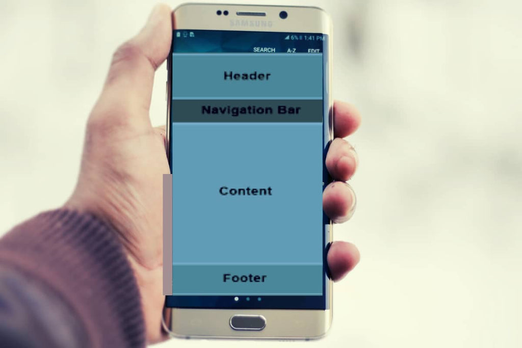
A single-column layout essentially comprises numerous box containers stacked on each other and typically includes a header, content section, footer, and navigation menu. This structure makes it suitable for mobile browsers, as it makes the user interface easy to follow and navigate.
03. Keep the Copy Short and Sweet
Cliché or not, the content will always be king. But this does not mean that you should blurb around and fill your copy with fluff.
Also, it does not mean that you should spend the whole day trying to come up with the perfect headline or looking for the best image to complement your text. Instead, it would be best to focus on using the best words that will help you connect and sell your call to action to the target audience.
In other words, your copy needs to be compelling and engaging enough for the readers to take the desired action. It needs to be concise, clear, and straight to the point.
It would be a smart move to paraphrase and summarize the copy used on your desktop landing page. You can consider using a shorter abbreviated copy for the mobile version, but remember that it still needs to be colorful and easy to follow to attract more attention.
Other helpful content writing tips dictate that you use short sentences, break up the text into smaller paragraphs, only use short and concise headlines, use bullet points to list key points, and always cut on fluff as much as possible.
To tie everything up, do not forget to add your call to action button to direct your visitors exactly where you want them.

04. Implement Sticky Navigation
The convenience they bring makes mobiles more applicable and increasingly popular. Featuring the same aspect when designing your mobile landing pages might help increase conversion rates and reduce bounce rates.
Well, your choice of design will greatly affect the overall user experience. While it is easy to settle for a navigation-free design, at first sight, it is not always the best to use for mobile landing pages.
It mainly affects the scrolling experience, which frustrates mobile visitors even more. But that is the opposite of what we want to achieve.
Therefore, consider using sticky navigation features in your design to help make your offers easily accessible and add extra convenience. This might include adding a sticky bar or a simple click-to-scroll button to help users navigate with ease.
A simple sticky menu tends to boost navigation by 22% and can have an unimaginable impact on mobile conversion rate. The Novotel Hotel website has the best example for this.

05. Add a Click-to-Call Button
The inclusion of contact details in a web page often helps to solidify business reputation and should be easily accessible on your landing page. But given how precious screen real estate is when designing one for mobile users, a bit of creativity might help do the trick.
That is where the use of a click-to-call button comes in handy.
What happens is that mobile visitors often want to find what they want on the go. If they don't, they will need an easier way to reach out to you to get it.
Adding a click-to-call button helps make mobile landing pages more usable and functional.
The name suggests a static button that prompts a direct call to your business line. You can easily customize and add one with PageFly Landing Page Builder to make your mobile landing page campaign stand out.

06. Optimize Forms
Landing pages often feature lead-capture forms, usually meant to help collect vital customer information. On the contrary, many people dislike filling them out on a mobile device.
Therefore, you must plan to optimize your forms. Only collect the information you need, and follow up later if you need more.
To optimize forms for your mobile landing page, you will need to:
- Use attention-grabbing but relevant headlines
- Limit the form to minimum fields as possible
- Choose a vertical alignment for the fields to fit accordingly
- Include auto-selected answers and drop-down menus for more convenience
- Add an easy to spot and a clickable "Submit" button
Here is a great example that we made using PageFly Landing Page Builder:

07. Make it Fast
According to expert findings, mobile landing page speed directly correlates with bounce rate. It is a world where a mere improvement of page load time by 0.1 seconds can significantly increase conversion.
In other words, making your mobile landing pages load quickly is non-negotiable – especially if you want to make the most out of them. It would be best if you did everything possible to make your mobile landing page load faster.
Image optimization is an excellent example to consider. As a rule of thumb, ensure that you only use images that weigh between 22KB and 33KB to achieve lightning-fast page load times. Here is more on how to optimize images for the web.
Other mobile landing page optimization tips for a quicker loading speed include using fewer visuals and bringing a Content Delivery Network (CDN) on board. Mobile site optimization should help speed up your overall page load time and increase sales.
Related article: Mobile usability: 10+ ways to deliver a stellar mobile shopping experience
IV. 6 Examples You Can Learn From
Now that you are better versed in landing pages, here are six carefully handpicked top mobile landing page examples to inspire and help you learn.
01. Shopify
Shopify is a popular eCommerce service provider, and its free trial mobile landing page is designed to target anyone who wants to start selling products or services online. From the outlook, the landing page is very simple.

The copy is short, engaging, and compelling, as its main focus is on highlighting key points about the product. The use of white space is well-balanced, and the designers also feature some social proof and click-trigger language to encourage users to click the strategically placed call to action button and start their free trial.
Like many of the other landing pages in this post, Shopify's trial landing page for sellers keeps it simple. It's not too text-heavy but still manages to persuade users by noting a few key points about its top-notch product. Visitors come away knowing that Shopify is an all-in-one platform that is easy to use and trust.
02. HelloFresh
The HelloFresh mobile landing page is an excellent example of a simple but bold design. It features a full-width background image, a sticky navigation bar at the top, and a great blend of clear but concise copy backed with quality images of mouthwatering delicacies to entice visitors into developing more interest.
We like most about this example because it highlights the different content writing practices suggested earlier on. Their headlines are short but persuasive, and the use of bullet points coupled with short sentences makes it easy for mobile users to find what they want quickly.

03. Uber
Uber's mobile landing page is another simple example, as it only features necessary elements for more conversion in terms of sign-ups. Their headline is succinct, direct to the point, and big enough to be the first thing you see when you land on the mobile site.
It is an effective strategy that establishes trust and excitement from the get-go. This is further complemented by including an extended contact form, lots of white space, and a general lack of navigation bars.

This makes the page less distracting and enticing for visitors to sign up. But before you employ the same tactic in your own landing page, note that Uber made this with a specific target audience in mind.
04. Doodly
On the other hand, Doodly effectively combines the use of engaging copy, timely pop-ups, urgent language, and videos to drive mobile conversions. The use of statements like "1-time price offer" or "limited time offer" in their mobile landing page encourages visitors to take action immediately or risk losing out on a good deal.
After all, the headline already informed them that the software is powerful, easy to use, and has no special requirements.

05. TouchBistro
TechBistoro, a top-rated restaurant POS service provider, is another excellent example of what a good copy can do. Their mobile landing page uses a combination of short sentences, lists, and small paragraphs to highlight important features and their benefits to businesses.
This is something that customers love because it makes the design easy to follow and connect with. But they do not stop there.
They further feature a small section of what customers are saying about them, providing social proof and encouraging visitors to take the desired action. To do this, they further entice them with a free demo by clicking on the call to action button outlined as "Book A Demo".

06. Loomly
Loomly is a popular automation software but for social media. Their mobile landing page mainly features a single-column layout, sticky navigation menu bar, visuals, video, and plenty of white space.
The web page is not text-heavy, and you can easily follow through using clear short headlines. The embedded video is 90 seconds long and strategically placed to explain the benefits of using Loomly for those who don't want to read through the text.
It is an effective tactic to use in your own landing page that can help minimize the overall bounce rate.

V. Conclusion
As much as technology is evolving at unprecedented speeds, mobile browsing will not be going anywhere soon. With mobile commerce on the rise, businesses have no choice but to hone their mobile marketing strategies to survive through the digital age.
Mobile landing pages are increasingly becoming a common digital tool for online businesses to increase conversion rates and reduce bounce rates. Ideally, a landing page refers to a web page that opens after clicking on a link from any destination location or online campaign.
Given the proliferation in mobile device usage throughout the world, creating a mobile landing page can help make your business more profitable. But it needs to be high converting for it to work because mobile visitors only take fifty milliseconds to make an opinion about your brand.
While this article details nearly everything you need to know about mobile landing pages, the strategies and examples discussed herein will go a long way in helping you design a high converting mobile landing page for your business.
It is not that technical, as some might think. But keep in mind that there are numerous competent landing page builders online to help you make quality mobile landing pages that load quickly and get results.
PageFly is one of the best mobile landing page optimization choices today that guarantees seamless mobile user experience and higher ranking in search results. Why not try it for free?
![Webflow Review: Should You Use It For Ecommerce? [What We Honestly Think]](http://pagefly.io/cdn/shop/articles/female-designer-reviewing-wireframes.jpg?v=1704468656&width=925)