You only have 10 seconds to capture a visitor's interest on your event landing pages.
On event landing pages, how do you achieve a balance between eye-catching design, powerful messaging for why attendees should come, and the value they'll receive?
People shouldn't be overwhelmed or underwhelmed by your event page before they even contemplate going. But how else can you advertise an event online besides social media and ad campaigns? Of course, high-converting event landing pages!
Even better, you can repurpose the content of your virtual events to raise event awareness through a variety of platforms.
If you've been having trouble getting people to convert on your event page, you've come to the correct spot. In fact, don't waste your time promoting your event unless you've gone over this checklist thoroughly.
1. What Is An Event Landing Page?
An event landing is different from your main website as it is a standalone page that’s designed with one primary goal which is to turn a visitor into a lead. For example, to increase trial signups, capture emails, and encourage visitors to register to your concert, conference, or trade show event.
In a word, it's a page dedicated to providing prospective event attendees with all of the detailed information they need to commit to registration for your event.
When users click on contextual, banner, or targeted adverts on Facebook, an email newsletter, a Google search ad, or other digital venues, they arrive at – or "land" on – the event landing. Each of these "landings" is part of an advertising campaign aimed at a specific audience.
Furthermore, an event landing is a page designed specifically to collect contact information from site visitors in exchange for an offer via the registration page. A landing page's goal is to begin generating event awareness and converting anonymous visitors into qualified leads.
The landing page can be a part of an existing multi-page site, or one of those standalone landing pages. Surprisingly, it is a separate web page with its own unique URL.
2. Why Do You Need to Create Event Landing Pages?
A landing page is an excellent approach to increase visitors, boost SEO, and establish your brand. It can also be used as part of a successful PPC campaign.
Your marketing efforts will be more focused if you give your event its own landing page. Consider it the hub of all your marketing communications. Bring as many people as possible to your event page, and that page will become a great conversion tool.
Here are 3 reasons why you need an event page:
- An event page funnels traffic: All your digital marketing efforts should channel traffic to your event’s website, helping its search rankings, as well as concentrating traffic on a page entirely under your own jurisdiction especially when you need an event landing to announce events.
- An event page focuses on conversion: An event page allows you to provide incoming traffic with the information and incentives they need to become event registrants (and attendees).
- An event page enables free marketing (via Social Media): A landing page for an event also gives you more opportunities for 'word of mouth' marketing. Where your registrants or interested parties are more likely to share your event with their social media networks, hence increasing your overall reach. Who doesn't appreciate free advertising?
However, you can't just create a landing page and call it a day. If you want to persuade your visitors to sign up for your online event, there are a few best practices and great event landing page examples to follow.
3. Best Practices for Event Landing Pages
Check out: Create High Converting Mobile Landing Page With These 7 Tips (6 Examples Included)
01. Implement A Fresh, Trend-Forward Design
This is why the importance of event page design cannot be overstated. A well-designed page can provide your brand a good impression to visitors.
The difference between a visitor staying on your page to learn more about your event and clicking the back button can be determined by event page design. Take a look at these design trends for ideas and make a note of any that jump out.
But what if you've never done any design work before? Don't be frightened. To design your event pages, you can always use a template. You won't have to develop a landing page from scratch if you use a template, which will save you a lot of time. To get the exact look you desire, simply use the drag-and-drop builder.
Check out this example of a spectacular event page by Conversion Conference:

This landing page has a simple design, event information, and a strong call-to-action button that takes you to a rsvp form.
Follow these guidelines to ensure that your design captivates people's interest and encourages them to attend:
- Keep it simple: Don’t clutter the page with unnecessary visuals and design elements that make it difficult to navigate.
- Make it easy to purchase or register: When it comes to event registration page, where you need to collect more information from your attendees, it's critical to keep the forms simple. On your landing page, long registration forms will dissuade visitors from filling out the needed details.
- Optimize for every device: Remember to mobile-optimize your event page. Mobile devices account for half of all web traffic, so make sure your landing page is mobile-friendly.
You can also design your event page so that key information is visible at first glance.
02. Include A Clear Call-To-Action
Your landing page should include a large, easily visible CTA button that directs visitors to a place where they can take action, such as a signup form. The most effective landing pages all have one thing in common: a strong call to action.
In this case, you want people to sign up for your online event or buy tickets. However, rather than leaving it up to them, you should make that clear on your landing page.
Here's an excellent example of a Moz:

Avoid using the phrase "Click Here" as your button copy because it is too general. Instead, use actionable copy such as "Grab a Virtual 2022 ticket now!" to tell visitors exactly what you want them to do. Your CTA should be as specific and relevant as possible.
Write as many call-to-actions as you can and take your time before deciding. Because this is one of the most important factors in determining whether or not your event page will generate conversions, you must be confident.
You might even think about running A/B tests to get real-world data to back up your final decision.
Visitors to your landing page must be directed to the next step; otherwise, they may not register or buy tickets for your event, even if you've written relevant information to them.
You can write in an action-oriented manner by including clear CTAs (calls to action), also known as buttons, on your registration landing page with phrases such as "Click Here To Register Now," so that readers understand that they must take a specific step in order to receive the benefits you've articulated in the copy.
03. Craft A Compelling Offer
Time is a valuable resource. Even if your online event is free, you're still asking attendees to take time out of their hectic schedules to attend. Create a compelling, one-of-a-kind offer to entice visitors to sign up.
Why should they participate in your online event? What can they expect to gain or learn? They effectively answer the ultimate question that visitors want to know, "What's in it for me?"
Here's an excellent example of an online event landing from Search Engine Journal:

Visitors now have a much better understanding of not only what the eSummit is, but also why they should go. Visitors are unlikely to attend unless there is a clear and compelling offer.
Consider your event's unique value proposition. That should be communicated in your main heading, as it is the first thing visitors see when they land on a new page.
04. Include All Relevant Details
Make sure your next event landing page contains all of the information about your online event, including the following:
- Time, date, and location
- The primary goal and the value proposition (why people should attend)
- Sponsors, speakers, and presenters
- Curated news bulletin for the event
- Quotes and video testimonials from previous attendees serve as social proof.
- To entice attendees, use previous event recordings or snippets.
- Transparency in pricing
- Support via live chat
The Growth Hackers Conference is a prime example of all of these in action:

You can even include a "Add to Calendar" link on your page for added convenience. Visitors can then click the link to add your event to their calendar.
Visitors should not have to search for important information about your online event. Most people simply will not go through the trouble.

When writing landing page copy, it's critical to have a thorough understanding of who you're writing to. It will be much easier to write relevant copy if you understand who your target event registrant is.
For Adobe Summit’s 2022 copy, They chose to address readers directly and created a powerful registration landing page that was tailored to the needs of the attendees. Adobe's Digital Experience Conference is a great event landing page example of event page design and branding.
The main event landing explains everything you can expect from attending the event as you scroll through it. To build anticipation, there's even a sneak peek at some of the featured celebrities.
Their event website includes all the details:
- Speakers – The speakers appear immediately after the main page header
- Headings – All page headings are benefit-driven, describing what you can learn by attending.
- FAQ – The FAQ section addresses the most frequently asked questions by potential attendees.
05. Earn Your Prospects’ Trust With Social Proof
You're already halfway there if you have a catchy headline and a visually appealing event page design. Now is the time to address any mental objections your customer may have. To accomplish this, you may want to highlight the benefits your event promises on your landing page. But why not take it a step further and have those benefits come directly from the past events' testimonials?
While this may be more difficult to accomplish if you are hosting for the first time, you can always rely on the influence of your partners whether they are speakers, sponsors, or influencers to earn trust.
06. Adapt To Any Type of Device With A Responsive Design
You're making a HUGE mistake if your event registration landing pages aren't already responsive or, in other words, mobile-friendly.
Now that mobile usage has surpassed desktop usage, responsive websites are more important than ever. Your customers will most likely discover you on their mobile devices first, whether they click on a Facebook ad or hear about you from an influencer. Don't waste valuable conversion opportunities by providing a poor mobile browsing experience!
Check that the loading speed is quick and responsive for other devices. You want people to fall in love with your page and, as a result, attend the event whether they're on a mobile or desktop device.
07. Feature Eye-Catching Visuals
Visuals can be effective marketing tools. In fact, when strategically placed on an event landing, videos can increase conversions.

You can encourage visitors and increase their likelihood of attending your upcoming event by including images, videos, or animations. You can also use these visuals to brand the event and increase brand recognition for your company.
Use the content you gathered from past events. Pictures and videos of people having a good time at the event can intrigue people's interest in returning to the event while also encouraging new participants to sign up.
Color Run, a 5K fun run known for dousing participants in colored powder at each kilometer, does an excellent job of promoting the atmosphere of their in person event by including vibrant images of participants throughout their entire page.
7 Event Landing Pages That We Love
01. Thinkific
We've all heard the marketing old phrase, "when you speak to everyone, you speak to no one." Thinkific, for example, does an excellent job of speaking to a specific demographic—women entrepreneurs in the digital space. More importantly, Thinkific emphasizes how the virtual summit, Think in Color 2022, is tailored to this specific audience.

The images and video are extremely powerful because they show attendees that the speakers are diverse, young, intelligent women who are eager to share their industry knowledge and empower other women.
This unique landing page, when combined with inclusive messaging "stop settling for sameness in the online space" and an emphasis on the challenges that women face when building an online business, provides attendees with plenty of incentive to get involved.

Remember that less is often more when designing a registration form, for example. By keeping your registration process short and simple, you can avoid potential roadblocks.
02. Artist Project Contemporary Art Fair
This event landing page was created by Artist Project to sell tickets for the Contemporary Art Fair. To keep visitors engaged to buy tickets for the opening night party, the event marketers create a sense of FOMO and urgency. With a call-to-action headline like "Don't Miss Toronto's Most Exciting Art Fair!" and a time-limited offer to save 20%, the message is clear: if you want in on this, act now.
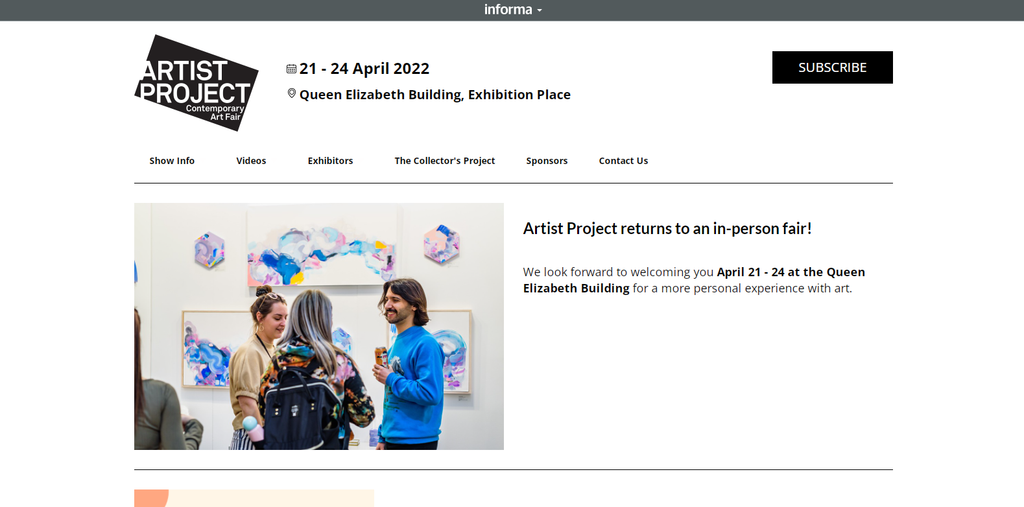
To stimulate people's interest in an art fair, your design must be on point. You can't promote an art show unless you show some art. This landing page does an excellent job of highlighting a variety of artists and mediums to highlight the fair's diversity. From mixed media war reflections to vibrant social commentary in the form of collage, it's clear that a wide range of art and talent will be present.
Make it a point to incorporate the heart of your great event into the design and copy of your landing page. Use visuals to tell your event's story, and CTA-focused copy to convert interest into action.
03. Web Summit

The first thing we notice about the Web Summit branding is the distinct color palette, which makes their landing page stand out. They also make excellent use of call-to-action buttons. This page has four visible buttons to generate leads.
There are many compelling reasons to attend the event on this landing page, and there are no distracting outbound links. Other sections of this website exist, but they are hidden in the hamburger menu on the top-right. Smart.
It’s also an excellent idea to add an event promotion like 50% discount to get more attendees to pre-register right away.
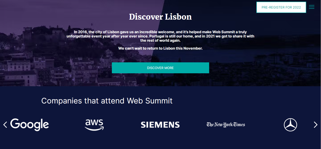
- Adding logos of companies that attend is another way to add credibility to the event.
- There are numerous CTAs scattered throughout the page, making it simple to register.
- Each speaker is highlighted with important details to learn more about their work.
04. Collective Zoo
Cerebro Marketing event organizers created this page for Collective Zoo to promote a concert with a UFO theme. When people from all over the country were planning to storm Area 51, this landing page diverted some of the attention to a free entry event in downtown Las Vegas.
We like how the language is completely on theme "Discover what to expect below" and how they extend the concept to the event details with a "classified" lineup.

Your event landing serves as a sneak peek at your live event. People will assume your event will be boring or dull if it is boring or dull. That is obviously not the case, so it is critical for event marketer to create an event landing that establishes the appropriate tone. Your copy and design should reflect what your attendees can expect and make it impossible for them to pass up the opportunity to sign up the rsvp form.

05. Twinwoods Adventure
This case differs from our previous event landing page examples. This landing page is used by Twinwoods Adventure to drive bookings for indoor skydiving. Although this is not a one-time, pre-planned event, the goal is to get visitors register and purchase tickets in advance.

One of the most appealing aspects of this landing page is that it is immediately clear what the activity is, thanks to heavy-hitting visuals balanced with detailed information. To ensure transparency, the price is listed first, followed by a CTA with an urgent and simple call "Book Now".
What's more, they focus on FOMO by:
- Boasting that they "attract over 100,000 visitors each year."
- Bragging about their high ratings on Google, Facebook, Trust Pilot, Airbnb and TripAdvisor.
- Quotes from actual visitors: "Do it, you'll love it."

Twinwoods understands that people may want to learn more about the experience before signing up for the rsvp form. As a result, they used on-page tabs to answer FAQs. Because this loads the information directly on the landing page, interested customers have no reason to click away before booking.
06. Affiliate Summit:

Affiliate Summit West event is a conference devoted to affiliate marketing. Their page contains all of the necessary information for attending without sacrificing the appealing design.
- The overall page design is consistent, eye-catching, and clearly sectioned, making it simple to navigate and find the information you require.
- The conference's locations and timing are clearly visible in the page hero area, making it simple for visitors to plan their visits.
- We love the slide-up tab animations for the various points of interest. It makes the page more interesting without drawing attention away from the main goal.
- The speaker grid makes excellent use of space while remaining subtle to the overall design.
- With reviews and testimonials, users can quickly see the benefits of registering.
- Several CTAs make it simple to sign up for the event.

07. Collision Conference
Collision is a conference that discusses the role of technology in today's world. It is one of America's fastest-growing tech conferences, hosting big names from the business, academic, and entertainment industry.
The conference landing page is captivating, simple to navigate, and completely on-brand. As a result, it's an excellent starting point for your event page design.

- The event landing has a consistent branded design that visitors can easily identify.
- Throughout the event landing, there are several examples of quotes, testimonials, and social proof that build trust and credibility to the event.
- The speakers are featured prominently with key details on the event landing, and you can learn more about them by clicking on their headshots.
- Using video on the page makes it more engaging and convincing to potential attendees.
- A countdown timer ticking down until the price increase encourages people to purchase their tickets right away.
- A variety of CTAs make it simple for users to register for the event.
Conclusion
Event landing pages are powerful marketing tools that can distinguish your business from the competition. You can also use them to generate leads that you can nurture through your sales funnel.
Best of all, while event marketers run remote events, all the attendees need is a computer and an internet connection. But you still need to convince them that your event is worth attending. The best way to do that is with a well-designed landing page.
Follow the tips laid out here to craft the best event landing for your future events. Craft best landing pages and add a clear call to action to motivate your target audience to act.
We hope this post provided you with some killer inspiration for your next event landing. Your event pages can truly be a sales machine, provided you keep your landing page clean and free of buttons that take attention away from registration.
Creating a landing page usually doesn’t take much time or money, while the investment you make is very likely to be recouped in the not-so-distant future. If you need a landing page that would be professionally designed and developed by a team of seasoned software engineers, do not hesitate to reach out to us using the contact form below! Let’s get talking!