It's all about effort economy - when building an online store, a lot of effort goes straight on the homepage. This is a perfect logic since it’s the first thing that visitors see when they arrive, as per the saying “There is no second chance for a 1st impression". But what if it's not about 1st impressions?
It's about a consistent experience that lasts, about a website that sells. And there’s no way you’ll achieve that without excellent product pages.
To get you started, let's dive into our top 9 best product page design examples, 3 free templates, 11 best practices and more. This will inspire you and how you can actually, and effortlessly, create product pages that sell.
Remember to scroll down all below for a bonus exclusive content piece!
Top 9 Product Page Design Examples
For more inspiration, check out our list of Best Shopify Stores Examples.
1. Sixty-nine
Sixty-nine took our first best practice of product page design to the bone: Beautifully expressive product images.

What they’ve done right:
- Clean, decluttering, minimal design with a lot of white space removes any distraction from the buying experience, giving users a clear and direct path to purchase.
- There are more than 3 product images, each image is taken from a specific angle to give visitors a full and detailed visualization of the actual product.
2. Manitobah Mukluks
Manitobah Mukluks checked off almost every item in every anatomy of a perfect product page design.

A pair of Manitobah Mukluks is not cheap, meaning that the decision making process of a prospective is much longer, and more complicated. However, Manitobah Mukluks combined forces from some of the best practices we mentioned earlier to ease the purchasing anxieties and sway visitors to become shoppers quicker.
What they have done right:
- They hooked visitors right when they landed on the page with a buying-anxieties killer:: “free shipping” and “free returns” are written in big, bold letters right next to the “Add to Cart” button. People feel like their purchase doesn’t have to be a forever decision, and that the price they see will be pretty close to the final amount.
- Product photography, though not out of this world, is good and diverse enough for shoppers to get the most important details of the product.
- Give weight to their quality and authenticity with an excellent video of the boot in action.
- Bring story-telling into their product page: Visitors can learn about the mission, vision and the story behind the art sole on the boot, hence, get emotionally connected to the brand, instantly.

3. Gymshark
Gymshark - as the name itself indicated - is a Workout Fashion brand.

What they have done right:
- What really stands out here is product photography. It gives you a sense of motion and movement so you can instantly imagine how sporty and comfortable you’ll be wearing this product.
- The navigation is done right. By displaying product style and color variants, they also encourage shoppers to click through to view all options, hence stay on-site longer and get more prone to adding it to cart.
4. Helix Mattresses
Helix Mattresses has a lot to teach us about ecommerce product page design. So buckle up:

- They don't sell mattresses, they sell a good night sleep. This value proposition is consistently emphasized throughout the customer journey, from the homepage to the product page - which organizes each mattress by its level of plushness and support.
- They give a firm nod to the classic “Why-Buy": 10-year warranty, Free US Shipping, Paying, 100 Night Sleep Trial, 4 Trust Badge from Trusted Organizations, 4.5-star rating with 1705 reviews. A mattress is a big purchase, so Helix gives every comforting reason they can so that the visitors are confident enough to make the leap
- Again, a mattress is a big purchase, so one-time payment sounds huge to most shoppers. They ease these purchasing anxieties with the option for paying in installment, as low as 25$ per month.
- Last, they cross-sell. Shoppers can buy often-forgotten products like Mattress Protector, Foundation or Frame without leaving the product page to look for it. Save time and brain-power on “Is there anything I missed?”
5. ColourPop Cosmetics
Named #1 most successful Shopify Store, ColourPop takes cross-selling to another level.

Scroll down from Above the fold, shoppers meet with a complete-your-look collection that will compliment the product. Having related products on a product page isn’t uncommon. What makes this example great is that colourpop is showing products that feature similar colors or styles and complement the original product - making them look more likely to be a good fit for the buyer.
6. Naiisee
The reason we include Naiisee is that beside good photography, easy navigation and clear product description, they’ve done Creating Urgency - Best Practice #7, really well.
Naiisee tapped right into buyer FOMO by showing limited stock level - urging buyers to take action instantly.

7. Poopouri
Poopouri is a toilet spray brand.
Bathroom hygiene is not a household-talk-about product, and even considered taboo.
How do you get behind a product that speaks candidly about something people often shy away from? You write the best product copy!

“Spritz 3-5 sprays into the toilet bowl on the water’s surface,” their product pages read. “Proceed to do your thing. *finger snap*”.

By lending itself to joyful, whimsical product description, Poopouri showcases their brand personality in a fabulous way and gains a good impression right off the bat.
Admit it: you let out a chuckle reading their product description.
8. Lush
There’s nothing like a good GIF to inspire the senses.
Lush’s use of rich media combined with descriptive content, a strong CTA and social proof is simply wonderful.

9. FLOS
FLOS is an interior furniture design brand, so naturally, FLOS’s products come at a costlier price, which means the buying journey is longer and shoppers need constant reassurance, and an eloquent answer to the classic “Why it’s meant for me".

In addition, one of the key challenges for furniture brands is that they must include information in a proper way so that visitors can visualize the product in their space as well as understand the value.
Here’s how they do it:
- Multiple product-solo and lifestyle product images
- Designer calls out to speak to the value prop
- Clear customization options available
- Dimensional sizing charts to help consumers visualize the item in their space

Want more inspiration? Check out our deep-dive case studies of top 30 Product Pages:
TOP 30+ exclusively selected Shopify Product page collection for your inspiration
Recap: The Anatomy of A Perfect Product Page

Product Page Template: Freebies From PageFly
In this section of the article, we offer you FREE templates. Our Shopify product page templates are optimized for device responsiveness and CRO (conversion rate optimization).
If you are selling on Shopify, grab an ecommerce product page template for free!
Bose - Young & Dynamic Product Page
👉🏼Try Bose ecommerce product page
If your target audience is younger, this product page design is for you. Bose features a colorful design and dynamic sections that impressively present your products.
In the product details section, this template includes a color swatch, countdown timer, and tab design. These features entice customers to purchase by leveraging visual and informative copy.

Jewelleri - Fashionable & Moody Page
👉🏼Try Jewelleri product page design
When it comes to a product page for clothing or fashion businesses, Jewelleri is an excellent option for store owners. This template allows merchants to display their products in style.
Embracing the mood and inspiration for a fashion online store can help trigger the sales funnel and convert better. You can include a social feed section or social proof signals to strengthen the customer journey and enhance their mood.

Plushie Children S Day - Colorful & Trustworthy Product Page
👉🏼Try Plushie Children S Day
When selling baby items, the product page must meet several touchpoints because the audience for this niche is complex. Buyers are the parents, but their children are the product users.
A good product page design for the baby niche should appeal to both users and satisfy buyers. You can use the Plushie Children S Day template from PageFly to create your product page and achieve the mentioned goals.
The template offers cute and soft designs to attract a young audience. Moreover, informative sections like tables, benefits bars, and a "people also ask" section increase trust among parents and encourage purchasing.

Ecommerce Product Page Best Practices
Before we walk you through the bookish bullet-points, we’d like to stress that a highly convertible product page is a hard-to-wield sword.
It takes time, and resources. Sales are the best, but product page visits are worth a cheer too. They indicate someone is on their way to becoming your customers, and you're in the right direction.
Locker room motivational speech is done. Let's dive in.
1. Do Your Homework: Planning First
Plan your product page for eCommerce website design first by mapping out all elements you're going to put on your product page. Each element should serve a purpose, provide a specific piece of needed information, and play a role in moving the page’s visitors deeper into the buyer's journey.
Efforts put into planning will pay off when you need to decide which element you should give priority to, or which elements can be used for A/B tests to boost conversion rate.
You can start your planning by paying a quick visit to Nielsen Norman Group Categorization of What to Include on Product Page:
Must Have At an absolute minimum, product pages must have these core components. |
|
Nice to Have Shoppers generally expect and appreciate these elements on product pages, but not all sites and apps need each of these. |
|
Fancy Features These may be worthwhile for some products, but only if they are flawlessly executed with high usability and utility for the user. |
|
This is how a basic product page looks.

(Courtesy of Rachel Rose)
That's a lot of elements to consider, right?
To help you avoid choice paralysis, we narrowed it down to the top best practices, and top elements you should give precedence to, right below.
2. Prepare Beautifully Crisp Product Images
Let make a detour to the statistic apartment:
- The human brain processes image 60,000 times better than text.
- Average attention span in 2015 is 8.5 seconds, lower than a goldfish
- A visual element increases retention of the content to 65 percent
Those are more than enough reasons for you to give your product images the utmost attention.
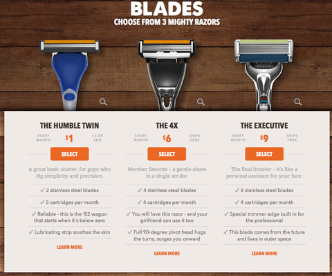
In the age of scrolling rapidly, captivating product images will anchor your visitor down and keep them a little bit longer on your site. Great product photography also builds the buyer’s trust that you need in ecommerce, especially since the buyer can’t see the product in person, product images speak for your brand.

(Source: Dollar Shave Club)
PageFly product image's checklist:
- Use images that are high-resolution and zoomable to visually communicate the details of your product to visitors.
- The more the merrier: Use more than 1 photo. A photo gallery of your product helps customers visualize your product better, hence, gives them the confidence to buy.
- Mindful about the image size. What's the point of having excellent product images if they take forever to load? Keep in mind that not everyone has access to high-speed internet, so always optimize your product images to the smallest size.
3. Add Eye-catching Call-to-Action
CTA Buttons are often taken for granted.
“It's a call-to-action button. What can go wrong?”
A lot, if you don't grasp the fundamentals:
- Content: Add to Cart, Buy Now, Get It Now. You decide, but keep in mind that it has to be recognizable and should compel visitors to act. Imagine a CTA button reads “Pay Me Money and Get It Now"
- Color: Different colors have different meanings, hence trigger different emotions from visitors. Get the color done right in 02 steps 1) Consider if the color you choose convey the mood and trigger the emotion you’re hoping for. 2) Consider if it abides by your color palette of the page, and if it stands out enough to earn customers' attention.
- Wording: Classic case of “You say tomato, I say tomato". Keep in mind that different dialects can result in different perceptions of the same word. For example, see how Amazon changes the CTA text on its US and UK websites to adhere to the local flavor.
4. Provide Easy Navigation Between Product Page

(Source: Naiise.com)
Use breadcrumb navigation to let your visitors know where they are. By having proper breadcrumb navigation, you help visitors have a better understanding of product hierarchy as well as avoid broken user experience by allowing your visitors to navigate easily to other areas of interest - which eventually increase time on site and reduce bounce rates.
After all, higher time on site = higher interest = higher chance for conversion.
(According to a recent study from Invesp)
Breadcrumb navigation is often neglected by most eCommerce business owners when in reality, breadcrumb navigation is an important element of product findability - the key to any eCommerce business. Your customers can't buy your product if they can't find it.
If you want to take your navigation game out of this world, Smashing Magazine - a trusted UX magazine published a detailed study on how you can level up your navigation design.
5. Make Use Of Compelling Videos
Always keep in mind that since your customers can't touch, feel or smell your products, you have to bank on excellent media to earn your customer trust. We already talked about images, now we talk about videos.
In a recent study, Stacks and Stacks found that visitors who saw videos on its product pages are 144% more likely to purchase the products. For all data-driven eCommerce owners, it is an interesting statistic why videos can not be forgotten by eCommerce stores that want to keep going strong in a competitive eCommerce landscape.
Here are the 4 most popular types of videos that eCommerce businesses use to highlight their products.
5.1. Unboxing video
Unboxing videos are a crowd-pleasing video type and quickly climbing the charts: In 2014, unboxing videos already had more than 10.3 billion views! Unboxing videos work because it allows customers to know exactly what they'll get, and know the brand they are buying from way better.
Remember: Brand personality plays a heavy influence on consumer behaviors. Brands that display positive personalities receive 3X word-of-mouth than less emotionally-connected brands.
Let's take a look at how Dollar Shave Club aced an unboxing video:
5.2. Product Tour videos.
When your products have a lot of details, have high-value and require higher persuasion power to get visitors to add the products to cart, you need product tour videos. This type of video shows and explains your products in great details - hence, keep your prospective visitors on-site longer, increasing the chance of conversion.
Let's take a look at how Nikon aced a product-tour video:
5.3. How-to videos.
How-to Videos adopt a time-honored practice of story-telling: Show, don’t tell. A how-to video shows customers how effective your product can be, which eases almost any concern about the product's usability and makes customers' lives much easier - all that is left is buying.
Looking for inspiration, check out this whimsical and charming video:
5.4. Product-line videos.
Product-line videos give customers a sneak-peek into how your products are created, assembled, packaged for shipping. Product-lined videos can easily triumph over other types of videos in terms of showing the quality of your workmanship, labor, and material - which make it easier for customers to feel connected to your brands and find the pricing reasonable.
Looking for inspiration? Check out how PepWear aced a product-line video:
To discover more than 4 types of videos and best practices to help you jazz your customers with product videos, we highly recommend you to check out this in-depth article on Ecommerce Product Videos from Coredna:
6. Write Attractive Product Descriptions
Product Descriptions wear many hats: They communicate your product value, get people excited and make them switch from visitors to customers in the blink of an eye. Product descriptions also make your product page content-rich so that the page can rank well under search engine eyes. Those are the ways product descriptions can benefit you, if done right.
If “done right" sounds too ambiguous for you, follow our checklist:
6.1. Speak to your target customer
Walk into your target audience’s minds and reflect key qualities of their persona on your product descriptions: Which information they deemed the most important, which voice will match their tone - whimsical or serious. Writing with an audience in mind will result in compelling product copy that makes your customers feel related and understood, hence, having more reasons to buy your product.
6.2. Distinguish feature and benefits
What do we talk about when we talk about the customer journey?
We talk about pain points and pain killers.
So if a shopper is looking to buy a summer t-shirt, he will care more about whether it is sweat-free or anti-allergic than if it is made of 100% organic cotton imported from Italy.
Features are essential facts about your products - which can easily sound like jargon to a lot of regular shoppers, while benefits are all about HOW your products can be the painkillers for audience' pain points, how its feature can be of use, and WHY they should buy it to ease their pain.
6.3. Choose your words wisely
Avoid excessive jargon that customers may not understand because if they don't understand what your products are about, they’re not going to buy it. Your product description should speak the regular shoppers' language, with words, phrases and concepts familiar to them.
Favor verbs over adjectives and go for powerful verbs that excite the readers.
- This sleeping bag is perfect for your outdoor camping.
- This sleeping bag gives you plenty of room to make yourself comfortable on your outdoor camping trip without the worry of getting cold or wet. You will feel safe even in unfamiliar surroundings.
Which one sounds more compelling? Decide for yourself!
6.4. Check your readability.
Most users scan pages on the internet, so it's your job to make it easier for them to scan through your product pages, which includes:
- Use bullet points.
- Use short, to-the-point, unbroken sentence
- Use a large, readable font
Check out these 12+ AI Tools To Generate Hundreds of Product Descriptions At Ease
7. Create Urgency and Play With FOMO
Urgency and Scarcity can be displayed on your product page in the form of a countdown clock for a 50% off offer, last 2 hours of free shipping or last 4 items in stocks.
Why is it effective? It taps right into one of our psychological phenomena - FOMO - Fear Of Missing Out. FOMO prompts shoppers to shorten their decision-making process.
We encourage you to think out of the box and create your own arsenal of FOMO. There are 16 ways to create a FOMO trigger, namely:
- Show your shoppers that other people are buying the products. They are more likely to checkout said products.
- Show stock levels. This is a subtle way to let your visitors know there's no time for pondering. It's now or never.
- Countdown clock - a classic trigger you probably saw many times before. Nobody likes time running out on them
- Limit free shipping. Did you know that around 90% of shoppers list free shipping as their prime incentive for buying online?
Theory aside, playing into FOMO has been made easier. Ecommerce platforms have been providing merchants with an array of apps and supporting add-ons.
8. Upsell and Cross-Sell: Don't You Forget
In definition:
- Upselling is a strategy to sell an advanced version of a product the customer already bought, with higher pricing.
- Cross-selling is a strategy to sell related products to the one a customer is buying.
In real-life:
- Up-selling: You are looking to buy a baby sleeping bag for your 2-year-old daughter, I offer you our best model with just 50 bucks more.
- Cross-selling. You're looking to buy a baby sleeping bag for your 2-year-old daughter, I'll throw in a teddy bear for 2 bucks. The teddy bear is a cross-sell
Steve Jobs once said: “People don’t know what they want until you show it to them”
That saying helps you understand the fundamental benefit of cross/up-sell - if done right. They help shoppers find more value than they're expecting, which as a result, increases your Average Order Value and Life-time Value.
Below are the basics to get you started with up-sell:
- Promote your most sold or best-reviewed products.
- Make sure the upsells are not 25% more expensive than the product your shoppers are buying.
- Don't shove the upsell products right in your shoppers' face, tell them why it's meant for them - this is when a customer persona shows its importance.
- Make sure the upsell products are in the same category with the original products.
What's about the cross-sell:
- Make sure the cross-sells are at least 60% cheaper than the product added to the cart.
- Cross-sell products should be easily-forgotten products: filters for lenses, lighters for gas stove, etc.
Those are the basics, to help you become a master of upselling and cross-sell, we also put together our trusted resources:
- Upsell and Cross-Sell Ultimate Guide from Hubspot
- Upsell and Cross-sell Actionable Tips from VWWO
Cross-sell, Upsell, Upsell, Cross-sell - I know right, terminologies drove me crazy too!
So let's have a quick, fun test. In the two examples below, which one is Upsell, which one is cross-sell?
Example #1:
Example 2:
Drum roll.
Which is which?
The first one is Cross-sell, the 2nd one is Upsell. Pretty distinguishable right?
Cross-sell and Upsell are pretty much everywhere these days, so the tools to set up cross-sell and up-sell are a dime a dozen. Here at PageFly, we highly recommend: Shopify Also Bought - A powerful cross-sell and up-sell app that does most of the heavy work for you.
Check it out and let us know what you think.
9. Social Proof, Trust Badge and Customer Review
It is not a stretch to say that shoppers have trust issues these days.
It's not their fault when online frauds are on the rise and ubiquitous.
And just as how you make a trusting bond with another human being, creating trust is all about being genuinely well-intentioned first, meaning your products have to be up-to-par in the first place.
Then, it's about getting them to notice how trusted you are, with 2 well-practiced approaches:
9.1. Highlight reviews from your customers
(Source: Fitbit)
Let's make another detour to the statistic department
- 72% of consumers say positive reviews make them trust businesses more.
- 68% of consumers trust opinions posted online.
- 84% of consumers reported always or sometimes taking action based on personal recommendations. 70% said they did the same with online consumer opinions
You can expect customers to willingly leave a review after purchase, or after using your product. But most of the time, you have to proactively reach out to your customers to ask for reviews.
The art of asking for reviews can be boiled down to one simple philosophy:
Love thy customer as thyself.
That means being an excellent friend first: supporting them first and asking for a review later.
That being said, putting the principle into action requires a combination of proper touchpoints and communication tools.
9.2. Trust Badge

According to a study by Econsultancy/Toluna, 48% of shoppers agreed that trust seals help them decide whether to make a purchase. Clear and visual, trust badges are an easy way to let shoppers know that their purchases are safe.
9.3. Social Proof
Social proof, to put it simply, is another type of customer reviews that you yank from your social media platforms and shows it to your visitors, with goals to increase confidence in your prospective buyers.
10. Shipping, Payment and Return Policy
Never, ever, keep your customers behind the curtain when it comes to shipping costs.
Customers won't want to spend their money on shipping, but that does not mean you can sneak in the shipping fees in the checkout stage. Be honest. Your customers might get annoyed and abandon the cart, right at the checkout.
Be clear on the return policy as well. Communicate about what you can offer: Do they have 14 days to return the product, an entire luxurious month, or no such privilege at all? Write it down clearly and avoid making your customers angry!
11. Design Mobile-first
Not the latest news, but:
- Mobile commerce is on the rise
- Google is getting more serious about its mobile algorithm, separating it from its desktop version to account for mobile consumer habits and preferences
It settles. Far gone when optimizing product pages for mobile was a nice-to-have, designing mobile-first is essential.
There is more to being mobile-friendly than just ensuring they’re bug-free and successfully load. E-Commerce business owners must tailor their content, images and literally everything in-between to create a smooth-sailing experience for mobile shoppers and drive the most sales.
Build The Perfect Product Page With Shopify
After reading the article, you probably think that a powerful product page design is a workhorse with a lot of responsibility and checklists.
The fact is: it is.
However, Shopify has been making it much easier for eCommerce business owners to build and run an online store. With an extensive library of themes, templates and dedicated support, Shopify is confident that anyone can build a product page.
How confident? We'll let Shopify speak in their own words.
Shopify also dedicates a separate section in the manual library just to teach you the How-to and allows for up to 60-day trials. That's how generous and customer-centric they are!
Now if you already have a basic Shopify product page and desire to check off every best practice we mentioned earlier, customization is your Arthur sword. We have that covered for you since, at PageFly, we're passionate about helping you build a successful business.
Check out: Shopify product page customization


