You know landing pages are essential for conversions. But do you know what a well-designed, compelling landing page looks like?
You’re about to find out.
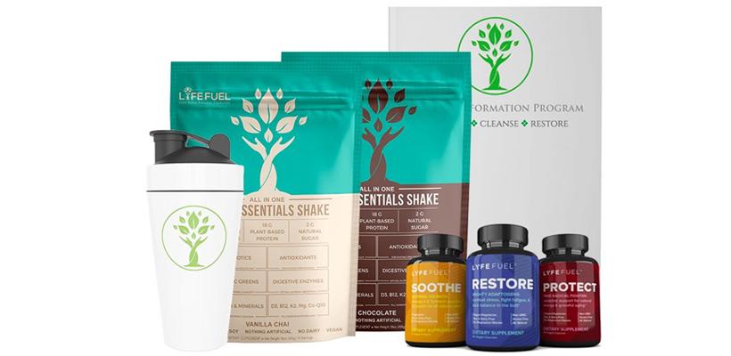
For this week’s Shopify store review we’ll be looking at Lyfe Fuel, built with PageFly and hosted on Shopify. I stumbled across their store while trawling for websites to review.
After clicking through, I was pleasantly surprised.
Take notes. This is a perfect model landing page for any of you merchants in the health/wellness niche.
Save time and watch the video review below.
Lyfe Fuel Shopify Store Review by PageFly
Most eCommerce landing/sales pages start with a strong hero image, headline, brief body copy and call to action (CTA). Lyfe Fuel has hit the nail on the head.

The image is overlayed with an opaque blue tone to give contrast to the headline and copy. The CTA is bright, bold and very green. It’s a great use of the isolation effect. Your eye can’t help but be drawn to it - as if it’s daring you to click it.
Let’s keep scrolling.

Nice use of more headlines to keep the reader engaged. They’re staying true to their brand color palette with the headings, and the images are colorful and enticing. They’ve done a great job of listing the benefits and using a pattern interrupt with the leaf graphic bullet points.
Pattern interrupts are subtle unexpected design or other elements that help keep readers on their toes and paying attention.

These guys go on to further expand with real benefits to the customer’s life followed up by a second call to action. Multiple calls to action nearly always convert better than simply having one, as long as they all lead to the same offer. Try to avoid making the purchase process any more complicated than it should be.
Next up are customer testimonials.

Buyers trust the words of other buyers more than from brands. Social proof like reviews ad testimonials are vital for your credibility and ability to convert visitors into customers. This carousel of positive words was made with the Slideshow Element in the PageFly app.

You can’t see it, but this section is a neat moving GIF that once again, interrupts the pattern. But above all, the use of statistics and fear-based copywriting is genius. Fear is a huge factor in buyer decisions. Also notice how after using fear, LYFE Fuel position themselves as the solution immediately.
Next up, another CTA with incentives to buy.

Notice the big bold headline, product image, price discount and Buy One Get One Free offer. Incentives like this can help convert visitors that were on the fence as they scroll. Just don’t go overboard with offering discounts and free stuff. There’s a fine line between buyer incentives and cheapening your brand.
And here’s a section many merchants overlook.
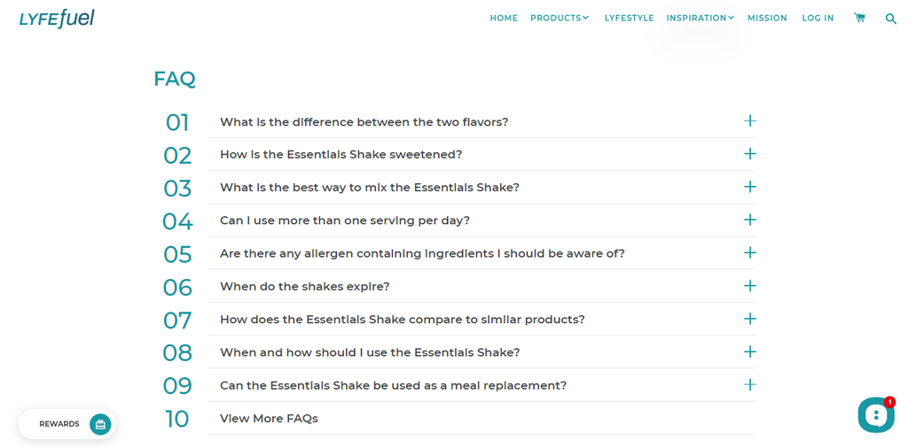
Dealing with abandoned carts? If visitors don’t have all the information they need to make a purchase decision, they’ll simply bounce. This Accordion Element expands with answers to frequently asked questions.
Not only does this provide all the info needed, but it also stops them from navigating to another page on your site for information. Keep them on the product/landing page at all costs if you’re serious about getting that sale.
Further Reading:
- Shopify Pages: A Definitive Encyclopedia For New Merchants
- Shopify Store Best Practice: Set Up and Analyze Conversion Tracking
- How To Add Google Analytics To Your Shopfiy Store: A Visualized Guide
- Top 100+ Shopify Stores For Your Inspiration
Conclusion
Impressed? I certainly was. I’ve seen many landing pages over the years, and have created even more. This one hits the mark in many aspects.
Could it be better? Sure, every page can be improved. A product or testimonial video would help with conversions. More images of people enjoying life with their newfound health would be a bonus.
But it’s hard to fault them when they’ve done so much right.
Landing pages are your first port of call to greet visitors and welcome them to your brand. Make the most of them by writing compelling content, using multiple CTAs and optimizing them for mobile devices.
Want to make high-converting landing pages like this one for your Shopify store? Try PageFly free for 14 days. Building beautiful web pages doesn’t have to be a pain.
With PageFly it’s as easy as pie.


