Hi, it’s Richard from the PageFly Team again!
In the latest version 4.20.0 of PageFly, we have made many UI improvements on both Desktop and Mobile versions, allowing you to seamlessly build a page without any hassle.
Most of the changes are for the mobile interface in which we want to enhance navigation in smaller screen sizes, so you can manage pages right in your pocket. Let’s jump right in.
Update on PageFly UI
With these small changes to PageFly UI, we hope to make it more intuitive, providing a more approachable look for you while creating your pages.
So what’s new?
Update UI for Banner Components
These small tweaks help you use PageFly more effectively.
First, we added a dismiss button (x) to all Information Banners. Critical Banner is now changed to Warning Banner with a yellow color to display information that needs to be taken action on. Like this:

Certain banner designs will also be changed.
For example, we change this banner…

…to normal text from 4.20.0 Version.

There’s also a new look for Inspectors or Sidebar banners. This is it before.

And this is it now:

Update UI color scheme
We updated the color scheme for certain texts, icons, links, and badges in some parts to synchronize color roles between Shopify and PageFly in-app:
- Grey: For updates on an action or information with a non-critical tone and for a completed action.
- Blue: Highlight an object or action with an important attribute. For example, on the PageFly Home Dashboard, you can see “Picked for you” and “100% Compatible with Shopify” are marked blue.
- Green: Marked a successful action.
- Yellow: Used to highlight notification that needs attention or incompleted action.
- Orange: For warnings and time-sensitive issues.
- Red: Use for critical and irreversible issues
New Look for “Preferences” Sub-menu
We replaced the current version with a better UI using tabs and setting layouts required by Shopify, helping you navigate the features more easily.
Here’s what Preferences currently look like. You can click on each Tab to see their corresponding setting.

Full-width Layout for Resource Index Pages
This includes changing the max-width layout on the Page listing, Section listing, Option swatches, Trash, Upload fonts, and Analytics sub-menu into the full-width layout for the desktop.
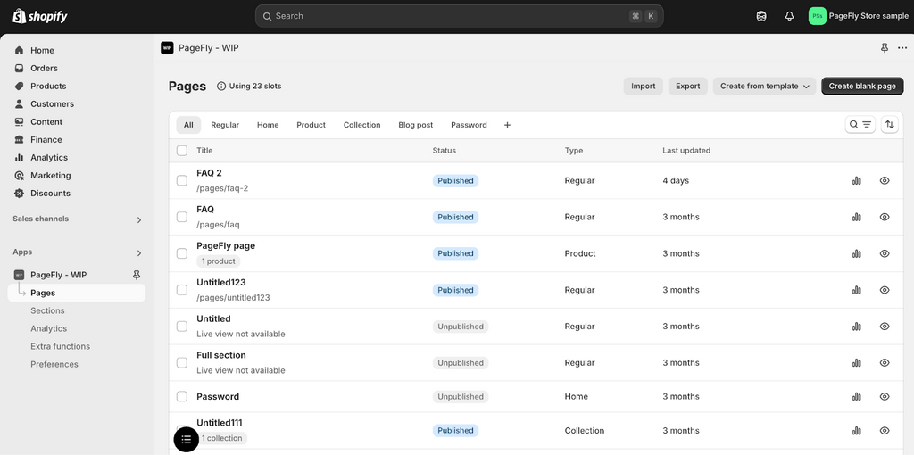
For example, this is the old look of Page Listing:

This is how it looks on PageFly 4.20.0:

This provides a wider view for lists of data with many columns and reduces friction while you setting up your pages.
Changes for Secondary Style For Actions
To make the UI easier to navigate, we updated the secondary action styling for some text buttons, minor icons, or dropdown menus in the Media Files and Integration dashboard.
For example, in the old version, you can see a list of buttons next to every media file.

But for the PageFly 4.20.0 version, the button will only shown once you hover to each media file. This gives a cleaner look.

Other Updates
Some other changes in PageFly UI include:
- No more confusing blank loading image. For now, you will see a PageFly logo pops up indicating that the system is processing and loading.
- Remove the Save Button for Analytics, User Interface, and Option Swatches settings.
- We limit the content in toast messages to 3 words or fewer so it’s easier to read and catch up.

Update on Mobile Editor
We know that you can’t always bring a laptop around, so these updates aim to make it easier to control and edit your store anytime and anywhere.
Despite the limited screen space, you can still use some basic features and build a simple page or section, with an experience like the Web version. Let’s take a look.
Introduce the use of the Drawer component
For the web version, every editing tool and setup can be seen on the left side of your screen. But this is quite impossible for a Mobile editor.
In 4.20.0, you will see a “drawer”, our new navigation menu made for Mobile Editor that can collapse or expand horizontally to use a feature or edit your page conveniently.
Here’s how to use the Mobile Editor with drawer:
Step 1: Log into your PageFly mobile app.
Step 2: Click Pages on the Menu bar > Create. You can choose to create a blank page or use a template.

Step 3: For example, you choose Create from template. Here you can see a range of page options to choose from, exactly like the desktop version. Pick one based on your current need.

Step 4: Choose Legacy Editor to start with. Then you can see a “drawer” pops up, allowing you to filter and surf through all the suitable templates. Like this:

Drawers aren’t limited to template selection but will be used for every editing menu on the PageFly Mobile App.
There are 3 ways to use the drawer: Full-width, a two-third of your editing screen, or entirely collapsed. This flexibility allows you to instantly see every change while adjusting your page design.
Step 5: After selecting your template, the drawer will show “Page content” - where you see the full outline of your page and can add sections or elements.
Drawer will be used across page editing features on PageFly. Thanks to it, you can freely edit a page on your phone the same way as you do on the web.
Update Page Outline
For the Page Content drawer, you can rearrange a section or element by Clicking the 3-dot button next to it > Move it up or down, instead of dragging and dropping like the Web version.

Sometimes while using Mobile, we can accidentally touch an element and move it out of place without any notice, disrupting the outline. This update will prevent it from doing so and provide a more seamless viewing experience for smaller screens.
Update Resource Picker and Page Assignment
We optimized the resource picker and page assignment using the above drawer modal so you can easily browse and select a collection, product, blog, URL, or page content for related actions.

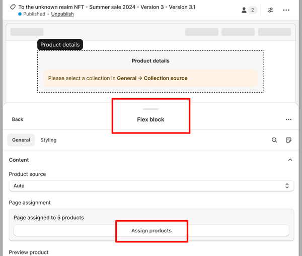
The goal is to ensure all the key functions available on the Desktop are also usable on Mobile with minimal effort. For example, when you select a collection for Product details, the Flex block will appear as a drawer, allowing you to assign products and edit as you wish.

Update Element Inspector
Following the above changes, you can now view and modify the properties of elements and pages without struggling with interface limitations on a smaller screen, thanks to the enhanced Element Inspector.

We also make the custom code editor more suitable for smaller screen sizes as well.

You can freely custom your page just as you do with a Web Editor.
Warning for iOS users
With the PageFly Mobile editor, you can view your page in all device modes, not limited to the mobile version. However, with iOS, you will be limited to standard mobile mode as iOS can be lagging or losing data due to limitation on “too much memory usage used at once.”
We give you a heads-up by adding a warning box when this can potentially happen.

Update on Live Chat on Mobile Editor
With the limited screen size, we decided to remove the Live Chat Button inside the Mobile Editor, giving you more space while editing your page. On the Home Dashboard, you can still access Live Chat normally through the “Message button” in the bottom left of your screen.
To access Live Chat Support, navigate to the 3-dot button on the top right of your screen, then click Live Chat:

Other updates
- In this PageFly 4.20.0 version, if you want to go back to the Home Dashboard from Mobile Editor, you need to click on the PageFly Page Editor header. This will open a Navigation menu where you can get back to Home Dashboard. Do not click on the Arrow button as it will exit the PageFly app.

- Move Third-party Setup into the Element Catalog drawer for Mobile users.

- Enhance UI for Page Listing so users can navigate and manage their pages on smaller screens.

- Enhance UI for Version history so you can easily review changes and revert if needed.
Wrapping Up
We hope that with the PageFly 4.20.0 Update, you can now build, edit, and manage your pages timely at every convenience. Our team continues to improve PageFly and offers the most seamless, smart, and strong Shopify Page Builder for high-performing and eye-catching storefronts.
While exploring the new UI for desktop and mobile, feel free to reach out to our support team if you stumble any problems.
Don’t forget to check out our PageFly Blog for details on previous updates and stay tuned for future releases:
- PageFly 4.19.0: Update Editor code, Refined Copy-Paste, Shopify Font Integration, and Faster Performance.
- PageFly 4.18.0: Improving Color Picker, Content List Items' Styling Synchronization & Updating Global Styles.


