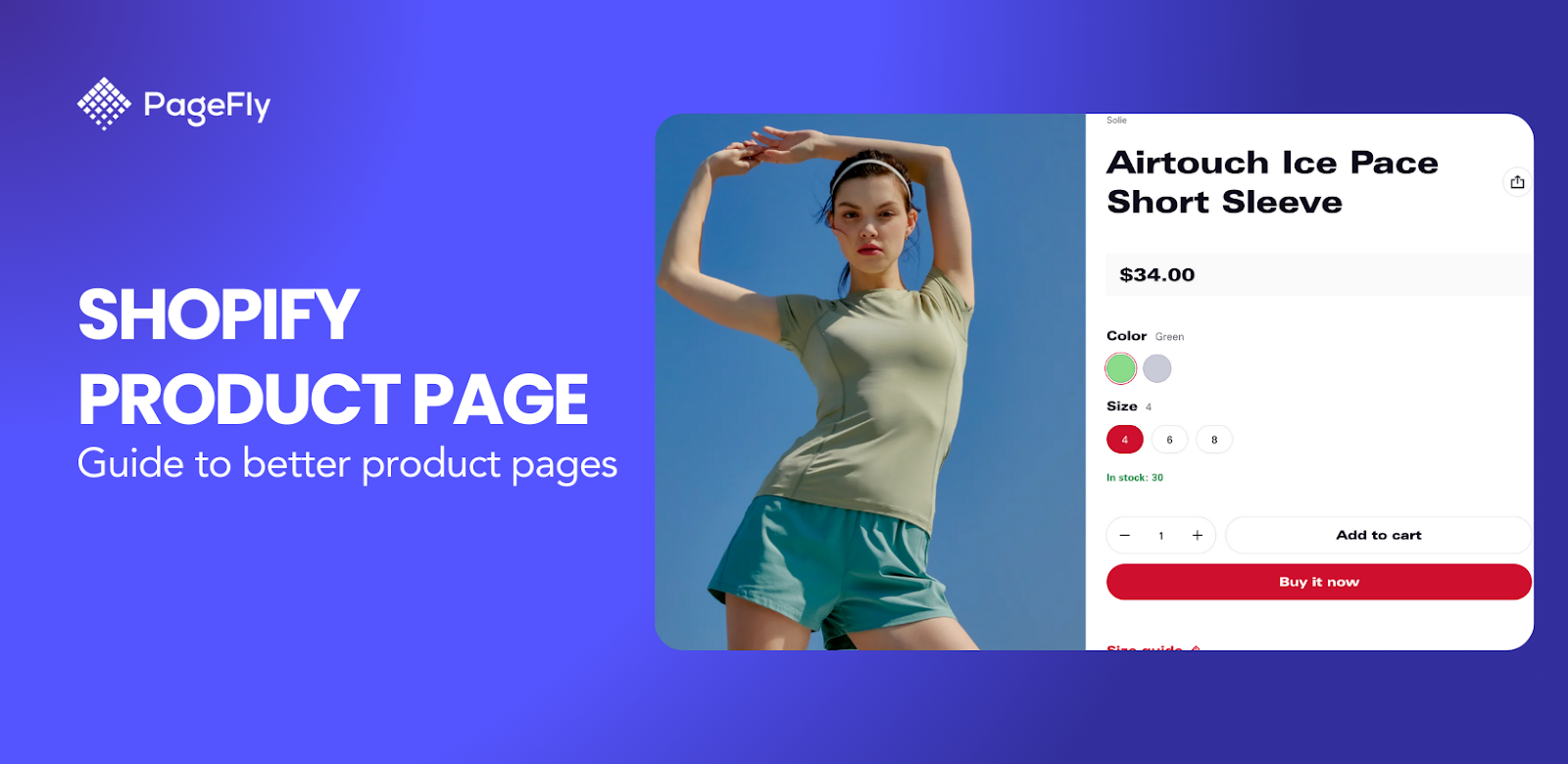
A Shopify landing page is a powerful conversion tool that can transform your store visitors into paying customers. Shopify landing pages are standalone web pages specifically designed to drive a particular action, such as a purchase or form submission, making them essential for boosting conversions and maximizing your marketing ROI.
This comprehensive guide covers everything you need to know about Shopify landing pages: from understanding 6 different types (splash, lead generation, sales, thank you, seasonal, and webinar pages) to step-by-step creation methods using Shopify's built-in tools, Liquid code, and page builder apps like PageFly. You'll discover proven examples from successful stores, access ready-to-use templates, and learn optimization strategies that boost conversions. Whether you're a beginner launching your first store or an experienced merchant scaling your business, this guide provides actionable insights to create high-converting landing pages that drive results.
Let's get started!
Key Takeaways: Shopify Landing Page Essentials
- Shopify landing pages can increase conversions by up to 160% compared to regular product pages when optimized correctly
- 6 essential types: Splash pages for announcements, lead generation for email capture, sales pages for conversions, thank you pages for retention, seasonal pages for campaigns, and webinar registration pages
- 3 creation methods: Built-in Shopify tools (free, basic customization), Liquid code (advanced, requires developer skills), or landing page builders like PageFly (drag-and-drop, templates included)
- Best practices: Single focused goal, mobile optimization, fast loading speed, clear CTAs, social proof integration, and A/B testing
- PageFly advantage: 125+ professional templates, free plan available, 4.9/5 rating with 5,600+ reviews on Shopify App Store
What is A Shopify Landing Page?
A Shopify landing page is a standalone web page designed to capture a visitor's attention and guide them toward a specific action, such as making a purchase, signing up for a newsletter, or downloading an ebook. Unlike your regular Shopify pages (homepage, product pages, collection pages) which serve multiple purposes and encourage exploration, a landing page focuses on a single goal with one clear call-to-action, ensuring higher conversion rates.
Why Shopify Landing Pages Drive Higher Conversions
Shopify landing pages deliver superior results because they address four critical success factors that merchants care most about:
Speed & Performance
- Average load time under 3 seconds (vs 5+ seconds for typical homepages)
- Mobile-optimized design ensures 70%+ of mobile visitors stay engaged
- Built-in Shopify infrastructure provides 99.9% uptime reliability
Mobile-First Design
- Responsive layouts adapt to any screen size automatically
- Touch-friendly buttons and forms reduce friction on mobile devices
- Progressive web app capabilities for app-like mobile experience
Conversion-Focused Design
- Single-purpose focus eliminates distractions that cause visitor confusion
- Strategic placement of trust signals (reviews, security badges, guarantees)
- A/B testing capabilities to optimize elements for maximum conversions
ROI & Measurable Results
- Track specific conversion goals (purchases, signups, downloads)
- Integration with Shopify analytics and Google Analytics 4
- Cost-effective compared to paid advertising (organic traffic + high conversion rates)
Shopify Landing Page vs Regular Shopify Page: Key Differences
Understanding the difference between landing pages and regular Shopify pages is crucial for your marketing strategy:
| Aspect | Landing Page | Regular Shopify Page |
|---|---|---|
| Purpose | Single conversion goal (signup, purchase, download) | Multiple purposes (browse, learn, explore) |
| Navigation | Minimal or no navigation menu | Full navigation menu and footer |
| Content Focus | One specific offer or product | Various products, information, links |
| Call-to-Action | One primary CTA repeated strategically | Multiple CTAs for different actions |
| Traffic Source | Targeted campaigns (ads, email) | Organic search, direct traffic, general browsing |
| Customization | Highly customized for each campaign | Consistent template across site |
| Conversion Rate | Higher (5-20% average) | Lower (1-3% average) |
In simple terms: Regular Shopify pages help visitors explore your store, while landing pages convert them into customers or leads.
Types of Shopify Landing Pages
Shopify landing pages are versatile tools designed to guide visitors toward specific actions, such as making a purchase or signing up for a newsletter. Each type of landing page serves a unique purpose in the marketing funnel, helping businesses achieve their goals efficiently. Below is an in-depth look at the most common types of Shopify landing pages, complete with introductions, key tips, and real-world examples.
Splash Landing Pages
Splash pages are visually striking pages used for announcements or age verification. They include minimal copy, bold visuals, and catchy messaging to create a strong first impression.
A Splash landing page includes minimal copy, strong visual and catchy messaging to instantly plant a strong impression on users. Splash pages often precede a web page so they can be used at any stage of your marketing funnel, however, we'd advise that you use it at the top of your funnel to give your brand awareness a boost, given it's often designed for wow-factor. Let's take a look at how Zara used the Splash page to verify locations.
Key tips:
- Use a lightbox overlay: Instead of redirecting the visitor to another page, a lightbox overlay maintains them on the same page they were on when they first arrived. The translucent nature of the splash page built in the lightbox overlay method ensures that guests understand they are in the right place they expected to be.
- Send visitors back to the original page: When your web takes users to a splash page, it's important to keep track of where they come from in the first place so that they can be routed back there if they choose to ignore it.
- Avoid repetitive splash page display: If your guests miss your splash page the first time, there's a good chance they won't want to take the step you want them to take the next time you put it in front of them.
- Maximize loading speed: It's critical that you don't flood your splash page with, let’s say, autoplay video, which can slow down the page's loading speed.
- Make your splash page design responsive: Make sure your splash page is available to all users with different viewing devices. Can’t stress enough the importance of mobile-focused mentality nowadays!
- Exit-intent button available: It is important to remind users that they have the possibility of exiting the website, as this would reduce the probability of them leaving it. No one enjoys feeling as though they have no options, and having the skip button accessible helps to alleviate this issue.

For example, this landing page simply allow customers to fill in location and language information to navigate them to the right sales pages. This type of landing page is useful for both navigating users and collecting users' general data for future campaigns.
Lead Generation Landing Pages
Different from your standard Shopify contact page, lead generation landing pages capture visitor information through forms in exchange for incentives like discounts or downloadable resources.
Back to our marketing funnel, Lead Generation landing pages are usually in the middle of the funnel - used for lead capturing. To create strong lead generation landing pages, you need to find the right balance, the equilibrium between the "asking" part , and the "reward" part. Basically, if you "ask" a visitor to leave their email or contact info, you have to "reward" them with an offer - which can be a Downloadable resource or a discount code.

For example, this landing page from Nauto collects customers' information and rewards them with a valuable eBook. With this landing page, they received thousands of data every month.
To help you easily create this type of Landing page, Shopify has built-in Contact Form and Customer form which can easily be added to your Coming soon page, Password page, or a Lead Capture page. In this example, Nauto used the Lead Generation page to collect contact information and capture leads.
- Reassurance and personalization: It’s important to learn, and observe your audience to know what they like and dislike when purchasing your items. For example, personalization enables you to display a different page for each visitor segment or even each visitor.
- Keep your landing pages simple: Landing pages with a simple look allows visitors to navigate better and catch necessary information. This could be achieved with, let’s say, a short and sweet headline or keeping the number of form fields to a minimum.
- Pop-ups are the way to go: Pop-ups are a great way to get visitor attention immediately. Blur the page background, then show an information box that might interest your visitors in a new product, a sales campaign or newsletter registration. Impressive!
- Social proof is the best ally: Social proof matters, demonstrating that behind your product are actual clients who love it increases your chances to perform better. For starters, you can try adding some star ratings and testimonials to your site
- The button you choose for your page matters: Adding some benefit to your button increases your chances of success. Just by changing the wording of your button you might be more successful at intriguing your customers. “Download now”? No, scratch that. “Download now to get XYZ discounts” should be a better way to go.
- Special offers, and discounts: Offering something for free in exchange for something like an email is a no-brainer for the customer. It makes people feel heard and special.
Sales Landing Page
Sales landing pages differ from regular Shopify product pages by being designed specifically to convert visitors into customers through focused messaging, eliminating navigation distractions, and emphasizing product benefits with urgency tactics. They are often long-form and used at the bottom of the funnel. To build sales landing pages, Shopify has Product pages and collection pages at your disposal - however, most of the theme templates consist of only Product Details sections, and a Products Recommendation sections so you'd need Shopify product page customization if you want to make it a sales landing page - which we'll cover the how-to right below.
A sales page can be long or short depending on your product and the amount of information you need to convince someone to pay or to click your precious Call-to-action Buttons. Generally, the more expensive or complicated your product or service is, the more questions your prospects will have about them, hence, the longer the page design, since the goal is to make your prospective buyers feel reassured enough to make a confident purchase right on the landing page.

Here comes a few tips to help you build a better sales page:
- Understand your audience: The more you know about your audience, the stronger your sales pages become. For example, a page that targets new moms should employ a tender language and soothing visuals, while products for a niche like motorbike riders might require an unyielding presentation.
- Structure your page in a clear and concise fashion: Don’t waste your customer’s time deciphering your message. Cut to the chase and make your headline an offer visitors can’t refuse. Lead with a benefit of the product or service, then mention what you’re selling.
- Make your copy convincing: Start by telling people what you want them to do. Use strong verbs and an authoritative voice. Focus on benefits instead of plain-jane features in your copy. For instance, instead of mentioning your racing bike’s wheel construction, explain what benefits buyers will derive from it.
- Describe your product benefits: One way to create more “breathing room” on your sales page is to break down information into bulleted or numbered lists. They attract attention and are more scannable.
- Prove visitors can trust you: It’s a great way to demonstrate that other people love working with us. You can post logos of companies you’ve worked with, testimonials from satisfied customers, or links to in-depth case studies.
- Use multiple calls to action: Remember that they should lead to the same conclusion. Make sure you’re adding content between them to give visitors a reason to continue reading.
- Make It Urgent: For instance, you could use a flash sale to encourage conversions. You’re offering a reduced price, but only if the visitor acts within X hours. You can also create urgency through desire by putting up a copy that says “Do you want to [...]? Why wait?”
- Handle objections: FAQs are also extremely useful. It’s a fast way to disseminate information without distracting your visitor from the conversion.
- Try exit-intent pop-ups: An exit-intent popup works extremely well when you want to give visitors a last chance to buy. You can use the popup to offer an exclusive discount or a bonus freebie — or simply to confirm that the visitor really wants to leave.
Thank You Page
Shopify thank you pages are where someone is redirected to after they’ve made a purchase, entered in their information, or fill in the information. Thank you pages are often under-appreciated, designed with only a boring "Thank You" line, while your thank you page has the power to either move a lead further down the funnel, or set you up for increased Average Order Value with repeating customers.

Here comes a few tips to help you build a better Thank You page:
- The personal touch: The mere act of using a customer’s name on your thank you page endears them to your store as it makes them feel that little bit more important. You can also integrate a map onto your thank you page that shows the user’s shipping address, again, to seem a little bit more personal.
- An incentive to return: There are two really effective ways you can do this
- A discount - something like 20% or 30% off your next offer
- A loyalty program - whereby your customers can build points for repeat purchases and eventually claim rewards.
- ‘Share to social’ buttons: This is for your customers to spread the word organically about your product and leave their honest reviews on their social media.
- An incentive to refer: Referral programs are financial incentives for your brand’s best advocates, your customers, to share the message of your company with their friends.
- Link to a survey: Completed surveys are absolute gold dust for the future of your store. Finding out exactly what you’re doing right and what you’re doing wrong from the people who are actually buying your products.
- Tracking info: This is to help your customers overcome issues of trust and foster long-term relationships between your consumer and you.
- Internal and external linking: Always remember to loop your thank you page back to another part of your store. Along with this, you can link your thank you page to the pages outside of your store, primarily your social media pages on Facebook, Instagram, Pinterest, etc.
Seasonal Landing Pages
Seasonal landing pages are designed to capitalize on holidays or special events by offering themed promotions and discounts. These pages leverage urgency and festive designs to boost conversions during limited-time campaigns.
Key tips to boost sales from seasonal landing pages:
- Make It Festive and Clear: Use holiday-themed designs while maintaining readability with balanced whitespace.
- Create Urgency with FOMO Tactics: Add countdown timers or stock scarcity indicators like “Only 5 left!” messages.
- Highlight Discounts and Free Shipping Offers: Emphasize deals that resonate with holiday shoppers.
For example. this PageFly's Easter landing page template features bold “50% Off” banners, countdown timers, and free shipping offers, creating sense of urgency and drive actions:

Webinar Registration Landing Page
Webinar registration pages are ideal for brands offering educational content or live demos that engage audiences while capturing attendee details. By that, businesses can easily monitor and manage the numbers of registration and attendee.
Key Tips:
- Highlight Event Benefits: Explain what attendees will gain from participating (e.g., exclusive insights).
- Use Trust Signals: Add expert endorsements or past attendee testimonials.

Examples: An online coaching platform uses webinar registration pages with clear CTAs like “Reserve Your Spot” alongside testimonials from past participants, increasing sign-ups by 30%.
How to Create a Shopify Landing Page
Creating a Shopify landing page is an essential step to boost conversions, enhance user experience, and achieve specific marketing goals. Below are detailed methods to create landing pages using Shopify’s built-in features, Liquid code customization, and powerful page builder apps.
Free Shopify Landing Pages: Built-in Method for Budget-Conscious Entrepreneurs
Perfect for solo entrepreneurs and micro businesses with limited budgets, Shopify's built-in page creation requires no additional monthly costs beyond your standard Shopify subscription. This method works best for simple landing pages like "Coming Soon" announcements, basic lead capture forms, and straightforward product promotions.
✅ Pros for new merchants:
- Completely free (no additional app costs)
- No learning curve for complex tools
- Automatically matches your store's theme design
- Built-in SEO optimization features
- Mobile-responsive by default
❌ Limitations to consider:
- Limited design customization options
- No advanced conversion optimization features
- Cannot create complex layouts or animations
- No A/B testing capabilities
- Basic form functionality only
To create a free Shopify landing page using built-in tools, navigate to Online Store > Pages, add content using the Theme editor, and optimize SEO settings for your target keywords.
Steps by Steps Guide:
1. Create a new template in Shopify theme editor
 2. Design by inserting content using Shopify’s Theme editor (images, text, videos).
3. Add page by going to Online Store > Pages in your Shopify admin dashboard.
4. Click Add Page and enter a title for your landing page (e.g., “Holiday Sale”).

5. Save and publish the page, then link it to your store’s navigation menu.
*You can also set up page SEO information like page title, meta description, etc.
Key Tips:
- Use Shopify’s Page Editor: Navigate to the “Pages” section in the admin dashboard to create a new page. Add text, images, and videos to build your content.
- Enable Contact Forms: Add Shopify’s built-in contact form for lead generation or customer inquiries.
- Optimize SEO Settings: Use the “Search engine listing preview” section to add meta titles and descriptions for better search visibility.
- Link Pages Strategically: Connect your landing page to menus or promotional banners for seamless navigation.
- Keep the design simple and focused on a single conversion goal (e.g., email signups or product purchases).
- Use high-quality visuals and compelling headlines to grab attention instantly.
- Make sure you test page speed and performance before launching
Using Liquid Code (For Advanced Users)
To create or customize a Shopify landing page using Liquid code, you can go to Online Store > Themes > Actions > Edit Code in Shopify admin.
Why using this method? Liquid is Shopify’s templating language that allows advanced users to customize themes and create highly tailored landing pages. This method is recommended for those with coding knowledge or access to developers.
Step by Step Guide:
- Go to Online Store > Themes > Actions > Edit Code in your Shopify admin dashboard.
- Locate the “Templates” folder and open the relevant file (e.g., page.landing-page).

- Add custom Liquid code to modify layout or insert dynamic elements like product recommendations or social proof widgets.
- Save changes and preview your landing page before publishing.
Pro Tips for customizing landing pages using code:
- Understand Liquid Syntax: Familiarize yourself with Liquid tags, filters, and objects for dynamic content creation.
- Backup Your Theme Files: Always duplicate your theme before making changes to avoid losing original settings.
- Add Custom Sections: Create unique sections like testimonials or countdown timers directly within the theme code.
- Test Responsiveness: Ensure your customizations work seamlessly across devices.
(*) Note: Shopify offers theme customization tutorials that are divided by the version of theme architecture they use. Learn how to identify your theme architecture version.
Customize and Create Shopify Landing Pages With A Page Builder App
Shopify landing page builders like PageFly represent the easiest and most flexible approach trusted by over 230,000 Shopify merchants worldwide. These specialized Shopify apps simplify the process of creating high-converting landing pages through intuitive drag-and-drop functionality and conversion-optimized templates designed specifically for e-commerce success.
PageFly stands out as the top-rated Shopify landing page builder with a 4.9/5 rating and 5,000+ reviews, offering merchants the perfect balance of ease-of-use and professional customization capabilities - ideal for merchants who want advanced landing page functionality without requiring coding expertise or expensive developer costs.
First, you must choose a suitable Shopify page builder app. To help you, we've analyzed the top 3 page builders in Shopify as follows:
Overview of Page Builder Apps
| App Name | Key Features | Best For | Pricing | Rating |
|---|---|---|---|---|
| PageFly |
| Beginners and advanced users seeking flexibility | Free plan available; paid plans start at $24/month | 4.9/5 (5,000+ reviews) |
| Shogun |
| Merchants focused on performance tracking and engagement | Paid plans start at $39/month | 4.7/5 (3000+ reviews) |
| GemPages |
| Brands prioritizing visual appeal and conversions | Paid plans start at $15/month | 4.9/5 (5000+ reviews) |
Now that you chose your own page builder. Let's see how you can use them to create edit your Shopify landing pages.
In this article, we choose PageFly as PageFly is the best trusted Shopify landing page builder with 12,000+ reviews on Shopify App Store and has a free plan for new users to publish 1 landing page.
Step 1: Install the PageFly Landing Page Builder
Visit PageFly on Shopify App Store, click the Add App button and fill in your store’s URL to install the app to your Shopify store.

Step 2: Create Shopify landing pages with PageFly
In the Shopify admin sidebar, click Apps > PageFly – Advanced Page Builder. After that, you will be redirected to the PageFly Dashboard on a different page.

In the Pages dashboard of the PageFly App, Click Create a page or the (+) icon on the left menu. Then you can choose the page type as your preference in Page Settings.

PageFly provides customizable page types specifically optimized for Shopify landing page creation, including homepage builders, product landing pages, collection showcases, about us pages, lead capture forms, and seasonal campaign pages. This Shopify page builder integrates seamlessly with your store's theme while offering advanced customization options that Shopify's default page editor cannot match.
After configuring your landing page settings, you'll access PageFly's Template Library featuring 125+ professionally designed Shopify landing page templates optimized for different industries and conversion goals. These landing page templates for Shopify are based on real-world data from high-converting stores."

However, if you want to start building things from scratch you can choose create with the blank page.

Step 3: Add Elements
The page editor offers PageFly andn Shopify Elements and sections for you to drag and drop to the blank page. PageFly enables you to have fun with the store’s looks by structuring your page any way you want.

PageFly also provides limitless experiments with elements.
A more comfortable approach could be using 125+ high quality templates (Updated from Aug 26, 2024) for your business in the page settings.
For a more detailed tutorial on how to create a Shopify landing page with PageFly, check out this tutorial:
Step 4: Preview or publish the page
Once you’re done building the page, hit Save. This option saves the page to a database but does not make it public yet. You can see the page preview via Preview.
The Publish button both saves the page and makes it public. You can see the live page via Live View. The page will link to your store with the address “your-shop-name.myshopify.com/pages/page-name”.
You can check the PageFly page in the Shopify database by going to Shopify home > Sales Channels > Online Store > Pages.
Create Using Shopify Landing Page Templates
The fastest way to create a landing page in Shopify is nothing but using pre-made template design. You can use PageFly 100+ page templates to create your own.
Here're PageFly's 2 best seasonal landing page templates for Shopify:
| Template Name | Key Features | Best For | Pricing |
|---|---|---|---|
| Cookie Easter | Festive design, countdown timer | Seasonal promotions | Free with PageFly |
| SmartNest Mother’s Day | Elegant visuals, urgency elements | Holiday campaigns | Free with PageFly |
Cookie Easter Shopify landing page template - Built by PageFly
The Cookie Easter Shopify landing page template, built with PageFly, is a visually engaging and conversion-focused design tailored for seasonal promotions.

The landing page excels in seasonal design, incorporating vibrant colors, Easter-themed visuals, and playful typography that immediately resonate with the holiday spirit. This creates an emotional connection with visitors and aligns perfectly with the theme of the promotion.

The layout is clean, with ample whitespace that emphasizes key elements like product images, discounts, and countdown timers. These features create a sense of urgency and focus attention on the promotional offer.
Additionally, the page is mobile-optimized, ensuring a seamless browsing experience across devices. Its use of high-quality visuals and concise copy enhances user experience while maintaining fast loading speeds.
By combining festive design elements with effective CTAs and responsive functionality, this landing page template successfully captures visitor attention and drives conversions.
SmartNest Mother’s Day Shopify Landing Page Template - Built by PageFly
The SmartNest Mother’s Day Shopify landing page template, built with PageFly, is a compelling example of a seasonal landing page designed to drive holiday sales. Its success lies in its strategic use of festive design, clear messaging, and effective call-to-action (CTA) placement.

This landing page captures attention with its Mother’s Day-themed aesthetic, featuring soft colors, elegant typography, and heartfelt visuals that resonate emotionally with visitors. The design creates an immediate connection with the holiday spirit, making it highly engaging.

The page emphasizes urgency through countdown timers and stock scarcity messages like “Only X left in stock!”, encouraging quick purchases. Additionally, discounts and free shipping offers are prominently displayed, making the value proposition irresistible to customers.
The layout is clean and mobile-optimized, ensuring seamless navigation across devices. By combining emotional appeal with actionable CTAs and urgency tactics, this template effectively converts visitors into buyers.
Top 05 Best Shopify Landing Page Examples
Other fellow Shopify stores can give you true inspirations for your Shopify landing pages.
I went to the Internet and checked out as many types of Shopify pages as I could, whether it be a home page, a product page or a thank you page. Here below are some of my exciting observations!
Skin Discovery Reward Landing Page (built with PageFly)
The Skin Discovery Rewards landing page, built with PageFly, excels in engaging visitors and driving conversions through its loyalty program. Its success lies in its clear structure, user-focused incentives, and seamless navigation.

The page excels in presenting a clear value proposition, immediately highlighting the benefits of earning rewards through purchases, referrals, and social media engagement.
The use of varied incentives, such as earning points for actions like following on Instagram or sharing referral links, appeals to different customer behaviors and encourages interaction beyond purchases.

Additionally, the clean layout and strategic placement of CTAs, such as the SIGN UP button and rewards widget, make navigation intuitive and action-oriented. The design is mobile-optimized and visually appealing, with bold headings and ample whitespace that emphasize key elements without overwhelming users.
This landing page succeeds because it combines a customer-focused strategy with a professional aesthetic. By offering monetary rewards for simple actions and making it easy for users to participate, it fosters engagement and builds loyalty. Its seamless navigation and retention-driven features, such as personalized referral links and loyalty points, further enhance its effectiveness.
Shopify's Free Trial Landing Page: Advanced Conversion Strategy Analysis
Let's analyze the closet example from Shopify its own.
Shopify's free trial landing page demonstrates enterprise-level landing page optimization that scaling D2C brands can replicate. This page generates thousands of new merchant signups monthly through strategic conversion psychology.
Conversion Strategy Breakdown:
- Single CTA focus: Only one action ("Start free trial") eliminates decision paralysis
- Strategic CTA placement: Hero section for ready buyers + bottom placement for those needing convincing
- Progressive disclosure: Information revealed gradually to maintain engagement without overwhelming visitors
- Trust signal integration: Customer logos, security badges, and social proof positioned at decision points
Why this works for scaling brands:
- Reduces cognitive load: Visitors process one clear message instead of competing offers
- Maximizes conversion rate: Studies show single-purpose pages convert 266% higher than multi-offer pages
- Optimizes for different buyer stages: Immediate CTA for hot leads, educational content for cold traffic
- Scalable template: This structure works for product launches, seasonal campaigns, and lead magnets
💡 Actionable takeaway for your store: Apply this dual-CTA strategy to your highest-value landing pages. Place your primary conversion button in the hero section and repeat it after your main value proposition section.

Flow - Seasonal Landing Page Example
Flow has seasonal landing pages where they share beekeeping tips. This tactic allows them to target specific visitors around the year.

The header bar with location customization allows Flow to get even closer to their customers around the world. Here below is a case study used as perfect testimonials.
Every scroll opens up an informative section and an engaging call to action button. Despite several calls to action and wordings, the messages and goals remain consistent.
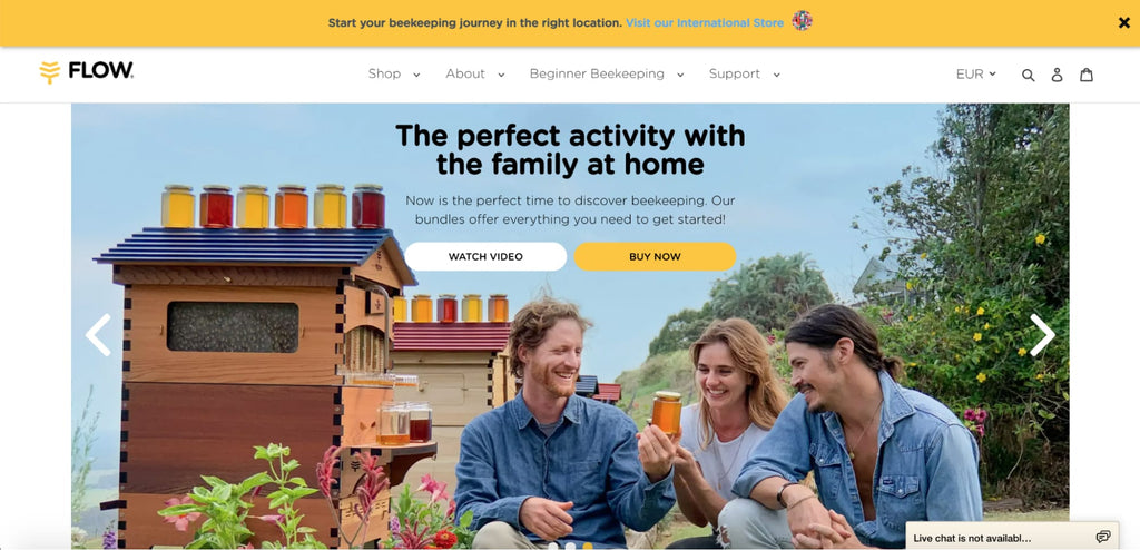

Use of images is a key weapon of Flow. By showing lively pictures of products in daily use, they highlight the connection between consumers and their natural goods. Plus, the lighting is really on point.
Luxy Hair
Luxy Hair sells hair extensions made from human hair, so it’s not a stretch to imagine that most of its customers are women. Since this product has many different variants, the shopper is taken on a journey toward the one best suited for them, first choosing the thickness of their hair, followed by the color, and answering more quiz-style questions.

After answering a series of questions, the shopper is brought to the specific product page containing (ideally) exactly what they’re been looking for.

The pop up notification uses discounts as a direct way to collect customer information. This will also help Luxy Hair play their personalization game at full blast later on.

Testimonials include big names in the beauty industry and photos of customers. What a great way to build trust!
Monk Manual
Half of Monk Manual’s landing thank you page is devoted to their referral program. It clearly sets out the milestones that customers can reach and an end goal of 15 referrals, with all of the benefits that referrers can earn along the way. Laying out the full progression of the program in such a visual way is a great way to get customers on board.

Aside from building their customer base through referral, Monk Manual also adds social sharing buttons to the page. This is powerful because customers might want to flaunt their new purchase, which means more potential new customers for Monk Manual to reach.
Conclusion
Start Creating High-Converting Shopify Landing Pages Today
Shopify landing pages are proven conversion tools that can increase your sales by 160% or more when implemented correctly. Whether you choose Shopify's free built-in pages for simple campaigns, or invest in a professional landing page builder like PageFly for advanced customization, the key is to start testing and optimizing.
Your next steps:
- Choose your method: Free Shopify pages for basic needs, or PageFly for professional templates and advanced features
- Start with one high-impact page: Focus on your best-selling product or highest-value lead magnet
- Test and optimize: Use A/B testing to improve conversion rates continuously
- Scale what works: Apply successful elements across multiple landing pages and campaigns
Remember: The most successful Shopify merchants use dedicated landing pages for every major campaign, product launch, and traffic source. With PageFly's free plan, you can publish your first optimized landing page today and start seeing improved conversion rates within days.
Ready to create your first high-converting Shopify landing page? Install PageFly from the Shopify App Store and choose from 125+ professional templates designed specifically for e-commerce success.
Shopify Landing Page FAQ
Yes, Shopify can create landing pages using three methods: (1) Built-in theme customization features in your Shopify admin, (2) Custom Liquid code for advanced users, or (3) Page builder apps like PageFly, Shogun, or GemPages that offer drag-and-drop functionality and templates.
The main difference is purpose: landing pages are designed for a single conversion goal with minimal distractions, while regular Shopify pages (like your homepage or product pages) serve multiple purposes and encourage browsing. Landing pages typically have no navigation menu, one clear call-to-action, and are used for specific marketing campaigns, whereas regular pages have full navigation and multiple options for visitors.
Yes, Shopify includes built-in landing page functionality through the "Pages" section in your admin dashboard. However, for advanced design flexibility and conversion optimization, most successful merchants use dedicated Shopify landing page builders like PageFly, which offers 125+ templates and drag-and-drop customization.
There are three main methods to create Shopify landing pages:
- Built-in method: Go to Online Store > Pages > Add Page (free, basic customization)
- Liquid code: Edit theme files directly (advanced users, full customization)
- Page builder apps: Install PageFly or similar apps (easiest, professional templates)
Shopify provides basic page templates for free, but they're limited in design options. PageFly offers free landing page templates with their free plan (publish 1 page), while premium templates require paid plans starting at $24/month. The investment typically pays for itself through improved conversion rates.
Absolutely. Custom Shopify landing pages can be created using Liquid code for complete control, or page builders like PageFly for visual customization without coding. Custom pages allow you to optimize for specific campaigns, products, or customer segments.
A landing page focuses on a single conversion goal (email signup, purchase, download) with minimal distractions, while a product page displays product details within your store's navigation. Landing pages typically convert 2-5x higher for specific campaigns because they eliminate competing calls-to-action.
- Free option: Shopify's built-in pages (limited design flexibility)
- Page builder apps: $0-39/month (PageFly: free plan + paid plans from $19/month)
- Custom development: $500-5,000+ (one-time cost for professional development)
- Templates: $0-200 (one-time purchase for premium designs)


