


There is no single correct Shopify banner size, because your theme crops the image to fit its section. For a full-width hero, upload a landscape image about 3000 x 1500 px (2:1) and keep the product, faces and text in the middle third. When we measured Shopify's own Horizon demo store, the same hero image showed as a 2.8:1 strip on a 1440px laptop and as a near-square 390 x 340 block on a phone.
Below you'll find the sizes we measured on Horizon and Dawn on 9 October 2026, Shopify's official upload limits, and a table of sizes for every other image type, from product photos to the favicon.
Key takeaways
- Full-width hero banner: upload 3000 x 1500 px (2:1). That is wide enough for a 1440px screen at 2x pixel density (2,880 px) and loses the least to both the desktop and the phone crop.
- Your theme decides the shape on screen. On Horizon the hero measured 1440 x 519 on desktop and 390 x 340 on a phone. Dawn's "Large" banner measured 720 px tall on desktop and 390 px on a phone.
- Keep the subject in the centre third. On Horizon only about 54% of the image height survives on desktop and about 76% of its width survives on a phone.
- Shopify's limits: 20 MB per file. Shopify's Help Center gives 20 megapixels on one page and 25 megapixels on another, so stay under 20 MP to be safe.
- Square product photos: 2048 x 2048 px, the size Shopify says "usually displays best".
What Is the Right Shopify Banner Size?
A Shopify banner is a full-width image section, usually at the top of the homepage, that sits behind a headline and a button. Themes name it differently: Horizon calls it Hero, Dawn calls it Image banner, and older themes use Slideshow. In every case the theme sets the box and the image is scaled to fill it, with the overflow cut off (CSS object-fit: cover, which we confirmed on both demo stores).
That is why the size you upload matters less than two other things: whether the image is wide enough to stay sharp, and whether the important part sits where every crop keeps it.
Recommended Shopify banner sizes (quick reference)
| Banner use | Upload size (px) | Ratio | Why this size |
| Full-width hero / image banner | 3000 x 1500 | 2:1 | Covers a 1440px screen at 2x density; middle of the range we measured (2.8:1 desktop, 1.15:1 phone) |
| Hero on very large screens (1920px+) | 3840 x 1920 | 2:1 | Horizon's own image list goes up to 3840 px wide; 7.4 MP, well under the limit |
| Separate phone-only banner | 1170 x 1020 | about 1.15:1 | The 390 x 340 box we measured on Horizon, at 3x phone density |
| Half-width banner (2 images side by side) | 1600 x 1600 | 1:1 | Dawn's 2-image banner measured 720 x 720 per image at 1440px |
| Announcement / promo strip image | 2400 x 400 | 6:1 | Thin strips crop hard on phones; keep text out of the image |
These are starting points, not theme rules. If your theme's documentation gives a size, use it. Shopify's own advice is to "check your theme's documentation" and to crop to "an aspect ratio that's close to the shape of the section's image area" (Shopify Help Center, Uploading images).
Shopify Banner Size for Desktop and Mobile: What We Measured
We loaded Shopify's two official demo stores in a headless Chrome browser on 9 October 2026 and measured the banner box at four screen widths. Horizon reported theme version 3.2.0 and Dawn reported 15.0.0.
| Theme and section | Screen width | Banner box (px) | Shape |
| Horizon, Hero | 1920 (large desktop) | 1920 x 636 | 3.0:1 |
| Horizon, Hero | 1440 (laptop) | 1440 x 519 | 2.8:1 |
| Horizon, Hero | 768 (tablet) | 768 x 497 | 1.5:1 |
| Horizon, Hero | 390 (phone) | 390 x 340 | 1.15:1 |
| Dawn, Image banner (Large, 2 images) | 1920 | 960 x 720 per image | 4:3 |
| Dawn, Image banner (Large, 2 images) | 1440 | 720 x 720 per image | 1:1 |
| Dawn, Image banner (Large, 2 images) | 390 | 195 x 390 per image | 1:2 |
Two things stand out. First, the desktop hero is a wide strip, nearly three times wider than it is tall, while the phone version is almost square. Second, the image never changes: the theme simply cuts a different window out of it at each width.
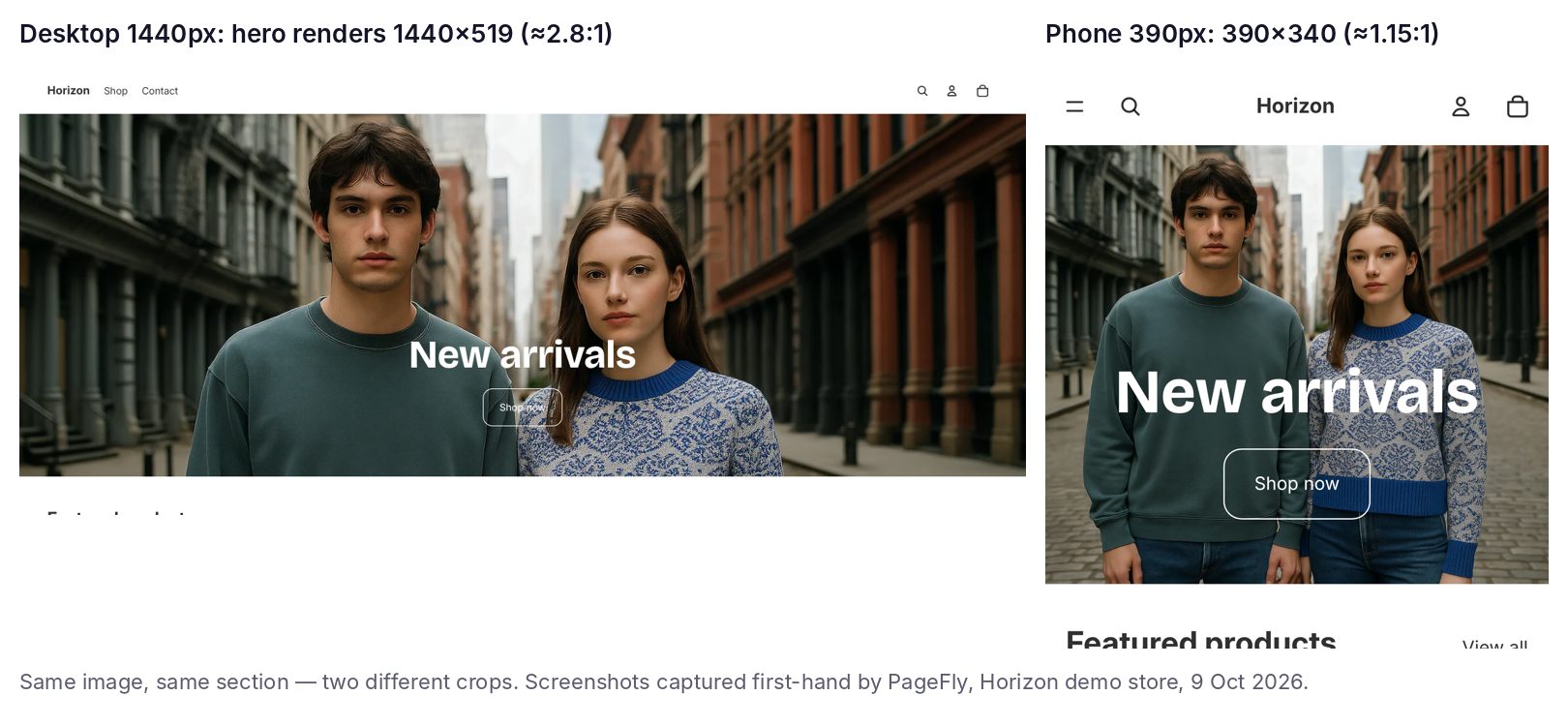
Same Horizon hero, two crops. Captured first-hand by PageFly on Shopify's Horizon demo store, 9 October 2026.
Shopify hero banner size on Horizon
Horizon is one of Shopify's free themes (our Shopify Horizon theme guide covers the rest of it). Its demo hero uses a 3072 x 2048 px source image (3:2). We mapped which part of it each screen keeps, using the focal point the demo store has set:
- Desktop at 1440px keeps the full width but only rows 35 to 1141 of 2048, about 54% of the height.
- Phone at 390px keeps the full height but only columns 295 to 2643 of 3072, about 76% of the width.
- The safe zone, the part that every screen shows, is the overlap of those two areas.
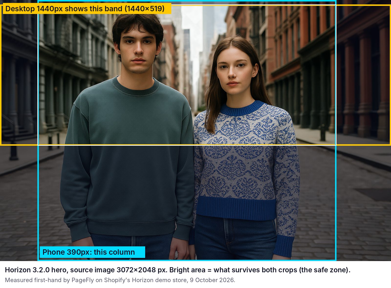
The bright area survives both crops. Measured first-hand by PageFly, Horizon demo store, 9 October 2026.
Horizon also requests a different file width for each screen. Its image list for the hero runs from 832 px up to 3840 px wide, and at 1920px it loaded the 1920 px version. If you upload something narrower than the largest size the theme asks for, big screens get an upscaled, softer image.
Shopify image banner size on Dawn
Dawn's Image banner section has a Height setting with four options: Adapt to first image, Small, Medium and Large. From Dawn's public source code, the minimum heights are:
| Dawn height setting | Desktop (750px and wider) | Mobile (under 750px) |
| Small | 420 px | 280 px |
| Medium | 560 px | 340 px |
| Large | 720 px | 390 px |
| Adapt to first image | Follows your image's own shape, so nothing is cropped | |
Our measurement matched the code: the demo store uses Large, and the banner was 720 px tall at 1440px and 390 px tall on a phone. Source: Dawn section-image-banner.css on GitHub.
If you want full control, pick Adapt to first image. The banner then takes the exact shape of the image you upload, so a 3000 x 1000 image shows as a 3:1 banner and nothing is cut. The trade-off is that the same 3:1 image becomes a thin 390 x 130 strip on a phone.
Dawn also has a Stack images checkbox for banners with two images. It is switched off on the demo store, which is why each photo shrinks to a 195 x 390 sliver on a phone:
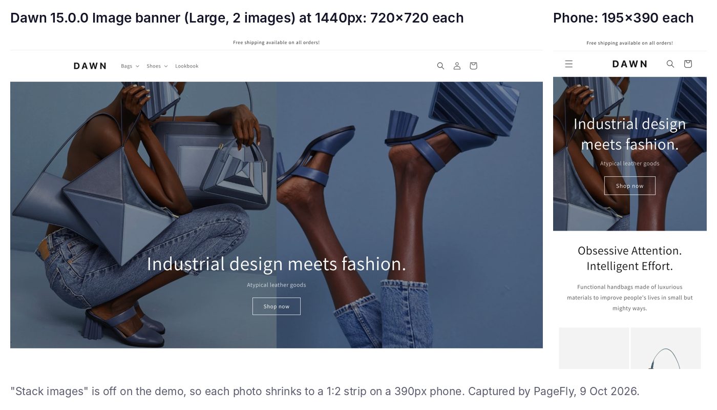
Dawn's 2-image banner with Stack images off. Captured first-hand by PageFly, Dawn demo store, 9 October 2026.
Shopify mobile banner size
On both themes the phone banner was 390 px wide and between 340 and 390 px tall, so roughly square. A wide desktop banner will lose its left and right edges on a phone. You have two options:
- Use one image and design for the safe zone. Put the product and any faces in the middle third of the image, and leave the edges as background.
- Add a separate mobile image if your theme offers that setting. Size it about 1170 x 1020 px for a Horizon-style phone hero.
Shopify slideshow banner size
A slideshow is a stack of banners in one box, so every slide is cropped to the same shape. Use the same size for all slides (3000 x 1500 px works for a full-width slideshow) so the box doesn't jump between slides. Shopify recommends JPEG for slideshows and says images used "for slideshows or backgrounds shouldn't have text in them", because overlaid theme text stays readable when the photo is simple (same Shopify Help Center page).
How to Set a Shopify Banner Up So It Isn't Cropped Badly
This is the routine we use. It takes about ten minutes per banner.
- Check your theme version and section. In Shopify admin go to Online Store, then Themes, then Customize, and click the banner section to see its name and its height setting. To see which theme another store runs, use our free Shopify theme detector.
- Export the image at 3000 x 1500 px (or the size your theme's documentation gives). Keep the product, faces and any text in the middle third.
- Save it as JPEG and compress it to a few hundred kilobytes. Shopify accepts files up to 20 MB, but a smaller file is what makes the banner appear quickly.
- Upload it and set the focal point. Shopify lets you pick a focal point on an image so the important part stays in frame when a section crops it.
- Preview at desktop and mobile widths in the theme editor, then check the real page on your phone.
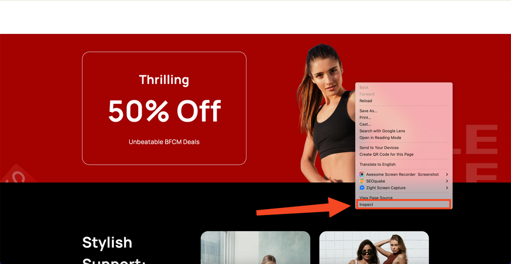
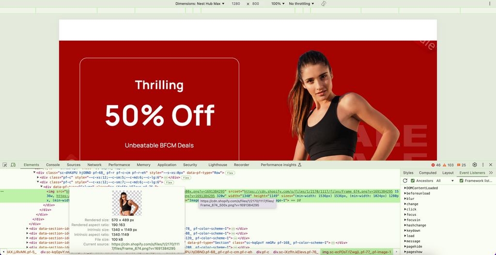
- Measure the result. Right-click the banner, choose Inspect, and hover over the
imgtag to see the size it is shown at, as in the screenshots below.
Step 6 — right-click the banner and choose "Inspect":
Step 6 — hover over the image code to read the rendered size:
Shopify Image Size Limits and Formats
These are the rules Shopify publishes, checked on 9 October 2026:
- File size: under 20 MB (Shopify Help Center, product media types).
- Pixel size: the product media page allows "any size up to 5000 x 5000 px, or 25 megapixels", while the theme images page says uploads "can't exceed" 20 megapixels. Until Shopify aligns the two, keep banners under 20 MP. 3000 x 1500 is 4.5 MP and 3840 x 1920 is 7.4 MP.
- Formats: JPEG, PNG, GIF, HEIC and WebP all upload. Shopify suggests JPEG for product images and slideshows, and PNG for line drawings, text and graphics with transparency.
- Square product photos: "a size of 2048 x 2048 px usually displays best."
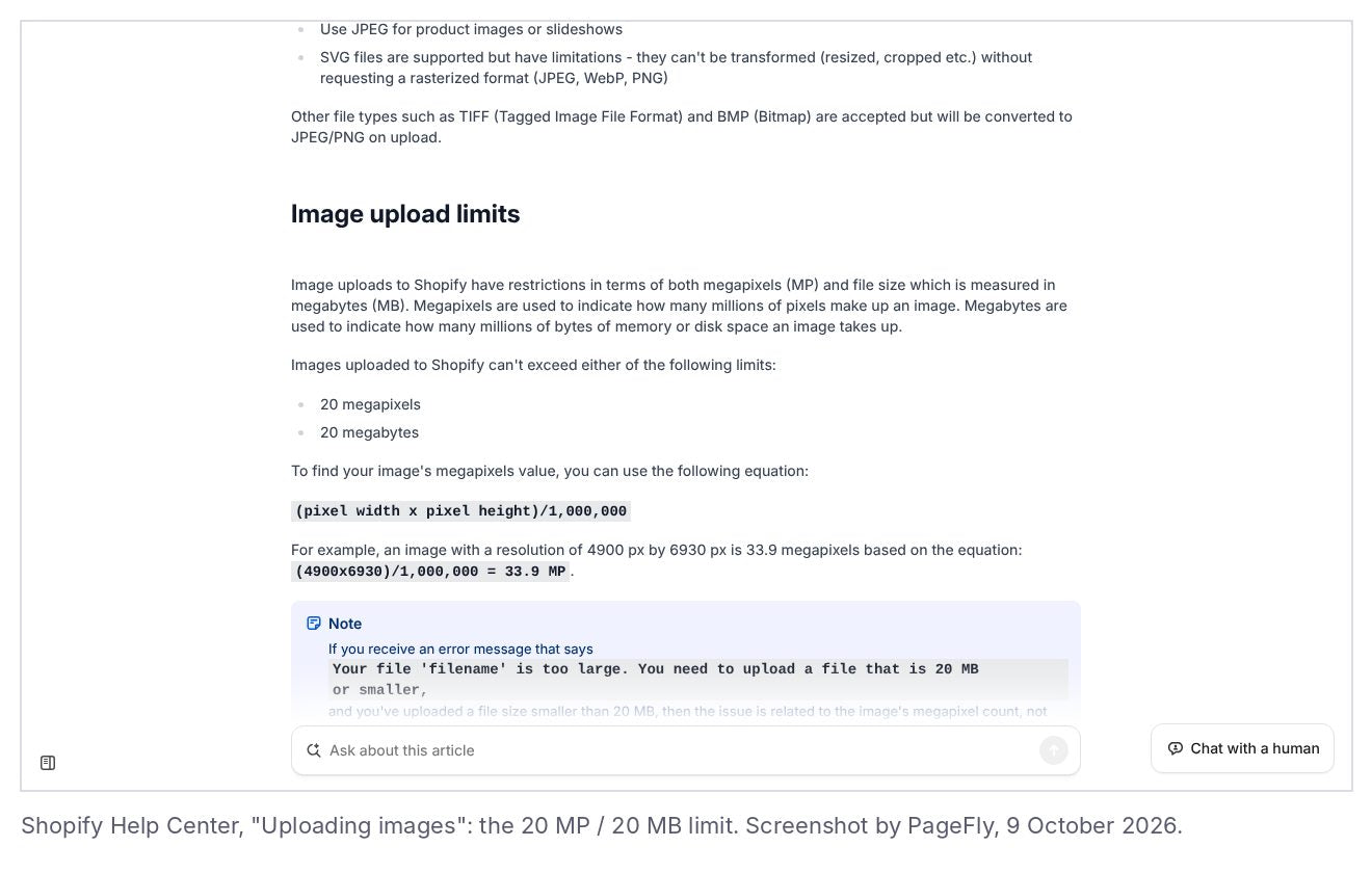
Shopify's "Uploading images" page, checked 9 October 2026.
Shopify Image Sizes for Every Other Image Type
Banners are only one image on your store. This table lists the sizes we recommend for the rest. Shopify publishes an official size only for square product images, so the other rows are our working recommendations, sized at about 2x the space most themes give each image.
| Image type | Recommended size (px) | Ratio | Note |
| Product image | 2048 x 2048 | 1:1 | Shopify's own recommendation for square images; see these product page examples |
| Collection image | 1200 x 1200 | 1:1 | Shown as a tile in collection lists; see collection page design |
| Blog featured image | 1600 x 800 | 2:1 | Also used as the social share image |
| Logo (header) | 500 px wide, transparent PNG or SVG | any | Themes set the display width in the logo settings |
| Favicon | 32 x 32 minimum (upload larger, square) | 1:1 | Shown in browser tabs |
| Background image | 3000 x 1500 | 2:1 | Treat it like a hero: simple, no text |
For the full product photo workflow see our Shopify image optimization guide. If your banner loads slowly, the Shopify speed optimization checklist covers compression and lazy loading.
Need a logo first? Hatchful is Shopify's free logo maker.
Why Banner Size Affects Speed and Search
Your hero banner is usually the largest thing on the screen when the page loads, which makes it the page's Largest Contentful Paint (LCP) element. Google counts LCP as one of its Core Web Vitals and suggests a good LCP is 2.5 seconds or less (web.dev, Largest Contentful Paint). An oversized, uncompressed banner is one of the easiest ways to miss that target.
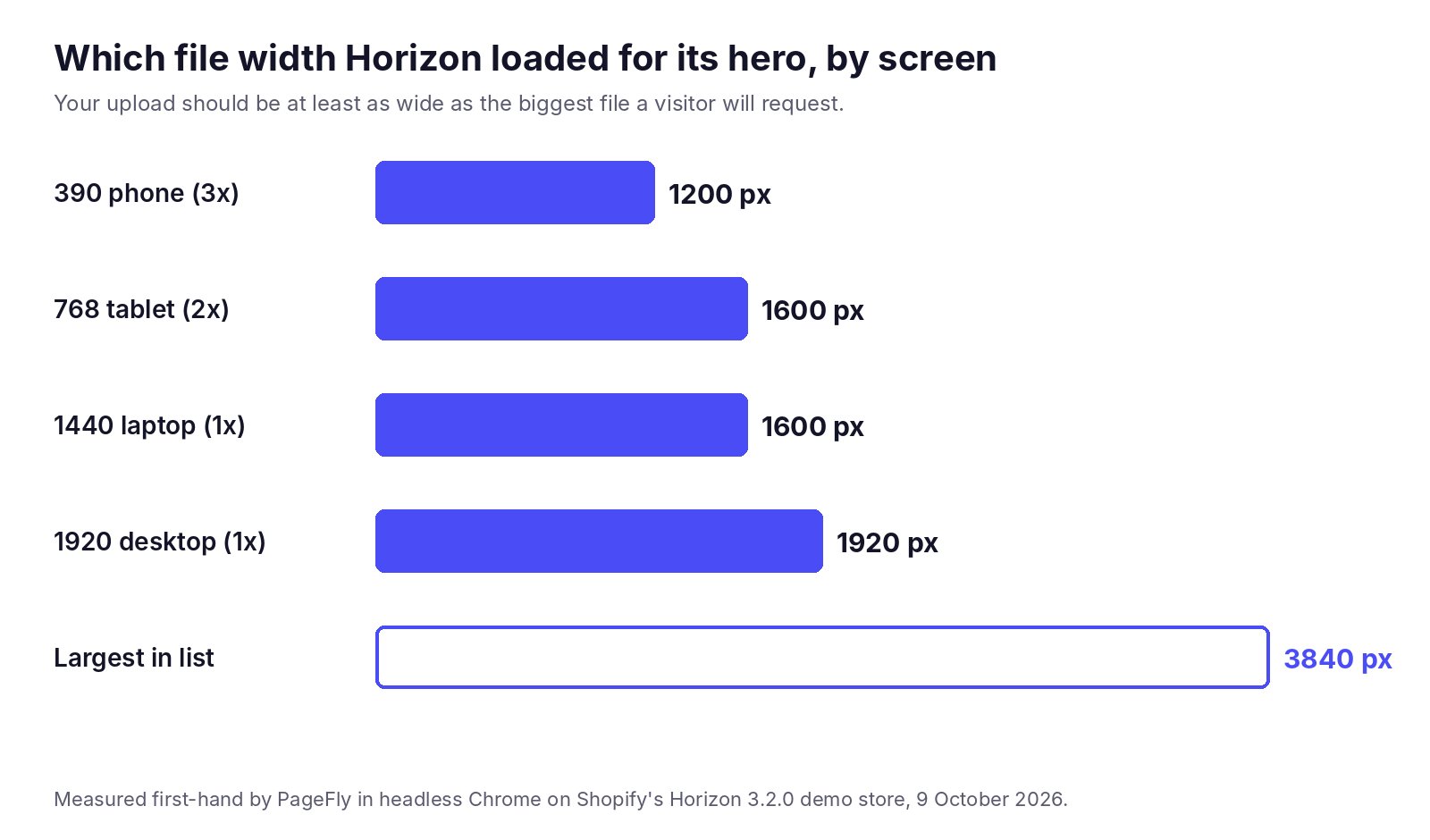
File widths Horizon requested for one hero image. Measured first-hand by PageFly, 9 October 2026.
Shopify helps here: its CDN resizes images on the fly, which is why Horizon could request anything from 832 px to 3840 px wide from one upload. Your job is to upload one good master image and keep the file compact. You can track how the page performs over time in Shopify Analytics.
Build a Banner That Fits Every Screen With PageFly
Theme sections give you one box and a few height presets. If you want a banner with a different layout on desktop and on mobile, PageFly's page builder lets you adjust a section separately for desktop, tablet and mobile, then preview each before you publish. You can start from a ready-made hero in the PageFly template library and compare plans on the PageFly pricing page.
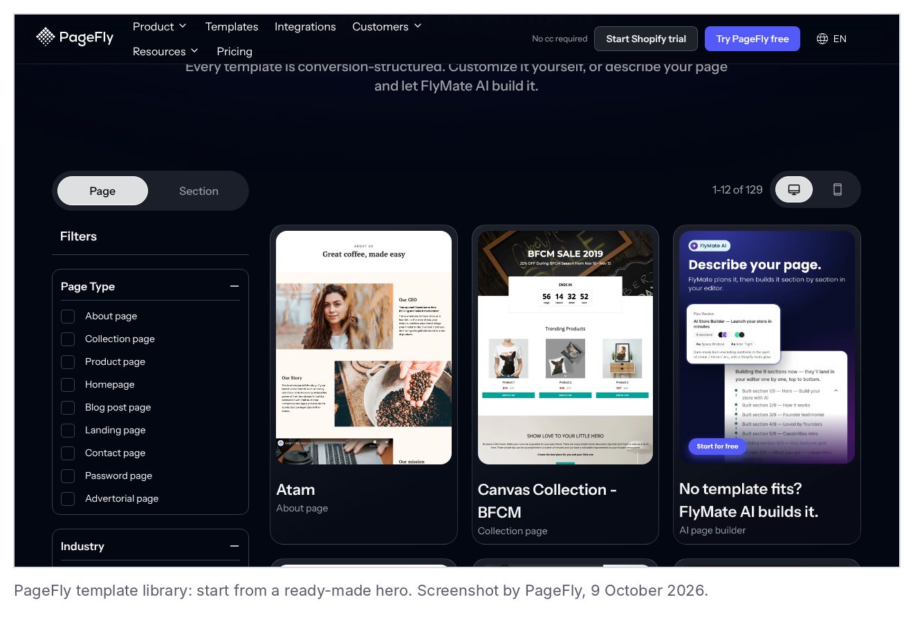
The PageFly template library, 9 October 2026.
Running a campaign? A dedicated Shopify landing page lets you size one banner for one offer, and the PageFly AI page builder can draft that page from a short brief.
For more examples of banners that work, see our round-up of the best Shopify store examples and our guide to designing a Shopify homepage.
Shopify Banner Size FAQ
For a full-width hero or image banner, upload a landscape image about 3000 x 1500 px (2:1). That covers a 1440px laptop screen at 2x pixel density, and the 2:1 shape loses the least when your theme crops it for desktop and for phones. Keep the product, faces and text in the middle third of the image.
Your theme sets the shape, not the upload. On Shopify's Horizon demo store (theme 3.2.0, measured 9 October 2026) the hero showed as 1440 x 519 px on a 1440px laptop and 390 x 340 px on a 390px phone. On Dawn 15.0.0 the Large image banner was 720 px tall on desktop and 390 px tall on a phone. One 3000 x 1500 image with the subject centred works for both.
Horizon's demo hero uses a 3072 x 2048 px source image and loads widths from 832 px up to 3840 px. On desktop it keeps about 54% of the image height; on a phone it keeps about 76% of the width. Upload at least 3000 px wide, or 3840 x 1920 px if many of your visitors use large screens.
In Dawn and other themes with the same section, set the Image banner Height to Adapt to first image, so the banner takes your image's exact shape. In other themes, crop the image close to the section's shape, set a focal point on the image in Shopify admin, and keep text out of the image so the theme's own text overlay does the work.
Shopify accepts image files up to 20 MB. Its Help Center gives 25 megapixels (up to 5000 x 5000 px) on the product media page and 20 megapixels on the theme images page, so keep banners under 20 MP to be safe. For square product photos Shopify says 2048 x 2048 px usually displays best.