Shopify product pages shouldn’t just be a bunch of boring pictures randomly tossed into a gallery.
According to Nielsen Norman Group, half of all online purchases occur within 28 minutes of the initial click, 75% within 24 hrs, 90% by day 12 and the remainder takes more than 4 weeks
Most buying decisions are made in less than 30 minutes. Trust me, it’s shorter than you might think, and plus, it’s super complex. The buying decisions involve a lot of browsing product pages, hopping from one shop to another, comparing, adding stuff to cart and phew, paying.
A product page, therefore, shouldn’t be a turn-off. Instead, your Shopify product pages have to be a shortcut - taking visitors immediately to the add-to-cart and payment pages.
In this blog post, I’ll give you our hand-picked Top 15+ Shopify product pages created with PageFly and why we think they work wonders.
The approach here is that I’ll be a regular customer casually scrolling through the page from top to bottom. Let’s see what makes me (and you) stick around!
Top 15+ PageFly Product Page Examples
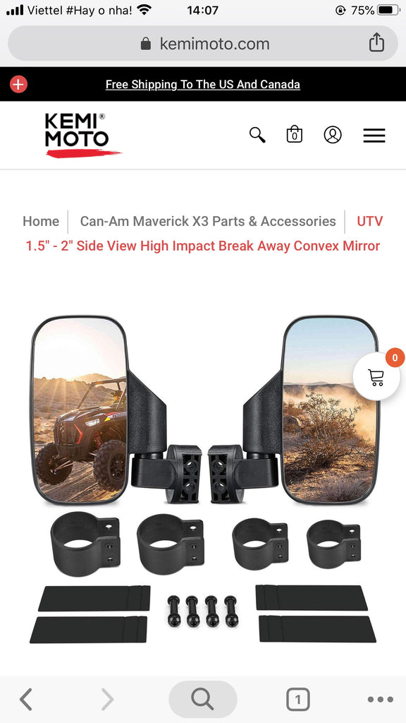
1. Kemimoto
Industry: Moto parts and accessories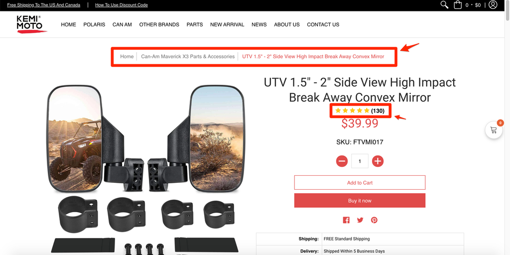
- The upper part of the page is consistent in colour. I like how the brand picks a slightness of red for their logo and keeps it running through texts, social media handles, buttons, etc.
- The navigation pane is clear to...navigate. Knowing where I am on the site can help me easily get to another page and explore more. For example, here I can access the Can-Am Maverick X3 Parts & Accessories collection.
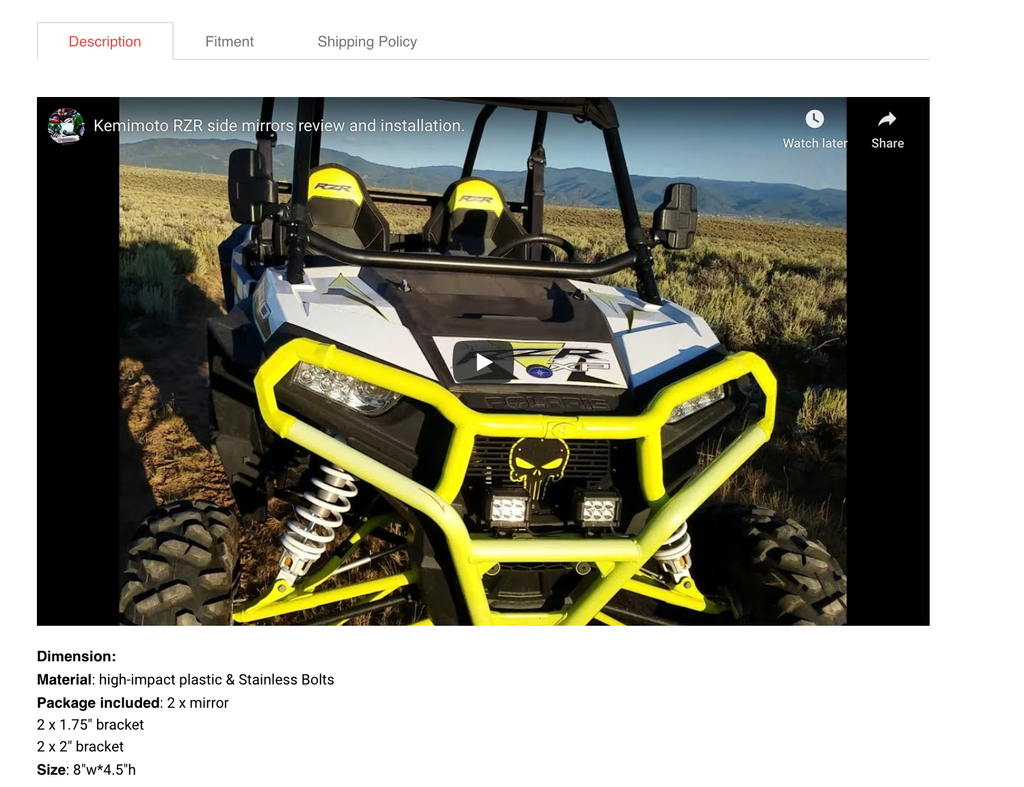
- With regard to premium products, the page goes further than displaying plain details about them. It sells by informing! As I keep scrolling down, I find myself really invested in their detailed description, figment and shipping policy, along with video and animations as cool bonuses.
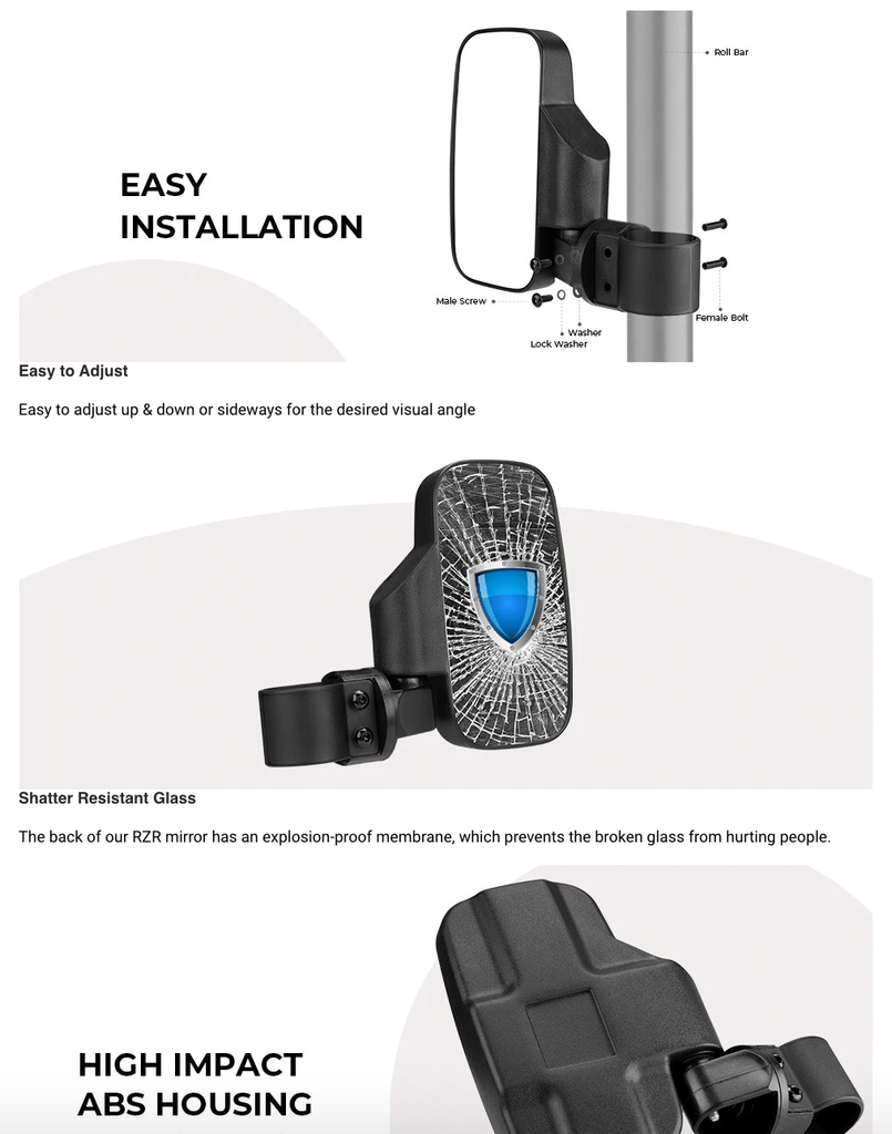
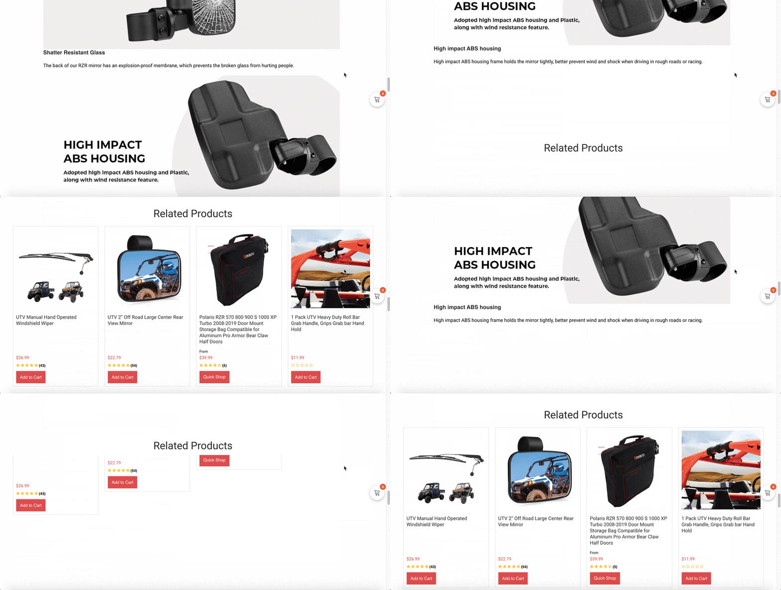
Animation:
2. Business&pleasure Co.
Industry: Beach accessories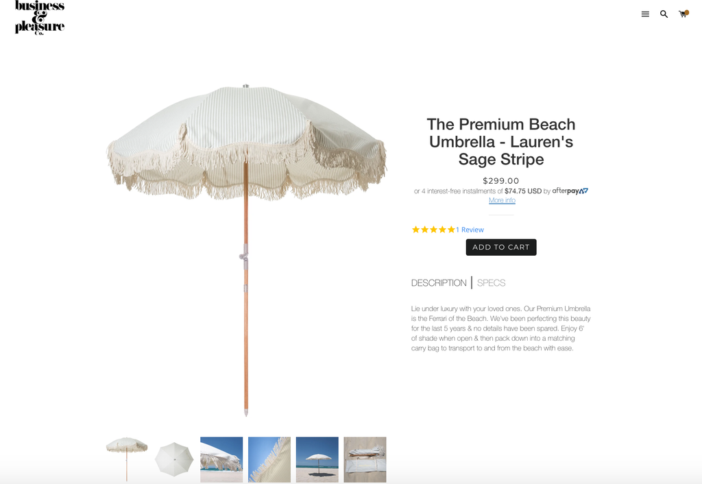
- Information board is split into two pieces: Description & Specs. Just like with Kemimoto, the product overview here evokes emotion while being greatly informative.
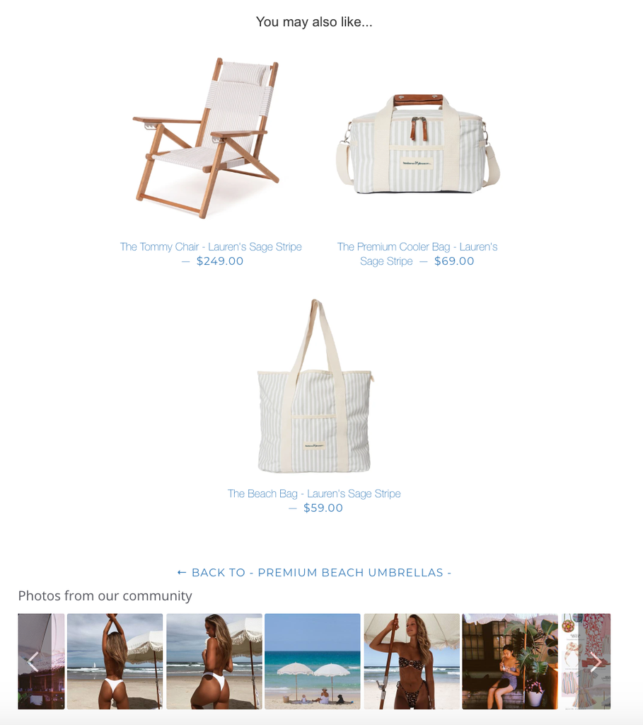
- The ‘You may also like’ list by PageFly encourages beach ladies to explore related products and buy more. At the same time, the navigation pane below helps users return and look at the collection as a whole.
- Credits should go to the built-in Yotpo app on PageFly. By exporting user Instagram pictures into a PageFly slideshows, business&pleasure co. evokes a need to travel, be free, and look good, targeting almost all the ladies out there.

3. Char Griller
Industry: Grills, smokers, and accessoriesKey takeaways:
- In times like these, I miss going out with friends. I visit Char Griller and I just love how they convince me that I’m going to have a great time once the coronavirus crisis is over. It starts with the red colours sprayed all over the place and the pictures of food.
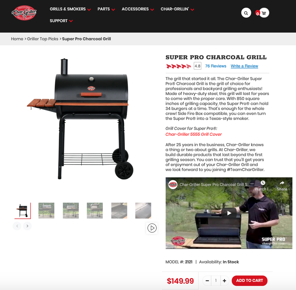
- The product's main image is accompanied by a series of food photos and parties alike. The product description also goes beyond lengthy words with an instruction video.
- A link to the related product (Char-Griller 5555 Grill Cover) is a see-more trigger.
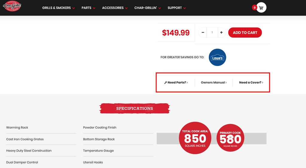
- Three calls to action at the end of the description separately direct customers to their supporting sites - the ‘Need parts’ and ‘Need a cover’ calls take you to a collection, while the other takes you to a manual.
- Merchants can use HTML/Liquid element to display custom content on the live page with code from outside
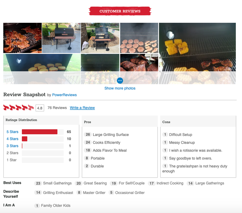
- What’s the lesson here? Ask yourself what you SUBTLY want to see on a product page. Is it just the product itself?
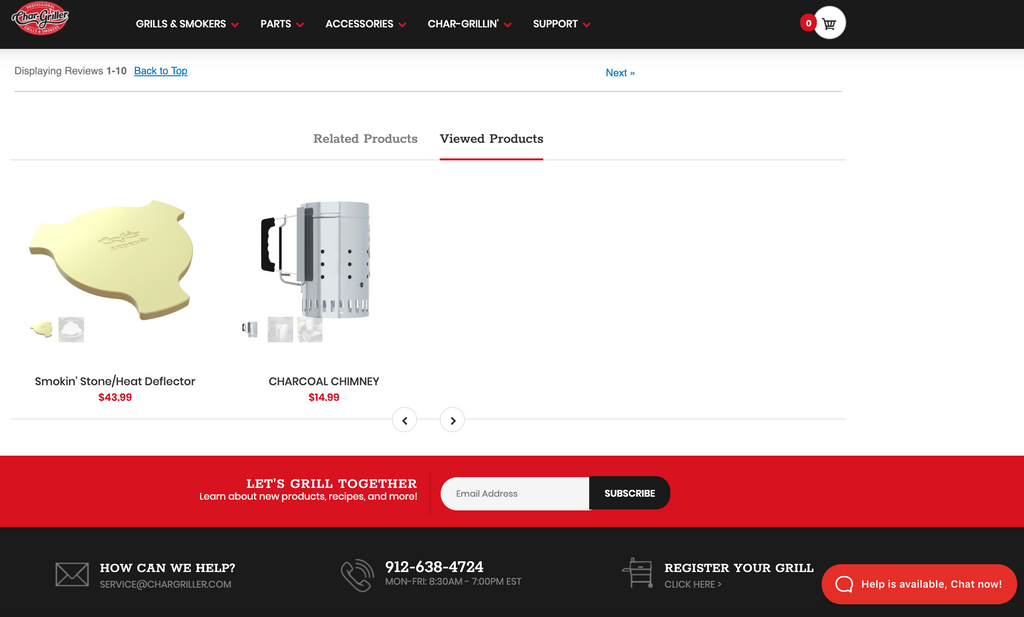
- An add-to-cart button is rarely enough. Sometimes customers might skip an opportunity and will later want to turn back time and make a better choice.
- By referring to Wiser directly in the PageFly editor, you can easily showcase personalised product recommendations to every shopper
- The ‘Viewed products’ tab allows them to do just that.
4. Mdrive
Industry: SupplementKey takeaways:
- Probably one of those few product page examples that make medical information exciting to follow.
- From head to bottom, Mdrive drives attention to their important information blocks by making the best use of PageFly animation.
- ‘Flash’, ‘fade-in’ and many other effects all come into play

- The supplement bottle box can be viewed from all angles thanks to the vertical image list on the left. Showing the packaging this way can help potential buyers take a closer look into the elements contained in the medical product.
- Nothing pushes customers away harder than a vague brand promise, especially when it comes to medication. Clear illustrative images with links to explanatory pages are how Mdrive proves themselves trustworthy.
- Although more or less different in their design, those pages are developed on the same flexible basis of PageFly regular page type.

- Some more trust elements
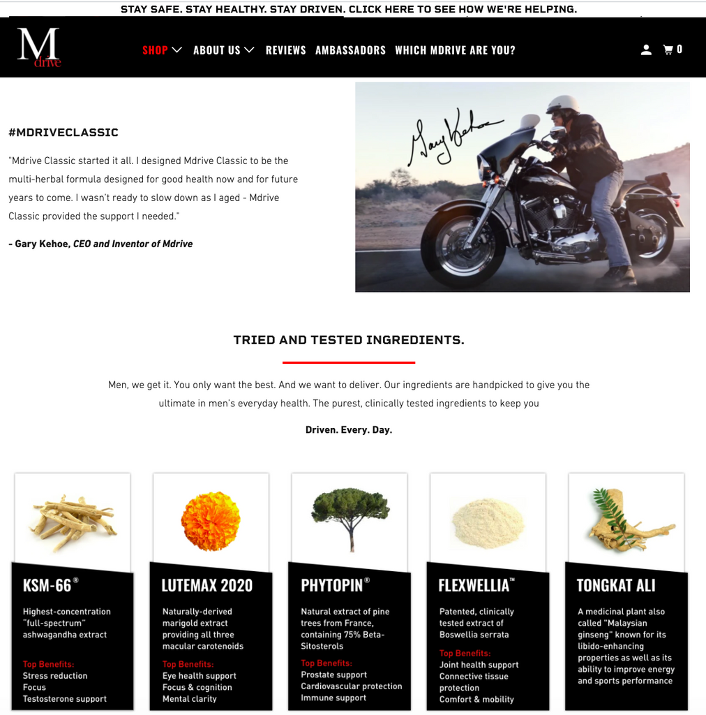

- Don’t forget that you always have PageFly’s built-in third-party apps to keep you company. In this case, a review section is transparently displayed in full to make the page look more convincing to visitors.
5. Gabriel Ash
Industry: ArchitectureKey takeaways:
- If you are looking for minimalism Shopify product page examples, this following product page is a great demonstration. The store owners come from an architectural background, and it’s quite obvious that they have racked their architecture brain into organising their pages as well.
- Heads-up: Gabriel Ash sells real housing models (houses, buildings, etc.). The price range stays undisclosed, which is reasonably native to this niche. All touchpoints here, therefore, should lead to a potential person-to-person discussion.
- The banner leads to a brochure order page
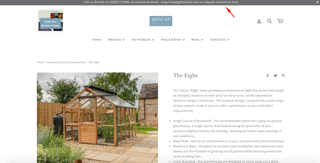
- Many elements (‘form’ included) can be inserted inside a PageFly ‘tab’
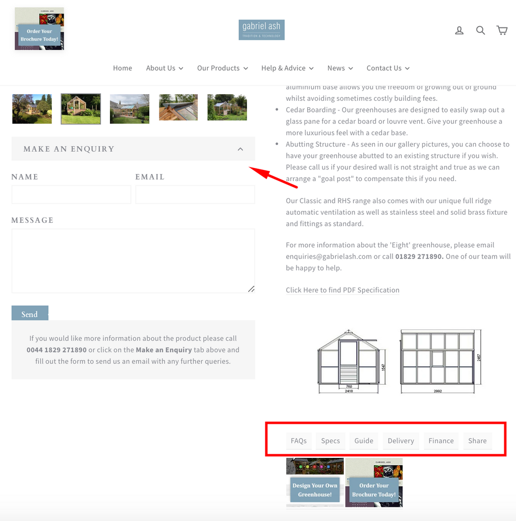
- A pop-up bubble in the related products makes the whole page look more animated. For me, I like the two suggestions below better - call-to-action buttons against the backdrops of poetic models.
- Just like designing an artistic magazine, PageFly gives users the flexibility to customize their pages. As long as you have a concrete idea in mind, the best Shopify page builder will help you refine the visualisation to its best.
6. Activ 5
Industry: Health, training productKey takeaways:
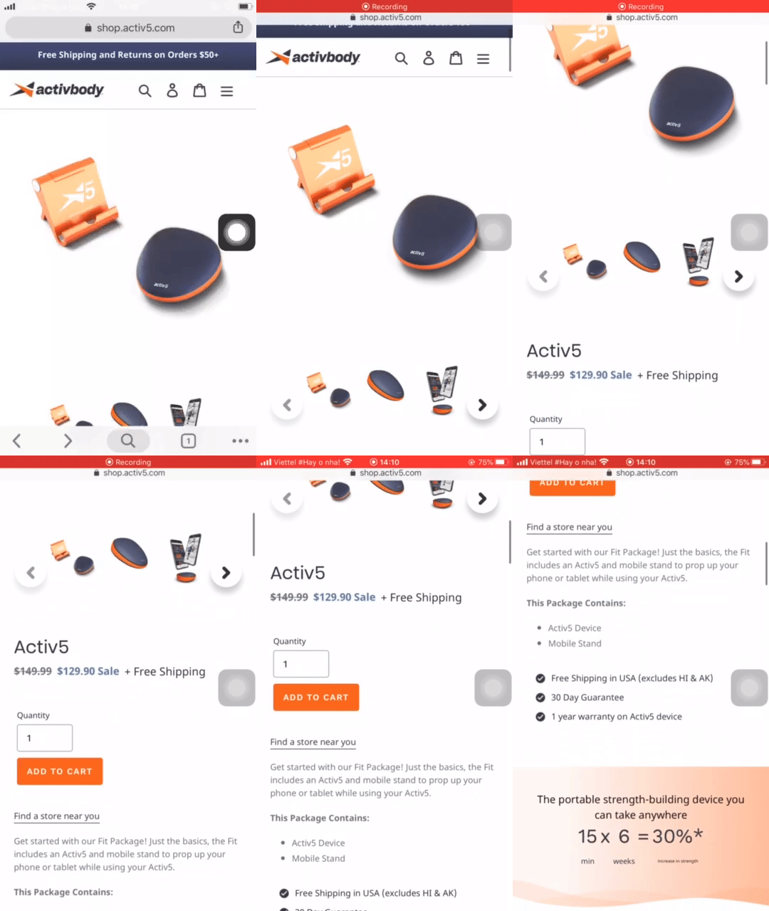
- Before we dive into one specific product, it should be noted that there are only 5 product items on display. The owners really took their time to curate unique content for each of them.
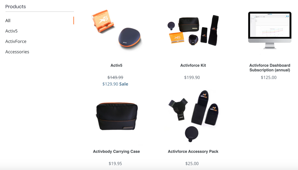
- Product details with sales items and slideshows of related products

- Two sections dedicated to benefit package and testimonials
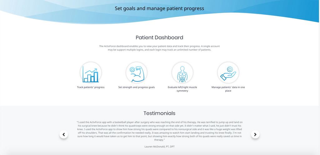
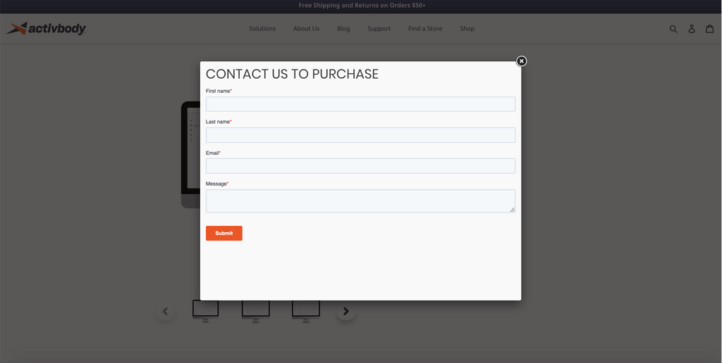
- Now let’s look at some key takeaways from each product page. For products that come in great price or comprise smaller product units, a call-to-action button to a contact form is a good option - a sales & marketing funnel, that is.
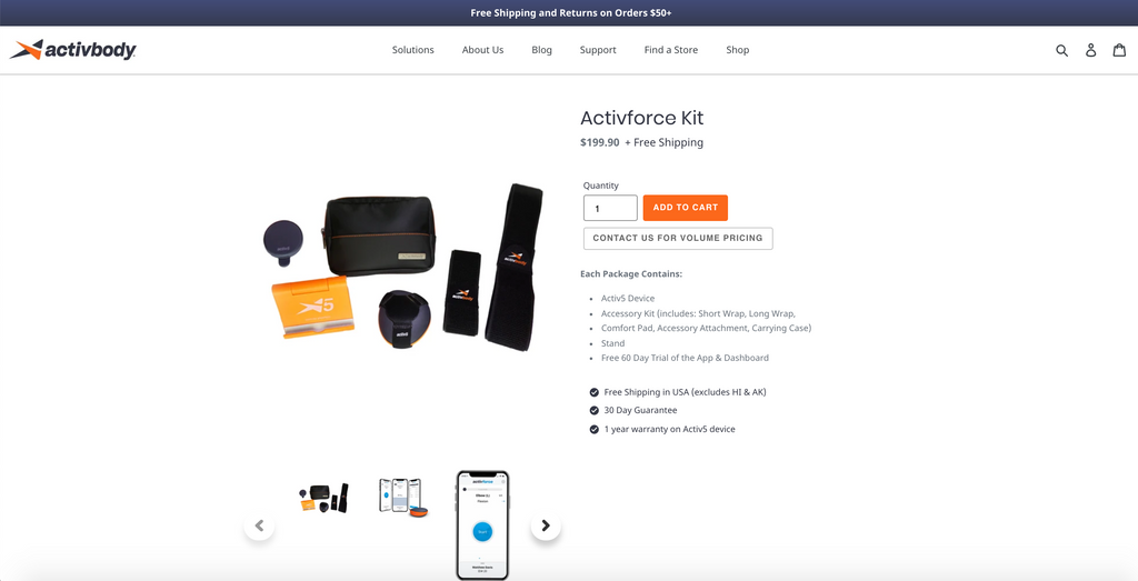
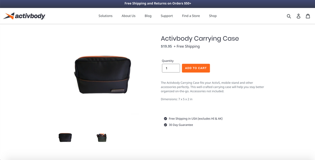
- For a costly tech product, having a physical store is important as your customers might want to drop by and get their hands on the product. You can attach the link to it in the description, just like Activbody.
7. Ruffnek
Industry: ApparelKey Takeaways:
- The fly-up animation can be activated anywhere from the PageFly editor, right from the moment you enter the page. Yet, the load speed doesn’t take long.
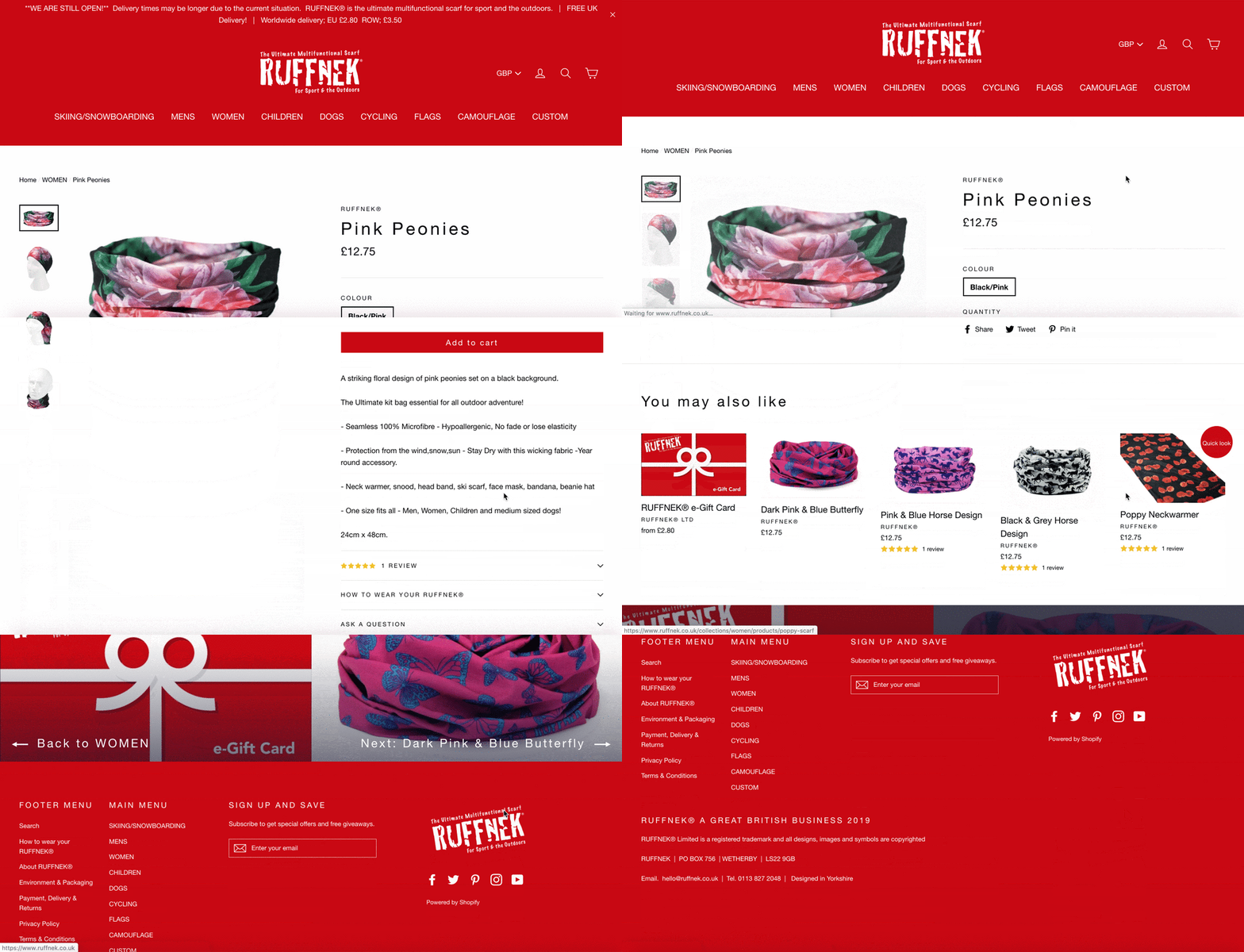
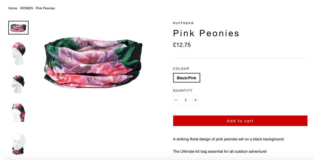
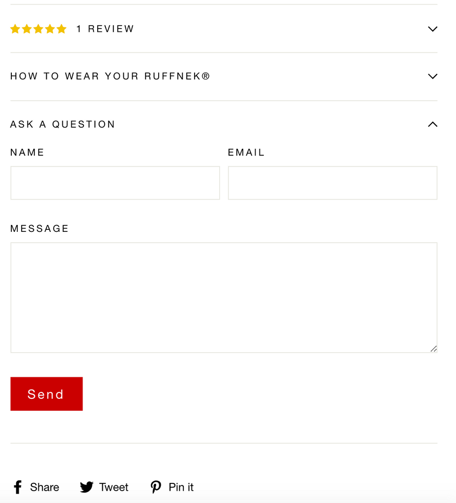
- Unlike other pages above, the product pictures here are put in vertical arrangement.
- The three accordions
8. Wildbounds
Industry: CampingKey Takeaways:
- The same vertical arrangement applies to camp supplies by Wildbounds. Merchants can learn from this structure to highlight the product height.
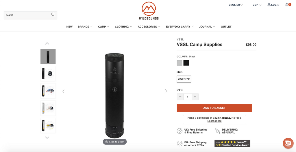
- One thing to note: Selecting a product colour will open a new page, which means it will take some time to load. I would recommend they make it a product variant to limit page switching time.
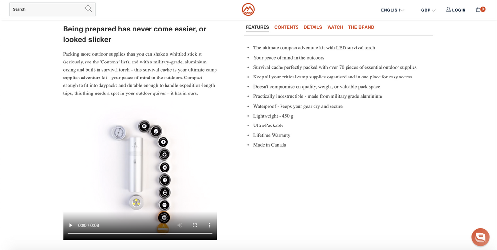
- Here comes another product video
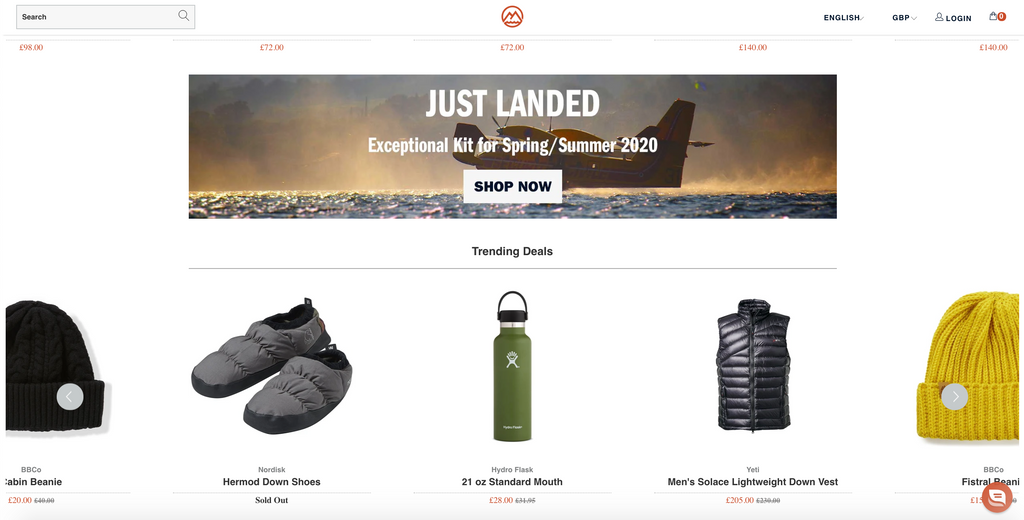
- Unlike above banners, Wildbounds put their promo banner in the middle of the page. This is to feed customers information as they start to look for other products. The Shop Now Button will direct you back to new products, and the shopping cycle will start over smoothly.
9. Artiplanto
Industry: PlantKey Takeaways:
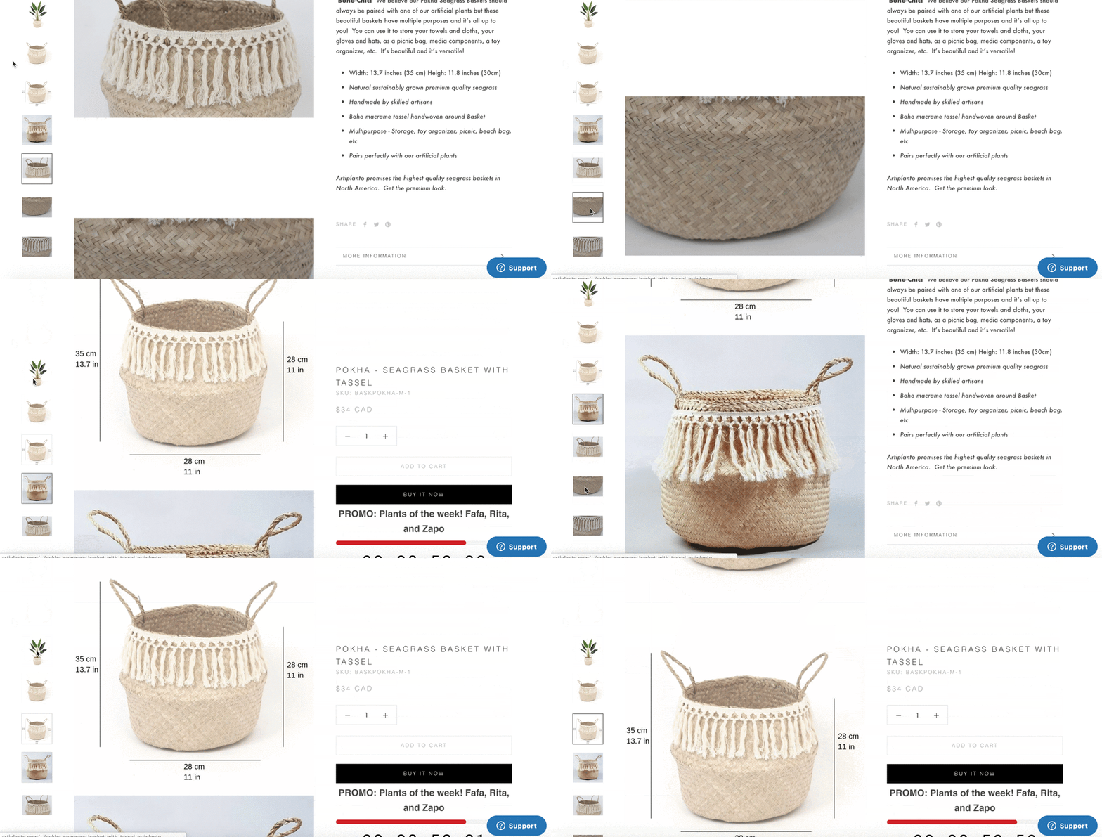
- I know I’m talking quite a lot about vertical arrangement and how it helps you focus on the height of your products. However, Artiplanto uses their tasteful eyes to engineer it a bit differently.
- The product images slide up through every scroll.

- Interestingly, when you click on a picture, it will auto-scroll to the corresponding image. This can be achieved by using Attributes and ‘sticky sections’
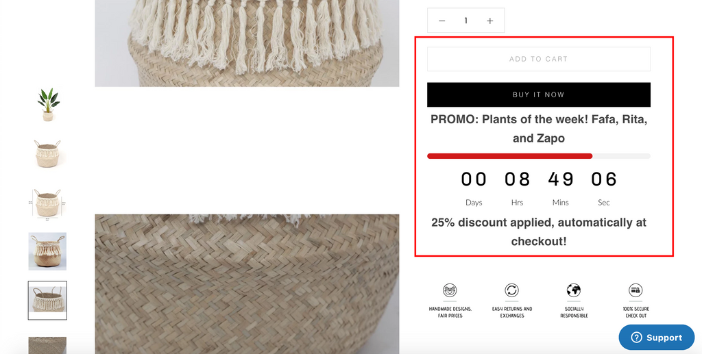
- Don’t forget the countdown timer for the FOMO effect.
10. Waterdrop
Industry: BeautyKey Takeaways:
- The product page is as beautiful as the product itself.
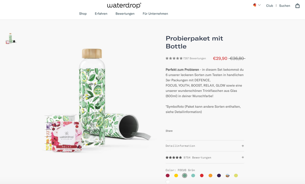
- The product comes in 10 colours, or 10 product variants. By using product variants, Waterdrop product pages take a shorter time to load than those of Wildbounds.
- The store merchant seems like a big fan of slideshows. Product presentation, achievements and reviews - it all comes in slides. All it takes is a drag-and-drop from the PageFly element list.
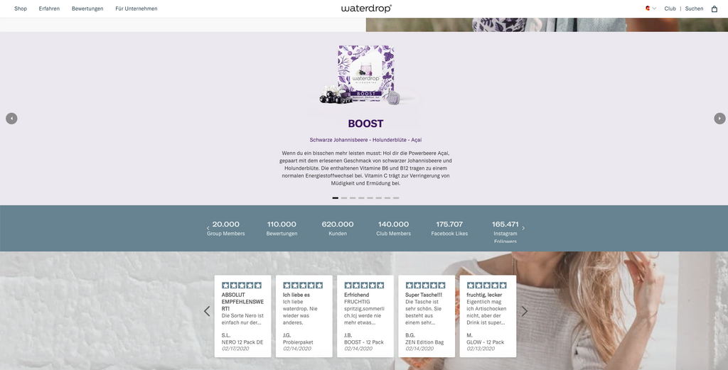
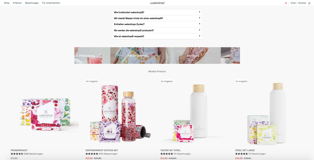
- Apart from the useful accordions and sales items, a banner of beautiful collections will urge users to click and see more.
11. Magjustable
Industry: Clothing AccessoriesKey takeaways:
- This product page is well-designed with a clean layout and attractive product images that showcase the hat's features. The color scheme is also pleasing to the eye and matches the product well.

- The Accordion layout created with PageFly makes it easy for customers to take an eye on all product features. The benefits of these features are also emphasized, which could be useful for potential customers who are looking for a practical and functional hat.

- The transparent layout of your product is definitely eye-catching and unique. It's great that you're able to showcase the quality and features of your product in such a visually appealing way.

- They also feature their social media channels on the product page making it easier for customers to get bound with their brand.

12. tradienet.
Industry: Digital Marketing for Trades and ContractorsKey Takeaways:
- The store owner with his professional background of building business' and associating websites, he also loves design, so he created product pages with the main layout style is one long page layout. One long page layout has a lot of pros like simplicity, easy to design and creative but still provide customers with all needed information.
- The clever incorporation of accordions into a product page effectively organizes the extensive amount of information, resulting in a clean and user-friendly layout that prevents the viewer from feeling overwhelmed while accessing the content.
- The product page invests in good product imagery and keeps the product page layout design minimal by using a vertical collapse layout. This way, customers can focus on the product at first, then, when they decide to buy or need some extra information, they can easily find it inside the collapsed accordion.

13. The Brick Business Fleet
Industry: Transport solutionsKey Takeaways:
- The store owners come from a design background, especially in manufacturing, so that the store layout is quite minimalistic and easy to grasp the highlights of the product, like the products they are selling.
- They use color swatches function on the product page, even though the product has only 1 color, this makes the site more professional. In the future, if the product has more than 1 color, using color swatches will be more effective because customers will not waste time choosing colors in the dropdown and remembering colors because they only need to observe the color swatches displayed directly on the screen.
- By showing many product options, customers will have more choices when visiting and buying the product. This is an effective way to sell and help increase sales.

- The Brick and Business Fleet always dedicates a separate section to display the specs and of the product. Using PageFly's Click Action feature, they provide a product brochure that just clicks a button and the brochure will appear.

14. Joile Clinic
Industry: Beauty and skincare
Key takeaways
- To ensure maximum clarity and readability, Joile Clinic employs a combination of bullet lists and accordion element to show the product information in product descriptions. This approach ensures that customers can quickly grasp the essential details while also having access to more comprehensive information when desired.

- Joile Clinic enhances the shopping experience by implementing upselling and cross-selling techniques on the product pages by showing the product list below the main product. This strategy allows customers to explore additional options and discover complementary products.

- CTA are designed to capture interest and motivate customers to take action. This inspires customers to book their desired treatments and experience the luxury of Joile Clinic.

15. PeakPlace
Industry: Outdoor and Adventure
Key takeaways
- PeakPlace added the sale banner on the top of the product page to attract attention, create a sense of urgency, and enhance the perceived value of the product. It can effectively drive conversions and encourage customers to make a purchase.

- PeakPlace has strategically emphasized the product price, ensuring it is easily noticeable and accompanied by a comparison to the original price. This prominent display of the product price is designed to attract visitors effortlessly. Furthermore, the clear visibility of the price allows visitors to evaluate this crucial aspect of the product with ease.
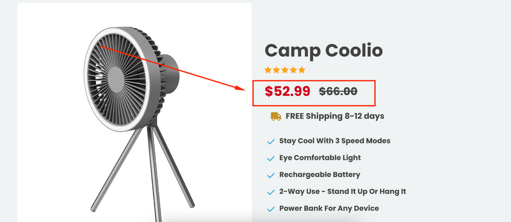
- PeakPlace showed the both user rating average and customer reviews to increase the trust for the product


16. Infraheal
Industry: Medical device
Key takeaways:
Being in our list of product page examples, INFRAHEAL used many product images from multiple angles. This store even provided image on a human model to facilitate a visual evaluation

By adding prominent and engaging CTA buttons on the product page, such as "Add to Cart" or "Buy Now," with contrasting colors that stand out, INFRAHEAL can attract visitors and encourage them to take action

INFRAHEAL highlighted product benefits using a content list element to create visual hierarchy, memory retention and readability that can enhance user experience, and improves the chances of converting visitors into customers.
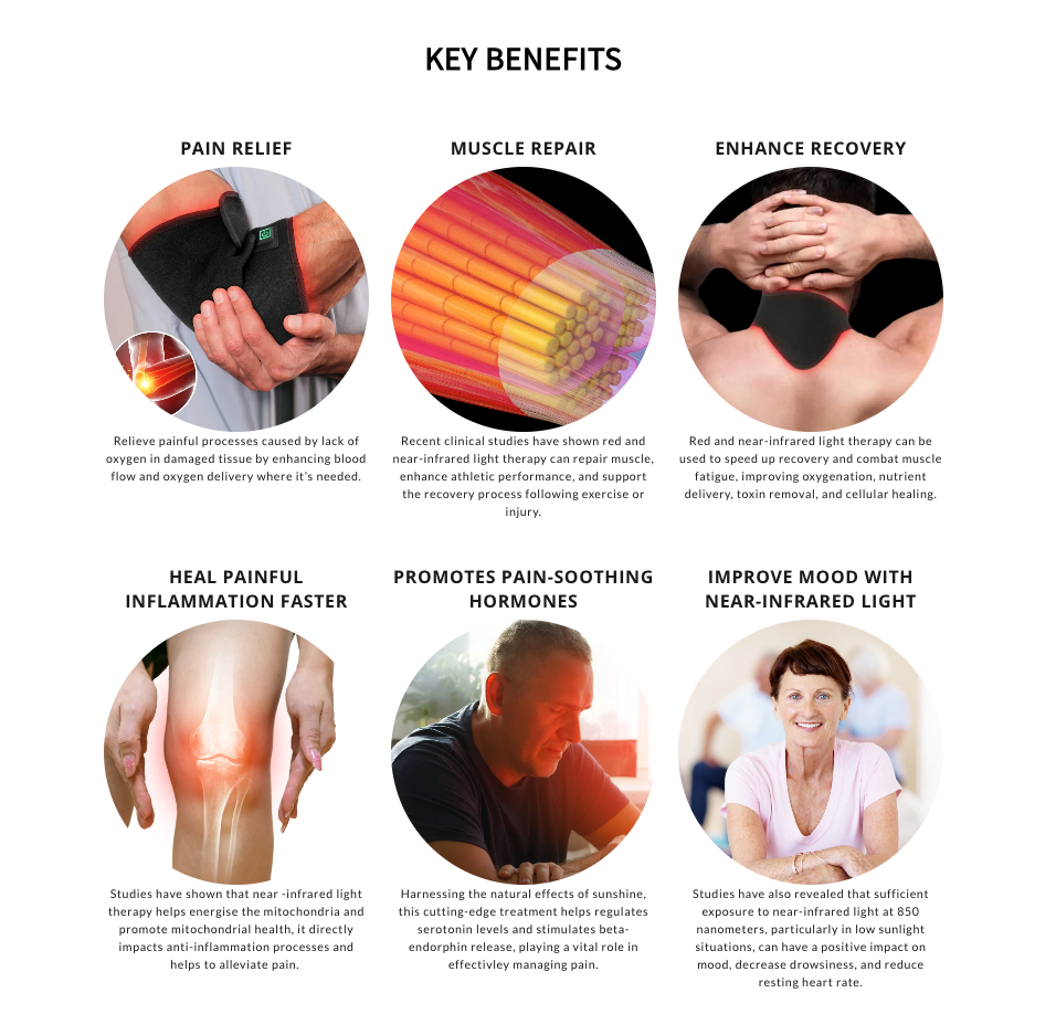
INFRAHEAL showed the both user rating average and customer reviews to increase the trust for the product

17. Feelou
Industry: Maternity Wear
Key takeaways:
- Like other product page examples, Feelou utilized numerous product images captured from various perspectives, including an image featuring a human model, aiming to enhance the ease of visual assessment.

- Combining the list element and accordion element, Feelou presents product details and additional information in a coherent manner, addressing varying reader preferences and promoting a comprehensive grasp of the product's attributes and advantages.

- Feelou employs the content list element for a seamless display of trust badges. This includes incorporating security seals, shipping guarantees, and payment icons that enhance credibility, trust, and conversion rates.

- Adding the testimonial section in the product page, Feelou showcases real customer experiences, building trust, and influencing potential buyers with valuable social proof.

18. WEKAY
Industry: Beauty and Personal Care
Key takeaways:
- WEKAY uses swatches as the selector for color variations provides a visual and intuitive way for customers to choose their preferred product options.

- WEKAY strategically highlights the product price, making it easily noticeable and providing a clear comparison to the original price

- WEKAY employs accordions to construct an FAQ section, aiding customers in clarifying their questions

- WEKAY utilizes the progress element to effectively present additional statistics for their product. This approach is ideal for conveying information and can significantly boost conversion rates.

Wait, so what now?
Let’s agree on the fact that the main function of a product page is to define products with images, details, price, ATC button, etc, thereby motivating customers to make a buying decision.
If you’re designing best product pages for your clients, you know it is easier said than done! Our top Shopify product page examples stick to the rules of a standard product page. Moreover, each product page design inspiration simultaneously creates novel things by making the best use of PageFly additional features.
Note: We have a diverse team of marketers and developers to support your work
Brush up on some following pro tips before you go!
Tips to Create Best Product Pages
Use Video on PageFly Product Page
Should you use a video on a product page?
Yes x3000 times! Each PageFly product page template uses video element to leverage the best visual aids.
A product video is an explanation video that effectively demonstrates the benefits of a product.
If the pictures and descriptions provide a theoretical relevance, a video is where customers can see the product in use and in motion.
Pro tip: While many product videos focus on the features of the product, let’s concentrate on how the product relieves the pain points these customers may encounter.
Use PageFly Lazyload to Optimize Loading Speed
What concerns most merchants about an interactive product page is the load speed.
How can you create moving effects on so many different PageFly page types without compromising page performance?
By using Lazy-load for your page, we can see 10-30% of reduction in the page loading time.
Use a PageFly Product Page Template for Mobile Mentality
Being mobile-conscious should just be common sense in this digital era. Jumping from store to store now only takes a single touch on the screen, making it easier for customers to quit halfway through browsing.
Learn how to design a product page compatible with various devices here
You can use any PageFly product page template to ensure mobile-friendliness in your store. Our 100+ templates are optimized for mobile responsive.
That’s it for the pep talk. Now it’s time to break all product page stereotypes using PageFly!
One last thing: If you’re setting up a Shopify client store using PageFly, you might be interested to know you can earn extra money with the PageFly affiliate programme. Whether you’re a freelance Youtube content creator or an agency, the programme is equally beneficial to any of you.





![How To Sell Customizable Products with PageFly & Zakeke [Tutorial]](http://pagefly.io/cdn/shop/articles/sell-customizable-products.jpg?v=1613966169&width=1640)


