One of the strongest weapons in your arsenal for creating conversions on your site are landing pages. Whether it’s more leads or product sales, a well-designed landing page can take our business to the next level.
A landing page on your eCommerce site can be a homepage, coming soon page, product page or even a well designed About Us age. But it’s safe to say that for the most part, they’re used in eCommerce to capture sales from the product page.
However, if it doesn’t convey your message properly, it will only cripple your efforts and confuse your readers. Or worse, make them completely lose trust in your brand.
You see, the psychology of sales has changed.
Up until recently, old-school sales techniques could still be used due to their relevance and deep rooting in human psychology. But in 2021….
Old-school sales techniques are as dead as a doornail.
Shoppers are savvier than ever. They’re smarter and also more aware of being scammed. In addition, finding a competitors product for a cheaper price is just a click away on Google. Here’s what Forbes had to say on the matter.
“The traditional practice of sales as a business discipline has become at best ineffective, and in many cases flat out obsolete.” - Forbes
The hard sell is dead. And dying along with it is the urgent sell.
It’s also not enough anymore to simply state the features and benefits anymore. Even price point is becoming less of a consideration in 2019. If the pain is strong enough, no price is too high.
So how do you stand out in your marketplace and capture sales without coming across like a pushy used car salesman from the ’70s?
You need to be radically different from your competition.
Not better, but different. Find your prospects pain, and guide them to the conclusion that you’re the right person to solve their problem.
This can mean simply taking a new angle towards your marketing approach. When M&M’s were struggling to differentiate themselves from other confectionary companies that offered a similar product, they created a motto that gave them the perception of being different, without actually being so.
“M&M’s melt in your mouth, not your hand”. What they did here was simply state a benefit of the product that no other brand had thought of stating. Other products did the same thing but failed to mention it.
Try and look for new angles to market your brand and stop competing on price and benefits.
If you’re using a page builder like PageFly, you have even more opportunity to do so by fully customizing your website, breaking the limitations placed on you with your default Shopify theme. Check out these Shopify collection page designs.
I’m going to show you great landing page examples built with PageFly ecommerce conversion rate optimization solution, and then give you some tips on how to not come across pushy in your attempts to create conversions.
I. Top High Converting Landing Pages Built with PageFly
Joile Clinic


Joile Clinic utilizes an enticing design by incorporating the luxurious combination of gold color against a black background. This visually appealing color scheme conveys a sense of elegance and sophistication, effectively capturing the attention of visitors.
The gold accents against the black backdrop create an alluring atmosphere that draws individuals in, generating a strong attraction to Joile Clinic's brand.
Feelou

Feelou employs a palette featuring the distinctive pink color, with sections seamlessly organized to showcase comprehensive product information, while also offering a space for customers to subscribe via email for updates.
The minimalist design is not only visually attractive but also remarkably transparent, guaranteeing a smooth experience for their clientele.
Brightgreens
Beth Macri

Blue Coolers
WEKAY
WEKAY persists in using the PageFly template to craft their About Us page. This template, specifically tailored for beauty products and personal care, boasts professional design elements. The incorporation of lively animations ensures that information is presented in an engaging and visually appealing manner.


Bright Greens
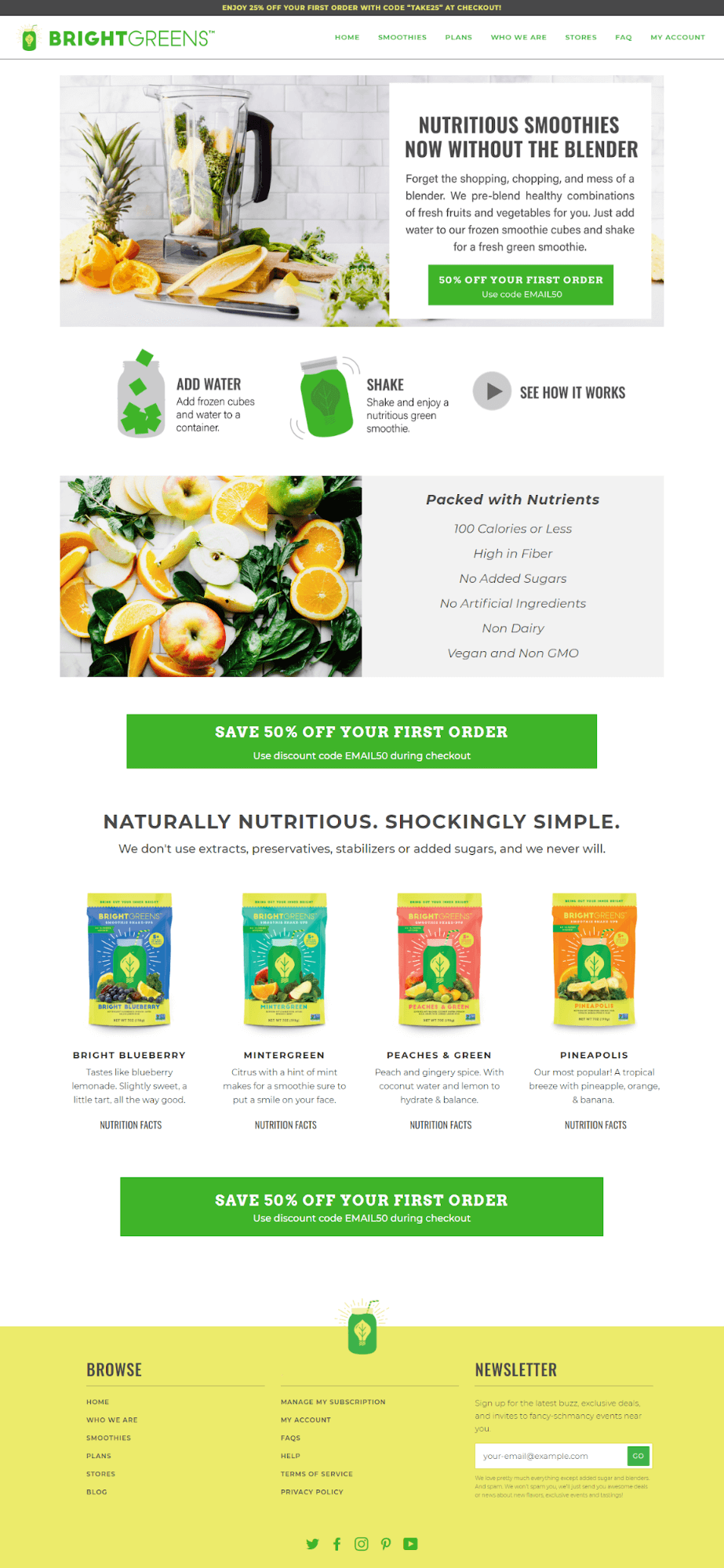
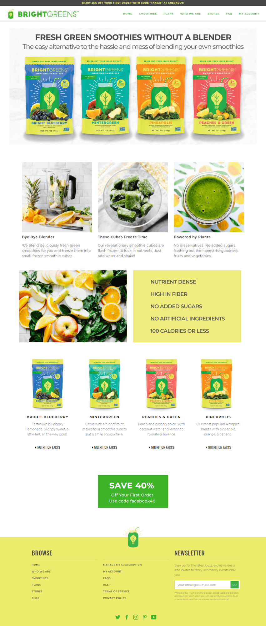
Bright Greens make the list again because they’re doing what any good brand does, creating different landing pages for different campaigns. There are a few benefits to this.
You can split test which landing page performs better and, you can target different audiences in your ads to test which buyers are more interested in your product. Data like this is important to be a long term winner in eCommerce.
JJs Party House
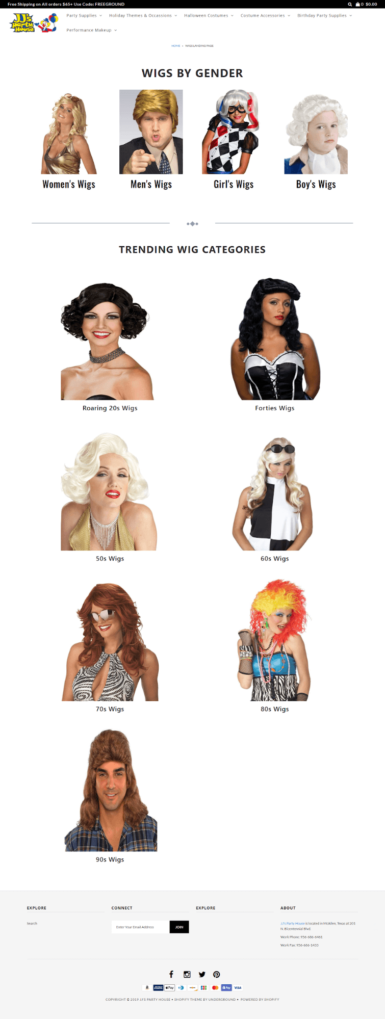
When it comes to high-converting landing pages, it’s not all about sharp design. Halloween costumes don’t need to be classy. They should embody fun.
Put this landing page in front of the right audience leading up to Halloween and you bet it’ll convert.
Salud Mediterranea

At first glance, I can see this is one of our most popular product landing page templates - Essence. With over 50 templates, PageFly gives you full web pages at your fingertips in minutes.
Read more: 25 High-Converting Webinar Landing Page Examples
Volant Aroma

- Almost all pages are built with PageFly from the home page, collection, product page, about us, etc.
- Sell: Aroma Diffuser & Essential Oil
- Loved by 100.000+ customers
Your Skin Love
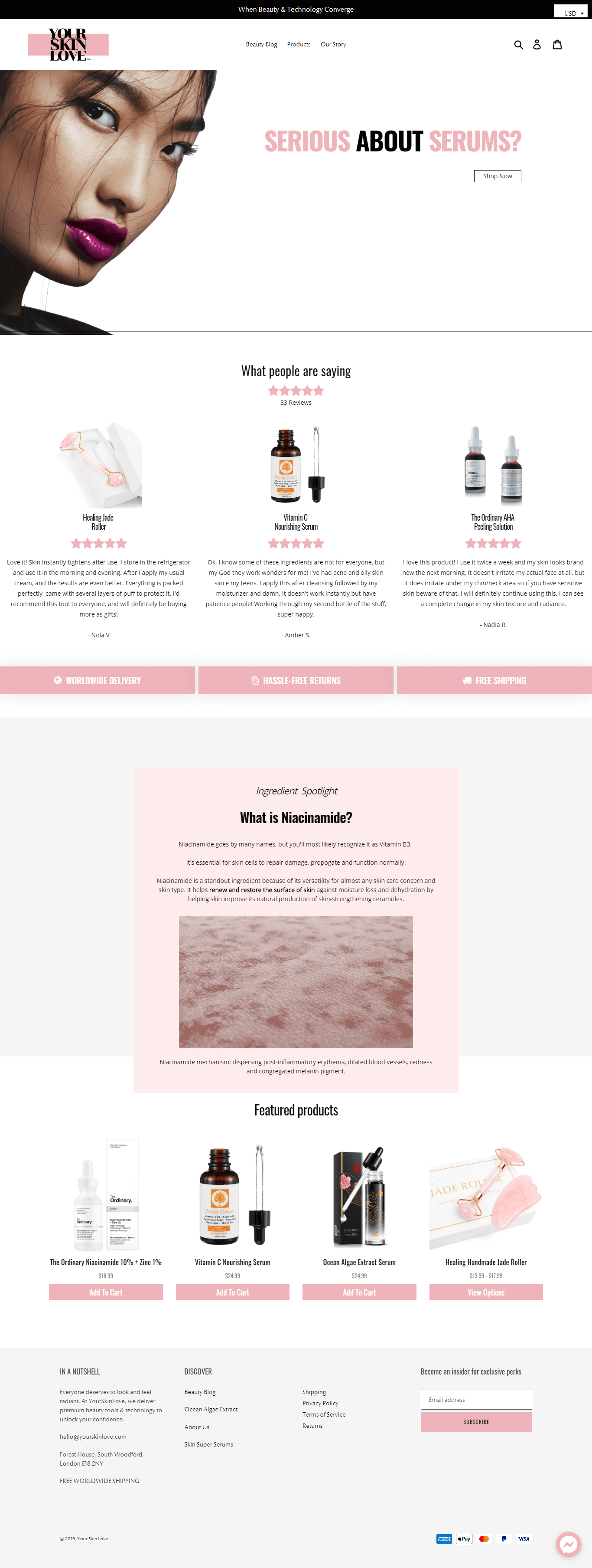
Consistent color schemes like this give a really good impression when people land on your site. This long-form style of landing page works really well, and the use of social proof helps establish trust when you land.
In addition, rather than hard selling the product, there’s a deep emphasis on the benefits and the impact it will have on your confidence (emotional trigger).
Pawsome.Coffee
They sell coffee with the aim to donate to save Cats that are in distress, abandoned and in need!
They are focusing on Cat Lovers in San Francisco and California to create a community “Pawsome Coffee and rescue some cats!”

Just Argan by Saha
- They sell 100% natural pure argan oil from Morocco, it moisturizes your skin and replenishes your hair.
- All of their bottles, labels, packaging, and other materials are sourced from local companies based in Washington.
- They bottle and package every box by hand in a sterile, safe environment. Professional-grade material and techniques ensure that their product remains completely free of impurities at all times.
- A low-volume, high-detail approach guarantees that every bottle of Argan oil sent to customers is of the best quality, free of defects and packaged with care.

The Brick Business Fleet
The Brick Business Fleet specializes in transport solutions for the toughest trades.
With years of experience, they offer an unparalleled trade solution in dedicated local manufacturing facilities utilizing the latest in 3d design, laser cutting, and advanced fabrication techniques.
They've brought local manufacturing and design from people who understand your trade to bring towing & fleet solutions to your business.

Verbosa

Consistent color schemes like this give a really good impression when people land on your site.
Verbosa uses F77F00 color code for text and background images to leave a lasting impression on customers about their brand and how they use orange peels and cactus leaves to make luxury hand-crafted bags made of vegan and non-plastic leather.
tradienet.

By dividing the layout into compact columns, this landing page facilitates rapid access to information for viewers. To enhance awareness and boost conversion rates, they employ the color code #6f28ec for pivotal call-to-action buttons.
Meller Moss

Having a consistent color scheme like Meller Moss can create a positive impact when visitors arrive on the website.
Meller Moss uses #3E2115 color code for text, icon and background images to leave a lasting impression on customers about their brand and how they use the finest materials to make the quality craftsmanship such as boots, shoes, luxury leather goods and accessories.
Magjustable

Clean & transparent - that’s all I can say about this landing page. The minimalist design is both visually appealing and refreshingly transparent, ensuring a seamless experience for their customers.
Its intuitive layout truly exemplifies the beauty of simplicity in design!
LEMAlab


LEMAlab employs a beige color scheme and organizes sections seamlessly to showcase in-depth product details, along with customer reviews for enhanced trustworthiness. The page design is minimalistic yet informative, presenting valuable information. Additionally, LEMAlab utilizes the accordion element to create FAQ sections, allowing visitors to find answers to questions about the brand and its products independently.
Huckle Bee Farms

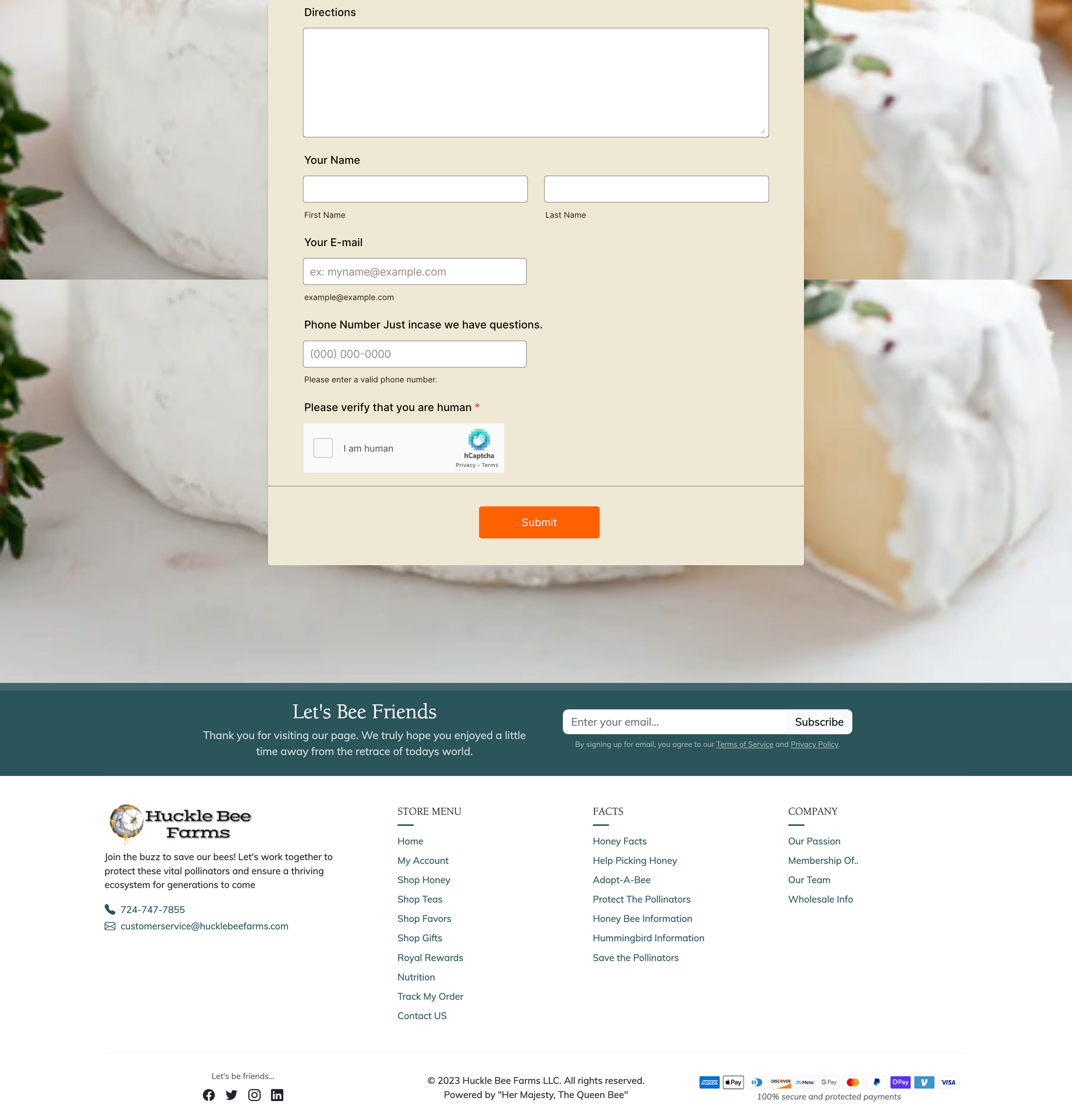
Huckle Bee Farms LLC took advantage of the parallax effect and background visuals to enhance the vibrancy of their landing page. Furthermore, they integrated a content list element for a smooth presentation of information. Incorporating the Klavyio form into the landing page effectively prompted visitors to contribute recipes, resulting in heightened engagement and improved conversion rates.
Design Your Own Shopify Store With No Limit
Fully Customizable. 80+ Templates and 50+ elements.
Completely Free/ No Trial. Optimized for Fast Speed.
II. Common Landing Page Mistakes
Remember when I mentioned the used car salesman mentality and why it’s harmful to sales? Well, people don’t like to be sold anymore. We prefer stories and content that makes us feel understood. And when our pain is understood, we hand over our hard-earned cash to make it go away.
So, filling your sales page with meaningless content can hurt you. According to Neil Patel, who’s like the Arnold Schwarzenegger of SEO, relevant content is a major key for high Google rankings.
Don’t forget that people can stumble upon your landing page from organic Google searches, so you need to optimize for this too.
Avoid these things.
01. Countdown timers
Go back a couple of years ago, and this tool was relevant and definitely worked! But now...
Countdown timers for the most part just look bad, taking away from the credibility of your site. There’s a big problem of sites pushing urgency that doesn’t even exist. They run countdown 24 hours a day every day.
So what happens if your customer leaves your site and comes back tomorrow to see the “urgent” sale is still running? You’ve lost most major credibility points.
Now, don’t get me wrong, countdown timers can still be effective, but 9 times out of 10 countdown timer Shopify apps won’t mesh well with your page. The result looks incongruent with the brand and as a result, spammy.
Here’s a countdown timer on a landing page that’s been in effect for several weeks now. Every single day. It does nothing to make me feel a sense of urgency, or a fear of missing out.

Tip: if you want to promote a sale, it’s a better idea to simply add a line of text to your announcement banner or product description - “30% off today only”.
Read more:
- Fire up Your Sales with Shopify PPC Landing Page Examples to Learn from
- The Ultimate Guide to Creating Successful Facebook Ads Landing Page
02. Trust badges
It’s common to see stores throwing up trust badges and payment badges every chance they get. But it’s just another element that can do more harm than good.
Why? Because when you have to tell someone to trust you, their gut reaction is not to.
Trust badges, guarantee badges, payment badges CAN work, but more often than not they’re making you look bad.
Take a look at Gucci, Prada, Tiffany & Co, or any other high-end brand and you won’t find a single trust badge in sight.
Which brings us to the next common mistake.
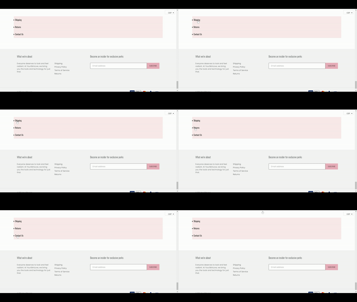
03. No interactive elements
Google loves it when people take action on your site. Providing links, videos and any other interactive elements show the big G that people are performing clicks, therefore there must be some value on your page.
PageFly has a number of elements you can drag and drop onto your landing page design that requires clicks. Most notably the Accordion Element that expands to display information on the same page.
04. Ignoring your heroes
If you want to build a brand that people trust and generates heaps of sales, you need to look at other successful companies in your niche and try to replicate the “feel” of those stores on some level.
I’m not talking about copying the design, but if Nike doesn’t need trust badges, why do you? There are certain standards of online shopping that need to be met, and there are certain things that consumers are used to seeing when they go online.
So if you want to create a global brand, one that’s premium, professional, edgy or fun, find other successful brands in your niche for your own landing page design inspiration.
05. Not optimizing for mobile
I can’t stress this one enough, especially since Google’s new mobile-first indexing. In English, this means Google now uses your site's mobile content to evaluate it and rank it in search engines accordingly. This is massive, and essentially means you need to seriously consider building your entire site with mobile in the front of your mind.
In addition, any sites that still use a mobile version (e.g: m.website.com) with “m” in the front are likely to suffer penalties from Google. It’s critical to have a responsive site, meaning one that respond accordingly depending on which device is being used.
If you’re a merchant or a developer building out a Shopify store for a client, PageFly (free for developers) can help you build responsive webpages from the ground up by editing it from a mobile, tablet or desktop view. Example below.
Design Your Own Shopify Store With No Limit
Fully Customizable. 80+ Templates and 150+ elements
Completely Free/ No Trial. Optimized for Fast Speed.
Conclusion
A high-converting landing page takes a lot of time, skill, effort and money to get it right. Two of the most well-known landing page builders are Leadpages and Clickfunnels. Both are great in their own right, but for the small business owner, the pricing is unrealistic at best.


