





A collection page is a filter, not a gallery. Get the filtering, layout and copy right and your Shopify collection page stops being a dead-end grid and starts doing the work of a salesperson — this guide walks through 10 real collection page examples, the design decisions behind them, and three ways to build a custom collection page without touching code.
Product pages close the sale, but collection pages decide which products a shopper ever sees. That makes collection page design one of the highest-leverage things you can fix on a Shopify store, and one of the most commonly ignored.
Key takeaways
- A Shopify collection page is a browse-and-filter page that groups products by category, theme or attribute — its job is narrowing, not showcasing.
- Shopify's own SEO guidance says a collection description should be “one to two sentences” — not the 150–300 word blocks often recommended. Longer is not better here.
- Filters and sorting are the single biggest usability lever on a collection page; Baymard Institute's benchmark of 344 top-grossing sites found 76% perform at “mediocre” or worse on homepage and category navigation.
- You can build a collection page three ways: the native Shopify admin collection, your theme's collection template, or a page builder for fully custom sections.
- Pick the method by catalog size — a 30-SKU brand and a 3,000-SKU catalog need different answers, and the comparison table below shows which is which.
What is a Shopify collection page?
A Shopify collection page is a store page that groups multiple products together under one category, theme or attribute — for example “Winter Coats”, “Men's Shoes” or “Summer Sale” — and lets shoppers browse, filter and sort that group before clicking through to an individual product. It lives at a /collections/<handle> URL, it is generated automatically by your theme, and it is usually the second page a visitor sees after your Shopify homepage. Every Shopify plan includes collections, so you already have collection pages whether you have designed them or not.
Collections sit in the middle of the funnel. They inherit intent from search or navigation, then hand a qualified shopper to a Shopify product page. If you want to change what a collection page looks like beyond your theme's settings, you can use PageFly, a Shopify page builder, to replace the default template with custom sections — or edit theme code directly. Both routes are covered below.
What do you use a Shopify collection page for?
Collections organize inventory in the way customers actually shop, which shortens the path to a product and gives search engines a crawlable category structure. Typical uses:
- Targeted product groups — organize by audience, such as men's, women's or kids'.
- Functional groupings — group by need, like pet supplies, desk setups or cookware.
- Promotional collections — seasonal ranges and event-specific edits you can retire later, often paired with a dedicated campaign landing page.
Shopify supports both manual collections (you pick the products) and automated collections (rules based on tag, price, vendor or stock level). Automated collections scale better once you pass a few hundred SKUs, and they pair well with the way Shopify pages and collections are linked from your main menu.
10 best Shopify collection page examples
Every store below built its collection page with PageFly. Read them as design decisions you can copy, not as skins — the useful part is why each layout works for that catalog.
1. Itsse

Neutral color tones work well for cosmetics and beauty. A collection page does not need to be fanciful — content and credibility matter more. Products are neatly laid out and the images are crisp enough to inspire trust — the same photography discipline that carries the best PageFly product pages.
2. Kinoian

White or light gray backgrounds on collection and product pages are a safe default because they match what shoppers are used to. A clean, simple design builds trust; being outlandishly different usually only works once branding is already established, which is also why most of the best Shopify store examples stay restrained here.
Kinoian has a large range of products, all reachable through drop-down menus for precise filtering. For bigger inventories, a well-structured Shopify all collections page helps by showing categories clearly and guiding users into the right one instead of making them guess.
3. 52 Hike Challenge

A community-led brand with a small catalog. Because there is not much to filter, the page leans on strong imagery (check your Shopify banner sizes before exporting artwork) and clear category blocks instead of a filter sidebar — the right trade-off at this catalog size.
4. Jennybird

Minimal design with large hero imagery. In fashion it is worth making a visual statement with photography, as most of the best Shopify stores in the category do. Note the drop-down menu and the ‘Pin It’ icon that appears on hover over each collection — small interactions that make browsing feel deliberate rather than accidental.
5. Meraki Company

This collection page uses several tones to separate each section, which breaks up a long grid. There are essentially no animations — a good call for load speed and SEO. The drop-down menus also combine text and images, which reads faster than text-only navigation.
6. LockFeet
LockFeet shows a sophisticated use of design to create a seamless shopping experience: a calculated juxtaposition of sections and elements that signals trustworthiness, professionalism and good craftsmanship, and makes you want to keep scrolling.
It opens with a crisp product photo and strong value propositions, then puts a row of products immediately below, then goes into product benefits. Further down there is an FAQ section and a testimonial section, which clear doubts on the page instead of forcing a shopper back out to search. That is closer to a Shopify landing page than a stock collection template.

7. Kylie Cosmetics

A clean, minimalist design consistent with the brand, built around its signature pink tones. The high-quality product images show not just the shades but swatches and packaging, so customers know what to expect. Star ratings on each product add trust and social proof at the exact moment a shopper is comparing options, which is one of the cheapest Shopify conversion rate wins available on a grid.
The filters and sorting options are what make it work: they let users narrow a large shade range quickly, and the layout holds up on mobile. If filtering is your bottleneck too, Shopify's free Search & Discovery app adds faceted filters to the native template.
8. Renegade GK

Renegade GK replaced the default collection template with a custom build in a visual editor, adding above-the-grid content that the stock template could not hold.
9. Big Bertha Original

A single-category brand that uses its collection page as the main browse surface, with supporting content sitting alongside the product grid rather than buried on another Shopify page.
10. Kaiko

Kaiko keeps its collection page tight and product-led. If you like this direction, the same principles show up in our roundup of PageFly product pages.
Shopify collection page SEO: what Shopify actually recommends
Most Shopify collection page SEO advice online tells you to write long category descriptions. Shopify's own current guidance says the opposite. In its category page SEO guide, Shopify states that “your collection description should contain one to two sentences to provide context for what the page is about” (Shopify, Ecommerce Category Page SEO). Two sentences of real context beats 300 words of keyword padding, and it keeps the product grid above the fold where it belongs.
The second thing Shopify is explicit about is internal linking: “If a page has more links pointing to it, it appears more important. ‘Orphan pages’ (pages without any links pointing to them) typically struggle to rank.” Practically, that means every collection you care about should be linked from your main menu and homepage, from related collections, and from body content — not just from the sitemap. The same guide says collection pages should show product names clearly, a high-quality thumbnail per product, and visible pricing.
On the UX side, the numbers are sobering. Baymard Institute benchmarked 344 top-grossing US and European e-commerce sites and found that 76% perform at a level of “mediocre” or worse on homepage and category navigation (Baymard Institute). Its usability testing across 19 leading sites in 8 verticals surfaced 900+ usability issues and produced 40+ guidelines. Category navigation is not a solved problem — which is why fixing it is still an advantage, and why it is worth A/B testing the change rather than assuming it worked.
Beyond the collection page itself, the same discipline applies one level down: see Shopify product page SEO for the product-level version, and Shopify's ecommerce SEO best practices for site-wide fundamentals.
Shopify collection page templates: pick by catalog size
There is no single best Shopify collection page template. The right one depends on how many SKUs you have, who is doing the work, and how soon it needs to be live. A 30-product brand does not need faceted filtering; a 3,000-SKU catalog is unusable without it. If you are comparing tools rather than templates, start with the page builder comparison. Otherwise, use this to choose:
| Method / option | Best for (catalog size) | Skill level needed | Cost | Time to live |
|---|---|---|---|---|
| Native Shopify collection (manual or automated) | Any catalog size — this is the baseline every store needs | None | Included with Shopify | Minutes |
| Theme collection template (theme editor) | Small to mid catalogs that need one consistent grid | None for settings; Liquid for anything beyond them | Included with your theme | Under an hour |
| Shopify Search & Discovery app (filters on top of the native template) | Mid to large catalogs where filtering is the bottleneck | None | Free (Shopify-built app) | Under an hour |
| Custom collection template in a page builder (PageFly) | Any size where you need content, not just a grid — campaign and brand collections | None (drag and drop) | Free plan available (1 page or section); paid plans from $24/month | An afternoon |
| Custom Liquid development | Large or unusual catalogs with requirements no app covers | Developer (Liquid, CSS, JS) | Developer time | Days to weeks |
If you are still choosing a theme, the collection template is one of the things worth comparing before you commit — our list of the best Shopify themes flags which ones ship strong grids. You can also run a competitor's store through the Shopify theme detector to see what they are using.
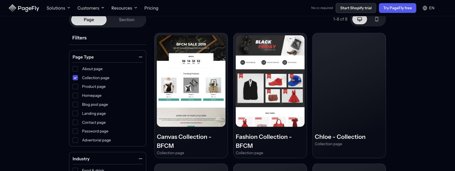
For a library of pre-built starting points instead, PageFly offers 320+ page and section templates, including on its free plan. Filtering the Page tab to Collection page returns 8 collection templates — the same filter also covers Homepage (46), Landing page (29) and Product page (27).
How to create a collection page on Shopify (3 ways)
Quick answer: create a collection in Shopify admin → Products → Collections → Create collection, then either style it with your theme's collection template or replace that template with a custom page built in a page builder. All three routes end at the same /collections/ URL, so you can start with method 1 today and upgrade later.
Method 1: Create a collection in the Shopify admin
- In your Shopify admin, go to Products → Collections and click Create collection.
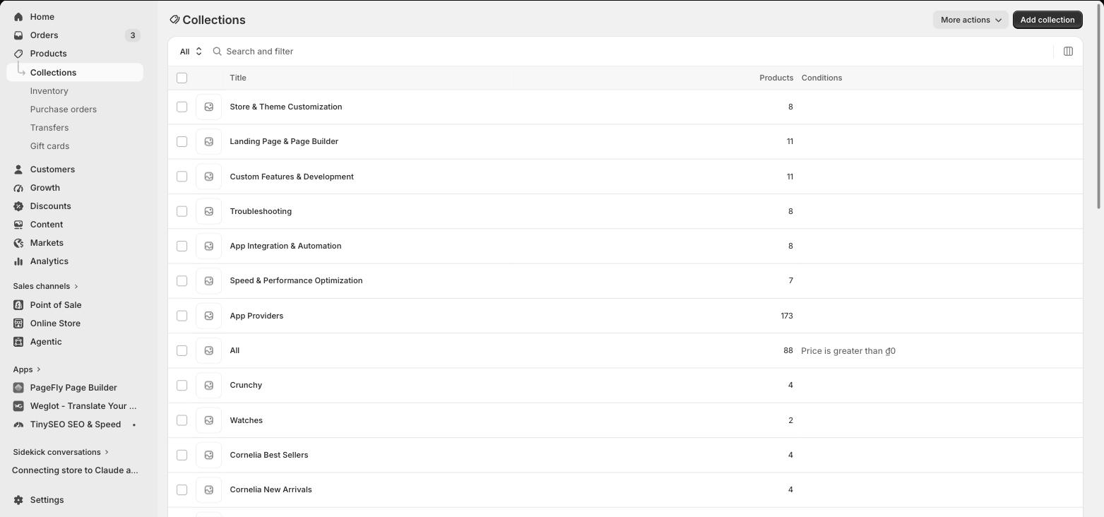
- Give the collection a title, then write a description of one to two sentences — Shopify's own guidance, as quoted above.
- Choose Manual (hand-pick products) or Automated (set conditions on tag, price, vendor, type or stock).
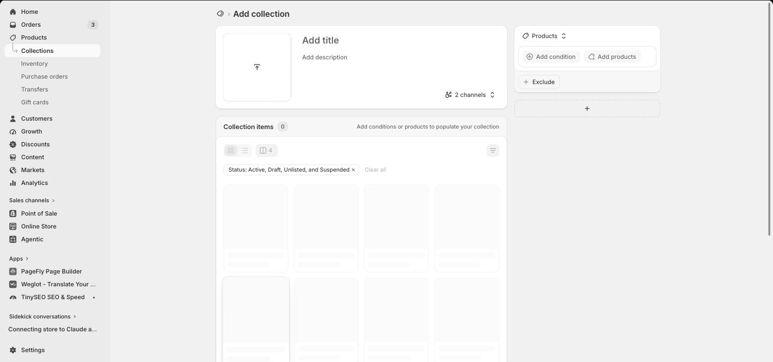
- Set the collection image and edit the Search engine listing fields so the page title and meta description are yours, not auto-generated.
- Save, then go to Online Store → Navigation and add the collection to a menu alongside your other Shopify pages. This is the step most stores skip — and it is exactly the internal-linking problem Shopify warns about, since a collection nobody links to struggles to rank.
Method 2: Style the theme's collection template
- Go to Online Store → Themes → Customize and switch the top dropdown to Collections → Default collection.
- Adjust the product grid: columns on desktop and mobile, image ratio, and whether vendor, price and rating show on each card. How much control you get here depends heavily on which of the Shopify themes you are on.
- Turn on filtering and sorting. If your theme's built-in filters are thin, install Shopify's free Search & Discovery app and configure filters there instead of editing code.
- Add supporting sections above or below the grid — a banner, rich text or a featured collection row. Check Shopify banner sizes before you export the artwork.
Theme editors are limited by design. Most free themes give you a handful of grid settings, and going further means editing Liquid — which risks breaking the template on the next theme update.
Method 3: Build a custom collection page with a page builder
A page builder replaces the default collection template with a page you compose from pre-built sections, so you can put a hero, a value-proposition row, a video, an FAQ or a testimonial block around the product grid. Here is the flow in PageFly:
- Open the app and complete setup. PageFly installs from the Shopify App Store; once it is in your admin, the initial setup runs in a couple of clicks.

- Create a new collection page. Choose a collection template to start from, or a blank one to design from scratch.

- Add and customize elements. Drag in text, images, video, buttons and product lists, then style each one to match your brand. Text carries the collection's positioning, images carry the product, and buttons carry the next step.

- Configure collection settings. Select which Shopify collection feeds the page, then set sorting and filtering behavior for the grid.
- Switch the view from All to Mobile and fix the mobile layout separately. This is where most collection pages are actually won or lost, and where Shopify conversion rates are usually leaking.
- Optimize for search. Set the page title and meta description, and keep the on-page description short. See how the visual editor works if you want a closer look first.
- Preview, publish, and add it to navigation under Online Store → Navigation so the page is not orphaned.
You can also watch this walkthrough of building a custom collection page with PageFly:
Shopify collection page optimization checklist
Work down this list on your highest-traffic collection first. Most stores get more out of fixing one collection properly than touching all of them lightly.
Navigation & structure:
- Implement breadcrumb navigation so shoppers can move back up a level.
- Give the collection a clear H1 containing the primary keyword — the same rule that governs product page SEO.
- Include a link back to the all-collections page.
- Show the product count (“Showing 24 of 86 products”).
- Keep search reachable on scroll with a sticky header, and make sure on-site search and discovery actually returns your catalog.
Filtering & sorting:
- Add a filter sidebar with collapsible sections.
- Cover the filters that matter: price, size, color, availability, brand.
- Allow multi-select filtering.
- Add a “Clear all filters” control.
- Offer sorting by best selling, price, newest and rating.
- Show active filters as removable tags.
Product display:
- Use 3–4 columns on desktop and 2 on mobile as a starting point, then test.
- Offer quick view so shoppers can check details without jumping to the product page.
- Show price, variants and sale badges on the card.
- Show ratings and review counts where you have them.
- Add an add-to-cart affordance on hover for desktop, and consider a Shopify cart drawer so adding to cart never costs a page load.
- Lazy-load images below the fold.
Content & SEO:
- Write a unique collection description of one to two sentences, per Shopify's guidance.
- Use the target keyword naturally near the top of the page.
- Add an FAQ block if the category genuinely raises repeat questions.
- Write a custom meta title and meta description rather than accepting the default — this is the single biggest click-through lever you control.
- Keep URLs readable:
/collections/mens-running-shoes, not/collections/category-1. - Add alt text to every collection and product image.
Trust & social proof:
- Flag bestsellers on the grid.
- Show a recently viewed row.
- Surface reviews or testimonials in-page.
- Show trust badges near the buying decision, not only at checkout.
- Link out to related collections and relevant Shopify pages.
Performance & technical:
- Keep the page fast — collection pages carry many images, and some Shopify themes are considerably heavier than others.
- Compress images and serve WebP where you can.
- Pick pagination or infinite scroll, not both.
- Test on real mobile devices, not just a resized browser.
- Add structured data (Product, BreadcrumbList).
Conversion:
- Add honest scarcity signals only where the stock data is real.
- Run collection-specific promotional banners.
- Add compare functionality for genuinely similar items.
- Include a size guide or product finder where the category needs one.
- Validate changes with Shopify A/B testing instead of trusting the redesign.
Components of a Shopify collection page
A well-built collection page is made of a small number of components, each doing one job:
- Category name — concise and descriptive, using the words shoppers actually search. It doubles as the H1 and the strongest on-page relevance signal.
- Breadcrumbs — show the path from home to this collection so visitors can back up a level instead of bouncing.
- Sort menu and filters — the narrowing mechanism. Sorting handles preference (price, popularity, newest); filters handle constraints (size, color, price band).
- Product cards — a clear name, one high-quality thumbnail and a visible price, which is exactly the set Shopify's category SEO guide calls for. Ratings and review counts help shoppers self-select before the click.
- Supporting content — a short intro, an FAQ or a comparison block for categories where shoppers need help choosing. This is what the native template cannot hold and a drag-and-drop editor can.
Design for mobile first
Smartphones changed how people shop, and collection browsing is where that shows up most: filters that are comfortable on a 27-inch monitor become unusable in a thumb-sized sidebar. Design the mobile grid and the mobile filter panel first, then let desktop inherit.
PageFly was built mobile-first from day one. Switching the view from All to Mobile in the editor lets you change spacing, column counts, font sizes and section order for mobile only, without a second theme. If mobile is where your numbers slip, our guide to Shopify conversion rate benchmarks is a good next read.
Conversion tactics that work on collection pages
These are the patterns worth trying on a collection page, in rough order of effort-to-payoff. Test each one rather than assuming it applies to your catalog.
1. Progressive disclosure. Instead of dumping every product into one page, show a first screenful and add a clear “Load more” control. The initial page gets lighter, and shoppers who want depth still get it. Combine it with pagination for very large catalogs so each page stays indexable.
2. Filter persistence. Keep a shopper's filter selections as they move between collections. If someone filtered for “Size: Medium” and “Color: Blue” in your t-shirts collection, carrying that into polo shirts removes a repeated chore.
3. Real social proof. Bestseller badges, review counts and customer photos in the grid help a shopper choose without opening five tabs. Use real data only — invented “12 people are viewing this” counters are a trust liability, not a tactic.
4. Restrained micro-interactions. Smooth filter transitions, image zoom on hover and clear add-to-cart feedback make a page feel responsive. Keep them subtle; heavy animation costs you the speed you just bought. A cart drawer is a better answer than a full page reload on every add.
5. Smart bundling. “Complete the look” blocks, volume-discount badges and frequently-bought-together rows inside the grid raise basket size without extra traffic. This works best in categories with natural companions — and it is the same logic you would apply on a Shopify landing page built to convert.
Quick wins you can ship today
- Add a collection banner with your value proposition (“Free shipping over $75”) and any live promotion — at the right banner size.
- Turn on sort options — best selling, price, newest, rating — and default to best selling.
- Fix mobile filters: convert the sidebar into an accordion and add a sticky filter button at the bottom of the screen.
- Show progress with a “viewing X of Y products” indicator so shoppers know how much is left.
- Write the two-sentence description on your top five collections and set their meta titles.
PageFly vs theme customization for collection page design
Most collection page designs are not achievable with a free Shopify theme. You can buy one of the best premium Shopify themes, but customizing a Shopify collection page design beyond its settings usually means code — and editing that code can break on update.
Take the free Shopify Minimal theme. In the editor, options for customizing your logo and navigation are minimal, and if you keep the announcement bar you are limited to predefined settings.
With PageFly you customize sections without modifying Shopify's core code. The drag-and-drop interface lets you position elements — logo right, navigation left — and, more importantly, add content the default template has no slot for: custom images, longer explanatory blocks, product video and GIFs. In a bracelets collection, for example, you can use a two-block layout to put a GIF next to the grid; to add a product video, drag the Video HTML element onto the page and upload the file (there is a file-size limit on uploads, so compress long clips first).
The same pattern applies elsewhere in your store: see Shopify product page customization for the product-page equivalent, and the best Shopify page builder apps if you want to compare tools before committing.
What PageFly adds to a collection page
- Customizable layouts — start from one of the pre-designed templates and modify it, rather than building a grid from nothing.
- Filtering and sorting — let shoppers narrow by price, size, color and more inside the page you designed.
- Responsive control — a separate mobile view so the collection works on the device most of your traffic uses.
- Drag-and-drop editing — no coding required, which matters when the person who owns merchandising is not the person who owns the theme.
- Conversion elements — countdown timers, stock indicators, bundles and a quick add-to-cart drawer, built as sections instead of stacked apps.
PageFly's free plan covers 1 page or section and includes access to 320+ page and section templates, so you can build and preview a custom collection page before paying anything; paid plans start at $24/month. Full details are on the PageFly pricing page. Building a landing-page-style collection instead? Compare the Shopify landing page apps first.
Best practices for Shopify collection page design
- Use high-quality images. Clear, professionally shot, and optimized for fast loading. Consistent image dimensions across the grid do more for perceived quality than any individual photo.
- Write engaging titles and short descriptions. Descriptive, keyword-aware titles help SEO and shoppers alike — keep the description to the one-to-two sentences Shopify recommends, and apply the same discipline to product page titles.
- Implement filtering and sorting. Let customers filter by size, color and price, and sort by newest, price and best selling. On mid-size and large catalogs this is the highest-impact change available to you.
- Show reviews and ratings. Positive reviews build trust and influence purchase decisions, and on a collection page they help shoppers pick a starting product.
- Use clear calls to action. “Shop now”, “View more” and “Add to cart” should be unambiguous and reachable with a thumb — the same CTA rules that apply when you build a landing page.
- Optimize for mobile. A large share of e-commerce traffic is mobile; treat the mobile grid as the primary design, not an adaptation.
- Use social proof sparingly. “Trending”, “Popular” and “Best seller” tags guide attention — as long as they reflect real data.
- Highlight promotions. Make live offers visible with banners or badges rather than hiding them one click deep.
- Improve page speed. Compress images, use a CDN and cut heavy scripts — collection pages are image-dense by nature.
Conclusion
Shopify collection pages are where browsing happens, so treat them as filters rather than galleries: group products the way customers think, make narrowing effortless, keep the description to two sentences, and link the collection from somewhere real so it can rank. The 10 examples above show what that looks like when it is done deliberately.
If your theme's collection template cannot hold the content your category needs, a page builder closes the gap without touching theme code — and the same approach carries across your homepage and your product pages. Start with your highest-traffic collection, fix one thing at a time, and measure it.
Shopify Collection Page FAQ
Optimizing a Shopify collection page comes down to helping shoppers narrow down quickly, then making the product card do its job:
- Clear navigation: add breadcrumbs so shoppers can see the path from your homepage to the collection
- Robust filtering: offer size, color, price range and availability filters so shoppers can narrow a large grid without scrolling it
- Short descriptions: Shopify recommends a collection description of one to two sentences, not a long keyword block
- Quick view: let shoppers check details without leaving the grid
- Page speed: collection pages are image-dense, so compress images and keep scripts light
With PageFly's collection page builder you can apply all of these through a drag-and-drop interface, no coding required.
There is no universal number — it depends on your catalog and how fast your grid loads. Use these principles instead:
- Too few products makes a collection look thin and reduces confidence
- Too many on one screen slows the page and overwhelms shoppers
- Best practice: show a first screenful, then paginate or add a Load more control
- Test it: a 3-4 column desktop grid with 2 columns on mobile is a reasonable starting point to test from
Organize products using a hierarchy that mirrors how customers shop:
- Main collections: by product type (clothing, accessories, home goods)
- Sub-collections: narrower categories (men's shirts, women's shoes, kitchen gadgets)
- Automated collections: rules based on tags, price ranges or stock levels, which scale better as your catalog grows
- Consistent naming across every collection
- Multiple placements: let a product appear in more than one relevant collection so it is discoverable from several paths
Then link every collection from your navigation. Shopify notes that orphan pages — pages with no internal links pointing to them — typically struggle to rank.
Yes. You can fully customize Shopify collection pages without code using PageFly's visual editor:
- 320+ page and section templates to start from, including on the free plan
- Drag-and-drop editing for full layout control
- Custom sections: add video, comparison tables and content the default template has no slot for
- Real-time preview as you build
- Separate mobile view so the responsive layout is a design decision, not an accident
230,000+ Shopify merchants use PageFly to build pages without writing code. The free plan covers 1 page or section; paid plans start at $24/month.
Check these common causes:
- Collection visibility: make sure the collection is not hidden from your Online Store sales channel
- robots.txt: confirm it is not blocking crawlers from your /collections/ URLs
- Meta tags: write a unique title and meta description for each collection instead of accepting duplicates
- Internal links: link the collection from your menu and from related pages — Shopify warns that orphan pages typically struggle to rank
- Description: one to two sentences of real context is what Shopify recommends — length alone will not fix indexing
- URL structure: use /collections/mens-running-shoes rather than /collections/category-1
- Sitemap: submit it in Google Search Console and check for crawl errors
A good Shopify collection page design treats the page as a filter, not a gallery: it helps a shopper narrow down to a shortlist in as few taps as possible. The elements that matter most are:
- A clear category title and breadcrumbs, so shoppers always know where they are
- Visible filters and sorting, placed where they are reachable with a thumb on mobile
- Product cards showing the name, one high-quality thumbnail and the price — the exact set Shopify's category page SEO guide calls for
- A one-to-two-sentence description, not a wall of text above the grid
- A layout designed on mobile first, since that is where most collection browsing happens