

Your Shopify homepage is a router, not a showroom — its only job is to move each visitor to the next page that fits them, in as few clicks as possible. This guide walks through 8 Shopify homepage examples we opened and verified on 18 September 2026, the section order that converts, four ways to build yours without code, a mobile checklist, and free templates you can start from.
The homepage is also where most stores quietly leak revenue. Baymard Institute's benchmark of 344 top-grossing US and European e-commerce sites found that 76% perform at a level of "mediocre" or worse on homepage and category navigation UX, and that only just above 50% of sites deliver a "decent" or better homepage experience. Baymard dedicates 17 of its usability guidelines to the homepage alone, which tells you how much of the work sits on this one page.
Whether you're building your first Shopify store or optimizing an existing one, your homepage design directly affects revenue. The examples below combine strong visuals with a clear path to purchase. For inspiration beyond the homepage, browse our roundup of the best Shopify store examples, or see how the same logic plays out on Shopify product pages.
So which elements actually move homepage visitors toward checkout?
It comes down to creating trust, giving people a reason to act, and showing them exactly which step to take next.
Key takeaways
- A Shopify homepage is a routing layer: announcement bar, hero, primary CTA, featured collections, social proof, bestsellers, brand story, email capture, footer — in that order.
- Above the fold you need one hero, one promise and one primary CTA. Competing CTAs cause decision fatigue, and undecided shoppers leave instead of choosing.
- Most homepage traffic is mobile, so design the mobile stack first and treat desktop as the wide version of it.
- Four ways to build it: theme sections, custom Liquid, a Shopify page builder, or an agency — the comparison table below shows which fits your skill level and timeline.
- The homepage rarely closes the sale; it hands off. Measure it by click-through to collections and products, not by its own Shopify conversion rate.
What is a Shopify homepage?
A Shopify homepage is the default page of a Shopify store — the page a visitor lands on at your root domain — assembled from theme sections (or page-builder sections) that introduce the brand and route shoppers onward to collections, products and offers. In Shopify's admin it is the "Home page" template, and unlike a normal Shopify page it can pull in dynamic content such as featured collections and product grids.
The useful way to think about it: your homepage is a router, not a showroom. It does not have to sell anything by itself. It has to identify what kind of visitor just arrived — someone who knows exactly what they want, someone browsing, someone who clicked an ad — and hand each of them off to the right next page as fast as possible.
You can build one three ways: with your theme's built-in sections, with code, or with an app. PageFly, a Shopify page builder, is one of the app options — it lets you lay out homepage sections visually and publish them to the Home page template without touching Liquid. Whichever route you take, the section order below is the part that decides whether the page converts.
The high-converting Shopify homepage section order
Here is the section order that works for most stores, top to bottom. Each section has one job, and each has a specific failure mode that kills it.
- Announcement bar — carries one time-sensitive incentive (free shipping threshold, current promo). Killed by: stacking three rotating messages nobody can read.
- Hero — states what you sell and who it is for in one glance. Killed by: a beautiful lifestyle image that never says what the product is, or an oversized file; get your Shopify banner size right so it stays sharp and light on mobile.
- Primary CTA — one button, high contrast, plain language ("Shop the collection"). Killed by: three equally weighted CTAs, which is decision fatigue by design.
- Featured collections — the main routing block, sending browsers into two to four clear buckets. Killed by: linking to a flat "all products" grid instead of real Shopify collection pages.
- Social proof — reviews, press logos and UGC, placed right after the first ask, the way most high-converting stores do it. Killed by: generic stock testimonials with no name, face or product attached.
- Bestsellers — a short, curated row that lets decided shoppers buy immediately. Killed by: a wall of products; link out to strong Shopify product pages instead of trying to sell in the grid.
- Brand story — one paragraph plus one image on why you exist, for the shoppers who need a reason to trust you. Killed by: a founder essay placed above the products.
- Email or SMS capture — recovers the majority of visitors who will not buy today. Killed by: a popup that fires before the hero has even loaded.
- Footer — the secondary navigation layer: support, size guides, contact and the policy Shopify pages. Killed by: hiding shipping and returns information that shoppers came looking for.
Two rules of thumb sit on top of that order. First, everything above the fold should answer "what is this and where do I click" without scrolling. Second, if you are sending paid traffic to a specific offer, do not send it to the homepage at all — send it to a dedicated Shopify landing page and let the homepage handle organic and returning visitors.
| Section | What it must do | What kills it |
|---|---|---|
| Announcement bar | Deliver one incentive or deadline | Rotating multi-message carousel |
| Hero | Say what you sell, for whom | Pretty image, no product clarity |
| Primary CTA | Give one obvious next click | Several CTAs of equal weight |
| Featured collections | Route shoppers into buckets | One undifferentiated product wall |
| Social proof | Answer "can I trust you" | Anonymous, unattributed quotes |
| Bestsellers | Let decided buyers act now | Too many options, no hierarchy |
| Brand story | Give a reason to prefer you | Long essay placed too high |
| Email / SMS capture | Keep the non-buyers reachable | Instant popup over the hero |
| Footer | Carry support and policy paths | Burying shipping and returns |
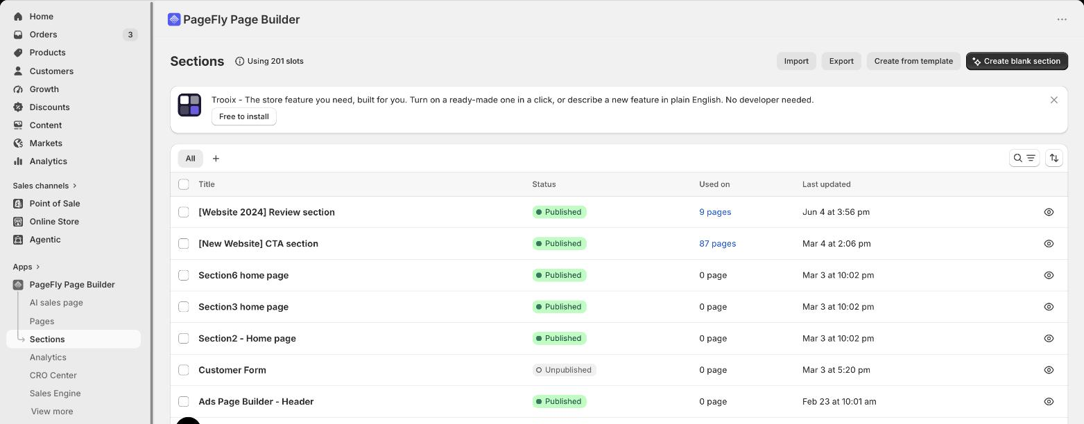
In practice this is easier to manage when each block in that order is built as its own named section rather than as one long page. Name them, keep them reusable, and reordering the homepage — or dropping a proven block onto another page — becomes an edit instead of a rebuild.
Common Shopify homepage layouts (and when each one wins)
Most Shopify homepages are a variation on four layouts, and you can see all four in the wild in our Shopify store examples roundup. Picking the right one is mostly a question of how many products you sell and how well-known your brand already is.
- Single hero + collection tiles. One full-width hero, then two to four collection tiles. Wins for small and mid catalogs where the shopper's first decision is "which category am I in". Pair it with tidy collection page design so the handoff is not a letdown.
- Category-grid homepage. Little or no hero, a dense grid of categories, prominent search. Wins for large catalogs and marketplaces where browsing beats storytelling — lean on Shopify Search & Discovery to make filtering usable.
- Single-product / brand-story homepage. Long scroll: hero, benefits, proof, FAQ, one CTA repeated. Wins for one-product and DTC brands, and it is effectively a landing page living at the root URL.
- Editorial / lookbook homepage. Imagery-led, magazine style, shop-the-look modules. Wins for fashion and design brands with strong visual assets — but it needs disciplined navigation, or shoppers admire and leave. Many Shopify themes ship this layout out of the box.
Shopify homepage best practices apply across all four: one primary CTA above the fold, no more than two levels of navigation, real product imagery, and a mobile stack you designed on purpose rather than inherited. If you are unsure which layout your competitors use, a Shopify theme detector will tell you what they built on.
The Purpose of Quality Shopify Homepage Design
Your Shopify homepage design doesn't have to be overly complicated in design or content. In a nutshell, you want to:
- Welcome your visitors to your site
- Tell them clearly what you want them to do
- Give them options to explore and find out more
But how do you implement this? Sometimes the best way to uncover insights is to ask the right questions. Consider this:
- What exactly do you want visitors to do? (buy something, subscribe to an email list, etc.)
- Are you making it easy enough for them?
- How many steps are involved from start to finish?
- Can any of these steps be removed?
In general, we believe in keeping the Shopify homepage design simple. No need to add more complexity to confuse your readers.
Consider that some prospects may land on your Shopify home page knowing exactly what they want. Others won't. Always keep this in mind and design accordingly — that is also why a homepage and a campaign landing page should never be the same page.
Shopify homepage design principles that convert
The four principles below show up in almost every homepage teardown we do — and in every product page teardown too. Three of the illustrations in this section — Dropbox, Soul Cycle and MVMT — are not Shopify stores; they are shown purely for their treatment of a layout principle, and every Shopify example in this article is in the numbered list further down.
Keep the navigation path obvious

Dropbox keeps it crisp, clear, and under control. Make the navigation pathways clear. This helps customers avoid "decision fatigue," a phenomenon that causes humans to back out of a decision that takes too long. High converting Shopify stores often emphasize simple and effective navigation to keep users engaged.
In analytics terms, when a user clicks away, this is known as "bouncing." We don't like bouncing. Note these tips to help your customers make faster decisions on your home page, a common trait in high converting Shopify stores.
Take advantage of "Above the Fold"
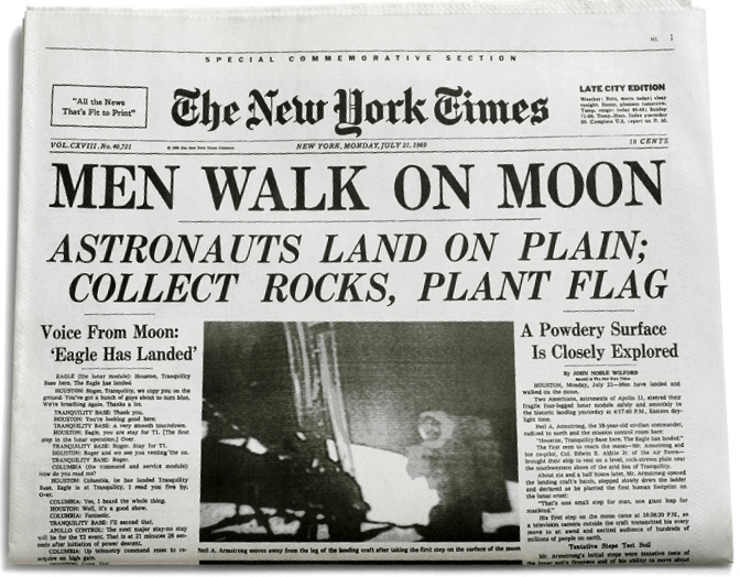
Above the fold is the area of the screen that customers see before they scroll down. Newspapers have been using this technique for years, placing enticing headlines in bold "above the fold" for customers to see before picking them off the shelf.
In regards to your homepage, it pays to use a compelling hero image coupled with a call to action. Remember when I said some customers arrive already knowing what they want? This approach is a hallmark of high converting Shopify stores. Getting your Shopify banner size right also keeps those hero visuals sharp on every device.

MVMT have implemented this nicely, with clear CTA's for men and women coupled with crisp images showcasing the product. They've also used a banner along the top to incentivize purchase with free shipping.
Make navigating easy
People glide swiftly from web page to web page on the internet. So it's important to facilitate this and design your site to be as navigationally smooth as butter.
When you're trying to attract lots of different types of visitors, it's tempting to make your Shopify home page more complex with layers of links and content.
But in fact, it's nearly always better to keep things simple.
Give priority paths to the header section with links you think readers will benefit from the most. Secondary paths can be placed elsewhere - at the bottom of the page for example. A Shopify cart drawer helps here too, and a visible search field backed by Shopify Search & Discovery catches everyone the menu misses.
The PageFly website does this, with the most important and relevant navigation links up top. Sections of further interest can be found in the footer section at the bottom.

This makes the entire web page cleaner and less confusing, and gives a great impression when first glancing "Above the Fold". Notice the Call to Action in the corner too.

It's up to you to balance your priorities. For example, if customer support is the focus of your brand, you may want to include those links in the header section.
Note: Including these navigation links is important for Shopify homepage SEO, letting Google understand your brand and site better, and the same internal-linking logic applies to Shopify product page SEO.
A compelling call to action
Calls to action are at the heart of influential web page design. Consider them signs to follow when you're lost in the forest. They tell readers where to go and what to expect when they get there.
Your call to action could direct to a product page, a blog, a 'learn more page', or a collections page. It's important to determine your goals and apply CTA's accordingly, and worth running a proper Shopify A/B test before you declare a winner.
Just remember, the harder it is for readers to find your Call to Action, the more likely they are to "bounce".
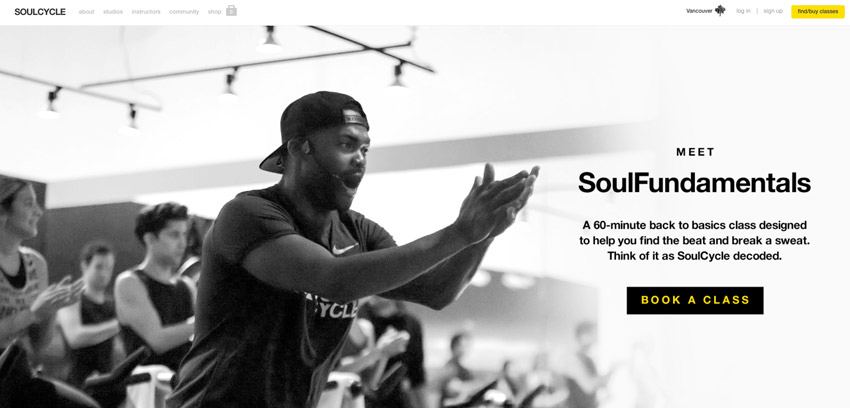
Allow it to be clearly seen with contrasting colors and use straightforward language like Soul Cycle (again, not a Shopify store — shown for the CTA treatment). There's nothing distracting above the fold to take away from the main goal, but there are navigation links for the user to explore further if needed.
How we verified these examples
Homepage round-ups age badly. The version of this guide that ran until today listed fifteen stores. When we re-opened every one of them on 18 September 2026, seven did not survive the check.
The test each example had to pass, in order:
- The homepage loads. HTTP 200 at its current canonical URL — not a redirect to a parked domain.
- It is actually on Shopify. Confirmed by at least one hard signal in the page source: assets served from
/cdn/shop/files/orcdn.shopify.com, ashopify-digital-walletshop ID, or a literal "Powered by Shopify" string. - There is something specific to learn from it right now. We quote what is above the fold today, not what was there when the example was first written up.
What that removed: Monasita's domain now resolves to a BrandBucket listing offering monasita.com for sale, so the store is gone. Caledonian Mobile Coolers, Zen Egg, Probi Solution and A.H Apothecary no longer resolve to any storefront we could find. Livroom returned nothing we could verify either way, so it is out until it can be. And MVMT — cited as a Shopify example for years, including in this article — runs on Salesforce Commerce Cloud today, not Shopify. Its above-the-fold treatment is still worth studying, so it stays in the section further up, correctly labelled.
Apply the same test to any round-up you read, including this one in six months. A "best Shopify homepages" list that has not been re-opened in a year is a list of screenshots, not a list of stores.
8 Shopify Homepage Examples, Verified Live in September 2026
Every one of the eight was opened on 18 September 2026 and confirmed to be a live store running on Shopify. Seven examples that ran in earlier versions of this guide were removed in the same pass, because they no longer meet that bar.
#1 Allbirds

Checked 18 September 2026: the hero runs an eyebrow line for the "All New Dasher NZ Collection" over the headline "Wildly Comfortable. Super Natural.", with two buttons side by side — SHOP MEN and SHOP WOMEN. The second section is four category tiles: New Arrivals, Mens, Womens, Best Sellers.
What to copy: the split CTA. Allbirds does not ask you to browse — it asks one question, who are you shopping for, and answers the routing problem in a single click. If your catalogue divides cleanly in two, the hero is where to do it.
#2 Gymshark

Checked 18 September 2026: a rotating announcement bar cycles five messages, including "Last Chance Sale | Up to 50% off* Last Chance styles." and "Free standard shipping on orders over $75". The hero headline is "UP TO 50% OFF*"; the section under it is two tiles, WOMEN'S SALE and Men's sale, each with a "Shop now" button.
What to copy: the announcement bar is doing real work here — it carries both the offer and the free-shipping threshold, so the hero does not have to. Most stores waste that strip on a slogan.
#3 Kylie Cosmetics

Checked 18 September 2026: announcement bar reads "🎁 new holiday gift sets are here 🎁 shop now". The hero is set in lowercase — "now available mood stones" — with supporting copy naming the three scents and one SHOP NOW button pointing into the fragrance collection. A video block follows.
What to copy: one launch, one CTA. The homepage is not a menu of everything in stock; it is this month's campaign plus an exit into it.
#4 Death Wish Coffee

Checked 18 September 2026: the announcement bar reads "TODAY ONLY — FREE POWER SURGE SAMPLE WITH ANY ORDER", with a second line promoting a golden-ticket giveaway. The hero is a three-slide carousel opening on "ANSWER THE CALL OF THE WILD" with two CTAs, followed by a seasonal section, "THE RETURN OF PUMPKIN CHAI".
What to copy: urgency with a deadline attached to it. "TODAY ONLY" is a real constraint rather than a permanent banner — which is the only reason it still works.
#5 Notion
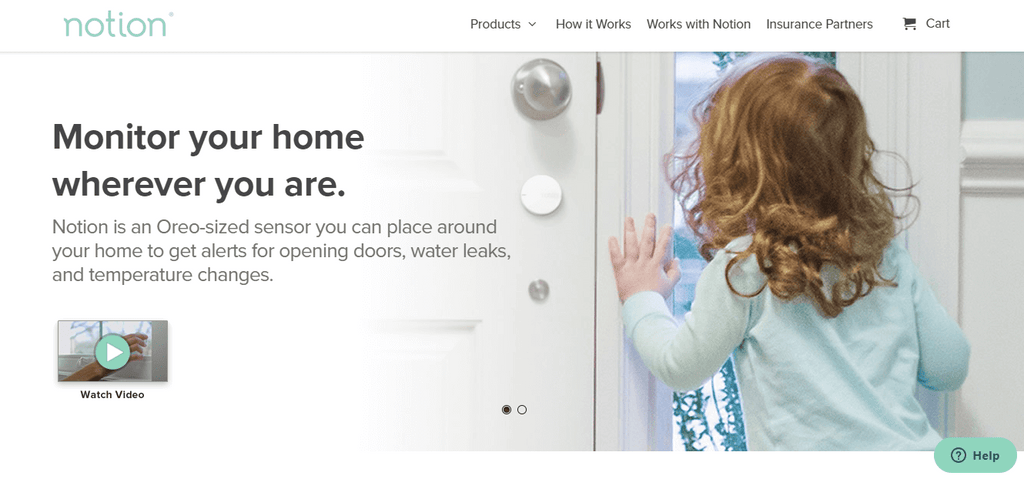

Checked 18 September 2026: the page opens on a question — "Why Choose Notion Monitoring?" — answered by three benefit blocks (Multifunctional Sensors, Cost Savings, Monitor Anytime Anywhere), then a numbered four-step explanation of how the system works: Sensors, Bridge, App, Savings. A "Build Your Own Kit" section follows, with the Starter Kit at $199.
What to copy: when the product is something people do not already understand, the homepage's job is comprehension before persuasion. That four-step diagram sells harder than any hero image would.
#6 Baby Bare Bubbles

Checked 18 September 2026: announcement bar "FREE DELIVERY OVER £20", then a four-item trust strip — MADE IN THE UK / FREE SHIPPING OVER £20 / SAFE AND SECURE CHECKOUT / SATISFACTION GUARANTEED — and a review line reading "4.94 out of 5 stars from 500+ very happy customers". The hero promise is "Cleanse, Replenish, Moisturise and Protect Young Hair & Skin." with a SHOP THE COLLECTION button.
What to copy: a small brand front-loading proof. Rating, country of origin and the shipping threshold are all settled before the visitor scrolls once.
#7 SJC Custom Drums
Checked 18 September 2026: the hero banner carries a single CTA, "SHOP THE XXV COLLECTION", followed by a returning-product section — "Pathfinder and Alpha Series drums are back!" — with two collection CTAs.
What to copy: one hero, one collection. For a made-to-order product, the homepage sells the range, not a SKU.
And one thing not to copy: the page currently renders a visible theme error at the very bottom — "Liquid error (layout/theme line 437): Error in tag 'section' - 'popup' is not a valid section type". Even strong homepages ship broken sections. Scroll to the bottom of your own, where nobody looks.
#8 Edward & Sons

Checked 18 September 2026: the apex domain 301-redirects to a store. subdomain. The hero carries an eyebrow — "Proud purveyors of innovative vegetarian groceries since 1978." — the headline "Convenience Without Compromise®" and a "Shop Our Products" button; the second section is built on one product line with a "Shop Crackers" CTA.
What to copy: the date. "Since 1978" is the cheapest credibility signal on the page, and most stores that have earned one never put it above the fold.
The eight stores above run on very different theme and app stacks, and that is the point: the section order matters more than the tool you build it with. With PageFly, all aspects of design are placed back in your hands — and the same editor builds your PageFly product pages, so the homepage and the pages it routes to can share one visual language.
Measuring Your Shopify Homepage Performance
Key metrics to track
Track these homepage KPIs in Google Analytics and Shopify Analytics. Note what is missing from the list: the homepage's own conversion rate. A router is judged by where it sends people.
- Bounce rate - a high bounce rate usually means a mismatch between the traffic source and the hero, or a slow first paint, and it drags your whole-store conversion rate down with it.
- Engaged time on page - useful as a trend line, not as an absolute target; compare it before and after a redesign.
- Click-through rate into collections and products - the single most important homepage metric, because it measures the routing job directly.
- Mobile vs desktop performance - monitor them separately; mobile almost always converts worse, so improvements there compound.
- Page speed - aim for Google's "good" thresholds on Core Web Vitals (LCP, INP and CLS), measured on a real mobile device rather than desktop.
A/B Testing Your Homepage
Test these elements, one at a time, and read the results with a proper Shopify A/B testing setup rather than eyeballing week-on-week revenue:
- Hero image versus video background (video can lift engagement, but only if it does not slow the page down)
- CTA button color and wording - specific verbs ("See the collection") against generic ones ("Shop now")
- Number of products displayed - a short curated row against a longer grid
- Navigation structure - a simple menu against a mega menu, which tends to help larger catalogs and hurt small ones
Mobile responsive design
I seem to say this with every piece I write, but it's worth repeating. Mobile responsive design should be your priority, because for most Shopify stores mobile is now the majority of homepage traffic — so design the mobile stack first and treat desktop as the wide version of it.
A short mobile homepage checklist: hero text readable without pinching; one thumb-reachable primary CTA; collection tiles stacked, not squeezed into columns; images sized to the right banner dimensions so nothing important is cropped; popups delayed until after the first scroll.
When creating your store with PageFly, you'll have the opportunity to view and edit it from a mobile standpoint in the visual editor, just as these merchants have done to capture as many sales as possible.
Earlier versions of this guide illustrated this section with a gallery of mobile screenshots captured in 2019. They have been removed: most of those stores are no longer live, and a six-year-old mobile screenshot is worse than none — it teaches a layout that predates the current Shopify theme architecture. Check your own homepage on a real device instead, against the checklist above.
Shopify themes or PageFly templates?
A perfectly valid question sits in front of you. But the answer is clear.
Most merchants join Shopify and quickly browse the theme store, selecting a free theme or paying a premium for one. Now don't get me wrong, a lot of Shopify themes are great, and fulfill users needs for the most part.
But they are limited in customization. The CSS editor is hard to access, and even if you do go in and meddle with the code, it can lead to problems.
Plus, you run the risk of your store looking like thousands of others who use the same theme.
PageFly, on the other hand, has PageFly templates designed for every type of page in all industries. They're SEO optimized, and fully customizable using simple drag and drop technology. And if you do need to modify some code on the backend, it's made easy with the Custom CSS editor.
No fuss.
When creating a new page in the PageFly dashboard, you'll be prompted to 'Start from Blank' or select a template.
Shopify homepage templates: which layout fits your store?
There are four realistic ways to get a Shopify home page template live — and you can preview the ready-made homepage templates before you choose. The right one depends less on taste than on your skill level, budget and deadline. If you need a custom home page but cannot write Liquid, options three and four are the ones to look at.
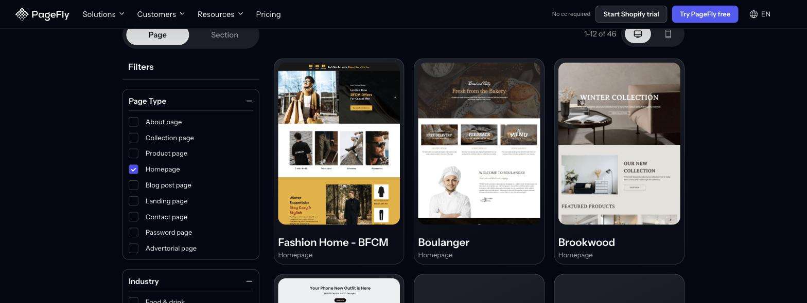
PageFly's template library carries 320+ page and section templates, and filtering the Page tab to Homepage returns 46 homepage templates to start from.
| Method | Best for | Skill level needed | Cost | Time to live |
|---|---|---|---|---|
| Shopify theme sections (free or paid theme) | New stores that fit the theme's built-in layout | Beginner - no code | Free themes available; paid themes are a one-off purchase | Same day |
| Custom Liquid / theme code | Teams with a developer and a layout no theme supports | Advanced - Liquid, HTML, CSS | Developer time | Days to weeks |
| Page builder app (for example PageFly) | Merchants who want a custom homepage without code, and want to iterate often | Beginner to intermediate - drag and drop | Free plan available (1 page or section, 320+ templates); paid plans for more | Hours |
| Agency or Shopify expert | Established brands needing bespoke design and build | None - you brief, they build | Highest; project-based fees | Weeks |
Whichever route you pick, the template is only the starting frame: you still have to fill it with the section order above, real product imagery and honest proof. Learn more about how the drag-and-drop route works in the PageFly visual editor, or compare what is included on each tier on the pricing page.
Best PageFly Templates for High-Converting Shopify Home Pages
Choosing the right template can significantly affect your store's conversion rate and overall performance. PageFly offers templates designed to cater to different niches and business needs. Here are eight of the best PageFly templates to consider for a high-converting Shopify home page.
1. Tee Vibes

Ideal for apparel stores, the Tee Vibes template showcases products with a clean and modern layout. This template is designed to highlight featured products and collections, making it easier for customers to browse and shop.
Key Features:
- Hero section with high-quality images
- Product grids and featured collections
- Call-to-action buttons for quick navigation
- Responsive design for mobile and desktop
2. Pet Corner

Perfect for pet stores, Pet Corner provides a playful yet professional look. This template focuses on showcasing pet products and accessories with engaging visuals and clear calls to action.
Key Features:
- Visually appealing hero section
- Detailed product descriptions
- Customer reviews and testimonials
- Easy navigation and search functionality
3. Nivellia

Nivellia is designed for beauty and skincare stores. It emphasizes product benefits and ingredients, appealing to customers who are particular about what they apply to their skin.
Key Features:
- Elegant design with a focus on product details
- Sections for customer reviews and testimonials
- Highlighted features and benefits
- Mobile-optimized layout
4. R2VF

This template is great for electronic and tech stores. R2VF focuses on showcasing gadgets and electronics with a sleek and modern design.
Key Features:
- Highlight sections for product features
- Comparison tables for different products
- Integration with video reviews
- Fast loading times for a better user experience
5. Tumbler

Designed for drinkware and accessories, Tumbler provides a stylish and functional layout. This template is perfect for highlighting product collections and seasonal promotions.
Key Features:
- High-quality images and product showcases
- Promotional banners and offers
- Customer reviews and ratings
- Easy customization options
6. Fizzy

Fizzy is ideal for stores selling beverages or related products. It features a vibrant and engaging design that captures the essence of the products.
Key Features:
- Bright and attractive design elements
- Sections for product features and benefits
- Customer reviews and testimonials
- Easy-to-use navigation and search
7. Kitchen Crafters

Perfect for home and kitchen products, Kitchen Crafters offers a cozy and inviting design. It showcases products in a home-like setting, helping customers visualize their purchases.
Key Features:
- Realistic room layouts for product display
- Detailed product information and specifications
- Inspiration galleries and customer reviews
- Wishlist functionality for future purchases
8. Maize - Thanksgiving

Ideal for seasonal promotions, Maize focuses on festive themes and holiday sales. This template is perfect for Thanksgiving campaigns.
Key Features:
- Festive design elements
- Sections for featured products and offers
- Customer reviews and holiday-specific promotions
- Mobile-friendly layout
With a template as the starting frame you save time and money, and you can still customize it to fit the look and feel of your brand. Adding products and collections takes only a few minutes, as seen in this tutorial video. The same approach works for the pages your homepage routes to, from product page customization to collection pages.
Conclusion
Thousands of merchants use PageFly for its customization options and customer support. If your homepage is not routing visitors anywhere, start with the section order above, fix the mobile stack, then rebuild the hero — and keep campaign traffic on a separate Shopify landing page.
PageFly has a free plan — it includes one published page or section, 10 AI credits a month, and access to 320+ page and section templates — so you can build and publish a homepage before you decide whether to pay for anything. From there, the next pages worth your attention are your product pages and your collection pages, since that is where the homepage sends everyone.
Shopify Homepage FAQ
Every Shopify homepage needs: (1) a clear navigation menu, (2) a compelling hero image or video, (3) a visible call-to-action above the fold, (4) featured collections or product categories, (5) trust signals such as reviews or ratings, (6) a mobile-first layout, and (7) a page fast enough to pass Google's Core Web Vitals thresholds.
Top to bottom: announcement bar, hero, primary CTA, featured collections, social proof, bestsellers, brand story, email or SMS capture, then footer. The logic is routing - identify the visitor, then hand them off to the right collection or product page in as few clicks as possible.
Yes. Your theme's home page template already lets you add, reorder and remove sections from the Shopify admin, and a page builder app such as PageFly adds drag-and-drop sections and pre-built templates on top of that. You only need Liquid if you want a layout no theme or app supports.
Long enough to route every visitor type and no longer - for most stores that is a few screens on desktop. Keep the hero, the primary CTA and the first collection tiles above the fold, then put brand story, social proof and email capture below.
Fast enough to sit in the good range for Google's Core Web Vitals (LCP, INP and CLS) on a mobile connection. Compress hero images, avoid autoplay video without a poster frame, and measure with PageSpeed Insights on mobile rather than desktop.
Feature a small, curated set - one row of bestsellers, or two to three collections, is usually plenty. Too many options cause decision fatigue, and the homepage only has to get shoppers into the right collection, not close the sale.