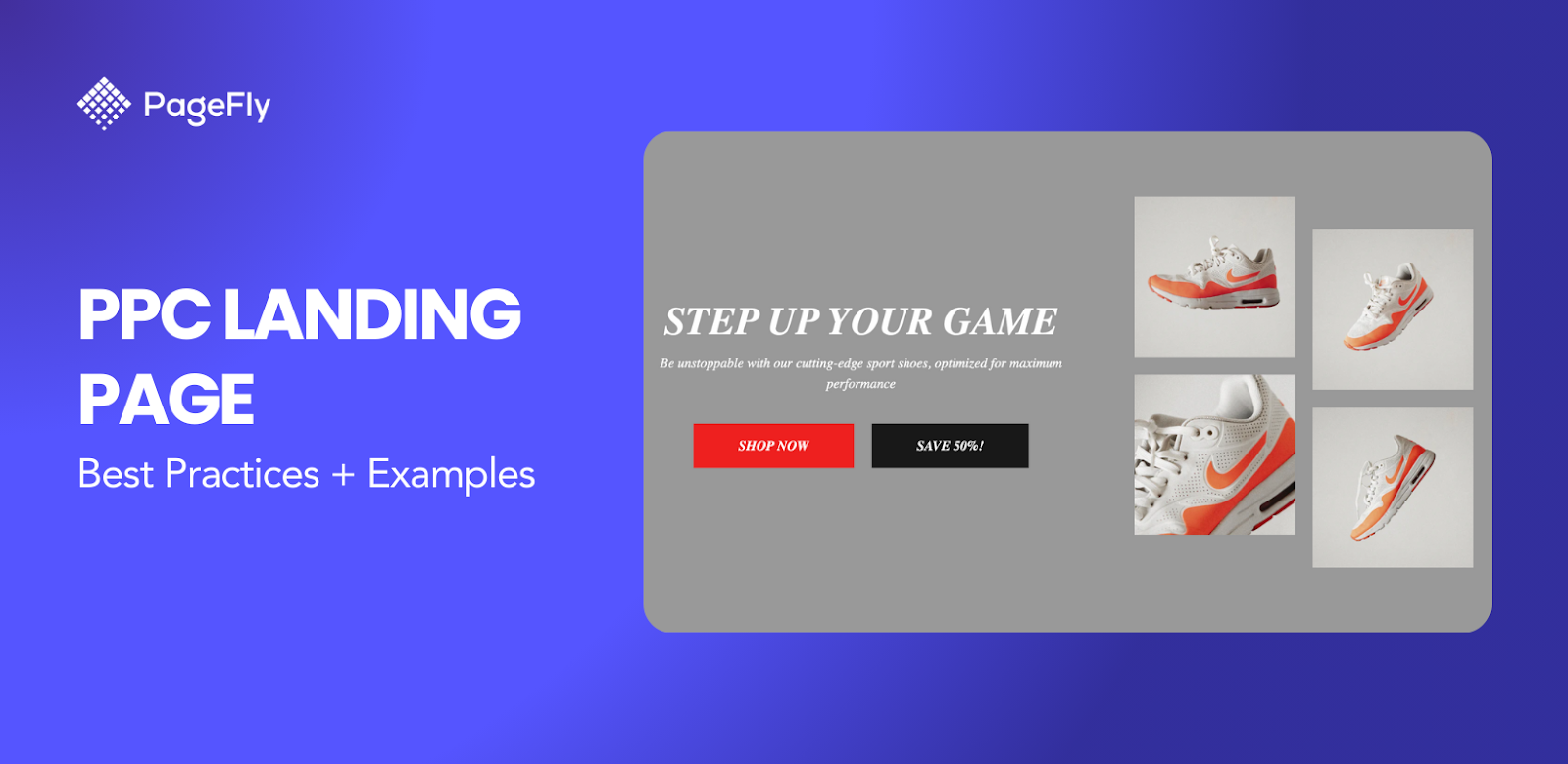
Accessible and flexible in budget, Pay-Per-Click or PPC marketing is a widely trusted tactic, leaving mental space for enterprises to dedicate their efforts to other activities that follow the click. Among the first contacts with the target audience, the PPC landing page is what makes or breaks the deal.
Search engines like Google have cemented their role in marketing as potent marketing outlets to capture potential customers. Some marketers invest in long-term strategies like SEO or search engine optimization. But those who are looking for an immediate spike in their web traffic rely on PPC ads to attract customers.
Business owners can pay a publisher a certain amount of fee to run a pay-per-click (PPC) campaign and show the ad when their visitor does a search for the relevant keyword(s). And when executed properly, the money invested in running PPC campaigns will come back multiple folds in terms of revenues for the business.
This article will shed light on the essence of PPC landing pages and uncover the best examples and industry secrets behind them.
What Is A PPC Landing Page?
A PPC landing page is a web page where users end up after they click a specific pay-per-click (PPC) ad on search engines.
If you click on this ad, for example:

You’ll be taken to this landing page:

These landing pages can be similar to or different from other pages (like product pages on your website) because they’re tailor-made to complement the search ad. If you are after brand awareness, a PPC ad about your overall business can just point to your home page. But if it’s the sales for your products that you want to drive, a single standalone page specifically designed to promote that product might be better.
If you run the campaign on Google search, the policy is that your landing page and display URL (the webpage shown in your ad) must share the same domain. Your landing page experience is one of several factors that helps determine a keyword's Quality Score.
The experience of a landing page is represented by such things as the usefulness and relevance of information provided on the page, ease of navigation for the user, and how many links are on the page.
Best Practices For Creating PPC Landing Pages
Even though PPC ads fast-track your journey to your customers’ screens, it does not mean that it guarantees immediate success. In today’s competitive ecommerce landscape, you might be competing against other brands over the same keywords.
As such, you need to find a way to make your landing pages stand out. Here are the best practices that you need to follow when designing a PPC landing page.
Keep The PPC Landing Page Design Relevant To The Keywords
One of the best ways to annoy people searching on Google (and in general) is not delivering on your promise. Thus, a good PPC landing page design does not only pertain to visual aspects.
Instead, it means delivering on the promise that you mentioned in your call to action.
Make sure the PPC landing page matches the keywords that you are bidding on and that the page matches the promise within the ad copy.
If you are targeting users looking for ‘bikini deals’ don’t send users to a ’10 things to prepare for your beach vacation this summer ’ landing page. Although the page sounds relevant and undoubtedly has a call-to-action, it's just not what the user was looking for when they chose to click your ad.
Compose Content With Your Target Customers In Mind
When writing content and deciding on imagery on your PPC landing page design, ensure that they match your target customer. For example, let’s say you are creating a PPC campaign to drive new leads for your Cloud service, there will be:
- People who already use Cloud and have sound technical knowledge.
- New businesses who don’t know why they need Cloud and have no understanding of technical terms.
You would want to use a separate set of images for each search ad targeting different personas. For example, for the tech specialists, you would want to portray a tech-saturated image that goes into great detail about systems integration and the use of Cloud in information management, data analysis, marketing, etc.
Develop A Mixed Use Of Conversion Elements
This is the part where you have to work your creative brain. Now that you have the clear objective in mind, the arrangement of landing page elements must intrigue your visitors to follow the call to action.
In the video below, Flux Academy explains the elements that you can put in a landing page to increase its chance of converting visitors into a customer. Watch the video and be sure to bookmark it so you can get back to it when designing your PPC landing pages.
Make Sure Your Landing Page For PPC Is Mobile-Friendly
Your landing page for PPC must not only look good on desktops but also on mobile devices as well, especially on smartphones.
That’s because 63% of searches occur on mobile devices in the US. (Source: statista.com)
In addition to that, in October 2023, Google confirmed the completion of its switch to mobile-first indexing. Which means that Google now crawls and indexes pages based on the perspective of a mobile browser.
As such, if your landing page for PPC is not optimized for mobile devices, it might not perform very well in Google searches.
Moreover, this does not only apply on a landing page for PPC. Instead, it applies to all websites that are indexed by the Google search engine. Therefore, when creating your PPC landing page design, make sure to check how it will look on mobile devices as well.
Fortunately, the Shopify theme editor has that function.

Simply look for the buttons highlighted above to switch from desktop to mobile screen. That way, you’ll know that your landing page for PPC is optimized for all devices.
Use Analytics To Inform Strategic Decisions
In addition to knowing how to create a compelling PPC landing page design, you also need to know how to understand insights about the results of your campaign.
Google Analytics should be used to track the performance of your PPC landing pages. Make sure that you have already assigned a goal to the landing page and its calls to action before you get the campaign running, e.g. the number of times a video is played or the number of clicks on the inquiry forms.
Once you have your goal set up you will be able to see conversion data of your PPC landing pages within Google Analytics which is perfect for monitoring top level performance.
Page speed is a critical success factor within the conversion process. Best practice for page load is 3 seconds and below. You can check your page speed with Google PageSpeed Insights (anything below 85 needs should be further investigated).
20 PPC Landing Page Examples To Learn From
To further help you in your quest to create a PPC landing page, we’ve compiled some PPC landing page examples below to show you how other brands design their ad pages.
Additionally, these PPC landing page examples come from a wide range of business categories so you’ll get an idea whatever niche you’re in.
Serenata Flowers

- Headline: Brand USP: 7 days/week delivery
- Ad description: Measurable benefits (time of delivery, shipment policy) and customer trust
- Sitelinks: Quality product sections

- Consistent goal, i.e. to promote key benefits and products of the store. The color palette is beautifully flowery
- Clear calls to action, in line with the sitelinks on the search ad.
- Product arrangement in gallery view, adorned with discount effects.

- Customer reviews and ratings for social proof
Ivyrose

- Headline: Promotes key glasses products
- Description: Focused on emotional benefits and discount
- Sitelinks: Promotes other product lines that might interest female glasses buyers

- While the store offers a wide range of choices for women buyers, the landing page maintains a consistent goal with the search ad and promotes glasses products only.
- Good use of imagery, illustrating how the products are used in real life.
- Discount effects and the countdown banner urge prospective users to buy.
Sourcing HTKD

- Headline: Positions the company as a B2B brand
- Description: Increases social trust by incorporating the great number of partners hosted on the platform
- Sitelinks: Promotes other categories that the company specializes in.

- Product section tailored to help visitors do more comfortable search (search bar, filter, sort, etc.)
- The ‘Contact Supplier’ call to action is placed in each product box, bringing wholesalers closer to the company agents.
Cleace

- Headline: B2B positioning. Order cap.
- Description: Medical trust
Shop Britto

- Headline: Promotes the type of product that stays close with the keyword most
- Description: An overview of all products in stock
- Sitelinks: Discount-heavy

- The banner and ‘rewards’ button act as discount reminders
- ‘Chat with us’ button enables the brand to show their will to do extra customer servicing
Talk Bass

- Headline: Discount-focused (free registration & low subscription fee), helping advertise a good variety of instruments that are offered by the brand.
- Sitelinks: Affiliated communities

- The page plays the role of a site for brand awareness, focusing on community building in the form of a forum.
- Topic threads help promote the product more effectively in a user-friendly tone of voice. The ‘Trending Today’ section lets visitors keep tab of what’s currently debated most in the community and choose to engage if interested.

Andesboba

- Headline: General branded messages
- Contact number

- The large banner slideshow shows off the aesthetics to the company in terms of F&B styling
- Meets brand awareness goal on every slide, inspiring consumers to explore more the story behind their boba products
TikTok

- For a general keyword like ‘ecommerce’, TikTok surely has to bid at a high cost.
- Both the headline and the description intentionally contain the keyword and further explains how the company helps its clients achieve their goal.

(*) Changed to English for easier explanation
- The hero banner stays consistent with the branded colors and has advertising copies that accentuate B2B potentials
- Imagery of metrics and charts pushes more traffic to the ‘Get Started’ call to action at the center. The calls to action are also placed and optimized in different spots throughout the place - really sticky and clickable!
- Benefits on the data-driven side

- Success story - an unconventional way to deliver customer reviews

- Repetitive bottom call to action, coupled with the registration form

Shopify App Store - Grayfox

Not a big surprise to see the Shopify app store on the first result. The eCommerce giant gains its reputation in eCommerce as a perfect companion for those who wish to start their online business.
However, the fact that the keyword ‘online store’ is bidded on by GrayFox, an app provider on Shopify is actually beyond me! Quite a bold move to perform such a competitive keyword.
- Headline: Product USP: AI optimization
- Contact number, meaning customer service point is only one call away
- Description: Promises both rational and emotional benefits brought by the product
(*) Mind you, Shopify has several apps to support your business. If you’re looking to build a functional store and customize your pages for free, check out PageFly, the number one Shopify page builder on Shopify app store.
- A video can speak louder and a lot more than words! Here you can find all the things you need to know about GrayFox, right upon entering the page.
- Text columns make the benefit section easier to follow
- Media gallery shows greater insights into the use of the product. Customer support can be reached through many different channels.

- Customer ratings and reviews. If possible, the app provider should encourage more users to leave their comments. Overall rating at 5 stars with only one comment does not really convey credibility and appeal to the audience.

Youtube

Another big tech corporation! Here we have Youtube bidding hard on the ‘Music album’ keyword to advocate their artists.
- Headline: Features artists and music works
- Description: Describes the work in a straightforward manner
Now let’s jump in headfirst and explore Youtube as a landing page!

- Search bar, with voice assistant, allows web visitors to explore Youtube massive sources of entertainment.
- Product description comes with hashtags and customer ratings (likes and dislikes)
- More product details in the drilldown. Clear call to action, motivating users to learn more from the artist and their video.

- Real-time customer reviews/comments
UAS Pharma

- Headline & description: A pretty clear big picture of what the company has to offer, highlighted by the key product at the end of the copy
- Contact number
- Sitelinks: Product categories

- Hero banner takes advantage of an emotion-charged image that resonates with potential buyers.
- The headline and copies deliver on health guarantees, which is arguably the most important concern about a cosmetic product.
- Straightforward product browsing and shopping experience

- Payment and logistic benefits are visualized in columns, with color consistent icons. Payment partner logos are to ensure credible transfer.

Booking

Booking can’t wait to make their comeback to the tourism scene. The everything-touristy company bids on common keywords like ‘travel agency’ to grab every opportunity that might come during and post-pandemic.
- Headline: Follow the [Place] + [Promise], or the [Problem] + [Solution] prompt. Booking probably suggests to me a European destination because they think other Asian folks and I might wish to travel to faraway places after COVID-19 is brought under control.
- Sitelinks: Two calls to action that urge me to make bookings instantly.
- Booking calendar pops up right at the moment the visitors enter the page. Super smart and ambitious!
- Clear destination description with customer ratings. The info box below asks aspiring travellers to comply with COVID-19-related customs.

- The subscription box at the footer acts as an inviting call to action.

Lost Boys Studios

I initially thought I would run into shops that sell photo lighting equipment. Turns out, educational organizations and online classes like Lost Boys Studios took the upper hand and bid on the opportunity to teach about photo light technique!
- Headline: Speaks right to the target audience, which is aspiring art students.
- Image: Clear portrays what it feels like to attend the course - very innovative and futuristic, I guess.
- Sitelinks: Focuses on the outcome of the program, providing the typical timeframe (12 months) and the certification (Compositing & FX)

- The banner automatic slideshow showcases the photo lighting works from the studio to warm up the audience.
- The information layout that follows capitalizes on both images and videos to better explain the program.

- Instructor profile gains more trust on a personal level, followed by alumni success stories.


- Call to action wrapped at the footer, below the detailed admission section

Eytys

- Headline & description: A simple description with the name of the brand and what the store has on display.
- Sitelinks: Nested pages

- Photos are used flexibly to show the products from different angles and create gallery viewing for the collection as a whole.
- Pop-up newsletter registration box contributes to lead generation, which also appears again at the footer


Korean Manufacturers

- Headline: Bids on Google broad match, so the term ‘seats’ can be associated with ‘chairs’.
- Description: Overall picture of the business. Includes the term ‘chairs’ intentionally to match the keyword
- Sitelinks: Covers other product lines of the manufacturer

- Visuals and copies target tech specialists in the industry, highly focused on specifications and technical drawings.

- Brand story is neatly told via quotes, text boxes and videos

- Another section of product specification

- Inquiry form is to build a lukewarm rapport between the company and clients.

Decor House Furniture

- Headline & Description: Broader match and phrase match keywords for ‘Home’ and ‘House’. Defines the company as a high-end furniture brand
- Sitelinks: Focuses on the two areas that furniture buyers might want to shop for.

- The header banner brings a highly Scandanavian feel to the table, like, literally ;) Every slide shows a wooden minimalist setting that truly inspires. That makes the call to action box on the right is a lot more clickable.
- The products are bundled into different collections and give a Pinterest-inspired vibe across the page.

Coach Spot

- Headline and description: Delivers professional credibility, along with other sports programs they offer
- Sitelinks: Discount and category options

- Flash sale banner and discounts that drive FOMO effects
Filmora

- Headline & Description: Positions the product as a multifaceted editing software, backed by impressive numbers.
- Sitelinks: Calls to action (Download & Update) and key features (edit & personalize features and multiple video effects)

- The sparkling banner creates an inspirational atmosphere for the page and reveals the wonderful effects of the product.
- Clear headline and copies, coupled with customer ratings, tempt the visitors to click on ‘Free Download’ and try out the software.
- Customer view and product benefits are visualized in a quite appealing fashion.

- More benefit visualization. Helps avoid tons of lengthy texts!

- Customer reviews with profile photos, names and detailed comments

- Call to action at the footer, also to introduce the release of the latest product.

Welters

- Headline & Description: Positions the brand as a leading expert in dental health
- Sitelinks: Point to ‘Contact’ and ‘About’ pages, taking web visitors to the company’s credentials and giving them better reasons to stay.

- Header banner compares the product with a traditional method, helping highlight its USP.
- Bold headlines and benefit description in bullet points, making it easier for users to skim and scan.
- Product benefits are illustrated in separate information boxes. Quite a good mix of icons, headlines and texts in terms of colors.

- The testing report, instruction video and product specification are to deliver medical guarantees to the readers.


Coursera

- Headline & Description: Highlights educational benefits and credibility
- Sitelinks: Includes calls to action and key products that address customer’s needs during the stay-at-home current situation worldwide.

- The header banner emphasizes the purpose-driven philosophy of Coursera, while including three clickable calls to action (Join for Free, Try Coursera for Business & free learning sources)
- The color palette is a consistent mix of blue and white, alleviating browsing distraction and adhering to the brand guideline.
- Reputable partner logos and understandable benefit columns to increase social trust

- The following sections boast wonderful numbers and achievements that the company has accomplished, clarifying measurable outcomes for those reluctant to sign up.


- Authentic customer reviews, including profile pictures, bios, titles and sharings.


PPC Landing Page Templates
Here’s the thing, not everyone knows how to design PPC landing pages. And if you want to run PPC ads as soon as possible, designing a landing page from scratch and learning what types of elements to use could still take some time.
Thus if you want to run ads fast, you need to use PPC landing page templates.
PageFly has a multitude of PPC landing page templates that are designed to suit all types of businesses. You simply have to choose a design that you want and you can further tweak it to add your brand’s personal touch.
Here are some of the best PPC landing page templates that you can find from our collection:

All our PPC landing page templates contain all the right conversion elements above to ensure the efficacy of your ad campaign. So if you’re keen to learn more, be sure to check out these templates.
Conclusion
The PPC industry is highly dynamic, and establishing a high-converting PPC landing page is among one of those crucial steps that give you a good start to the game. Hopefully the examples and tips above have given you an extra boost to initiate your first PPC landing page.
If you are no digital marketing expert, turning to Shopify and the trustworthy page builder PageFly might be of help - no tech background required, and plentiful templates to choose from! After some getting used to, you can basically work your way around the admin panel, set up different types of pages without difficulty, and then invest your primary efforts into operating your business.
FAQs
What is a landing page in PPC?
A PPC landing page is a dedicated web page that users arrive at after clicking on a PPC ad. It’s primary goal is to drive conversions (sales, sign-ups, etc. depending on your goal) by aligning closely with the ad’s message.
What is the difference between a PPC landing page and SEO landing page?
A PPC landing page is designed specifically for paid ads. The focus of which is immediate conversions.
On the other hand, an SEO landing page is optimized for organic search ranking and long-term visibility.
What is the main purpose of a landing page?
The main purpose of a landing page is to guide visitors toward taking a specific action or to “convert”. Conversion in landing pages may have various meanings depending on your goals.
For a landing page that aims to acquire more email subscribers, getting sign ups means conversion.
For a landing page that aims to sell, generating revenues means conversion. And so on.
Ppc Landing Page FAQ
A PPC landing page is a dedicated web page that users arrive at after clicking on a PPC ad. Its primary goal is to drive conversions (sales, sign-ups, etc., depending on your goal) by aligning closely with the ad’s message.
A PPC landing page is designed specifically for paid ads, with a focus on immediate conversions.
On the other hand, an SEO landing page is optimized for organic search ranking and long-term visibility.
The main purpose of a landing page is to guide visitors toward taking a specific action or to “convert.” Conversion on landing pages may have various meanings depending on your goals:
For a landing page that aims to acquire more email subscribers, getting sign-ups means conversion.
For a landing page that aims to sell, generating revenues means conversion.
And so on.

![Art Business Names: 350+ Ideas + Free Generator [2026 Updated]](http://pagefly.io/cdn/shop/articles/art_business_name_a626399e-f03a-49cf-a3ea-a9cc49e9bdd8.png?v=1780568321&width=1640)
![14 Profitable Small Food Business Ideas for 2025 [Real Numbers]](http://pagefly.io/cdn/shop/articles/1_58b587d2-13db-4aa6-8c19-e40f5c88d3eb.jpg?v=1758255771&width=4460)