On the hunt for modern shop counter design ideas for your retail store? We got you! In this article, we have compiled a list of Shopify stores that have retail outlets and we will see how they made their sales channel follow the same brand identity. Of course, we will point you in the right direction in finding some of the best modern shop counters on the internet.
So, if you want some design inspirations from real Shopify stores, keep reading.
Outline
- A New Business Milestone
- Ecommerce Checkout Page & Retail Store Counter: How Are They Connected?
- Elements Of Highly Converting Online Checkout Pages And Retail Store Counters
- Secure Payment Method
- Mobile-Friendly Checkout
- Checkout Options
- Frictionless Checkout
- Upsell & Cross-Sell
- Social Media Sharing
- Implement Brand Identity
- Topnotch Customer Support
- Modern Design
- Modern Shop Counter Design
- Bottom Line
A New Business Milestone
To most ecommerce brands, establishing a retail store is a symbol of growth and financial stability. It is equivalent to opening a new chapter in your business and making a statement to the world that, “I Made It!”
If you have reached this milestone in your ecommerce business, congratulations! You are a step closer to becoming a mainstay brand in your niche. This is a stern warning to your competitors and they better look out – because you mean business and you are on the rise.
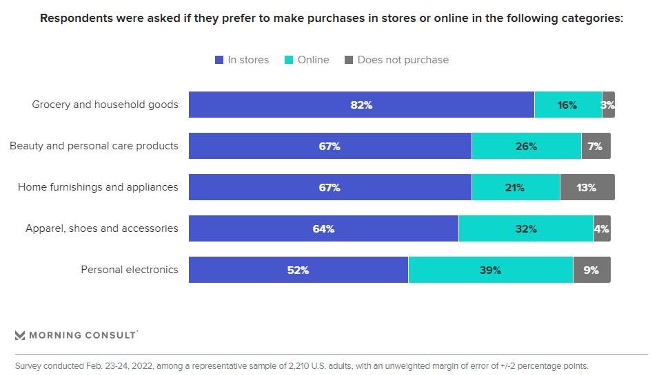
A survey conducted in 2022 by Morning Consult yielded a rather unexpected result in this era of ecommerce. As you can see, more than half of the respondents still prefer in-store shopping on the following niches:
- Grocery and household goods
- Beauty and personal care products
- Home furnishing and appliances
- Apparel, shoes, and accessories
- Personal accessories.
This shows that physical stores still remain relevant nowadays. With that, there are challenges that come with establishing a retail store alongside your online store. One of which is the design.
Your retail outlet should carry the same brand identity to give your customers similar (or better) shopping experience like they had in your online store.
One way to do that is by adopting a uniform theme on both sales channels.
Ecommerce Checkout Page & Retail Store Counter: How Are They Connected?
Large brands like Gymshark, Allbirds, Spanx, and Kylie Cosmetics all know the importance of having both digital stores and physical stores to cover large bases of customers. These brands all started on ecommerce and later on established their physical stores.
There are four (4) important reasons why brands still use the traditional method of brick and mortar store despite finding success in ecommerce:
01. Customer Loyalty
To some customers, having someone to ask when needed is important in their buying experience. Retail stores provide this kind of customer service better than ecommerce stores. And it contributes a great deal in building customer loyalty if customers can interact with a brand’s employees to ask questions or advice in their purchase decision.
This is also the reason why Starbucks is so famous – because great customer service establishes brand loyalty.
02. Customer Interaction With The Products
Ecommerce stores fall short in terms of providing a tactile feel of their products to their customers. It is hard to make a purchase decision when customers don’t know how the product looks and feels in person.
Physical stores offer tangibility. They allow customers to browse through your products and have a feel of them one by one.
03. Immediate Sales
Ecommerce stores are notorious for encouraging impulse purchases. Because why not? In just a click of a button, you’ve already checked out and all you need is to wait for the delivery.
Physical stores can also provide this benefit to businesses. They are great at converting window shoppers into customers.
04. Convenience
Digital stores are best for effortless shopping because customers can make a purchase while they are lying on their couch.
On the other hand, physical stores are best for customers who want an immediate solution. Thus, if a customer has a specific need for that exact time, they can have it by buying from a retail store.
So… Where’s The Connection?
Ecommerce stores and physical stores go hand in hand. Both have their advantages and disadvantages. That is why they are complementary in nature. What an ecommerce store can’t provide, a physical store should – and vice versa.
There are things that your retail counter and online checkout page should have in common:
- Minimal checkout friction
- Great customer service
- Implementation of brand identity
- Items for upselling and cross selling
Let’s talk more about this in the next section.
Elements Of Highly Converting Online Checkout Pages And Retail Store Counters
Before choosing a modern shop counter design for your retail store, there are important elements that must be present as well in your checkout page.
These elements are crucial to execute in both physical and digital sales channels because:
- They have a direct influence in your customers’ purchase decisions.
- Impacts their confidence in buying from your store.
- Affects your business’ ability to increase conversion rates.
Here are those elements:
01. Secure Payment Method
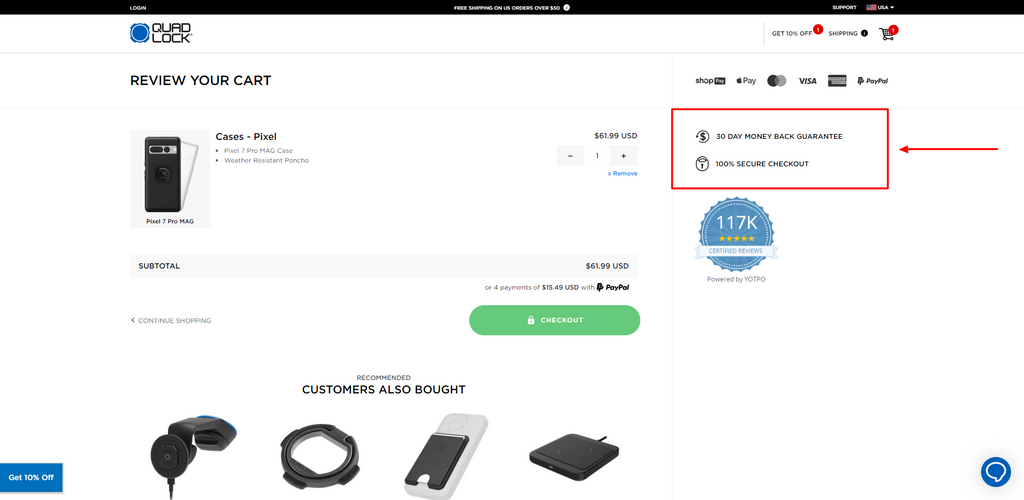
Be it in your online store or in your retail outlet, customers need a secure way of payment. Of course, the most secure one is through cash payment. But if the customers opt for contactless payment, you should give them the confidence that their financial data is secure in your payment gateway.
One way of this is by adding security assurance seals in your checkout page.
02. Mobile-Friendly Checkout
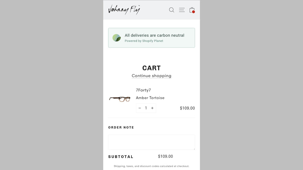
Your digital checkout should not be burdensome to use for customers. It should only ask for necessary details and nothing more – such as asking them for personal information to create an account.
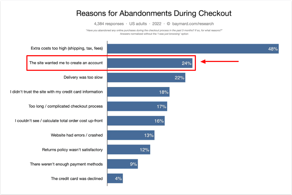
Studies show that mandating customers to create an account on your website is the top 2 reason why 24% of customers abandon their carts.
03. Checkout Options

Credit and debit card payments are very common nowadays. However, there are other digital payments that customers can use, such as ShopPay, PayPal, Amazon Pay, GPAy, Maya, etc. Depending on where the customers are located, their common choice for digital payments may be different.
Thus, your online store and your physical store should give your customers the freedom to pay on whatever means they find most convenient.
04. Frictionless Checkout
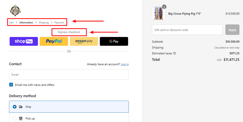
Unnecessary customer inconvenience during the checkout process affects your ecommerce sales.
Some examples checkout frictions are the need to:
- Provide shipping information
- Create an account
- Endure lengthy checkout processes.
Provide a checkout progress indicator to let customers know how many steps are needed. But if you want to eliminate the problem altogether, provide an option for express checkout.
A Shopify POS works the same way for your physical store.
05. Upsell & Cross-Sell
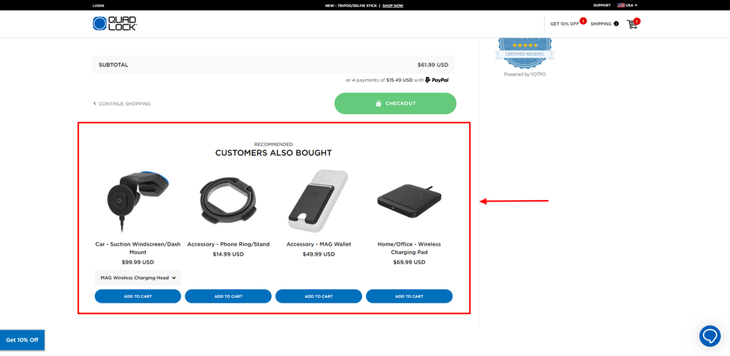
In a retail store, strategically placing low-value items along the customer’s journey to the counter is a means to upsell and cross sell. An additional item in every customer’s transaction, when it all piles up at the end of the month, has a huge impact on your sales and profitability.
You can execute the same strategy in your ecommerce store by adding a recommendation section below your customer’s cart.
According to VWO, “Upselling or cross-selling done right helps the customer find more value than they were expecting. It can increase revenues by up to 43%.”
This significant increase in revenues makes upselling and cross-selling one of the better sales strategies that you should not skimp on if you want to increase your bottom line.
Quad Lock did a great job in executing an upselling and cross-selling strategy by showing other items that their customers bought in their store that are not currently in your cart.
06. Social Media Sharing
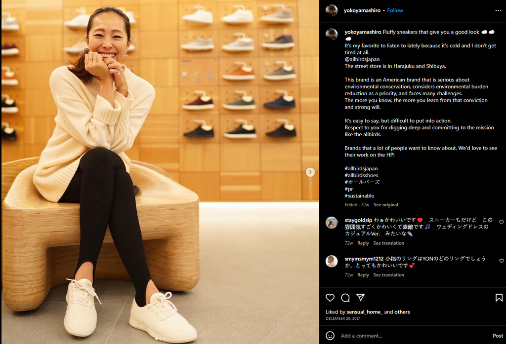
User-generated content helps you establish brand awareness through the perspective of your happy customers. That is why it is important that you seize the opportunity to ask your customers to share their shopping experience or product review.
Create a branded hashtag so your customers can use it when they post on social media. Display it in your ecommerce store and put a simple sign in your retail store.
The more customers use your hashtags, the better it is because your brand gets organic exposure through their social media accounts.
07. Implement Brand Identity
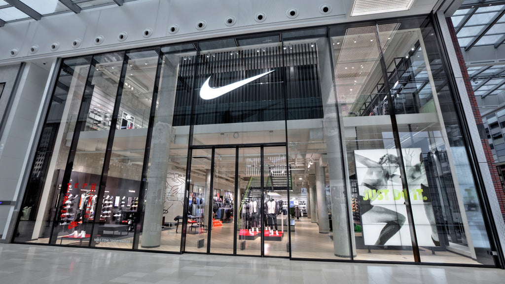
Nike is arguably one of the more iconic brands in the world. Their simple swoosh logo is worth a thousand words and there’s probably no one who does not identify the logo.
This is what brand identity does to a brand. Nike has successfully done it with their swoosh logo along with their years of experience in developing their brand and keeping their retail outlets up to speed with the current trends.
Having a concrete brand identity is an important aspect of both retail and ecommerce businesses to stay relevant in an ever-competitive market.
It is crucial that your brand identity is not just in your retail outlet facade but implemented all throughout the store. Thus, it is important that it is included in your modern shop counter design.
When brand identity is implemented in all your sales channels, you can leave a lasting impression on your customers.
08. Topnotch Customer Support
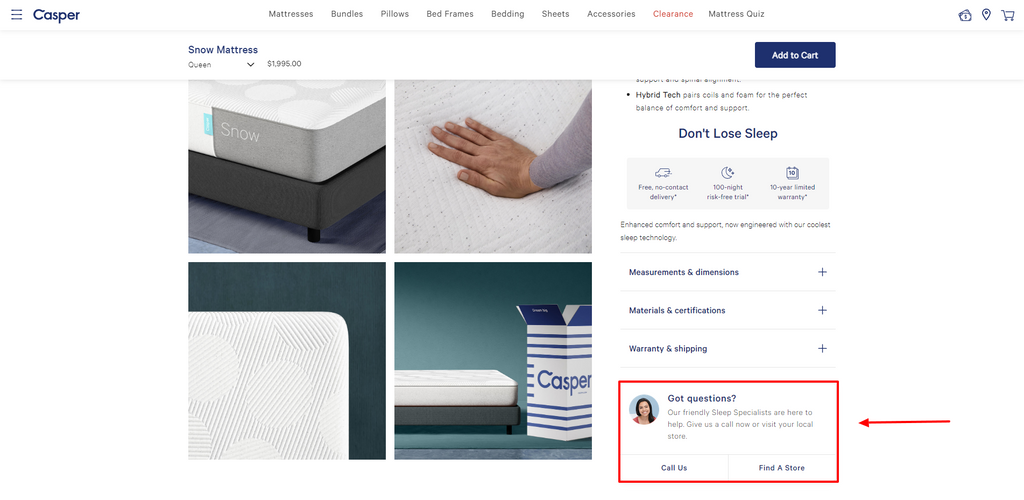
Great customer support is easier to execute in retail stores compared to ecommerce stores. In physical stores, your staff can support your customers right when the customer needs assistance. Thus, problems are easily resolved especially during the checkout page.
Ecommerce stores are a different story though. Checkout page inconveniences increase risk of cart abandonment.. And if you are not there to solve it, you lose out on a probable sale.
To counteract this problem, your online customers should have access to live chat support when problems arise.
According to LiveChat, 51% of online consumers declare they are more likely to make a digital purchase from a brand that offers live chat.
09. Modern Design
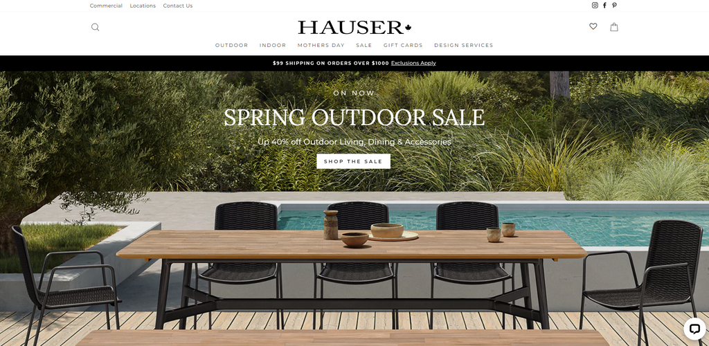
Modernity does not only mean the physical appearance of a website. It also pertains to a website’s architecture in order to cater a secure online transaction.
However, the look and feel of a website still plays a crucial role in establishing the feeling of security in a customer’s mind. A clunky website with low quality images gives the impression of poor security, and this is a reason for them to abandon their cart or worse, not browse at all.
There are hundreds of Shopify themes to choose from when creating a modern website. Additionally, you can use a page builder to implement a modern design that your target customers would be attracted to.
By implementing a good UX design in your website, your customers can have that sense of confidence to shop in your online store.
In the same way, a modern designed retail store with seamless design that is representative of the brand identity builds a trusting image in your customers’ minds.
Modern Shop Counter Design – Real Shopify Stores
Now that you know how to implement a sales-driven strategy in your ecommerce and retail stores, the time has come for us to look for some modern shop counter design inspirations.
Here are real Shopify stores with existing physical outlets that are implementing a uniform theme on both sales channels. We will analyze their checkout pages and see if they have the right elements of a sales-driven checkout page.
At the end of each list, we will point you in the right direction to find a modern shop counter design similar to that of the store’s theme.
01. Velasca
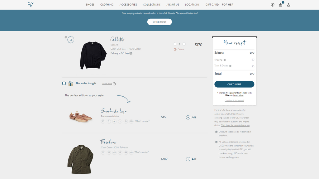
Velasca Milano is a manufacturer and retailer of genuine Italian leather shoes. Their shoes are made by experienced shoemakers. They also sell other accessories for men such as belts, wallets, and shoe-care products.
Their website is a perfect example of modern-classic. A store that harks back to the past to retain its classical styling while employing modern designs to remain relatable. Their checkout page has the same attributes whilst offering a very seamless checkout process and providing a section for product suggestions as an attempt to upsell or cross sell.
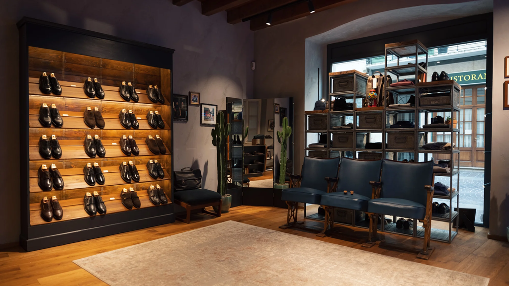
Their physical store in Brescia, Italy is no different. A classic vibe with modern simplicity. It looks more like a gentlemen’s lounge rather than a shoe store.
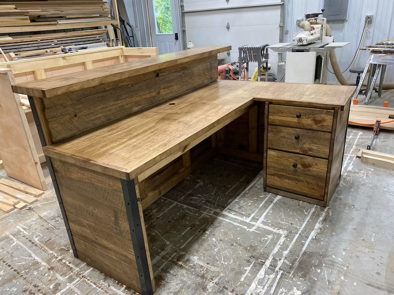
A modern classic store like Velasca needs a similar modern shop counter design like this minimalist wooden retail counter.
This one is made by FurnitureByFrazer and you can buy it on Etsy.
02. Florist
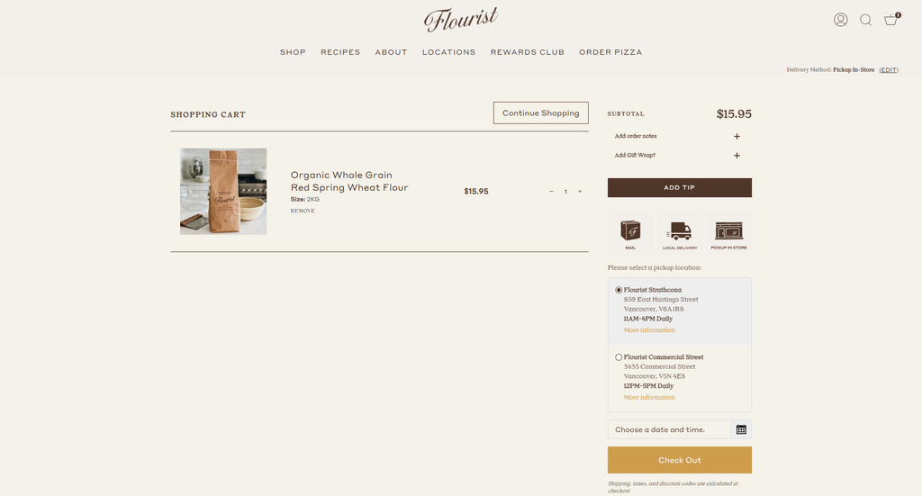
Flourist is a Canadian owned business that focuses on sourcing products from local farmers. They sell breads, baking materials, as well as pizzas.
Their website is as simple as it can be. Straightforward. Built for shopping and storytelling – and they do it incredibly well.
What stood out in the Florist checkout page is that it gives the customers a choice whether they want to have the items delivered in their home or they want to place an order and pick it up in one of their stores. This strategy allows the customers to experience the convenience of ecommerce and the customer service of retail counters.

Their retail store, on the other hand, is one that looks like an artisan’s boutique instead of a bakery. It adopts a wooden texture accompanied by yellow lights to give that calming vibe.
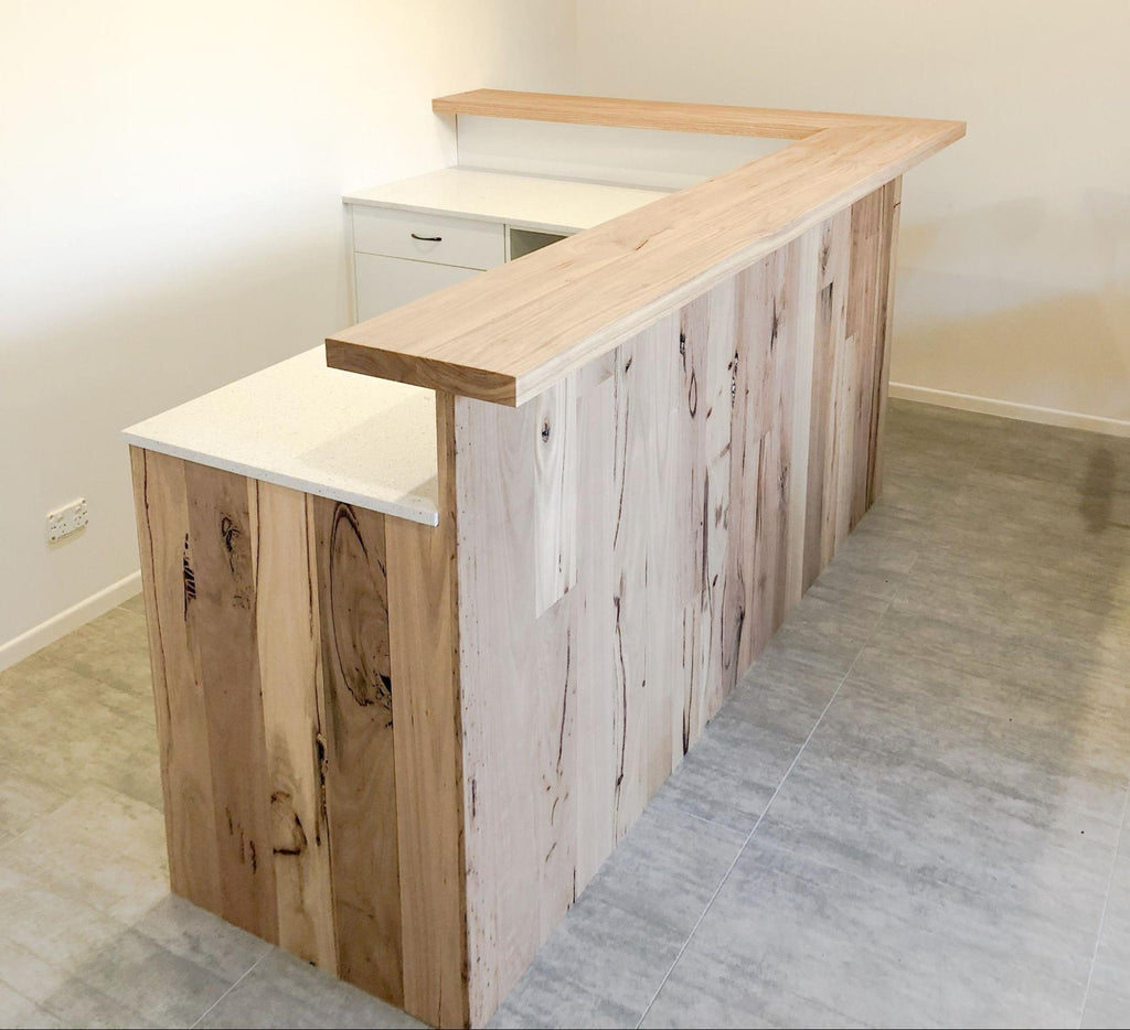
A wooden counter with light tone and smooth finishes would go well with a physical store like that of Flourist.
This wooden counter is made by RAW Sunshine Coast and you can have them create wooden furniture depending on your test.
03. The Sill
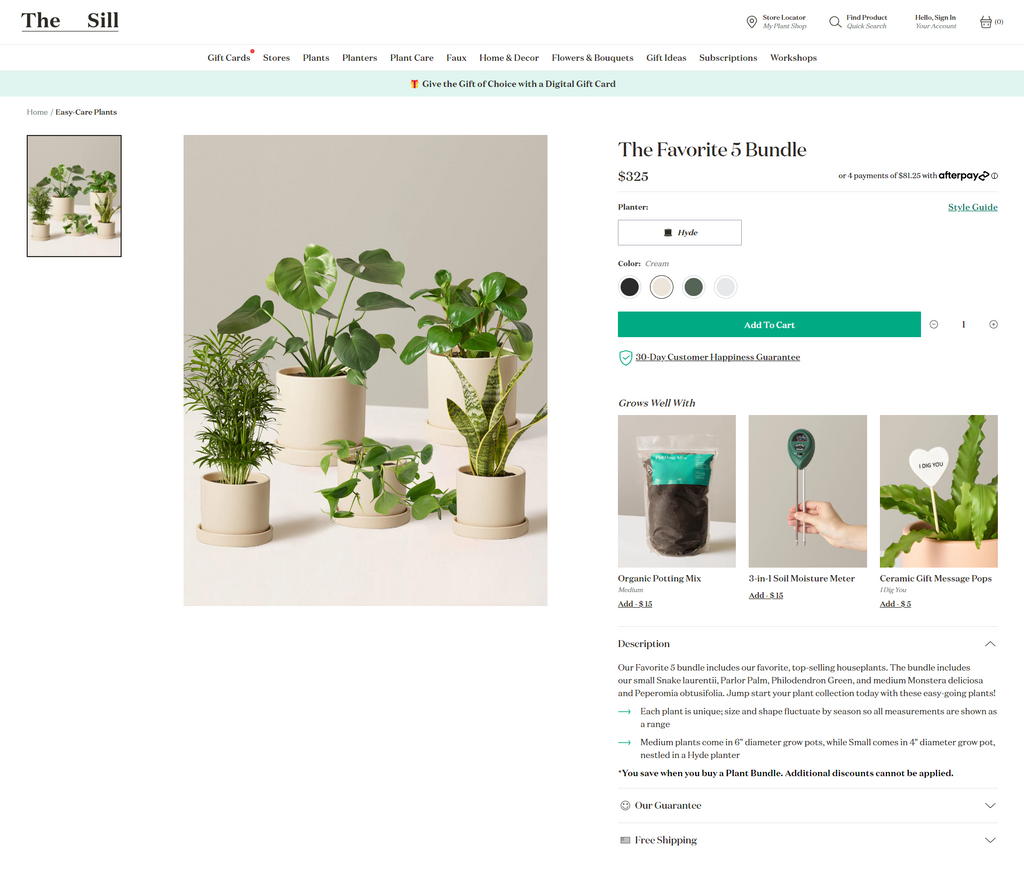
The Sill is a plant store that originated from New York City’s Chinatown. They potted plants, potteries, and faux plants. Just like nature, their online store is full of life and filled with different accents of green to symbolize life.
Their checkout page is no different. Green and lively. It provides a description of every product in the cart as well as a section for low-value items for cross-selling – which is a great way to increase sales and customer lifetime value.
Scroll down and you’ll be greeted by more greens. It’s a pleasure to shop in this store.
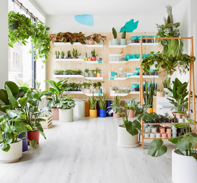
If you walk into their physical stores, they are full of plants and other things related to gardening such as loam soil, spray bottles, succulents and more. You can barely see their shop counter. And perhaps that’s the point. To fill the store with life.
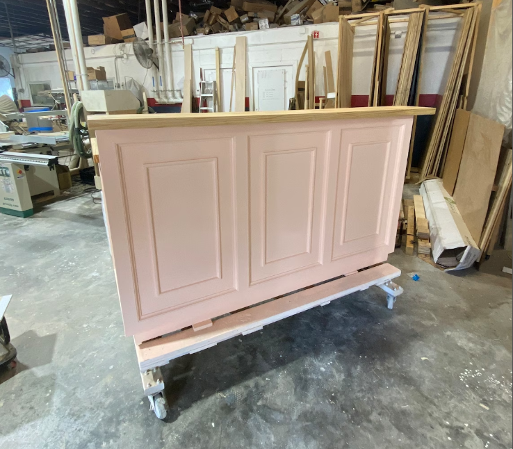
If you have a nature-inspired retail store, a small painted wooden retail counter with real wood texture at the top will look great in it. It will provide a nice contrast against the greens and it will pop up in your store.
This particular retail counter is made by ShopAndisList on Etsy.
04. Allbirds
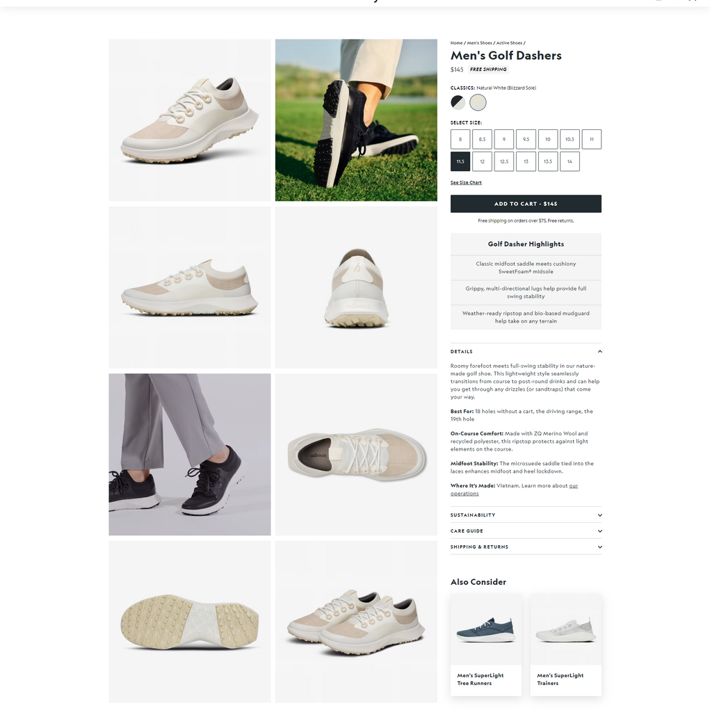
Allbirds is a global apparel brand that manufactures its products out of sustainable materials like cotton, tree fiber, and wool. Its product range includes shoes, t-shirts, and athletic wear – all made from eco-friendly material.
Their checkout page provides the customers a more immersive shopping experience by adding high-definition images of their purchase as well as product details so customers can learn more about the product. They also have a subtle attempt at upselling or cross selling with their suggested products.
After choosing a size, customers are directed to the final step of the process that allows for an express checkout.
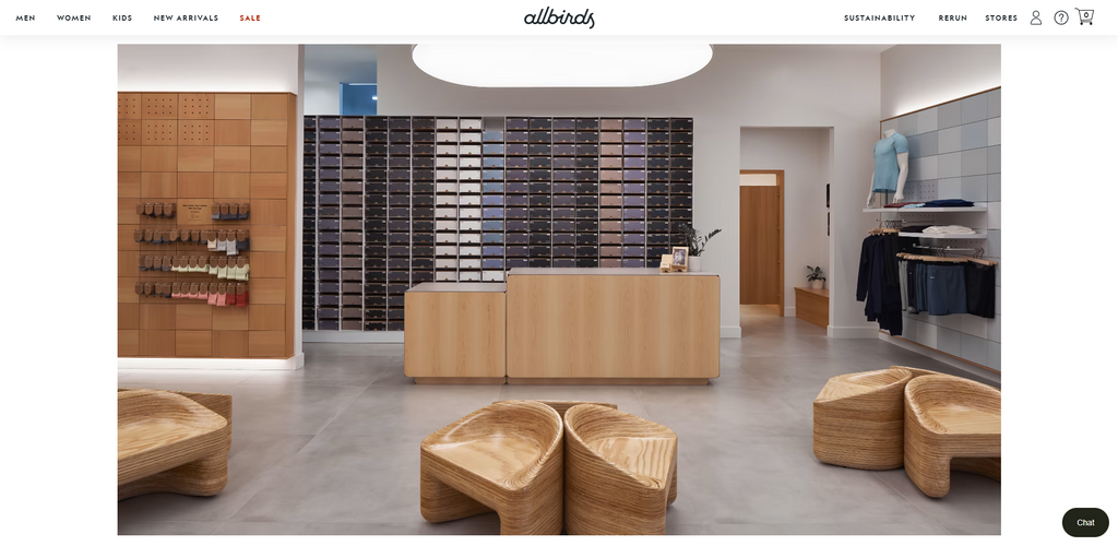
If there’s one word to describe their retail store in Toronto, it would be “unconventional”. If other retail stores fill their counters with items for upselling and cross selling, Allbirds went the other way. They emptied their counter perhaps as part of their branding effort as a zero carbon footprint company.
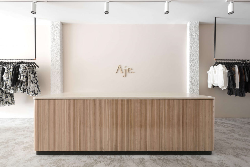
Minimalist retail stores like this provide a clean aesthetic for a truly modern and minimalist design that is fit for a garment store. Less visual distractions can communicate a feeling of convenience and comfort. To most retail customers, that’s what they truly want.
This modern shop counter design is created by We Are Tribe – an Australian interior design company.
05. Thursday Boots
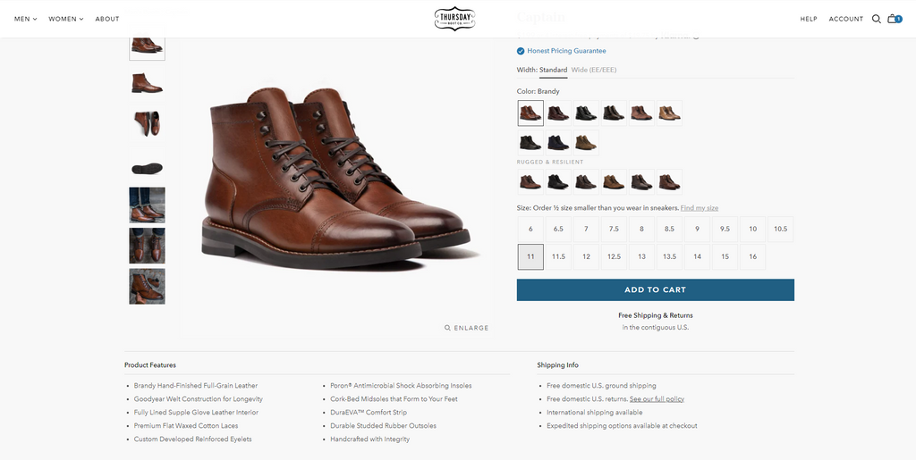
Thursday Boots is a shoe brand that originated in New York City. They make fashionable leather work boots for people who want the best of both worlds - utility and style. Despite their quality and craftsmanship, Thursday Boots manage to price their boots as low as $149. They also branched out to other footwear like sneakers.
Their checkout page is a neat one that provides further details about the products. However, there are no sections for upselling and cross-selling.
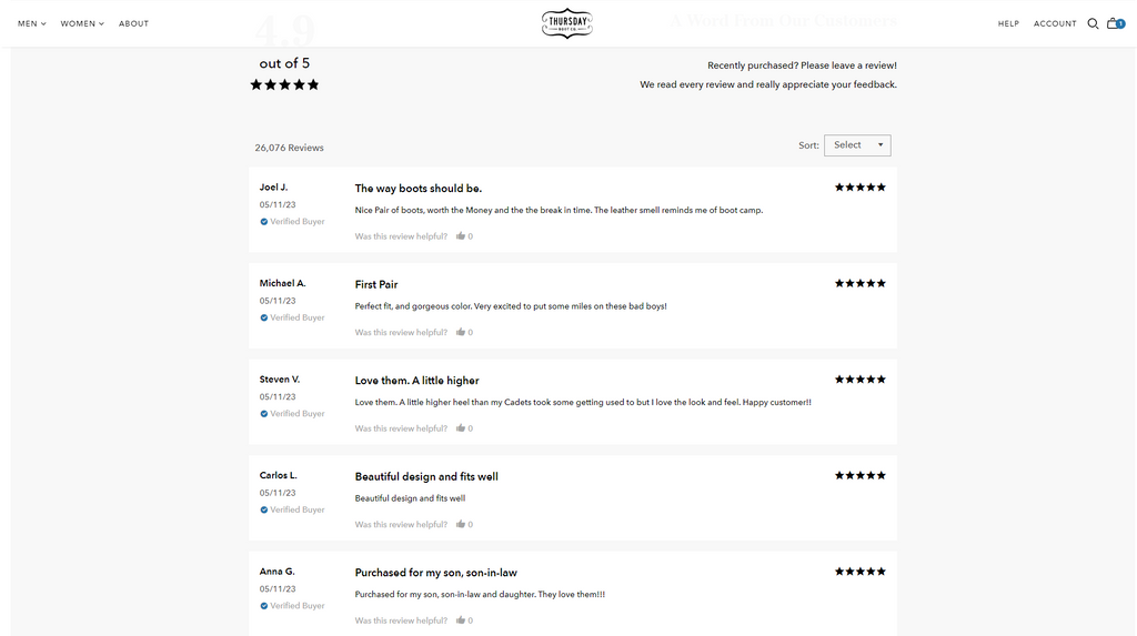
What they have is a section for recent customer reviews – which is a great strategy to convince the customer that they are making the right decision in buying their products.

Their retail store in New York City has a classic and utilitarian vibe to it with a splash of dark tones for a calmer vibe. You can also see marble-top display tables with a light color to provide a nice contrast against their brown leather boots.
Their retail counter carries the same contrast between the color of varnish and bluish gray ridges to provide a nice visual texture on flat colors.
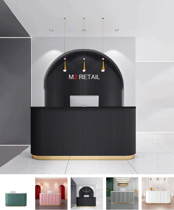
If you like this modern shop counter design for your retail store, you can find it on M2 Retail. You can choose from different colors and dimensions to match your store’s needs.
Bottom Line
As we have learned in this article, great attention to detail is a must if you want to establish a sales-driven ecommerce and physical store. Particularly in ecommerce, your checkout page should include sales-increasing attributes to help you increase your sales without being too pushy toward the customer. The Shopify stores at the top did not disappoint when it comes to this aspect.
Running a retail store alongside your Shopify store is an effective way to cover all bases if you want to maximize your sales. Your Shopify store can cater to a much wider online audience while your retail store can focus on dominating a specific location to further brand awareness and growth.
But there’s a price in implementing a multi-channel approach. One particular challenge is simultaneously keeping track of your sales, inventory, and other important figures.
Shopify POS is a powerful tool that can lighten up the load in your business management. As your business grows and operations become more complex, Shopify Plus will help go farther in your retail and online business.
Did these modern shop counter design ideas inspire you? It’s time to make that retail store a reality!


![Modern Shop Counter Design Ideas for Your Retail & Online Store [Real Store Examples]](http://pagefly.io/cdn/shop/articles/Modern_Shop_Counter_59244db6-8954-4175-90c6-d6c780672098.jpg?v=1742903899&width=820)

![14 Profitable Small Food Business Ideas for 2025 [Real Numbers]](http://pagefly.io/cdn/shop/articles/1_58b587d2-13db-4aa6-8c19-e40f5c88d3eb.jpg?v=1758255771&width=4460)
![Art Business Names: 350+ Ideas + Free Generator [2025 Updated]](http://pagefly.io/cdn/shop/articles/art_business_name_e94a54e9-d325-4ba3-94ab-7b4297952312.png?v=1760062968&width=1640)

