In this comprehensive guide, we'll analyze the best Shopify homepage designs, explore what makes them convert, and provide actionable tips you can implement today.
Your Shopify homepage generates 50-80% of your store's first impressions, and you only have 3 seconds to capture a visitor's attention. According to recent studies, 38% of users will stop engaging with a website if the homepage layout is unattractive, while a well-designed Shopify homepage can increase conversions by up to 200%.
Whether you're building your first Shopify store or optimizing an existing one, your homepage design directly impacts revenue. The best Shopify homepage examples we'll explore combine stunning visuals with strategic user experience elements that convert browsers into buyers.
So which elements convert homepage visitors into customers?
It’s about creating trust, incentivizing them and showing them exactly which steps to take from homepage to checkout.
The Purpose of Quality Shopify Homepage Design
Your Shopify homepage design doesn’t have to be overly complicated in design or content. In a nutshell, you want to:
- Welcome your visitors to your site
- Tell them clearly what you want them to do
- Give them options to explore and find out more
But how do you implement this? Sometimes the best way to uncover insights is to ask the right questions. Consider this:
- What exactly do you want visitors to do? (buy something, subscribe to an email list, etc.)
- Are you making it easy enough for them?
- How many steps are involved from start to finish?
- Can any of these steps be removed?
In general, we believe in keeping the Shopify homepage design simple. No need to add more complexity to confuse your readers.
Consider that some prospects may land on your Shopify home page knowing exactly what they want. Others won’t. Always keep this in mind and design accordingly.
Examples of High Converting Shopify Stores
Dropbox

Dropbox keeps it crisp, clear, and under control. Make the navigation pathways clear. This helps customers avoid “decision fatigue,” a phenomenon that causes humans to back out of a decision that takes too long. High converting Shopify stores often emphasize simple and effective navigation to keep users engaged.
In analytics terms, when a user clicks away, this is known as “bouncing.” We don't like bouncing. Note these tips to help your customers make faster decisions on your home page, a common trait in high converting Shopify stores.
Take advantage of “Above the Fold”
Above the fold is the area of the screen that customers see before they scroll down. Newspapers have been using this technique for years, placing enticing headlines in bold “above the fold” for customers to see before picking them off the shelf.

In regards to your homepage, it pays to use a compelling hero image coupled with a call to action. Remember when I said some customers arrive already knowing what they want? This approach is a hallmark of high converting Shopify stores.

Shopify Plus company MVMT have implemented this nicely, with clear CTA’s for men and women coupled with crisp images showcasing the product. They’ve also used a banner along the top to incentivize purchase with free shipping.
Make navigating easy
People glide swiftly from web page to web page on the internet. So it's important to facilitate this and design your site to be as navigationally smooth as butter.
When you're trying to attract lots of different types of visitors, it's tempting to make your Shopify home page more complex with layers of links and content.
But in fact, it’s nearly always better to keep things simple.
Give priority paths to the header section with links you think readers will benefit from the most. Secondary paths can be placed elsewhere - at the bottom of the page for example.
The PageFly website does this, with the most important and relevant navigation links up top. Sections of further interest can be found in the footer section at the bottom.

This makes the entire web page cleaner and less confusing, and gives a great impression when first glancing “Above the Fold”. Notice the Call to Action in the corner too.

It’s up to you to balance your priorities. For example, if customer support is the focus of your brand, you may want to include those links in the header section.
Note: Including these navigation links is important for Shopify homepage SEO, letting Google understand your brand and site better.
A compelling call to action
Calls to action are at the heart of influential web page design. Consider them signs to follow when you're lost in the forest. They tell readers where to go and what to expect when they get there.
Your call to action could direct to a product page, a blog, a ‘learn more page’, or a collections page. It’s important to determine your goals and apply CTA’s accordingly.
Just remember, the harder it is for readers to find your Call to Action, the more likely they are to "bounce".

Allow it to be clearly seen with contrasting colors and use straightforward language like Soul Cycle. There’s nothing distracting above the fold to take away from the main goal, but there are navigation links for the user to explore further if needed.
10 Best Shopify Homepage Examples That Convert
Real Shopify Stores Setting the Standard
#1 Allbirds

Read more: Best Jewelry Dropshipper For Your Successful Business
#2 Gymshark

Fitness apparel using video backgrounds and social proof with 5M+ customer testimonials.
#3 MVMT Watches

Clean navigation with gender-based CTAs and free shipping banner optimization.
#4 Kylie Cosmetics

Product-focused hero images with Instagram integration showing real customer photos.
#5 Death Wish Coffee

Bold branding with subscription model prominently featured, achieving 300% growth year-over-year.
Top PageFly Homepage Templates
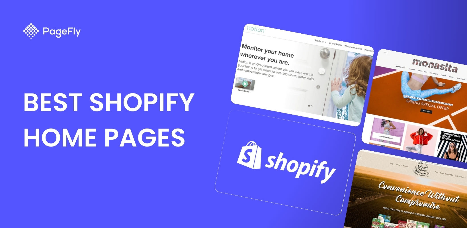
#1 Notion

Notion, created with PageFly, has taken a fresh approach to their homepage design. As one of the best Shopify homepage examples, the initial CTA is a ‘Watch Video’ button aimed to help users learn more about the product.
When the carousel slides across and the second hero image is revealed, the CTA promotes purchase with a contrasting ‘Shop Now’ button, showcasing why it’s considered among the best Shopify homepage examples.

When the carousel slides across and the second hero image is revealed, the CTA promotes purchase with a contrasting ‘Shop Now’ button.
Read more: Best Jewelry Dropshipper For Your Successful Business
#2 Caledonian Mobile Coolers

Caledonian Mobile Coolers is a great example of a consistent theme, relevant imagery, and concise call to action. This makes it one of the best Shopify homepage examples, as nothing distracts heavily from their main CTA, and more information can be easily found directly on the homepage.
#3 Monasita

Above the fold, Monasita is targeting users with a ‘Spring Special’. This area of your Shopify home page is perfect for seasonal promotions to capture more sales.
#4 Livroom

Although we’re not quite sure what exactly Livroom do (looks like a house party delivery service), we dig the design.
#5 Baby Bare Bubbles

When it comes to bathing your baby, it’s important to stress the use of natural products. Baby Bare Bubbles have done this with a neutral color scheme and ingredient transparency. The benefits are clearly stated on their homepage, and multiple calls to action can be found throughout.
#6 SJC Custom Drums
You can see some really cool animations and interactive moving elements on this custom drum website built with PageFly.
When trying to create design features that seem like they’re outside the scope of the app, the support staff at PageFly might be able to help you apply custom code if needed. All you have to do is request a ticket via the chat box in the right corner of the PageFly dashboard.
#7 Edward & Sons

The key to Edward & Sons home page design lies in its simplicity. Each image is actually a CTA, which can be seen when they move as you hover the mouse over them.
#8 Zen Egg

The Zen Egg website is extremely minimal, perhaps reflecting the empty state of mind needed to find 'zen'. This minimalism combined with testimonials and a word from the designer inspires trust.
#9 Probi Solution

Finnish cleaning company Probi boast a visually appealing homepage with nice hero imagery and minimal design.
#10 A.H Apothecary

Last on our list of Shopify home pages created with PageFly is A.H Apothecary, with a design that’s as unique as it is wholesome. The dark background is easy on the eyes and the home page tells a story from the get-go.
PageFly usage isn’t limited to any specific niche, as you can see from the range of brands mentioned above. With PageFly, all aspects of design are placed back in your hands, and not in those of a designer with biased opinions.
Measuring Your Shopify Homepage Performance
Key Metrics to Track
Track these essential homepage KPIs in Google Analytics and Shopify Analytics:
- Bounce Rate - Aim for under 40%. High bounce rates indicate poor relevance or slow loading.
- Time on Page - Target 45-60 seconds. This shows engagement with your content.
- Click-through Rate to Products - Should be above 30% for featured products
- Mobile vs Desktop Performance - Monitor separately as mobile typically has 20% lower conversion rates
- Page Load Speed - Use Core Web Vitals: LCP under 2.5s, FID under 100ms, CLS under 0.1.
A/B Testing Your Homepage
Test these elements for maximum impact:
- Hero image vs video backgrounds (video can increase engagement 80%)
- CTA button colors and text (changing 'Shop Now' to 'See Collection' increased CTR 27% for fashion stores)
- Number of products displayed (6-8 products optimal for most niches)
- Navigation menu structure (mega menus increase engagement for 50+ product stores)
Mobile responsive design
I seem to say this with every piece I write, but it’s worth repeating. Mobile responsive design should be your priority, with more than half of all eCommerce sales globally coming from handheld devices.
When creating your store with PageFly, you’ll have the opportunity to view and edit it from a mobile standpoint, just as these merchants have done to capture as many sales as possible.
 #1 Notion #1 Notion |
|
 #2 Caledonian Mobile Coolers
 #3 Monasita #3 Monasita |  #4 Livroom #4 Livroom |
 #5 Baby Care Bubbles #5 Baby Care Bubbles |  #6 SJC Custom Drums #6 SJC Custom Drums |
 #7 Edward & Sons #7 Edward & Sons |  #8 Zen Egg #8 Zen Egg |
 #9 Probi Solution #9 Probi Solution |  #10 A.H Apothecary #10 A.H Apothecary |
Shopify themes or PageFly templates?
A perfectly valid question sits in front of you. But the answer is clear.
Most merchants join Shopify and quickly browse the theme store, selecting a free theme or paying a premium for one. Now don’t get me wrong, a lot of Shopify themes are great, and fulfill users needs for the most part.
But, they are very limited in customization. The CSS editor is hard to access, and even if you do go in and meddle with the code, it can lead to problems.
Plus, you run the risk of your store looking like thousands of others who use the same theme.
PageFly, on the other hand, has PageFly templates designed for every type of page in all industries. They’re SEO optimized, and fully customizable using simple drag and drop technology. And if you do need to modify some code on the backend, it’s made easy with the Custom CSS editor.
No fuss.
When creating a new page in the PageFly dashboard, you’ll be prompted to ‘Start from Blank’ or select a template.
Best PageFly Templates for High-Converting Shopify Home Pages
Choosing the right template can significantly impact your store's conversion rates and overall performance. PageFly offers a variety of templates designed to cater to different niches and business needs. Here are ten of the best PageFly templates you should consider for creating high-converting Shopify home pages:
1. Tee Vibes

Ideal for apparel stores, the Tee Vibes template showcases products with a clean and modern layout. This template is designed to highlight featured products and collections, making it easier for customers to browse and shop.
Key Features:
- Hero section with high-quality images
- Product grids and featured collections
- Call-to-action buttons for quick navigation
- Responsive design for mobile and desktop
2. Pet Corner

Perfect for pet stores, Pet Corner provides a playful yet professional look. This template focuses on showcasing pet products and accessories with engaging visuals and clear calls to action.
Key Features:
- Visually appealing hero section
- Detailed product descriptions
- Customer reviews and testimonials
- Easy navigation and search functionality
3. Nivellia

Nivellia is designed for beauty and skincare stores. It emphasizes product benefits and ingredients, appealing to customers who are particular about what they apply to their skin.
Key Features:
- Elegant design with a focus on product details
- Sections for customer reviews and testimonials
- Highlighted features and benefits
- Mobile-optimized layout
4. R2VF

This template is great for electronic and tech stores. R2VF focuses on showcasing gadgets and electronics with a sleek and modern design.
Key Features:
- Highlight sections for product features
- Comparison tables for different products
- Integration with video reviews
- Fast loading times for a better user experience
5. Tumbler

Designed for drinkware and accessories, Tumbler provides a stylish and functional layout. This template is perfect for highlighting product collections and seasonal promotions.
Key Features:
- High-quality images and product showcases
- Promotional banners and offers
- Customer reviews and ratings
- Easy customization options
6. Fizzy

Fizzy is ideal for stores selling beverages or related products. It features a vibrant and engaging design that captures the essence of the products.
Key Features:
- Bright and attractive design elements
- Sections for product features and benefits
- Customer reviews and testimonials
- Easy-to-use navigation and search
7. Kitchen Crafters

Perfect for home and kitchen products, Kitchen Crafters offers a cozy and inviting design. It showcases products in a home-like setting, helping customers visualize their purchases.
Key Features:
- Realistic room layouts for product display
- Detailed product information and specifications
- Inspiration galleries and customer reviews
- Wishlist functionality for future purchases
8. Maize - Thanksgiving

Ideal for seasonal promotions, Maize focuses on festive themes and holiday sales. This template is perfect for Thanksgiving campaigns.
Key Features:
- Festive design elements
- Sections for featured products and offers
- Customer reviews and holiday-specific promotions
- Mobile-friendly layout
Using these best PageFly templates, you can create a high-converting Shopify home page that not only looks great but also drives sales and enhances the overall shopping experience for your customers. Explore the various best PageFly templates available and choose the one that best fits your store's needs to boost your online success.
What’s more, you’ll save time and money, and be able to customize the template to fit the look and feel of your brand. Adding products and collections to templates takes only a few minutes as seen in this tutorial video.
Conclusion
Thousands of merchants are seizing opportunities with PageFly for its powerful customization and customer support.
Some people call excuses simply well planned out lies. All I know is that you can’t deposit your excuses at the bank. PageFly offer a free 14-day trial with the top tier plan - no strings attached - so you can start building a business today.