By the end of 2022, clothing and clothing accessories retail stores in the United States accumulated total sales amounting to an estimated $40.6 billion. Yes, that is how much people love shopping for clothes. With this amount of transactions happening in an entire country, how can you, as a retailer, earn your desired sales with tons of competition around the area?
In this blog, we will focus on the importance of a clothing store layout, above any other factors, in the overall performance of your business. The question is, can a store design provide you a chance for a larger business venture?
Outline
- Why You Should Pay Attention To Your Store Layout?
- Ideal Types Of Clothing Store Layout
- Blended Retailing: In-store and Online Presence
- Conclusion
Why You Should Pay Attention To Your Store Layout?
Discover Consumer Behavior
The store’s appearance, positioning of products, and the entire usage of the area, all generate an impact on a potential buyer’s purchasing decisions. The design of your store and the segregation of each clothing category should somehow make it easier for them to find the things they need and try the items they are curious about.
Also, be mindful of the route your consumers take every time they are inside your store as it will help you discover what most people are searching for and what they are just ignoring.
Introduce The Brand's Identity
The brand identity focuses on how a business portrays its desired image to potential buyers. Establishing a store that caters to all human senses is a great way to enhance brand identity and experience. Put something to your brand name — play the right music, use your color palette, put signages, and train your staff to target multi-sensory engagements.
Generate More Sales
Shoppers need a reason to enter your store, so your design should make them feel like they must pay a visit. An attractive location adds a powerful hold to the curiosity of the target market. Tidy your shop and give consistently good customer service as consistency leads to loyalty and familiarity. According to a research study, inconsistencies may result in customers opting to look for a more organized establishment, leading to low sales and poor brand exposure.
Another point to note is the wise usage of the decompression zone, which is a specific area of transition between the outside and inside of your store. A study found that this specific area does have an impact on store sales. Be smart in using this space, and make it an opportunity not a drawback.
Prevent Theft
According to the 2021 National Retail Federation's (NRF) annual survey, the total retail shrink amounted to $94.5 billion in losses. It’s better to be prepared with some theft prevention methods you should note including stationing customer checkouts near the entrance and exit doors, putting mirrors and security cameras within the establishment, and letting your consumers be aware of the consequences of theft through signages.
Contribute To Overall Convenience
The retail store layout should aim for a time and energy-saving experience — together with all the aforementioned importance of a good clothing store layout, convenience can be attained by focusing on how your consumers will travel around your shopping area. Remember to have smooth ins and outs to avoid store traffic or overcrowding.
Ideal Types Of Clothing Store Layout
If you want a highly-rated customer experience in your clothing store, dive in and learn the different types of retail store layouts that will not only level up your brand identity but will also help you expand your reach and sales.
A good store layout plan can help you attractively display your most popular merchandise while also effortlessly extending customers' time browsing your shop — without them knowing. Being knowledgeable about the benefits of different store layouts can be a great way to finalize your pick.
Grid
A grid layout, which is the most common, emphasizes clean and uniform arrangements of shelves or racks. This is a good pattern for easy product inventory and control. Grid layout not only maximizes product display but also minimizes empty space. The flow of consumers is foreseeable, so merchants will have a better chance of exposing products and promos.
There will be an aisle between each product rack, where customers can freely roam around. The parallel-like flow of this layout prevents customers from colliding with one another. A survey revealed that 81% of respondents prioritize stores that value social distancing. This layout caters to the needed physical distancing practice not only for a more relaxed environment but also to avoid the spread of the ongoing coronavirus.
An example of a shop that uses this layout is Walmart stores, which feature clothing, groceries, electronics, and even pharmaceuticals. Notice that most of the areas inside Walmart use a grid layout — especially in the grocery section. Meanwhile, below you can also see a grid layout design when incorporated in a clothing shop.

Loop
The loop sales floor layout, also called racetrack, leads customers through a single path to get a glimpse of the whole inventory before heading to the checkout counter. This design usually has a center display with shelves and racks on the establishment's walls.
A recent survey in the United Kingdom, which was facilitated by the Policy Institute and Centre for Attention Studies at King’s College London, revealed that 49% of the respondents believe that their attention span is shorter than it previously was. So, since middle areas provide a higher possibility for items to be exposed, the emphasis on these centerpieces will likely help catch customers’ attention.
With this layout, though customers can see the entire store at once, merchants still control the path each shopper takes. One of the cons of this layout is that though it may seem convenient when the volume of customers becomes high, some may not be able to quickly wander around the remaining area at a near distance.

Straight
The straight store layout, also referred to as the spine layout, is ideal for small businesses. A linear design can help owners entice customers from the front all the way to the back of the store.
This layout is easy to execute or implement, providing clear direction for customer movements. However, the likelihood that some may be missed to explore remaining items if they only stay on the main aisle is also present. Straight layout design can mostly be seen in small department stores and is an ideal choice for new merchants.

Free-flow
Free-flow is like abstract art. Free-flow layout intends to appear as if it doesn't follow a predictable pattern. In this design, merchants can position products in any arrangement while still allotting enough open space for customers to move around. Free-flow is not designed with clearly measured aisles or barriers, unlike grid retail store layout.
A free-flow layout can be seen as a highly-experimental design that can emphasize different store displays. The customers are the ones who will decide where to go and what to see next. Despite the liberty this design represents, window display and start paths are mostly near or in line with the counter.

Diagonal
The racks or shelves are diagonal, so the aisles are at an angle where people can see more inventories as they search through the shop. It can be somehow similar to a grid layout; the only difference is how clothes are positioned. This store design can contribute to the space management of stores with very limited sizes. But, note that a narrow aisle is among the disadvantages of having this layout.
With the proper placement of the checkout counter, the diagonal layout can provide better security monitoring as merchants will be able to see the happenings in their stores more.

Geometric
The geometric store layout demonstrates the brand's creativity — commonly used in fashion stores. If you have more unique product shapes, interiors, and designs, a geometric structure can highly improve the overall look of your clothing store. This layout will definitely create an eye-catching vibe that will please shoppers' sights.
The geometric layout is also one of the easiest designs to play with. You can freely incorporate various vibes for unique visual complexity, which is a suggested factor that contributes to a memorable real in-store shopping experience.
For those planning to build a loud brand statement about their products, geometric store design can assist you with that. Though the entire finish may not target less trendy markets, it can be advantageous when attracting those interested in more stylish appeal.

Mixed
A mixed layout is the combination of multiple store designs, all put in a floor space plan. If you cannot choose a single-store layout, then try experimenting with some. The mixed design aims to establish flexibility and dynamics — the mix of diagonal, straight, and geometric store layouts, for example.
Big-sized stores often use this design for a more one-of-a-kind customer experience. Using this can help shoppers differentiate the various types of clothing your shop offers or other kinds of products present in your store. Most stores with mixed layouts maintain an open and wide floor where people can still browse at their own speed.
A great example of this is Nordstrom, which inputs various layouts for customers to quickly modify the branded shops that are within the store. The visible differences in each layout create distinct identities of the labels under Nordstrom.

Angular
The angular layout mostly has round shelf shapes and curved walls or dividers. If you want an exciting approach using a mix of different shelf and rack sizes, this layout is the best for you. The angular design is widely used in smaller locations due to its ability to emphasize the quality of products. Try to be innovative in using rounded displays, as it sometimes affects store spacing. There are lesser displays in angular layout, making it a good option for luxury retailers.

Blended Retailing: In-store and Online Presence
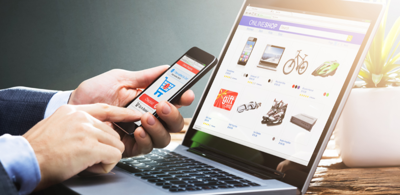
The hybrid of e-commerce and traditional bricks and mortar shops helps in the betterment of a business structure. Though most people still want to shop in stores due to the reason of being able to touch the products before buying them, the high number of shoppers opting for a digitized purchasing experience is something to look out for. In 2022, online retail sales were estimated to reach $5.7 trillion worldwide, which is predicted to increase in the coming years.
Aside from having a well-improved physical store, you should not forget the ability to launch an online store or website to serve potential markets that are far from the reach of your actual shop. Most customers make their impulse purchases while scanning the internet, moving from one shopping website or application to another. Often, customers will visit your store after researching it online, looking at the available products on your pages as they somehow want to see if what’s online is real or not. So, better leverage your ideas to the digital market as well. Fortunately, creating one is now trouble-free, there are several e-commerce platforms that give full online visual merchandising services if you ever want to start one, Shopify for example.
A good store layout is one that warmly welcomes potential buyers when you or your staff can’t, and that also goes for your online persona. As long as they feel belonged and are prioritized, everything will go according to your plan. Below are some in-store tips to incorporate in your online clothing stores:
Focus on the lighting
Good lighting helps customers visibly see what they are searching for. It also allows stores to boast their products in a more detailed manner, showcasing every corner and angle of the shopping area. Lighting effects not only influence the experience of the customer but also boosts staff productivity — they can be more active and look vibrant in assisting anyone who enters the store.
The lighting element also plays a vital role in an online store. The contrast and color temperature of your website affects the consumer's attention span. You should be able to balance it together with the other effects that contribute to the overall appearance of your website such as saturation, highlight, and shadow. Another advantage of having good lighting is creating an ambiance that can help your customer get comfortable while buying something from your store.

Be smart in playing with colors
Incorporating different shades of colors in your store is a crucial step; you better know your brand as well as the target customers you are aiming for. Most younger shoppers are attracted to bright and bold colors, while older consumers mostly want subtle and calming ones. Try to play with colors while incorporating your branding style as color increases brand recognition.
Meanwhile, when incorporating this into your online shop, just like in setting up the lighting, you better be wise in arranging and considering the products’ colors. A lot of merchants nowadays try to opt for the aesthetic vibe, something calming and pleasing.
For example, you can gather all of your clothing products per color shade, and list it all in one page, or you can go with the colorful type of design — with all vibrant colors in one place. Any of these will surely work depending on your branding and style. One tip, make it something unforgettable, there is always a wow factor when it comes to colors.

Strategize product placement
It depends on how you want your products to be seen. Product placement is also based on how you prioritize each category you have; for example, if you are trying to get more sales from the least bought products, then you can try placing them at the center for greater visibility.
If we try to focus on segregating your products online, we can say that it can be easier compared to how we do it in a traditional setup. With just a click, customers can transfer from one type to another, from the highest price to the lowest or bigger size to smaller.
But, imagine what will make people stay in your online shop, if you are thinking about your store homepage, well you are right. The homepage is the door of your website, it is best to display the most sought-after products you think the market will be interested in. Monitor your sales as well as customers' behavior; with proper analysis of the inventory, you can possibly market even the products that are being ignored while still giving a spotlight to those top-selling clothing products you have.

Have a clear clothing store theme
Carefully plan your store theme — this is solely about your branding and target consumer. Theme bounds to entertain the customers while adapting to your brand’s perceived environment. A great sense of balancing is required for it not to be seen as too pushing.
An example of a themed success story is Chapman Taylor’s Global Harbor Shanghai office, which was developed with the use of classic European architecture styles with other subordinate themes. Its playful architectural design attracts people and improves shoppers’ experience. Global Harbor won the best retail architecture in the world category at the International Property Awards 2014-2015.

Of course, correlating this to your digital shop will be more cost-effective since you don’t have to hire site developers, architects, and engineers to achieve your preferred theme. Even if you are just in the comfort of your home, you can easily design your e-commerce site with the help of Shopify, for example — the page is your canvas. Just ensure that it is in line with your physical store’s theme for brand consistency purposes.
You don’t need any technical experience, here are some examples of ready-made Shopify clothing store templates:
- Blum ($290) - A theme that is more focused on fashion brands and provides more emphasis on the visuals of what you are selling. This theme doesn't only work on laptops or desktops but also on mobile devices. Blum is known for its smooth storytelling layout and customizable pop-ups, you can literally put all your creative juices together with this theme. Also, one notable feature of this is its page speed quality, with scores of 80/100 when tested in Google PageSpeed.

- Dawn (Free) - If you are cutting some expenses, then Dawn is perfect for you. You don’t have to break the bank with this one. Dawn is known for being the minimalist type of theme, which helps draw customers into reading all content you prepared. It is more on large high-resolution imagery and simple yet sleek fonts. Some may not want over-whelming shapes and designs, so Dawn is here to serve them. Dawn is also easy to set up, you can launch your page in just minutes. It also offers free theme updates, allowing merchants to explore different features Dawn has to provide.

- Atom ($190) - Atom is another Shopify clothing theme that is built for a greater chance of you telling your brand’s story. This theme is best for owners who have in-person selling as well as those wanting longer-form text sections. Another good thing about Atom is that it caters to EU translations, so if one of your target groups is primarily in Europe, try to check this one — with an unlimited free trial. This theme also flaunts strong image gallery features with slide shows, image rollovers, and even animation.

You might also want to check out these article-related content for your future Shopify store:
- Top 8 Best Shopify Themes for Clothing Stores (2023)
- Top 10 Trending Ecommerce Designs For Your Online Store In 2022
- Top 30 Best Free Shopify Themes + Premium: A Complete Review
Conclusion
Carefully planning and choosing the right clothing store layout design for your business can have a massive impact on your goals, sales, and reach. Even its simple lighting, color combinations, and product placement contribute to the whole setup of your clothing store. Keep in mind that sight is one of the most powerful senses humans have, in just one glance, customers can instantly fall in love with what they are seeing. So, ensure that your chosen store design is pleasing in the eyes of your target market.
Moreover, your online store plays the same role as your physical shop, both should have an effective shopping experience — something that will leave a great influence in the long run. With so many options available in Shopify, it should be easier for you to create a page as good as your physical shop.



![14 Profitable Small Food Business Ideas for 2025 [Real Numbers]](http://pagefly.io/cdn/shop/articles/1_58b587d2-13db-4aa6-8c19-e40f5c88d3eb.jpg?v=1758255771&width=4460)
![Art Business Names: 350+ Ideas + Free Generator [2025 Updated]](http://pagefly.io/cdn/shop/articles/art_business_name_e94a54e9-d325-4ba3-94ab-7b4297952312.png?v=1760062968&width=1640)

