As the top online marketplace in the US, with more than 2 million daily active shoppers, Shopify is certainly a great choice for your online food business. There’s no better time to start than now, with the online food delivery business expected to reach a market volume of $1.65 trillion by 2027.
But how do you get started with building a profitable Shopify food store?
This article covers the essentials of creating an online store with Shopify. We highlight the 7 top Shopify food stores, assess why they do so well, and then, provide a step-by-step approach for creating a mouthwatering food store with Shopify.
The 7 top Shopify food stores (and what they do well)
Dang Foods

Dang Foods is an online food store that sells plant-based Asian-American snacks that range from rice chips to coconut bars. This food store uses a Themeforest Shopify theme on its website which makes it more responsive and boosts user experience. Dang Foods offers website shoppers two options for shopping — Shop by product and shop by goal, a customer-facing feature that optimizes their overall shopping experience.
As a fully plant-based food store, Dang's color palette consists of greens, oranges, and yellows which gives the perception of a nutritious and fun food brand. The brand also used animation to complement the overall perception with fruits (product ingredients) moving on the screen as you move your cursor around which is pure eye candy.
Cutter & Squidge

Cutter & Squidge is an all-natural UK food brand that also uses a ThemeForest theme (Cutter). This food store presents a minimalist perception with light brown and white colors that form a perfect background for its bright and bold product images. The Cutter & Squidge food website also has an in-menu promo feature alongside the numerous pop-ups offering sweet deals to website visitors.
This food store has a detailed static menu bar for customers to jump right to another page regardless of what page they are on. They also use long-form content to accentuate their product appeal as each product on the home page has a preview description that can open up to a much larger product description with an impossible-to-miss “Shop Now” button.
Seriously Low Carb

Seriously Low Carb brings class to traditional food store design. The extensive menu bar ensures that website shoppers can make their choice right from the home page without scrolling through a series of products.
There’s even a menu for over £45 products. Right beneath the menu, there’s a slideshow of hot-selling products for shoppers who still haven’t made a decision from the homepage menu. Each product slide has a concise and compelling copy that tells you all you need to know to buy that product.
With several purchase options, from bundle builder to friend’s pantry, Seriously Low Carb considers its website visitors' needs even before they have to ask. The high-resolution images used on the website all look real and natural, convincing shoppers that they will get exactly what they ordered.
Partake Foods

Partake Foods is a Makro-themed Shopify cookie store that caters to consumers with allergies. This food website combines pink, orange, green, and blue pastel colors to a visually appealing food website. The choice of colors also allows for the brand products to take center stage on the website.
Partake Foods also uses amazing copywriting to clarify the safety of its products for people with allergies and takes a step further to provide assurance to website shoppers in an “Announcement” article that sits on the header of the website.
This food website has a menu for “ingredients” and a “blog” feature that is used to share more information about the website’s products.
Quantum Energy Squares

Quantum Energy Squares is an online food store that combines plant-based whole foods with caffeine from organic green coffee beans to make energy squares. One can perceive the energy that the brand radiates right from its home page which is designed with playful shapes, objects, and very bright hues of pink, blue, and yellow.
The playful design is combined with a visually appealing layout that stores features that certainly support an impressive user experience. This food store also uses an in-menu promo feature to highlight its most amazing promos and a series of popups to showcase other store promos.
The store layout is designed for easy navigation and there’s also a blog feature to nurture customers by offering added value.
Mezcla

Mezcla is a plant-based snack store that aims to make consumers of their products “feel good”. What better way to accomplish this than to make their primary hue “blue”. Mezcla uses color psychology on its Mezcla Shopify theme to give a perception of comfort and cool.
With brightly-colored website images that focus on the details of each product, Mezcla appeals to all the senses of customers indirectly. The blue colors give the perception of a “feel good time”, and the chilly details on the blueberries on the home page give the perception of “ready to eat”.
Scrolling further down the page you will find properly described high-resolution product images that can compel anyone to “add to cart”. Since Mezcla has few products, it has only two product menus—Shop products and Shop swag.
Mosaic Foods

Mosaic Foods is a food and beverage site that aims to strike a balance between healthy food and great-tasting food which explains their use of greens, blues, and yellows. But a great website is more than its colors. Mosaic Foods makes minimalism look super appealing with simple, yet striking fonts and a neat website layout with CTAs for everything.
This food website displays its products as a slideshow which consumes less space, leaving more room on the web page where they include customer reviews and a more detailed explanation of the brand and its vision, bringing personalization to the food website.
Mosaic Foods also has a food menu that is different from its main menu to accommodate for a long list of food categories and to avoid clustering. Instead of a promo, Mosaic Foods displays its vision on the homepage header, evoking a sense of oneness with website visitors.
You Too Can Create a Mouthwatering Food Store with Shopify

Source: Pexels
A mouthwatering food store is what you need to successfully sell food online. Your website visitors should be able to get a pleasant feeling from your online store that would convince them to make a purchase. This could be your store color palette or your chosen stock images, or even the animation on your home page.
There should be something that keeps your website visitors glued to your website and that also makes them add as many products to their shopping cart. Follow these steps to ensure that you do it right.
Identify your Personality

Source: Pexels
Consider how you want customers to feel about your Shopify food and beverage store. Do you want your food store to be renowned for selling vegetarian food or straight-from-the-farm food products? Do you want to be known as a food store with affordable prices? Or do you prefer to be known as an upscale gourmet food shop selling unique and exotic food items?
Knowing the answers to these questions can help you in creating a personality that supports your brand's mission. For instance, healthy and organic food stores often align with fresh green and earthy tones (brown, beige).
Vibrant orange, yellow, and pink often represent a fun and playful food store. If you’re opting for a sophisticated and gourmet food store then deep purple, gold, and blacks would be just perfect.
Source: Themeforest
Select the Theme
You don't have to build your own website from scratch as there are thousands of themes to choose from on the Shopify Theme Store. These themes make it very easy for you to build and launch your website in very little time and are usually affordable.
To get the best out of Shopify themes, you should explore different themes and only choose the one that not only looks great but also enhances the overall shopping experience for your customers.
You can get free Shopify themes from Shopify theme vendors or buy a premium Shopify theme and access more features and functionalities.
The best Shopify theme would provide you with customization options, easy navigation and user experience features, integration support, high loading speed, and support and updates.
Here are some Shopify themes you should try out for your food store;
- Marios by Buddha Themes
- Oganova by Nova-Creative
- Brezza by MagikCommerce
- Purital by Engo Themes
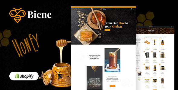
- Biene by Buddha Themes
Read this article on “How To Choose The Best Shopify Themes: 07 Essential Criteria” for the best Shopify themes.
Use Bold Imagery
Bold imagery is the scent marketing of online food businesses. Store visitors cannot smell the food you sell on your website but you can use bold imagery to arouse their sense of smell. As a food store, the imagery on your website should be very bold and should contain as much detail as possible so that visitors can almost taste the food in their mouths.

Source: Seriously Low Carb
The trick is to create a visual experience that triggers the viewer's imagination and enhances their desire for the food you offer. Aside from using high-resolution images, showcase close-up shots (steam rising from a hot dish), leverage storytelling to create a narrative around your food products, and finally, emphasize emotions and experiences (Images of people enjoying your food products).
Optimize for Mobile Devices

Source: Pexels
79% of the traffic on Shopify comes from mobile devices. This means that almost all the visitors on your website would be using their mobile phones to browse through your website. Optimizing your Shopify website for mobile will ensure that they get the best user experience while shopping on your website using their mobile devices.
Optimizing your Shopify store for mobile would also help with search engine optimization.
Customer Reviews and Testimonials
Customer reviews are the icing on the cake for food and beverage stores as they give credibility to the content of the store. Reviews and testimonials also make your website shoppers imagine themselves in the position of your existing customers.
This supports your website's reputation and builds trust among potential customers. When visitors see positive reviews and testimonials from satisfied customers, they are more likely to trust your business and feel confident in their decision to make a purchase.
Successfully selling food online however is more than just aesthetics and pleasant copies. You also need to consider food safety laws and sanitation rules that apply to the food industry. This is why some online food brands add a "certifications" page on their website.
Conclusion
Online sales of food will grow at a compound annual growth rate (CAGR) of 25% from 2022 - 2030 as consumers are increasingly buying everything they need from online stores, including food items. This presents a profit-making opportunity for business owners who want to sell food on online B2C marketplaces.
New sellers often find Shopify an easy marketplace to start selling. Want to start selling on Shopify? Read this beginner’s guide article on “How Does Shopify Work? A Beginner’s Guide to Start Selling on Shopify”
Explore more about Shopify Food Store and Shopify Theme, Check out:


