Updated on 19 April, 2021.
We have gone a long way since PageFly 2.16.0, check out the latest version of PageFly: PageFly V3 - Built For Tomorrow of eCommerce
For the most up-to-date information about PageFly, check out: PageFly Help Center.
--
About a month ago PageFly team shipped the version 2.3.0 with the release focusing on your product page. With that release we introduced Shopify Product elements and major UX Improvement. You can read the changes here. Today, we’d like to introduce to you the next big update 2.4.0 with focus on Shopify elements, and again new UI improvement.
New features
New Product List element
Ability to add any product elements
Now you can add any product elements to the Product List element and relocate them freely.
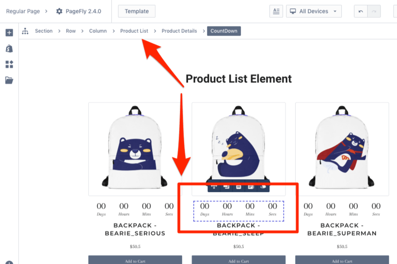
Moreover, you can even add general elements to your Product List element, for example, we want to run the BFCM promotion campaign and in our case we add the Countdown element.
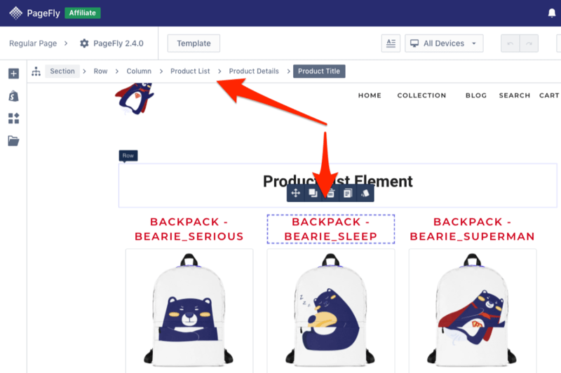
The styling of product elements can be customized as well. In our example, the Product Title element is selected, and the Color is set to a red one.

To save your time, the style settings applied to 1 product element will automatically applied to all similar product elements in the list
New products source
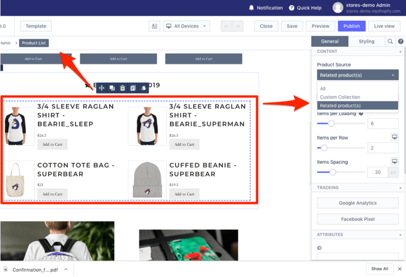
When you add the Product List element there is one more option called “Related Product(s)”.
How it works?
Based on the product you selected and which manual product collection it belongs to, all products from that Manual Product Collection will be shown.
In our example, in the manual collection called “BFCM Sales Related Products” with five products. So all five products will be shown.
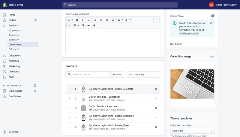
5 new collection elements
Inside the PageFly editor under Shopify Elements you can find six new elements including Collection Details, Collection Image, Collection Title, Collection Description and Collection View Details. With this improvement, The Collection Details follows the concept of the Product Details element in the previous release.
From here on you can build your Shopify Collection Page from scratch. In addition, inside the collection area you can add any general element too. It’s a significant improvement in the customization possibilities of PageFly.
Side Note: These elements are available only in Pro and Premium plans.
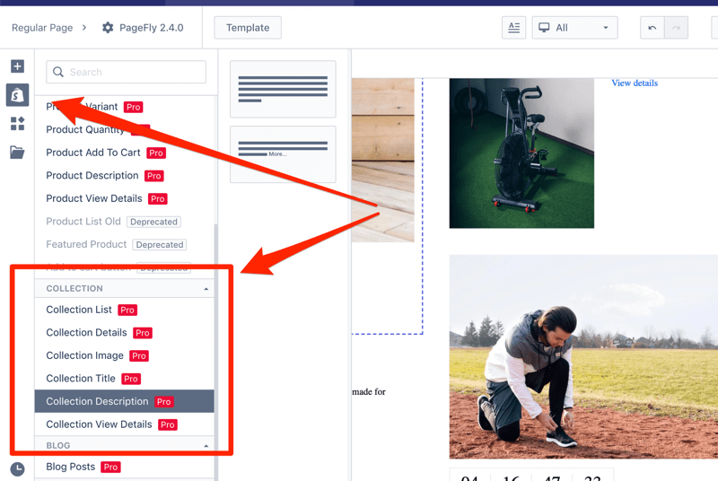
New Click Action parameter
The old Action settings contained “Go To URL”, and “Open Behaviour” parameters. You could find it in elements such as button, icon, column, and headings.
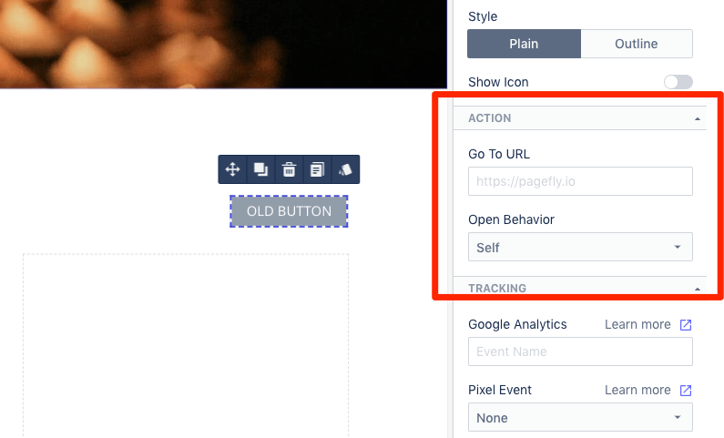
The new Action settings has four options for you to decide with Action
- Go to URL
- Scroll to a section on the page
- Send an email
- Call phone number
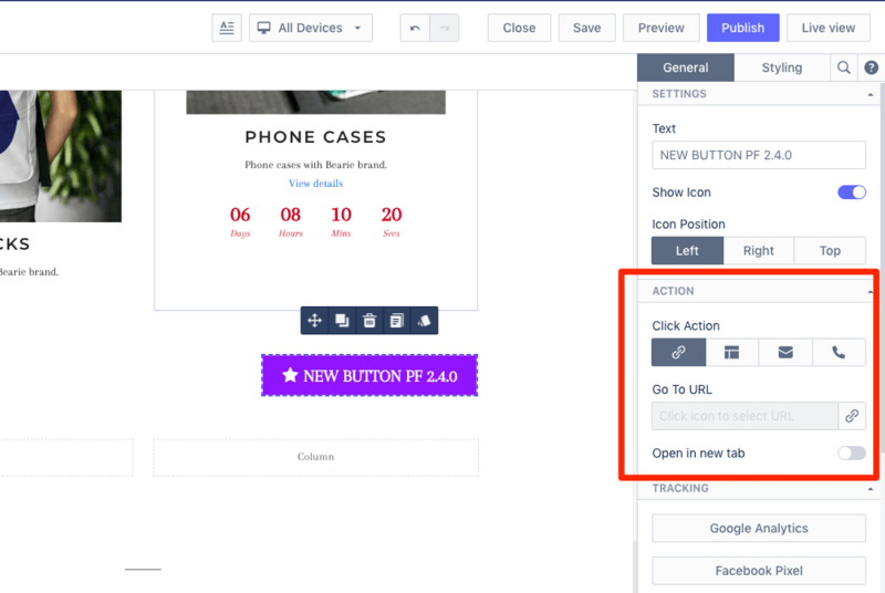
By default the action is Go to URL. Select the link icon and you’ll see a modal window to pick the URL.
You can insert the full URL for the 1st option, or if you need the user to be redirected to a specific page on your store, select the appropriate tab and your list of pages will be shown. This improvement will save you time on setting up the page.
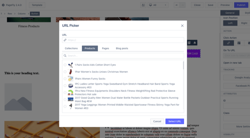
The 2nd option is “movement” to a specific part of the existing page. Let’s say you want the user redirected to the testimonials section when the user clicks on button “See Testimonials”. Pick the “Scroll To Section” and select the section you want the user to be moved to.

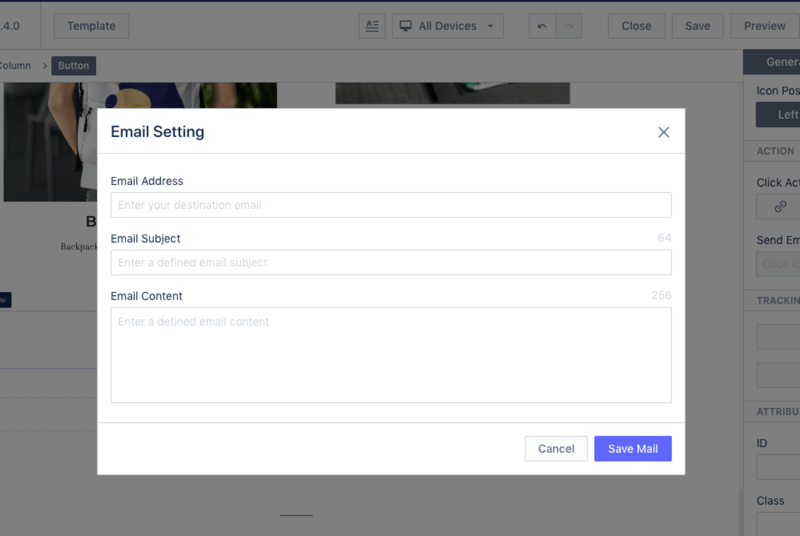
We’ve had many requests from customers stating they wanted to click on the Email Icon or Email then automatically trigger the Mail Client software with a predefined Subject Line and Content. By choosing the Email option you’ll now see a modal window with Email Address, Email Subject, and Email Content settings.
The last option in Action settings is Phone. Customers usually use this option on the Contact page.
New Style Presets feature
We moved the element variations to “Style Presets” settings inside the element inspector. Click on the button and you’ll see 6 options to choose for the button element.

The Style Presets is currently applied to Button, Image and Paragraph element, but in future will be added to more elements for convenient styling.
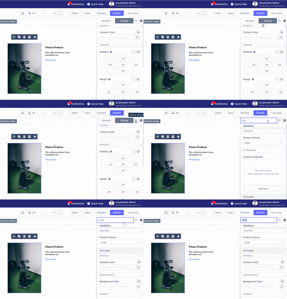
New parameter search function in element inspector
At the TOP of the element inspector located on the right editor’s area we added a Search Box. You can easily find the parameter you want to use. For example, edit the font’s style or add some padding to the element.
New reset parameter function
For any elements under the Styling tab near Padding and Margin parameters you can find an icon “Reset Value”. If you changed values then later want to revert back to the original values, now it’s accessible with just 1 click.

Improvements
Every member of PageFly Team is working on support. We really want to understand how you (merchants / partners) use our product. When we do support we can clearly understand what problems you struggle with and bring it to the table for discussion and find solutions.
We are aware that to understand the value of PageFly it takes a big learning curve. To reduce time learning how to use the product we made some improvement changes in the App’s User Interface.
Improved element breadcrumbs
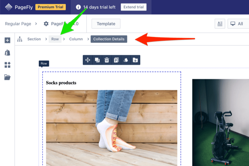
You probably know that the right layout building includes the layout structure Section - Row - Column - Elements. When you build a page there is a helpful part on the top of your editor called Breadcrumbs. The main goal of this function is helping you understand which part of the layout you have selected.
With the version 2.4.0 release it’s been made more clear to increase your productivity. In the image below I have selected “Collection Details” element and made the mouse hover over Row. You can see selected element with presentation dark grey color, and mouse over with light grey color.
Improved column handling
In a row you have two or more columns, the old approach is dragging and dropping the column inside the editor area. Now you can drag and drop columns from the Inspector area easily.

Improved element parameter ordering and grouping
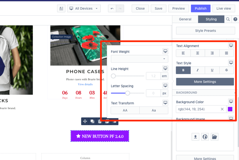
PageFly customization possibilities are huge. In the old version you could see all element parameters showed up right in the Inspector. It made it hard to find the right setting to configure the page. With this release we decided to relocate less used settings with a “More Settings” button. When you click on this button an additional window will be opened with more settings.
Improved Google Analytics tracking
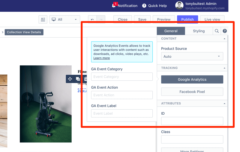
You’re running Google Ads and driving traffic to your landing page with 3 - 5 CTAs with a product purchase initiative. To differentiate Google Analytics events we have added new Event types including Category, Action and Label. Let’s say On the product landing page you have three CTAs, you can name Google Analytics Label as Top, Middle and Bottom.
Summary
Holiday season is coming up and it's the right time to make your storefront look better and convert more users. With new Product and Collections elements you can build highly customized Shopify pages for sales campaigns. With 50+ pre-designed page templates and a 24/7 Customer Service Team we’re ready to help you convert more visitors into customers in this season.


