Updated on November 20, 2020.
Striving for the betterment has long been sculpted in our DNA and PageFly have continuously released new updates with way better features, better UI and stronger customization capacities.
For the most up-to-date information about PageFly, check out: PageFly Help Center.
---
It was a Tuesday, August 13th, in the boiling heat of Hanoi summer. PageFly Office was filled with the excitement of a new chapter:
PageFly version 2.3.0 was to be released.
A new UI that “might need to be slowed down”, customizable product elements and the first PageFly-developed Design System are just some of the things that made our team so proud.
We can't wait to share the updates.
Take a look at what’s new in the PageFly 2.3.0 update and discover how building pages can actually be a relaxing experience.
Warning:
You’ll love it (maybe a little too much)!
New App UI
The brand new User Interface is the first change you’ll notice. Visually, these just seem like changes in colors, distance, icon and/or layout. But technically, they are the result of a set of consistent standards laid in place.

In fact, all the units that form the PageFly app now follow standards specifically defined and regulated by PageFly Design System.

Despite having yet to be published, from this version onwards, the PageFly Design System will serve as an ultimate guide for any updates to come.
Besides making things look consistent and well-organized, designing all elements based on the same standards also reduces the time required to load elements. The loading speed, as a result, has been improved significantly.
Added 9 New Shopify Elements
In previous versions, PageFly users were limited when it came to adding products. To add a product into a page, one could only either use the Featured Product element (which they have no control over how objects are aligned) or a separate Image element with a separate Add-to-cart button.

The only changes you can make to the Featured Product element is to include/exclude objects. The overall layout, which was inherited from the Shopify default product page couldn’t be tweaked.

The result: It was virtually impossible to create such custom Product pages.
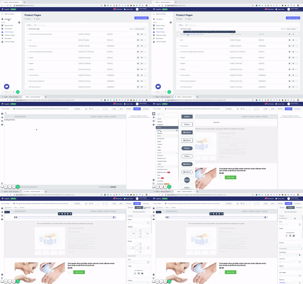
But that’s in the past now. In PageFly 2.3.0 version, users have control over the smallest elements that form a product page.
Place it anywhere and build it the way you want.
There are no more fixed positions. This is complete freedom of customization.
Interact with each element
All the units that form the previously-named Featured Product element can now be used as individual elements with the ability to be placed at any position, with unique styling, and unique config.


Each element has its own styling
Individual product elements can exist independently
A Product Image element doesn’t need Product Details, Product Title or Product Price, etc to be added to the page. Users can add any individual element to the page and assign a product to it (or not).

Build once, assign to many products
Users can assign many products to a page. The page being built now serves as a product page template applied for all the products assigned.
The special thing about assigning one template to multiple products is about product information. On the live page, once being assigned, the template will automatically detect and display the product information, such as Product Image, price, description, etc.
Assign custom products to specific elements
On a page, there can be Product Details elements and Individual Product Elements.

Individual Product Elements can either be included within a Product Details element or stand separately from other elements.
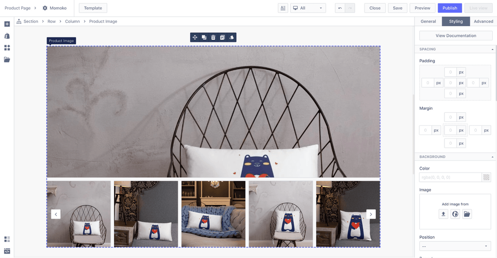
Each Individual Product Element can be assigned to a specific product. At the same time, the whole page can also be assigned to a specific product.
So here’s how PageFly prevents confusion:
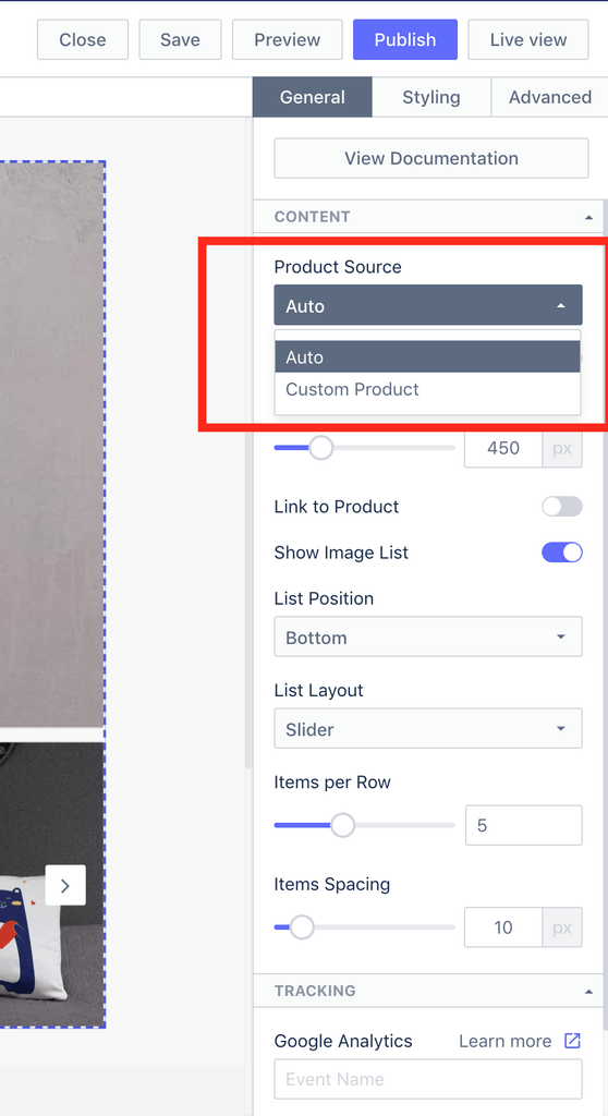
There’s a setting named Product Source
For a certain Product Element, if the status of Product Source is set to Auto, then that element will display the information of the product that is assigned to the whole page.
If the Product Source status is set to Custom Product, then users can select another product to assign to that Product Element. This Product Element will display the information of the custom product and is independent of the product assigned to the whole page.

Note: If an individual Product Element is included within a Product Details element, it will display the information of the product assigned to the Product Details element.
Image list: More product images with customizable thumbnails
To all the users who had complaints about PageFly not being able to add more than one product image, we listened. The Image List feature is our apology to you, and also a special thank for your patience despite our app’s imperfections.
In a nutshell, you can add as many product images as you want into the product page. The Image List layout is customizable and the first image will be set as the featured image.

Minor Updates - All For A Smooth User Flow
If you’ve been using PageFly from the previous version(s), you might be familiar with the occasional frustration caused by interruptions of the user flow.
Regarding this, if there’s anything the PageFly team has got to say, it would definitely be this:
“We’ve always been listening to your concerns, and always will. Whatever frustrates you, just let us know. We’ll put our heads down to try and get rid of it”.
Here’s what else we did in this 2.3.0 version.
Breadcrumbs
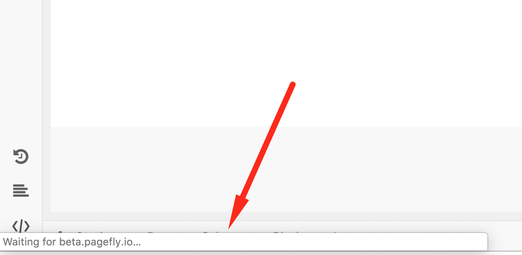
Moved from the bottom to the top of the editor page. The main purpose is to avoid the Loading message of the browser.

Menu Bar
Rearrange the buttons to adapt to the steps of the common user flow

Updated Page Settings within the editor page
In PageFly 2.3.0, you don’t have to close the editor page to change page settings like page types, header & footer or assigning products.
Create Under Construction Page
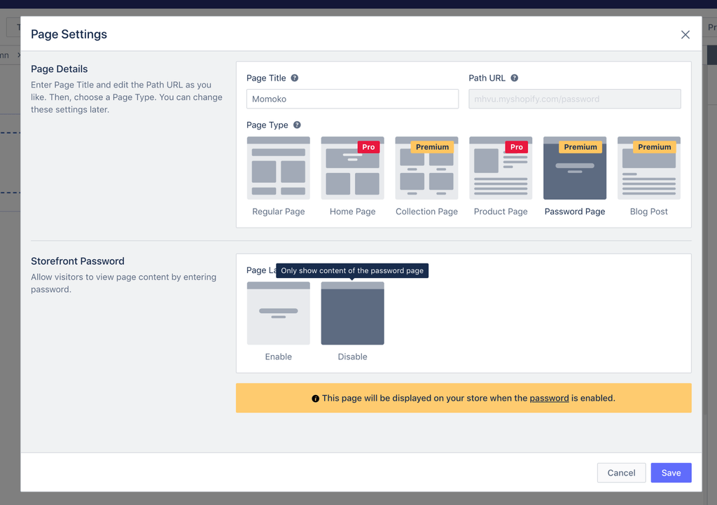
In the new version, you have the option to Disable password on a Password Page. The so-called password page will now serve as an Under Construction page, which shows information to your store visitors without necessarily asking for a password.
Select Blog for Blog Post
While in the previous version, all blog posts created with PageFly were automatically stored in the first Blog, in this 2.3.0 version, users can decide which Blog to display their blog posts.

Hide/show theme styling
Along with Header & Footer, Theme Styling includes all default stylings inherited from the theme of the store. Enabling and Disabling these styling is now available on the Menu Bar of the Editor.

Inspector
Collapsible parameter sections
Parameter sections can now be collapsed to save space and make it easier for users to have an overview of what they have in the inspector.

Font preview
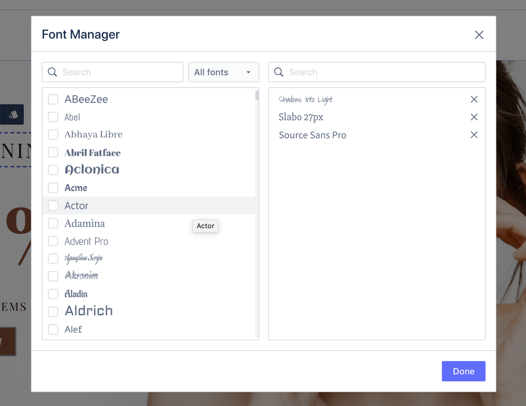
All fonts now appear in their original font faces. Users can see how each font preview looks without interacting with it.
Real-time adjustment
Besides entering values, users can use the … bar to adjust an element until they are visually and emotionally content with it.

Multiple Measurement Units Available
Units of measurement are now available in %, px, and em.

Try it yourself!
So, PageFly 2.3.0 has been live for 3 days now. Bugs have been fixed and PageFly technical team will still be working on bugs to come.
The app is getting more stable with each update. Come join the excitement of the team and see how you can gain even more control over the way you build your pages.


