Believe it or not, selling on your Shopify store does not only happen in the home page and product pages. It also happens at the checkout page – and if you screw this up, you might miss out on potential revenues that could propel your business to greater heights. But you need not worry, Shopify one page checkout is here to help.
In the fast-paced and competitive world of ecommerce, the success of your online store lies on several factors like visual designs, page speed, and navigation, among other things. But there’s one process that all online customers must go through to complete their purchase – the checkout process.
The checkout process is the point where customers decide whether or not they will complete their purchase. Thus, this step becomes a crucial element of your sales conversion. Nowadays, customers demand a more seamless checkout process. One that won’t require them to go through a lot of hassle just to buy what they need.
Shopify already sits at the top of the food chain outpacing other ecommerce platforms’ conversion rates by up to 36%. And now, they just made things better because they just rolled out an update to their one-page checkout that could help you acquire more sales. Let’s talk about it.
What Is Shopify One Page Checkout?
Imagine queuing up at a long line in a supermarket – it’s irritating and some people just lose their patience, leave their purchases, and step out the door. We’ve witnessed it countless times in the past.
The same scenario will happen to your online store if customers find your checkout page cumbersome to deal with. And this gravely affects your conversion rates.
This is where a one page checkout (or a single page checkout) comes in handy. It provides a streamlined checkout process that will allow your customers with a complete checkout on a single page and with just a few clicks.
Take a look at this video to see how streamlined the Shopify one click checkout is:
Source: Shopify Youtube
The global cart abandonment rate for the year 2023, according to a Dynamic Yield research, is 71.68%. This means that more than two-thirds of potential online sales are lost because customers decided not to complete their purchases at the final step (checkout) of the online shopping process.
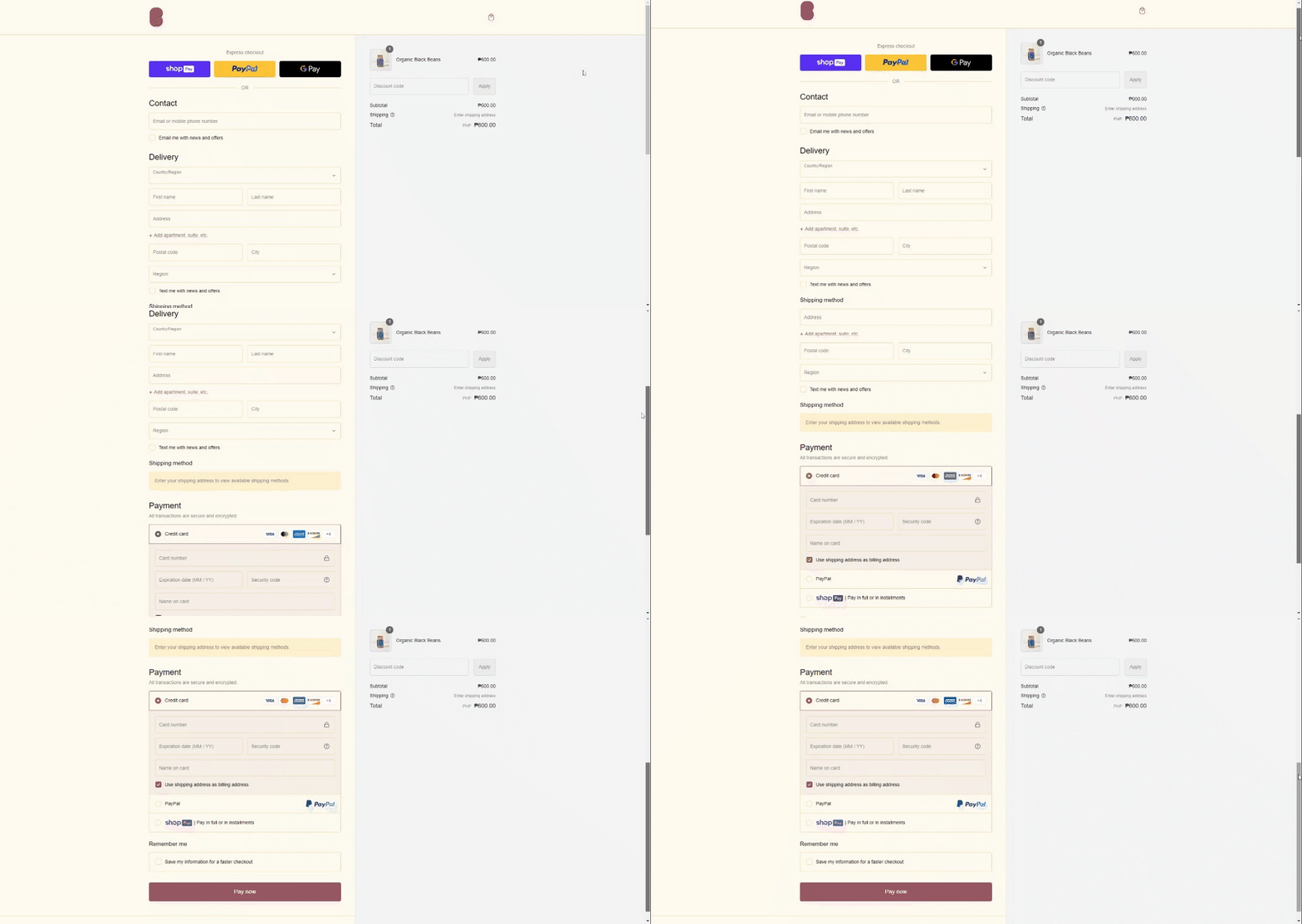
Source: Beanstory
At the sample checkout page above from Beanstory, you’ll notice that all the checkout forms are contained in the same page.
In this single page, contact number, delivery address, and payment options can be filled out. This means that customers no longer need to be redirected to different pages in order to complete their purchases.
It may seem like a small change, but this single page checkout from Shopify promises a potential increase in sales conversion because of the faster, more convenient shopping experience.
Pros And Cons Of Shopify Single Page Checkout
According to Shopify:
“Our new design goes beyond a mere aesthetic upgrade; it's a thoughtful reimagination that’s intuitive and easy to use. We've fine-tuned every pixel and interaction, ensuring each element of the design serves a purpose in guiding your buyers towards completing their purchase. This meticulous attention to detail results in a checkout experience that looks good, is delightful for buyers, and highly converting.”
Thus, this new Shopify single page checkout can be expected to deliver a number of benefits to existing and new Shopify users.
Pros
Increased Conversions
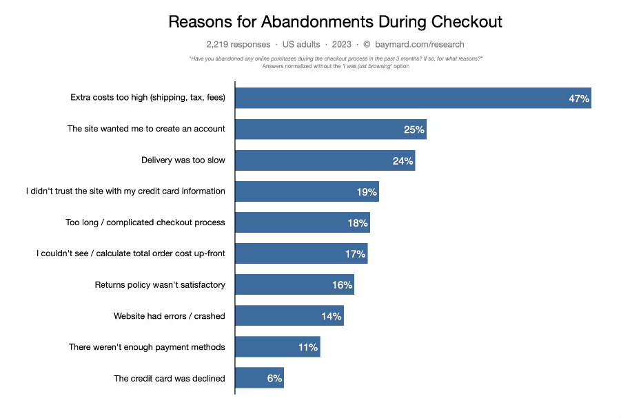
Source: Baymard Institute
According to a 2023 research conducted by Baymard Institute on 2,219 US adults, there are two checkout-related reasons as to why they abandon their carts:
- Top 2 reason: The site wanted me to create an account (no guest checkout)
- Top 5 reason: Too long / too complicated checkout process
The one page checkout process eliminates all this friction – making the experience more delightful for customers. And since these problems are now solved, online stores can expect a reasonable increase in their conversion rates.
Improved User Experience
According to different research from Statista, the total global share of mobile ecommerce in 2023 is at 60% – amounting to almost $2.2 trillion. This means that the number of people who are using mobile devices to shop online are more than those who are using desktops or laptops.
Therefore, as an ecommerce entrepreneur, you should give high importance to the mobile version of your online store. On a mobile device, the page load time can vary from a few seconds to a minute. Having multiple checkout pages means buyers should spend up to 5 minutes filling out data to get their items. As you can expect, many people will give up before hitting that number!
The single checkout page on Shopify is a step closer towards a better mobile experience. As you know smartphones don’t have the same screen real estate as computers with larger screens. Thus, mobile websites must be designed to meet the customers’ visual expectations.
Cons
Long Scrolling Page
The single checkout page for Shopify can be a double-edged sword. Consolidating all the shipping information in a single page results in a longer scrolling page which, unavoidably, some users might find undesirable – especially mobile shoppers. Thus, it could also lead to cart abandonment.
Trade-Off With Upsell Opportunities
Since the single checkout page is designed to be simpler and more straightforward, trade-offs had to be made. Unfortunately, upsell opportunities were one of the casualties of the Shopify single page checkout. Therefore, if not managed properly, this could actually result in a lower customer cart value.
Nevertheless, this can be rectified by using a “Review Cart” page. This is a page where customers can review their purchases before proceeding to the checkout.
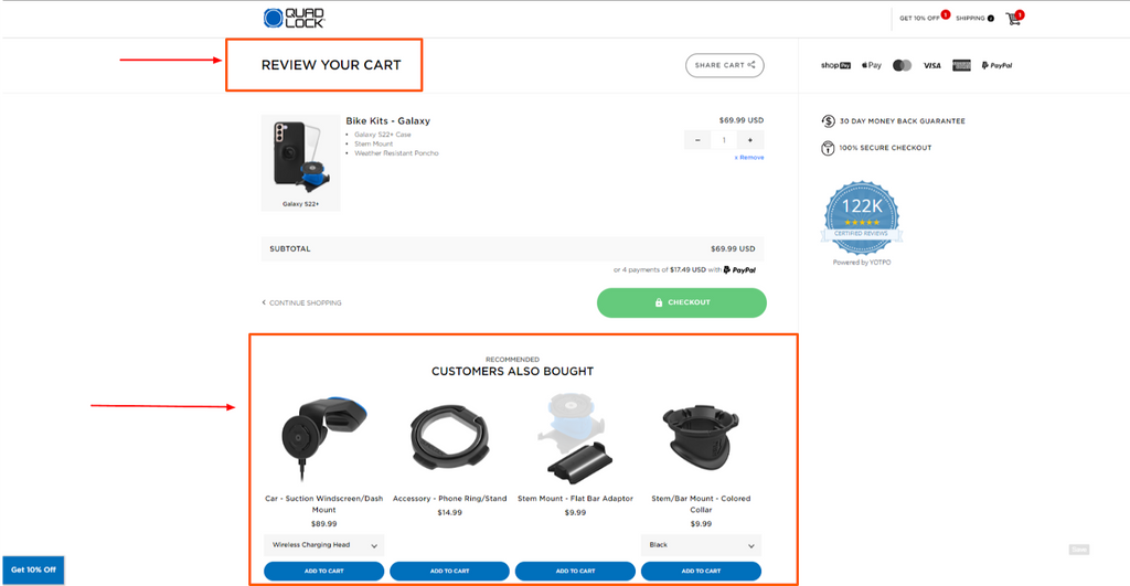
Source: Quad Lock
In the sample image above, Quad Lock maximized their page by adding a product suggestion or “Recommended” section below the cart.
May Impact Load Speed
The consolidation of all checkout details in one page means that mobile and desktop browsers have to download more information. Therefore, it may result in a slower load speed – especially for users with slow internet connectivity.
This is just a possibility. However, upon trying out Shopify stores with single checkout pages via our mobile phones, we didn’t notice a less-than-desirable change in the checkout process.
Read more: One Product Shopify Store: How to Build & 03 Successful Examples
One Page Checkout Shopify: The Latest Update

Prior to this update, Shopify’s checkout flow consists of three separate pages (after reviewing the cart) by default – customer information, shipping information, and payment. The one page checkout used to be an option for Shopify users who want a streamlined process.
Apps were also used for more customizability to implement single checkout pages.
But in this recent update, the single page checkout has become the default settings for all Shopify users, except for Shopify Plus users.
This means that the single checkout page will apply to the following plans:
- Basic Shopify
- Shopify
- Advanced Shopify
Users of the above-mentioned plans don’t need to do anything to switch because this update automatically converted them to one page checkouts.
Unfortunately, in this new update, the single checkout page ceased to become an option for non-Shopify Plus users and there is no means to revert to the previous three page or multi page checkout.
In Shopify’s own words:
“For stores on a non-Shopify Plus plan, one-page checkout is the default checkout experience and you can't switch to the three-page checkout experience.”
But before you think that Shopify left you with no option for customizability, well, it’s not like that.
You can still perform some tweaks to your checkout page through your Shopify admin.
Go to Settings > select Checkout.
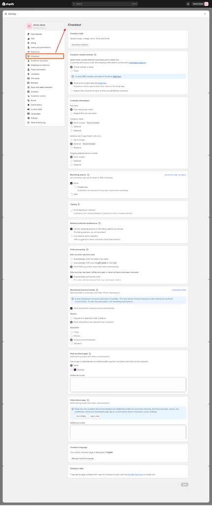
As you can see, customization options like customer contact method & information, marketing options, order processing and more are not lost at all. You can even add custom scripts if you want to make a customization at a deeper level
Lastly, there are a multitude of checkout apps in the Shopify store that you can use to further tweak the checkout page. We have a list of apps listed at the end of this article.
You Might Need To Implement Some Adjustments
Since the new single page checkouts will become the non-negotiable layout for Beginner, Shopify, and Advanced Shopify users, some online stores might experience some inconsistencies with the customizations that they previously implemented.
Shopify cautions said users to take notice of the following things:
- “The header layout for one-page checkout is different from three-page checkout, which might impact how your background image displays at checkout. If you have a background image on your checkout form, then you might need to adjust the cropping on your image and replace it.”
- “The one-page checkout introduces some new customizable wording to the Checkout & system section of the theme content editor. If you've previously made content changes or custom translations, then you should confirm that your customizations display as expected on your new one-page checkout."
Quick Read: Shopify Thank You Page: How To Use It To Acquire More Sales? [With Video Tutorials]
One Page Checkout for Shopify Plus

While non-Shopify Plus users can non longer revert to the previous checkout orientation, Shopify Plus Plan users, on the other hand, can choose not to use the one-page checkout.
This has been clearly stated in Shopify’s latest documentation:
“If your store is on the Shopify Plus plan, then you can switch between one-page checkout and three-page checkout from the Branding settings section of your checkout editor.”
Here’s how you can change the checkout layout on your Shopify Plus store:
Desktop
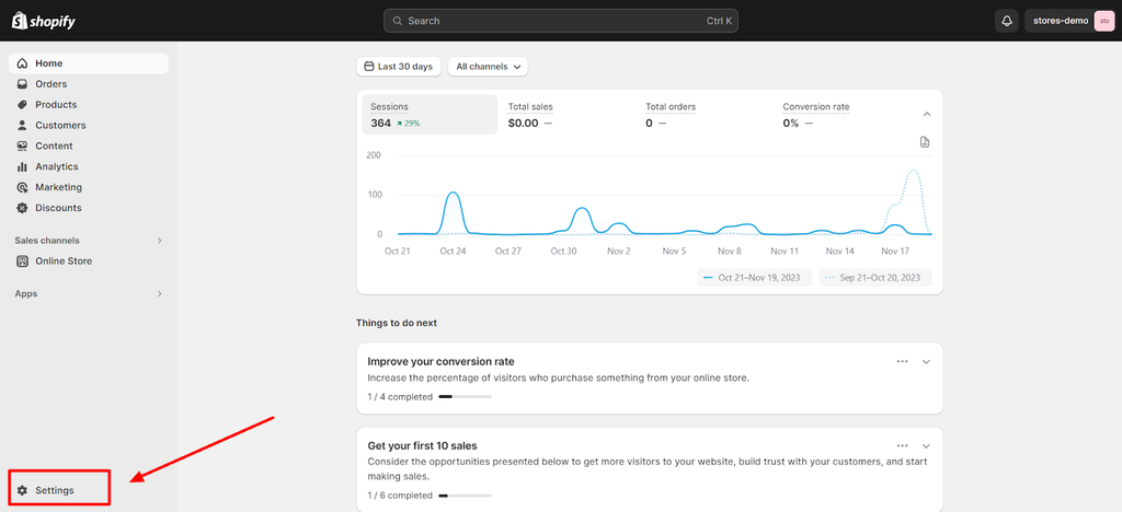
Step 1: Open your Shopify admin and click Settings
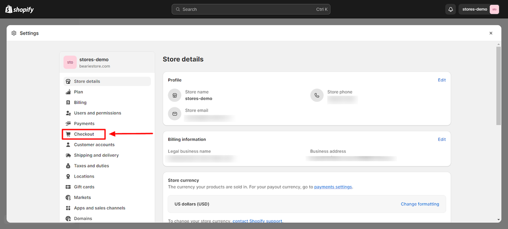
Step 2: In the settings menu, click Checkout
Step 3: Choose what you want to edit from the checkout menu
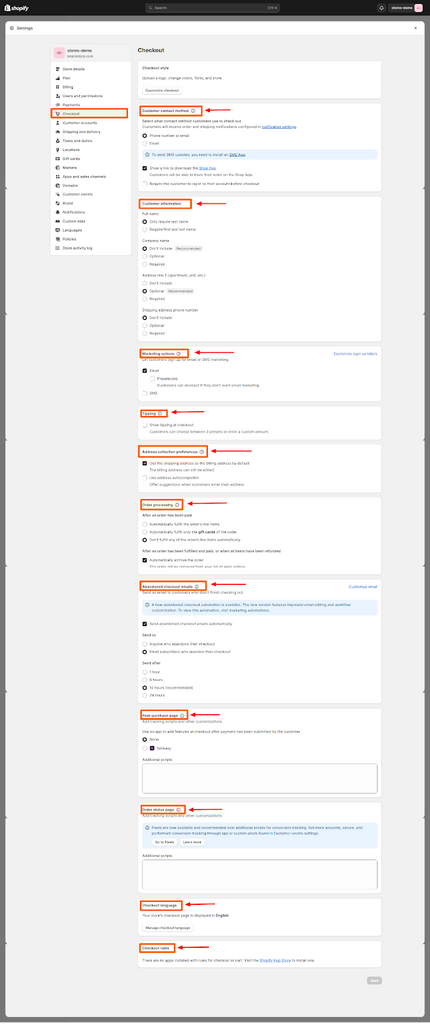
The checkout menu will give you access to the different content of your one-page checkout page such as:
- Customer contact method
- Customer information
- Marketing options
- Tipping
- Address collection preferences
- Order processing
- Abandoned checkout emails
- Post-purchase page
- Order status page
- Checkout language
- Checkout rules
These sections will help you modify the structure, collected information, and some functionalities of your checkout page.
But if you want to change the aesthetics of your checkout page, you need to open the checkout editor – for that, let’s move to the next step.
Step 4: At the top of the checkout menu page, click on the Customize Checkout button to open the checkout customizer within your Shopify theme editor
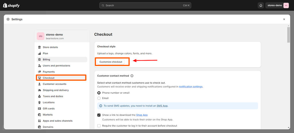
In the checkout customizer, you’ll be able to change the colors, typography, animations, images, and other visual elements of your one-page checkout page.
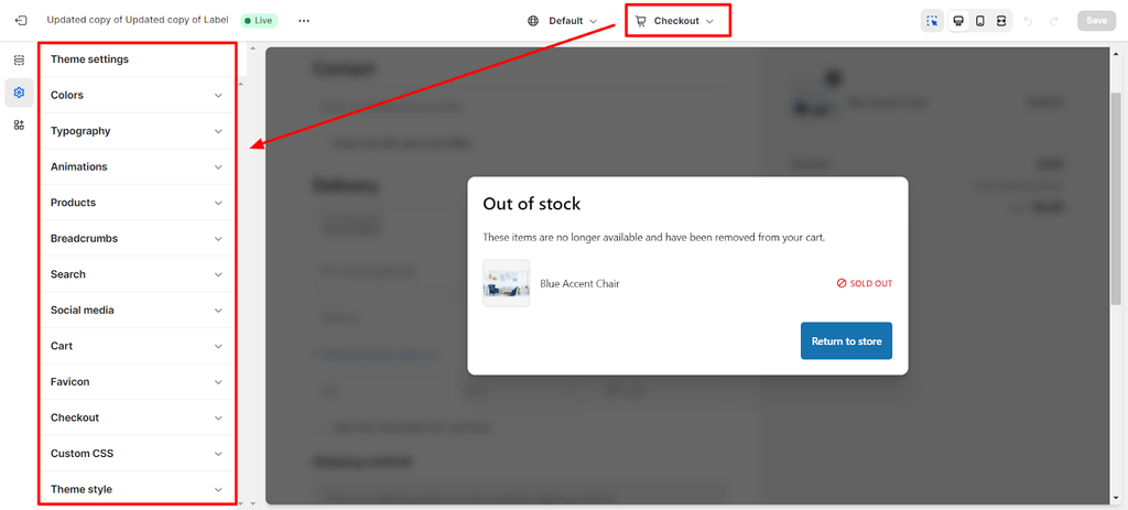
You can also choose what type of cart (either a drawer cart or page cart) you want for your store.
Additionally, you can also add custom CSS if you want more complex changes to be implemented.
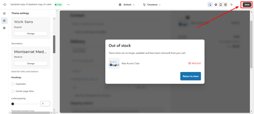
Step 5: When you’re satisfied with the changes that you’ve made, click Save to finalize them and implement them to your store
Some Reminders When Editing Your Store
01. Duplicate your theme for safety measures
Whenever you’re editing your store via the theme editor, it’s a good practice to duplicate your store to make sure that your live store is insulated from the potential mistakes that you might make while editing.
You can do that through your Shopify dashboard. Click Online store > Themes > three-dot icon > Duplicate.
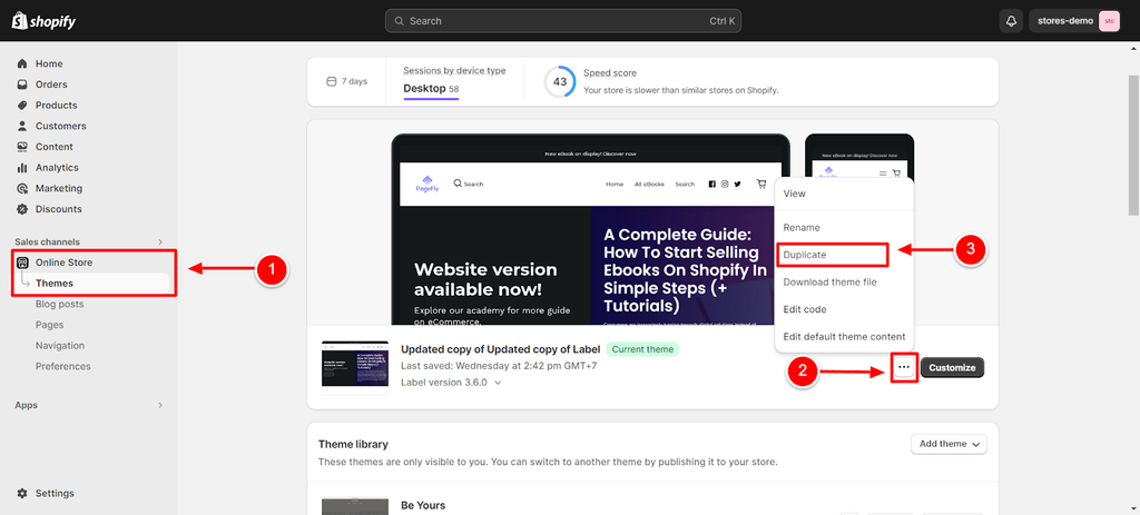
After duplicating it, a copy of your theme will be created under Theme Library.
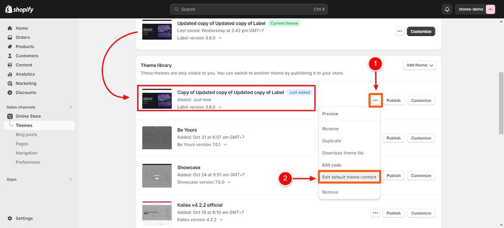
You can then click the three-dot button > edit default theme content to open the theme editor and make the changes that you want to do.
Remember that as long as you are editing the Copy of your current theme, the changes will not be implemented to your online store even if you save the changes.
The only way for the changes to take effect is if you click on the Publish button after you make the adjustments.
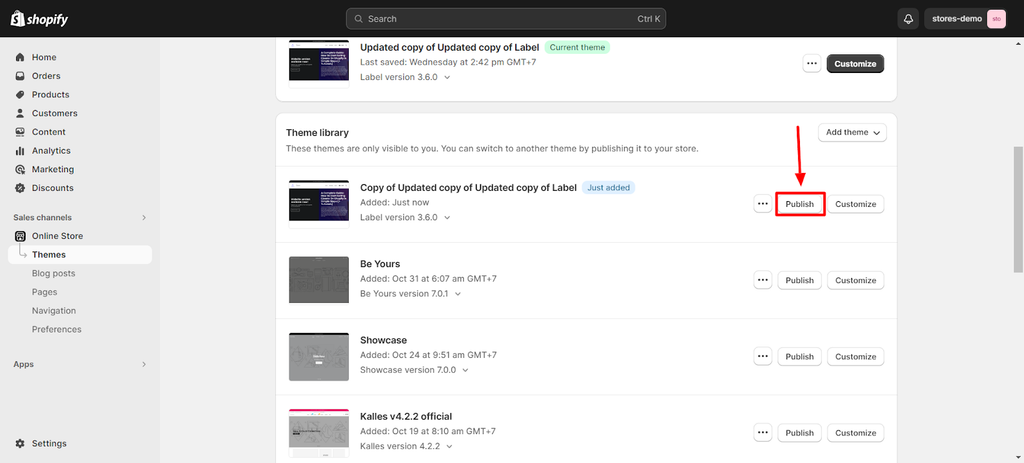
After clicking the Publish button, the duplicate theme will now become your current theme.
Repeat the process when making changes to your store to ensure that no undesirable changes due to errors are made to your live store.
02. Check for responsiveness
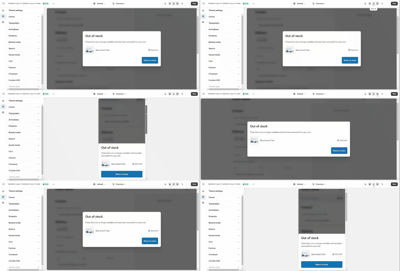
Confirm if the new design is responsive. You can easily do that by toggling over the desktop, mobile, and full-screen icons beside the Save button.
By doing this, you’ll minimize the possibilities of having broken layouts on your live store – thereby preventing negative user experience.
Shopify Single Page Checkout: Common Myths

We’ve been reading quite a few myths online about the latest single page checkout for Shopify. And in this section, we want to debunk some of these myths in order to put your minds at ease – knowing that this latest update is actually an improvement and not a step backward for your online store.
Myth #1: Analytics Will Be A Nightmare
Some articles online say that single page checkouts will no longer provide detailed checkout analytics like the three page layout.
However, this is not true. According to Shopify:
“The one-page checkout collects the same information from your customers as the current three-page checkout, and the same analytics that relate to checkout are available in your Shopify admin. Any existing conversion tracking setup using the order status page will continue to work after your checkout is updated to one-page checkout.”
Myth #2: It Will Slow Down The Website
While it is possible for some users to experience a slow site speed, this is on a case-to-case basis and there are a lot of factors that come into play, such as: internet speed, browser, and the device that they are using.
To confirm this, we visited some Shopify online stores using our mobile devices and we did not notice an unusually slow loading speed.
Additionally, we tested the same websites that we tried using the PageSpeed Insights tool that tests the core web vitals of a specific website.
The following images show the mobile speed test results of the Shopify stores below.
Test #1: Eve Gravel
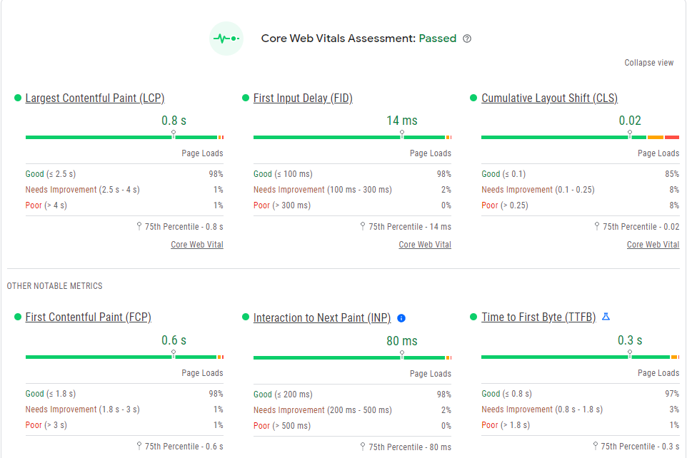
The first Shopify store that we tested is Eve Gravel. As shown in the result above, it passed the core web vitals assessment. And looking at the results of six different metrics, all of which fall under the parameters making the website “Good”.
Test #2: Garden Tool Company
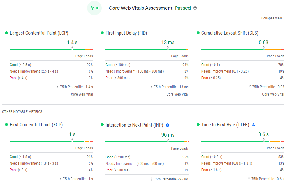
The second store that we tested, Garden Tool Company, also passed the core web vitals assessment of PageSpeed Insights. All six metrics that were measured returned a “Good” score.
Myth #3: It’s Not As Customizable As The Three Page Checkout
Since everything is consolidated into one page, you might fear that the customizations will become limited or that you will lose your previous custom setting from your multi page checkout. But there’s no need to worry in regards to this aspect.
According to Shopify:
“The one-page checkout supports the same customization options as the three-page checkout. Any customizations that you've made will continue to work seamlessly when you switch between checkout layouts.”
What’s New With The Shopify One Page Checkout?

Now that we’ve discussed the applicability, pros and cons, and myths about the single page checkout for Shopify, let us now talk about what’s new with this latest update.
Aside from the obviously revamped look page, The one page checkout has the following additional language customizations:
Shipping
- Address fields
- Shipping methods
- Rollup title, and more
Billing
- Address fields
- Buttons
- CTAs, and more
Payment
- Payment method
- Subscription heading
- Expired payment method
Customer account
- Rollup label
- Invalid shipping method
Review
- Blocks
- Review title free order
Stock
- Price update
- Title
- Description
To enhance your checkout process further, watch the video below to learn how to add a sticky add-to-cart button using PageFly.
Alternatives To Shopify One-Page Checkout
Shopify’s implementation of the new one page checkout as the default to all stores does not mean that users are stuck to it.
In fact, users can still use third-party apps to elevate the look, feel, and functionality of their checkout pages.
Check out the list below:
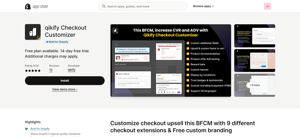
01. Qikify Checkout Customizer
Rating: 5 / 5
Pricing: Free for Basic, Shopify, and Advanced plans. $99 per month for Shopify Plus.
Source:Shopify app store
Qikify is a free checkout solution for Shopify users who are using Basic, Shopify, or Advanced plans who want to customize their checkout payment and delivery methods.
On the other hand, Shopify Plus users will be charged $99 per month but they get more customizability. This includes collecting customer information via custom fields.
This app also allows users to improve their sales by allowing them to add upsell and cross sell elements right at the checkout page. It also allows adding checkout banners, rewards bar, testimonials, and more.
Key features:
- FREE Customize checkout payment & delivery methods (Work for all Shopify plans)
- Custom checkout fields: Various templates & conditions to provide more services
- Product offers: Checkout upsell, cross-sell with auto discount in checkout page
- Custom cart: Update item options; or checkout upsell with quantity discount
- Customize checkout branding (for FREE); Create banner, Reward bar, Testimonials
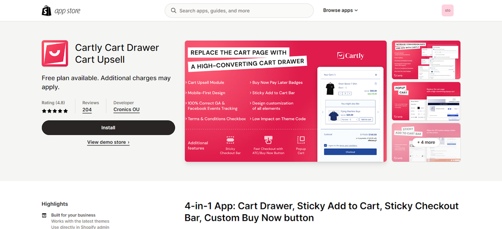
02. Cartly Cart Drawer Cart Upsell
Rating: 4.8 / 5
Pricing: Free plan available. Starts at $9.99 per month
Source:Shopify app store
Cartly Cart Drawer Cart Upsell is another app that provides a bunch of solutions to make the shopping experience more delightful to your customers. It enables users to add a cart drawer (designed by CRO experts according to their web page), sticky add to cart or checkout buttons, and even add a one-click checkout button so customers can do their purchases with relative ease.
Key Features:
- Ajax cart drawer w/ in cart upsell & popup cart page w/ skip to checkout button
- Add Terms and Conditions checkbox and Buy Now Pay Later (BNPL) info to the cart
- Sticky Add to Cart, a floating fixed add to cart button at the bottom of a page
- Manage direct checkout & skip cart flows with Buy Now, Buy button & ATC button
- Fast checkout sticky bar: send visitors to checkout from any website page
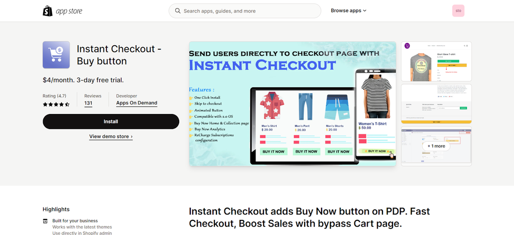
03. Instant Checkout - Buy button
Rating: 4.7 / 5
Pricing: Free plan available. Flat rate at $4 per month.
Source:Shopify app store
Instant Checkout is a cost-effective app for merchants who want a straightforward checkout solution and those who don’t want to spend huge amounts for a checkout app.
As its name implies, Instant Checkout makes shopping easier for customers – especially to those who want a fuss-free shopping experience. By using this app, your customers can proceed to the checkout page right from the product page after choosing what they want to buy – thereby bypassing the hassle of going through the “review cart” page.
It’s a simple yet smart solution that your customers will surely appreciate.
Key features:
- One Click Install - No coding skills required. Just enable the app and use it.
- Add animated "Buy Now" button on product, collection & home page products.
- Edit the look and feel of your Buy Now button to match your store's brand.
- Sticky Buy Now button | Skip to checkout | Button Analytics
- Compatible with ReCharge gateway Subscriptions.
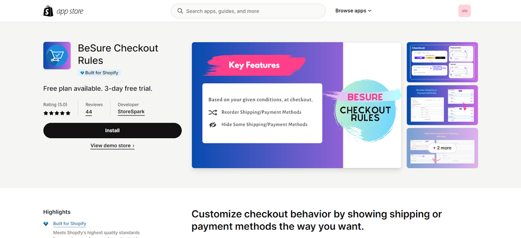
04. Be Sure Checkout Rules
Rating: 5 / 5
Pricing: Free plan available. Flat rate at $4.99 per month
Source:Shopify app store
Be Sure Checkout Rules is a unique app that lets you modify the arrangement of forms and fields in your checkout page. You can reorder shipping options the way you want them to appear and you can also do the same to the payment methods.
Additionally, you can set a variety of conditions that will trigger checkout modifications.
All these, in turn, lets you somehow control the choices of your customers according to your preferences.
Key features:
- Reorder/Rearrange shipping/payment methods on the checkout page.
- Hide payment/shipping methods by e-g Cart total, Product tag, Customer tag, etc.
- Set the default pre-selected shipping or payment method.
- Hide express checkout payment methods only on the checkout information page.
- Hide shipping, e-g, UPS, or block checkout, if the address contains a PO box
Conclusion
As shown in the statistics above, 2 out of 5 reasons for cart abandonment relate to the checkout process. This goes to show customer experience has a tangible effect on your online sales conversions.
With the global cart abandonment rate for ecommerce reaching as high as 71.68%, the one page checkout is Shopify’s long-term solution to regain their users’ lost potential revenues.
The Shopify one click checkout has its flaws which some users might find unappealing. However, since it's already here, it is up to online store owners to adapt to this change and use it to their advantage.
With the progressively changing ecommerce landscape, Shopify strives to always keep up with market demands.
According to their blog, “Since early 2022, we have shipped several improvements to our new checkout, adding up to 1.5% of the conversion lift.”
After all, millions of businesses rely on Shopify’s platform. As such, Shopify would not implement changes like this if there is no proven benefit for their users. Therefore, this complete checkout overhaul was released for a good reason.
Explore more, check out: Shopify Abandoned Carts: Reasons, Hacks, Tips, and More


