One of the earliest things you need to consider when creating a new Shopify store is how it would look. However, it takes a lot of time to conceive the design itself. And honestly, thinking of a unique design is more complicated. That’s why you should take inspiration from these Shopify storefront examples that we’re about to show you.
You see, looking at other Shopify store examples to get inspiration is not a bad thing. All great designs were inspired by something, right? And that’s why knowing other successful Shopify stores in your niche is a great idea to jumpstart your creativity.
Thus, if you’re struggling to finalize the storefront for your online business, sit back and relax because we’re about to show you some spectacular online stores per product category. And before we end the article, we’ll show you a Shopify storefront app that you can use to create an amazing online store yourself.
Let’s get started.
What Is A Shopify Storefront?
A storefront is the customer-facing side of a Shopify store. It is where the visitors browse and purchase products from your brand. In short, it’s your ecommerce business website.
Shopify websites offer a seamless shopping experience, integrating product displays, search functions, and a seamless checkout process, among other functions.
More importantly, online stores made with Shopify can be designed to be truly stunning to wow your customers as soon as they land on your Shopify store.
Multi Shopify Storefront
The term storefront also applies to enterprise-scale Shopify stores that have several versions of their online stores based on their target country or audience. These different versions of their online stores are also called storefronts.
However, you can only create multiple Shopify storefronts for one website if you’re using a Shopify Plus plan. In Shopify Plus, you can create up to 25 storefronts.
Essential Parts Of A Shopify Storefront
Ideally, an ecommerce website should have all these pages:
- Homepage: The main landing page that showcases the featured products, promotions, and brand identity. This is crucial for first impressions.
- Collection Page: This page groups the products in a Shopify store per category to make it easier for customers to browse items.
- Product Page: A product page contains complete information about a specific product.
- Cart & Checkout Page: The cart and checkout page are automatically included in a Shopify store. In these pages, customers can manage their purchases and facilitate a seamless checkout process.
- About Us Page: Shares the brand story, mission, and values, helping build trust with customers.
- Contact Page: Provides ways for customers to reach out when they need to inquire.
- Privacy Policy Page: Outlines how customer data is collected, used, and protected.
- Terms and Conditions Page: Details the legal agreements between the store and its customers, covering usage and policies. In the US and EU, the Privacy Policy and Terms & Conditions page must be present in all websites.
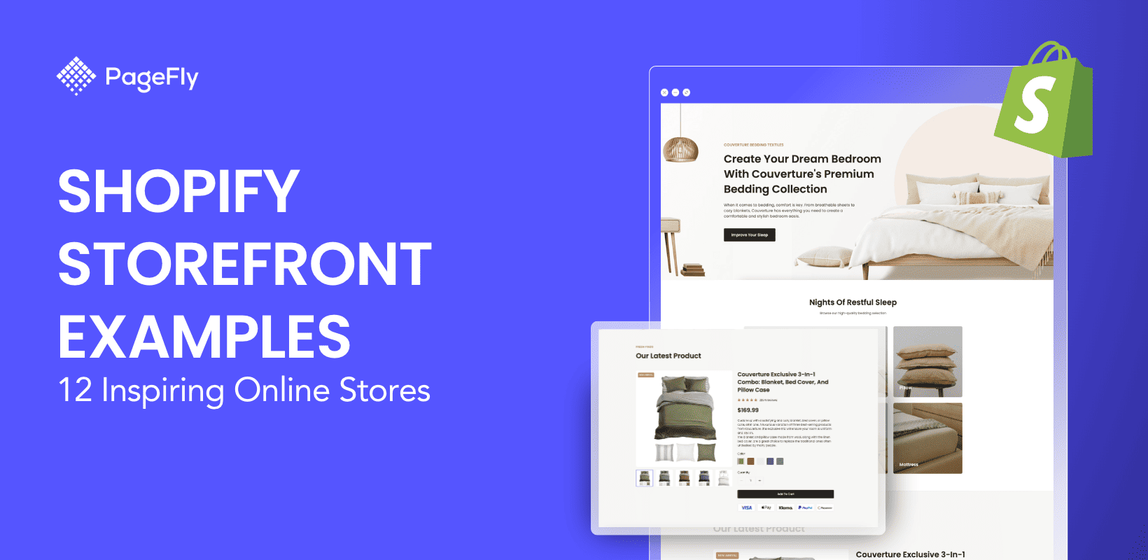
Shopify Storefront Examples To Inspire You
Below are 12 of the many well-designed Shopify stores right now. To give you a variety of choices, we chose one storefront example per product category.
Check the list, visit their website, and immerse yourself with how well these online stores are designed.
Fashion: Roden Gray
https://rodengray.com/

The first Shopify store on our list is Roden Gray, a vibrant and youthful apparel brand that has a free-spirited appeal.
Since we’re talking about free spirit, this characteristic was applied throughout their website. They went against the ordinary design of other Shopify stores in that their online store looks like a page from a magazine of the good old days.
The website is dominated by large-sized images that tell a bold story. The page fonts pop out when you read them. And here’s the thing, Roden Gray sure knows how to captivate and connect to its audience through words.

The most standout feature of Roden Gray’s website is the homepage itself. It saturates the screen with large images that maximize visualization of their products.
It’s like turning the pages of real magazine.
Home: Our Place
https://fromourplace.com/

Our Place’s Shopify storefront is relaxing and homey – it should be because it sells home products. And boy did they do it well.
In all Shopify stores, the first things that capture an audience's interest are the images. Our Place did it so well by having studio-quality images with muted backgrounds that blend it with their pastel-colored products.
Some image sections even have arch-shaped borders that represent the arched doorways that originated in Mesopotamia.
Upon digging deeper into their website, we found out that the founders of Our Place indeed came from the Middle East.

They have a lot of products. But their collection page does not look cluttered despite having large images. And instead of creating multiple pages for their collections, everything is accessible in a single page because of their effective use of product galleries.
Fitness: Alphalete
https://alphaleteathletics.com/

We’ve all heard about the fitness brands in Shopify such as Gymshark and Bodybuilding.com. But this fitness brand has the sickest website of them all.
Introducing Alphalete, a fitness brand that sells sports apparel. Similar to Roden Gray’s store, Alphalete’s Shopify site is dominated by a combination of large and small images. But in addition to that, Alphalete made use of videos on their homepage to add some pop to their brand.
Moreover, their website utilizes a deep black background to make their products look more vibrant.
“Less talk, less mistake” is probably one of the quotes they live by as there are very few words on their website. They let the products (and the images) do the selling for them. And it works for us.

Alphalete’s product pages are truly a sight to behold and it’s evident that they put a lot of effort towards designing them. Ordinary Shopify stores usually have the default product page that comes with their themes.
But Alphalete is different. You can’t find this product page layout elsewhere. It’s a fully customized page that works amazingly for their brand.
Beauty: Glow Recipe
https://www.glowrecipe.com/

The fourth one in our list of Shopify stores is Glow Recipe – a chic and posh cosmetics brand that’s targeting a youthful and vibrant set of audience.
This is pretty evident in their color choices and in how their storefront was designed. Firstly, they use a very light pink background for their website. These pink hues continue to their product images albeit having a more pronounced shade of pink mixed with a gradient of different color.

What truly attracted our eyes are the videos of their young customers who are using their products in a fashionable vibe. At the same time, this approach helps establish credibility with the help of user-generated content of UGC.
Food & Drinks: Chilly’s
https://www.chillys.com/

Chilly’s is a popular Shopify store in the food and beverage space because they don’t just sell water bottles. They sell water bottles with art.
Now and then, Chilly’s collaborates with artists and brands to create unique bottle designs that you’d be proud to own. This gives the audience a wide array of choices for such a very simple product.

In addition to that, Chilly’s has a very modern-looking website as evidenced by how clean the website is. It employs large image sections but they aren’t overwhelming at all.
The website navigation is fluid and the product pages are sleek. Kind of like how Apple (the tech brand) creates a website.
Quick read: PageFly Product Page: 15+ Examples + Tips (2024 Updated)
Baby Products: Kyte Baby
https://kytebaby.com/

Of course, we have a Shopify clothing store for babies! Kyte Baby is an apparel brand for babies and toddlers founded by a mom with a mission – go ahead, check out their website.
Kyte Baby has a very homey and toned-down store and it gives us the same kind of feeling when we enter a baby store.

Instead of using hyperlinks in the mega menu, Kyte Baby used square images of cute babies for their products and it positively contributes to the store’s overall vibe.
Aside from that, there’s nothing fancy going on in this website. No shocking animations or out-of-this-world effects. Instead, it’s a more simple aesthetic that is achieved by a pure understanding of design.
It goes without saying that babies are sooo cute!
Toys & Collectibles: Toynk
https://www.toynk.com/

If you’re a toy collector, you’ll surely love this Shopify store – introducing Toynk.
Whether you’re collecting some Funko Pops of your favorite characters or you just want to buy some merch to show how you fancy them, Toynk has them.
Toynk’s Shopify store has a playful vibe courtesy of the blue and green color combination – which works well because it’s a toy store.

This Shopify store is not extraordinary. But where it truly shines is in the UX department, particularly in terms of navigation. Despite having hundreds of products, it’s very easy to navigate and everything is properly organized within the mega menu.
Pets: Happy & Polly
https://happyandpolly.com/

If you’re like us who love cats, Happy & Polly’s colorful Shopify store will surely get you excited.
They sell all kinds of things that will help cat lovers show how much they love their pets. Starting from the staple feeding bowls and cat litters. They also have some outfits for those cute but menacing fur babies.
Of course, they have some toys as well to keep your feline babies entertained, and honestly though, watching cats play is also very entertaining especially considering how clumsy and jumpy they are.

Happy & Polly’s Shopify store has some shoppable videos right at the homepage. And these videos are very interesting as they feature real cats enjoying their products. If we’re in the market for some cat products, these videos alone are enough to convince us to buy.
Vehicles: Alpinestars
https://www.alpinestars.com/

Alpinestars is a Shopify store dedicated to adrenaline junkies, particularly to those who love motorcycles – be it for everyday use, touring, or more extreme adventures such as motocross.
Alpinestars’ Shopify store is undoubtedly designed to sell. But it does so in a way that motorcyclists would understand – the feeling and experience.

Because of that, they let their products sell for them. No words are needed. The online store is made up of images and videos that all tell a story that will truly resonate to their target audience.
Gift Stores: Love Pop
https://www.lovepop.com/

Love Pop is a Shopify store that sells gift cards and other novelty items.
Love Pop’s online store is designed to highlight all its products. As you can see from their homepage, they didn’t waste any section telling a story, instead, they utilized most of its sections to display all their unique offerings.
While this approach might not work on all businesses, this one works well with Love Pop because it gives more gift ideas to their audience who are looking for a unique surprise to their special ones.
With a multitude of offerings available on their website, they managed to organize it well.

Love Pop’s Shopify shop is a great example of a simplistic storefront design which proves that you don’t need fancy elements to create an appealing store.
Their product page, for example, is very simplistic but it works well to give enough emphasis to their products.
Consumer Electronics: Anker
https://www.anker.com/

The final one in our list of Shopify storefront examples is Anker, a consumer electronics brand whose primary products are chargers for various types of devices.
As a tech brand, Anker’s website has a modern feel but not too much to take away the focus from their products. We particularly like the zoom effects on some of its sections.

But what caught our eyes were the product testimonials from none other than MKBH and Unbox Therapy. They sure know how to use reviews to sell their products.
The combination of pastel and dark colors contributes to the sleekness and fluidity of the website.
Outdoors & Adventures: Thru Dark
https://www.thrudark.com/

The final one in our list of Shopify storefront examples is Thru Dark. We saved it for last because it’s definitely not the least. Quite the contrary, it’s the one that we like most.
Being an adventure-oriented brand, Thru Dark’s online store has a certain appeal that kind of reminds us of Mission Impossible – when Ethan Hunt gets his mission from that nifty device that self-destructs.

The online store is undoubtedly one of a kind in terms of overall design. Instead of using a solid background, it utilizes a smoky black image that penetrates through its opaque collection page.
Customizing your purchase is a very exhilarating experience as it’s like choosing armors and ammunitions for a video game hero.
We should see more of these sci-fi-inspired online stores!
Elements To Boost A Storefront On Shopify
Designing ecommerce stores isn’t just about making them visually appealing. Instead, the goal is to create one that converts visitors into customers.
To do that, you need to add some conversion elements that could boost your chances of making a sale.
Here are 5 elements that you need to create a successful Shopify store:
Product reviews

Source: Volant
According to B2B Saas Reviews, 82% of consumers find customer reviews more authentic and influential than marketing claims. As such, product reviews in an ecommerce store help build credibility with your target customers through the help of your existing customers.
In-menu promos

Source: Cowboy
In-menu promos or announcements make it easier for your target audience to see the current deals on your website. Since these are located right at the mega menu portion of your website, they are highly visible and the probability of attracting attention is very high.
Clear CTAs

Source: Who Gives A Crap
CTAs or calls-to-action are the words or phrases that you use to encourage your audience to take action. CTAs vary depending on the action that you want your audience to do. But the most important thing about writing CTAs is that they should be clear and concise.
Trust signals

Source: Thursday Boots
Just like product reviews, trust signals help your brand establish credibility in the eyes of your target customers. It goes without saying that when including trust signals on your website, they must be factual. Do not include false claims just to attract customers.
Design

Source: Allbirds
Since Allbirds is a brand that advocates sustainability and eco-friendliness, they designed their website to reflect their ideology. As such, their storefront is dominated by shades of green, which represent nature. In designing your storefront, make sure that your brand’s unique voice is reflected in there just like what Allbirds did.
Now that you know what to include in your Shopify storefront, let’s take a look at some unique Shopify storefront examples in the next section.
Create A Shopify Custom Storefront For Your Store
After seeing all those unique Shopify storefront examples, you might be wondering if you would do that in your Shopify store.
Well, you’ll need a landing page builder like PageFly.

A landing page builder is a design tool that will help you create effects on your online store that are not possible when using the native Shopify theme editor.
PageFly has more than 100 templates that you can use for any page of your website such as your homepage, product page, collection page, and more.
On the other hand, if you want to create something from scratch, feel free to do so with our intuitive drag-and-drop builder.
Conclusion
We’ve now reached the end of our list. Were you inspired to make your Shopify store stand out?
If that’s the case, we highly support your plan! You see, uniqueness is one of the things that made these brands stand out. Uniqueness does not always have to be something similar to what Thru Dark has done. You can also stand out even if you have a simplistic approach just like Love Pop.
But the most important thing in designing a Shopify storefront is to give your brand a personality. And this is the reason why Our Place’s storefront (the second store in our list) stood out for us – because it pays homage to the culture, to its origins.
A great store sells. And what better story to tell other than how your culture has inspired you to create your brand?
Read more: 20+ Websites Built with Shopify: Stunning Examples and Inspiration
Shopify Storefront Examples FAQ
A storefront is the customer-facing side of a Shopify store. It is where the visitors browse and purchase products from your brand. In short, it’s your ecommerce website.
There are several types of Shopify stores. The top 10 Shopify store categories right now, according to Store Leads, are as follows:
- Apparel
- Home & Garden
- Beauty & Fitness
- Food & Drink
- People & Society
- Sports
- Health
- Arts & Entertainment
- Toys & Hobbies
- Autos & Vehicles
According to Store Leads, there are 2,380,897 live Shopify stores at the end of the second quarter of 2024.