Here’s a quick question.
In 2022, Walmart’s revenue was approximately $573 billion. If you were asked to suggest possible ways to boost that number, would you say “redesign over 1000 stores”?
Probably not. But that’s exactly what Walmart did.
Why does a store’s layout have so much impact on business growth?
Here’s the reason: A retail store layout maximizes customer engagement and satisfaction, which in turn impacts sales. A proper retail store layout uses psychological tricks to influence customers’ buying habits.
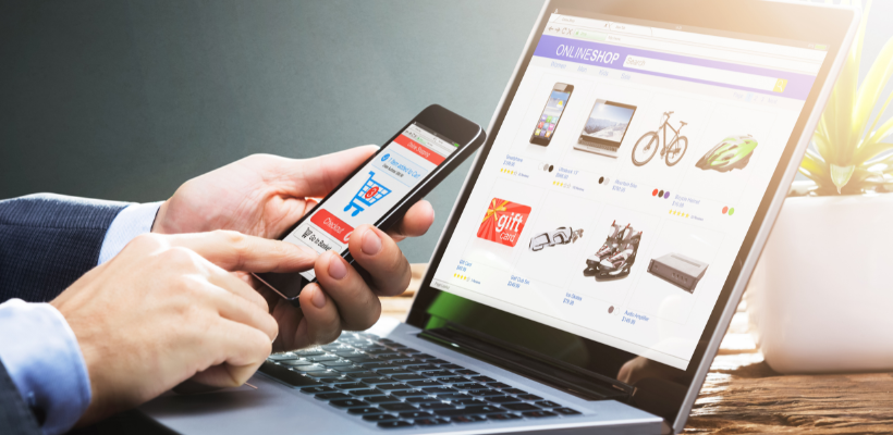
If you are looking to redesign your brick-and-mortar store or open a new one to complement your Shopify store, you’ll find examples of top retail store layouts and tips you can use to maximize the foot traffic your store receives.

Source: Pexels
Outline
- What is a retail store layout and why does it matter?
- Customer flow: how does it affect your retail store layout
- Factors to consider when designing your retail store layout
- Types of retail store layouts
- Applying psychology to create an effective retail store layout
- Real-life examples of successful retail store designs
- Conclusion
What Is A Retail Store Layout and Why Does It Matter?
Your retail store layout describes how you arrange your products, displays, and fixtures within your retail space.
A well-designed layout enhances the customer experience and exposes your customers to your products.
Now, you might think that the design of your retail store is a small detail to consider when your big goal is to increase brand sales. After all, when you think of impacting sales, your mind immediately goes to “bigger things” like inventory, location, and your marketing strategy.
But the comments of Paul Loux, Vice President of Store Design and Experience at Ulta Beauty, in a recent interview show the massive impact your retail store layout can have on your revenue goals.
“From the moment a customer decides to come into the store all the way to checkout, [Ulta is] creating a physical environment that connects to our digital environment in the right way… an optimal experience for discovery and product browsing, and above all, human connection.”
For context, Ulta Beauty posted revenue above $10 billion for the first time in its history and its increased focus on creating a memorable in-store experience for its customers is a huge contributor to that growth.
Some other benefits of a well-designed retail store layout include:
Better Use of Space
Thinking hard about your store’s layout helps you make better use of your space. Ideally, you want to allocate store space based on your product’s demand and customer flow (we’ll talk about that in a bit).
Improved Inventory Turnover
A well-designed retail store also helps you sell out certain items fast. It is possible to lead shoppers to specific segments of your store as evidenced by Costco’s tendency to place seasonal products near the store entrance to attract attention.

Source: Business Insider
Theft Minimization
Shoplifting and employee theft make up a huge part of the $61 billion retail shrinkage problem. But your retail store layout is one of the many factors that determine how well you combat it.
Your layout should offer a clear line of sight from the checkout to all parts of the store. It should also avoid cramped spaces on the shelf in order to help employees notice theft quicker.
Customer Flow: How Does It Affect Your Retail Store Layout
Customer flow is the path your shoppers take as they navigate their way through your store, from the entrance to the exit.
Understanding this journey gives you crucial information on the number of visitors your store receives, their different navigation patterns, the areas of your store they frequent and their interaction with your products.
If you know how many people visit your store and what areas they frequent, you can redesign your store’s layout to take advantage of this traffic and make more sales.
One common way to quantify your retail store’s flow is by using a People Counting System.

Source: IAM
This is a technology that tracks how many people are in a location or space, like a retail store.
Just like how a website traffic is monitored to understand the behavior of customers on a website, measuring your customer flow using a People Counting System allows you to understand your customers’ behavior within your store.
For instance, you can find out:
- How many visitors entered your store
- How many repeat customers you get
- What directions your store visitors took
- How many people left with making a purchase
- What part of your store are frequently visited
This information will help you design a natural flow that improves your customer satisfaction and increases sales.
Factors to Consider When Designing Your Retail Store Layout
Your customer flow is one of the biggest factors you should consider when designing your retail store. But it is not the only one. Some other factors include:
- Product placement
- Lighting
- Checkout kiosk
- Cost effectiveness
Product Placement
The type of products you sell and how you want to display them to customers wields a huge influence on the type of layout you run with.
Your product placement should be based on seasonality, popularity, and sales history.
For instance, you might want to place seasonal products near your entrance so customers might see them quickly. Or keep high demand products near the back of your store so that customers view other products before they get to it.
Lighting
Another factor to consider is your lighting. Your lighting serves different purposes, depending on the type of product you sell and the amount of store space you have.
Checkout Kiosk
The position of your checkouts, to a large extent, determine your customers movement throughout your store. The best practice is to put your checkouts near the store’s entrance.
But what’s more important is that your staff have an unimpeded view of the store, regardless of the checkout position.
Cost Effectiveness
It goes without saying that your budget will also factor into your decision. The resources you have will determine how much you are willing to spend on your retail store layout design.
Types of Retail Store Layouts
There are many types of store layouts to consider. Here are five of them to get you started.
- Grid layout
- Loop layout
- Free flow layout
- Spine layout
- Diagonal layout
Let’s examine each one of them.
Grid Layout
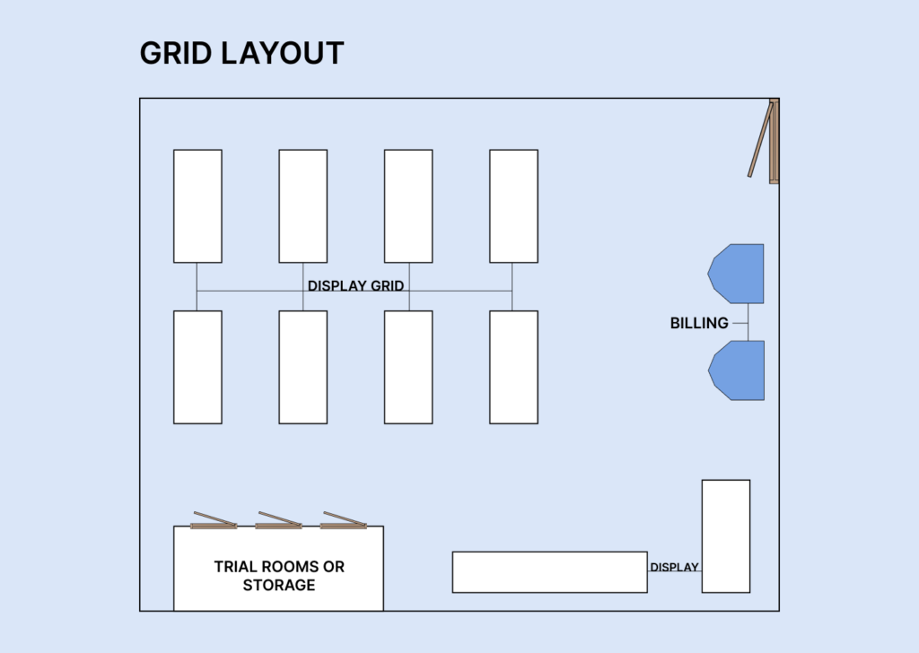
Grid store layout is a commonly used layout in retail stores. Products are placed on long aisles arranged in a grid-like pattern. This makes it easy for customers to view products as they walk down the aisles.
Grid store layout is favored by pharmacies and supermarkets as it allows them to place large amounts of products within easy view of the customers.
Source: OmniPay
Pros of The Grid Layout
- It is easy to navigate. Not only does this layout allow customers to move around quickly, it also lets them browse different products at once.
- It can handle high traffic flow. A big characteristic of the grid layout is its open aisles which suits retail brands with high traffic
- It allows you to maximize your space. Customers in a grid layout often move in predictable patterns. With this knowledge, you can turn your walls into a space to boost brand awareness or deal promotion. This area is often called your Power Wall and it's a powerful way to get your audience attention.

Source: Pexels
Cons of The Grid Layout
- The grid layout is a standard and common design which leaves little room for creativity. It’s hard to create a memorable experience with the layout.
- You’ll easily have frustrated customers if your product grouping isn’t clear.
Loop Layout
Think of the Loop store layout as a more controlled version of the Grid layout. It creates a deliberate path for customers to follow round the store, right from the entrance to the checkout.
Also known as the Racetrack layout, the loop layout is effective because it encourages customers to browse through most of the retail store’s merchandise before getting to checkout.
IKEA, for example, uses the Loop layout in its stores. By confining its customers to a single path and creating an intentionally overwhelming in-store experience, IKEA is able to keep its customers in the store for longer and get them to make impulse purchases too.

Pros of The Loop Layout
- Its enclosed loop encourages buyers to browse through the store on their way to checkout. This in turn facilitates impulse buying.
- It allows for a friendly, relaxed environment. It works particularly well in stores where the journey makes sense.
Cons of The Loop Layout
- The time spent in journeying round the store can be frustrating to certain customers who already know what they want.
Free Flow Layout
The Free Flow layout is a more simple layout compared to the first two. Brands that use this layout do not force their customers into structured movements. Instead, they create a relaxed shopping environment and encourage wandering within the store.
You’d mostly find this layout type in boutique stores and high-end retailers.

Source: Pinterest
Pros of The Free Flow Layout
- This layout gives an experiential retail experience to your customers.
- It encourages your customers to wander freely which can increase the chances of impulse buying.
- It creates a visually appealing store with more spaces between products.
Cons of The Free Flow Layout
- This layout gives an illusion that there are no rules to follow. That is misleading as you still have to understand rules around customers’ buying behaviors and patterns to make the layout work.
- You might need to have staff on hand to guide customers through the store. If you sell different products using this layout, you’ll also need to clearly indicate where one product’s section ends and another begins.
Spine Layout
The Spine layout, also known as the Straight store layout, focuses on movement efficiency. It is a design that directs the customers in a straight line, from the entrance to the back of the store.
You’d mostly find the layout in stores with limited space that want to maximize their available space. Some examples include gas stations and convenience stores.

Source: Shopify
Pros of The Spine Layout
- It is very easy for customers to navigate. This in turn facilitates quicker transaction times.
- It maximizes the use of space.
Cons of The Spine Layout
- It can be monotonous and boring for customers.
- It doesn’t encourage exploration as customers can move quickly down the aisles.
Diagonal Layout
The diagonal layout is a variation of the Grid layout. The key difference is that, unlike the Grid layout, aisles in the Diagonal layout are placed at angles to give customers more product visibility.
It works well in places that have limited spaces and it’s often used in gift shops and boutique stores.

Source: Pinterest
Pros of The Diagonal Layout
- It enhances security by providing a better sightline from the checkout.
- It creates a good movement circulation.
Cons of The Diagonal Layout
- It can cause congestion at certain intersections.
- It can be confusing for customers that are not familiar with the store.
Applying Psychology to Create An Effective Retail Store Layout
Customers do not only buy what they need, especially in retail stores. In fact, a research conducted by Invesp showed that 8 out of 10 impulse purchases are carried out in a brick-and-mortar shop.
The reason why this happens is because retail store owners have figured out how to impact customer behavior with psychological tricks.
Let’s take a look at two of these tricks:
1. Create A Welcome and Inviting Entrance
In an interview with Verywell Mind, Dr. Dan Pallesse, PsyD, a clinical psychologist, noted that retail stores are constantly looking to shift human behavior.
“When it comes to supermarkets, the moment you walk through those doors, you are being nudged.”
But the problem is, before you get a chance to show your customers the products you have in the store, you need to get them to “walk through those doors”. A big part of making this happen is your entrance visual appearance.

Source: HAG
Here are some ways to make your store’s entrance inviting.
Make Your Windows Stand Out
When gotten right, your windows can be the focal point of your customers’ attention. Attract eyeballs by using an attractive display, or a piece of artwork, or even an attractive product. Eye-catching window display is a trick used by luxury retailers to divert traffic into their stores.

Source: Pinterest
Make Your Purpose Clear
Place signage at your entrance to communicate your brand’s purpose and personality. It is easier to get customers into the store if they understand what you have to offer.
Avoid The Decompression Zone
This is the first 15 meters from your entrance into the store where the customer takes a look around your store. Products kept in this area are often overlooked.
2. Use Sensory Experiences to Evoke Emotions
Creative Director of IKEA USA, Richard La Graauw, stated that:
“20% of our buying decisions are based on logic. [The other 80%] is actually based on emotions.”
A key part of creating a retail store layout that compels customers into making buying decisions is creating an overwhelming sensory experience.
The result of this experience can be explained by a psychological principle known as the Gruen Effect.
The Gruen Effect explains how people enter a store and are immediately overwhelmed by sensory cues. This causes them to momentarily forget their initial reason for entering the store, so they make more impulse buys.

IKEA has mastered the art of exploiting the Gruen Effect. Here’s how you can do the same too.
Use Music to Create A Mood for Your Store
The type of music you choose reflects the atmosphere of your store. 8 out of 10 shoppers say they like listening to music in a physical retail store. There’s a lot of research that shows how music can influence the customer experience in a retail store.
For instance, customers standing in a checkout line tend to feel like less time has passed if they listen to familiar songs.
It is advisable to work with a professional music provider, rather than play music from your device. This is so that you can choose music that reflects your brand and avoid complicated licensing issues.
Control Your Store’s Mood with Proper Lighting
Proper store lighting doesn’t just help your customers see better. It also helps them feel better. A case study involving UK fashion and lifestyle store, Gary Weber, showed a 10% increase in sales after proper lighting was implemented to create a friendlier atmosphere.

Source: Omnify
Control Your Customers’ Emotion with The Power of Scent
Our sense of smell is often the least leveraged tool when it comes to creating experiential retail designs. It shouldn’t be so however–humans are 100 times more likely to recall a memory based on smell over something we touched or heard.
There are professional scents machines that you can choose thousands of scents from, to create an atmosphere that keeps customers in your store longer.
Real-life Examples of Successful Retail Store Designs
Nike
Nike stores often use a Loop layout. As explained earlier, this layout features a circular pathway that leads customers through the store. The products are usually displayed around the store’s perimeter and the center is left free for passage.

Source: Nike
Target
The retail giant typically uses the Grid layout design. By having straight aisles that run parallel to one another, Target’s customers can easily navigate the store and find products easily.

Source: Financial Times
Apple
Apple is big on customer experience. So it is no surprise that the tech giant opts for a Free Flow layout design in most of its stores. There are no defined pathways so customers are free to move around and interact with products at different stations.

Source: Apple
Conclusion
There are a lot of things to consider when choosing a retail store layout. The type of products you sell, the quantity of products you want to put on display, and the amount of space you have should all factor into your decision.
And whether you go for a grid or spine or geometric store layout, you can enhance the effect design by employing the psychological tricks mentioned in this article.



![14 Profitable Small Food Business Ideas for 2025 [Real Numbers]](http://pagefly.io/cdn/shop/articles/1_58b587d2-13db-4aa6-8c19-e40f5c88d3eb.jpg?v=1758255771&width=4460)
![Art Business Names: 350+ Ideas + Free Generator [2025 Updated]](http://pagefly.io/cdn/shop/articles/art_business_name_e94a54e9-d325-4ba3-94ab-7b4297952312.png?v=1760062968&width=1640)

