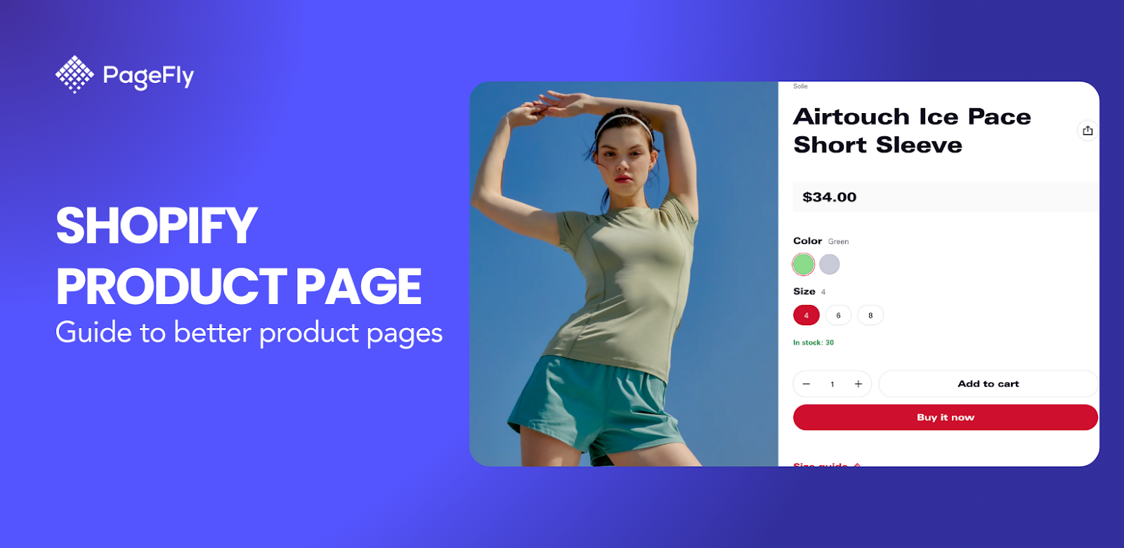
Many Shopify store owners assume the best place to link ads is their home pages. After all, that is where prospects will find all the products for sale, and it is generally the most visually appealing page on a site. But that assumption is incorrect. The best place to land after clicking on an ad is a page that is highly relevant to that ad.
If your prospects land on a relevant page, they are more likely to browse the content of that page. Conversion rates from highly optimized sales landing pages are generally much higher than Shopify generic pages, home pages, about us page and even broad category pages.
Create High Converting Mobile Landing Page With These 7 Tips (6 Examples Included)
Shopify Landing Page Promo: What Is That?
A Shopify landing page promo is a standalone webpage targeted to a specific cohort of your traffic, with the aim of providing a more relevant experience in order to achieve the ultimate objective of driving that cohort toward conversion.
In the Shopify world, while retailers can’t be expected to actually create unique websites for every user, they can create unique digital storefronts. Landing pages represent the tool through which brands can adapt to the user in question, creating relevant and positive-impression making experiences for each of the individuals engaging with your brand.
By taking a customer-first approach to your Shopify sales landing pages optimization strategy, you will do more than create impactful sales landing pages that guide your traffic in the precise direction you want them to go. You will simultaneously unlock incremental value from each of those individuals, driving higher returns for your business as a result.
9 Key Elements of an Effective Sales Landing Page
1. One Landing Page - One Goal Only
One goal landing page is much better than a generic page. There should have one single landing page for each campaign. If there are multiple products with same category or same promotion, you can put them on a landing page. This is how Farm body makes their eCommerce pages work:

If you send a mixed-up message, your audience will be confused and, probably; they will leave the landing page, with no further action. Thus, you should have one main call-to-action, one suggestion and one path for visitors to select. When visitors encounter too many choices they will take more time to do select something, and it’s more likely they leave sooner than expected, with no conversions.
2. Big And Catchy Headline
The headline is one of the first things visitors are going to see. Make sure it’s big, bold and easy to read. Think of your title as the cover of a book. It should precise enough to tell customers what landing page is about and also interesting to grab people's attention and draw them in.
Let's have a look at Sticker Mule, which clearly states what this landing page is about, what can the customer get from it...

One tool that helps with this is Coschedule’s Headline Analyzer. This headline analyzer, like any automated tool, is far from perfect. But it will share some useful tips for improving your headlines and making them more engaging. It provides advice on different types of headlines (e.g. questions, lists or, how to’s) and makes suggestions for words that tend to grab the attention of readers.
3. Powerful Imagery

A compelling headline combined with stunning imagery taps into the emotional side of your customer in ways that will light a burning desire for them to take action. Powerful images can be worth many thousands of words. Blackmagic Design can be an example. The photographer may found scenes of camera and mountain or sunset can be so emotional.
Usability tests by Jakob Nielsen prove that people pay a lot of attention to pictures. When talking about people, photos of real people get lots of attention while overly-staged stock photos are mostly ignored. If you’re looking for top-notch photos for your Shopify landing page, Burst from Shopify can be a good choice.
4. Write Concise And Consistent Copy
Get the length of your product page copy just right. Don’t overwhelm your potential customers with unnecessary information. If needed, utilize icons to illustrate your copy and make it easier for people to quickly scan. When writing your copy use short sentences, bullet points, and mention customer's benefits or value over features.
One more essential thing that you should keep in my is the consistency. If your visitor heard about you on Twitter, Facebook or via email, keep that story and conversation going. People will feel connected and won’t question the process as they might if you talk about one thing in an email and then another thing on your landing page. This may cause confusion and cost you a customer. Consistency should also apply to landing page content, from the heading, sub-heading, and button, let's have a look at how Kettle & Fire do
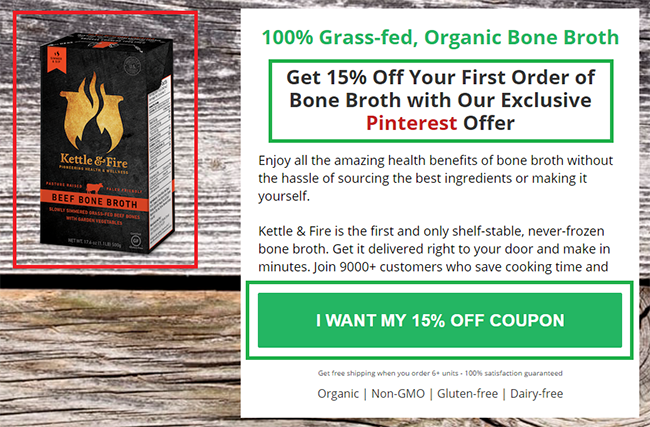
The message and CTA only point to only 1 discount and repeat multiple times, that makes the customers feel they are in the right direction
5. Mobile First eCommerce Landing Page
Mobile commerce is rising globally. As a report of Shopify 2016, the purchasing amount on mobile is counted for 56% of the total. According to a report namely 2016 US Cross-Platform Future in Focus of comScore indicated that mobile is becoming the first touch point in digital with 65 percent of digital time spent, while desktop usage is decreasing under 35 percent.
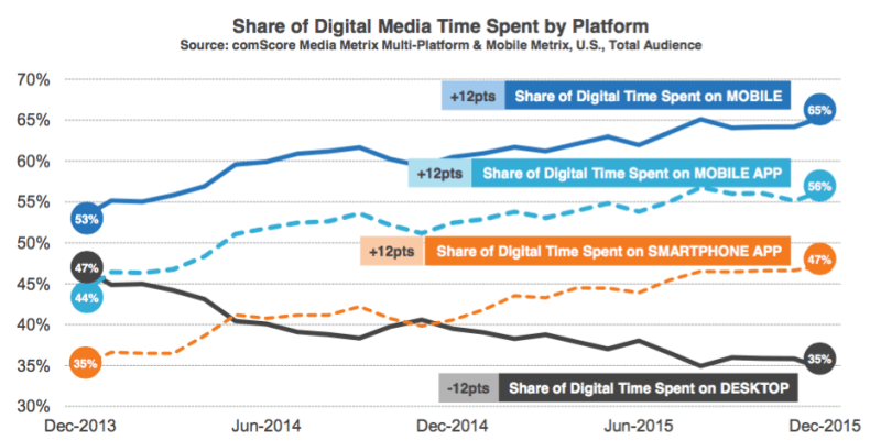
Mobile purchase leads one-third of the eCommerce world. Thus responsive Shopify store will bring you more money.
Different from mobile responsive, mobile first methodology focus on the design of the mobile device before the other ones. Shopify store’s mobile interface now is not just a responsive version of
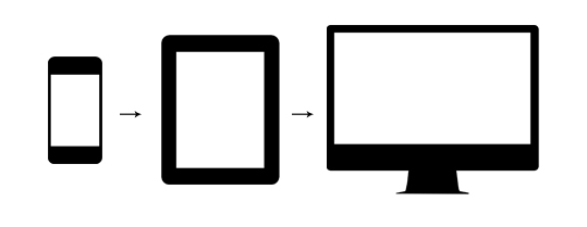
The user experience on mobile is more important than on desktop. Short attention spans mean today’s consumers won’t wait long for websites to load, and certainly won’t bother using those not optimized for mobile devices. Let's have a look at a Best Buy promotion landing page, we would see a very different interface of mobile version and desktop version
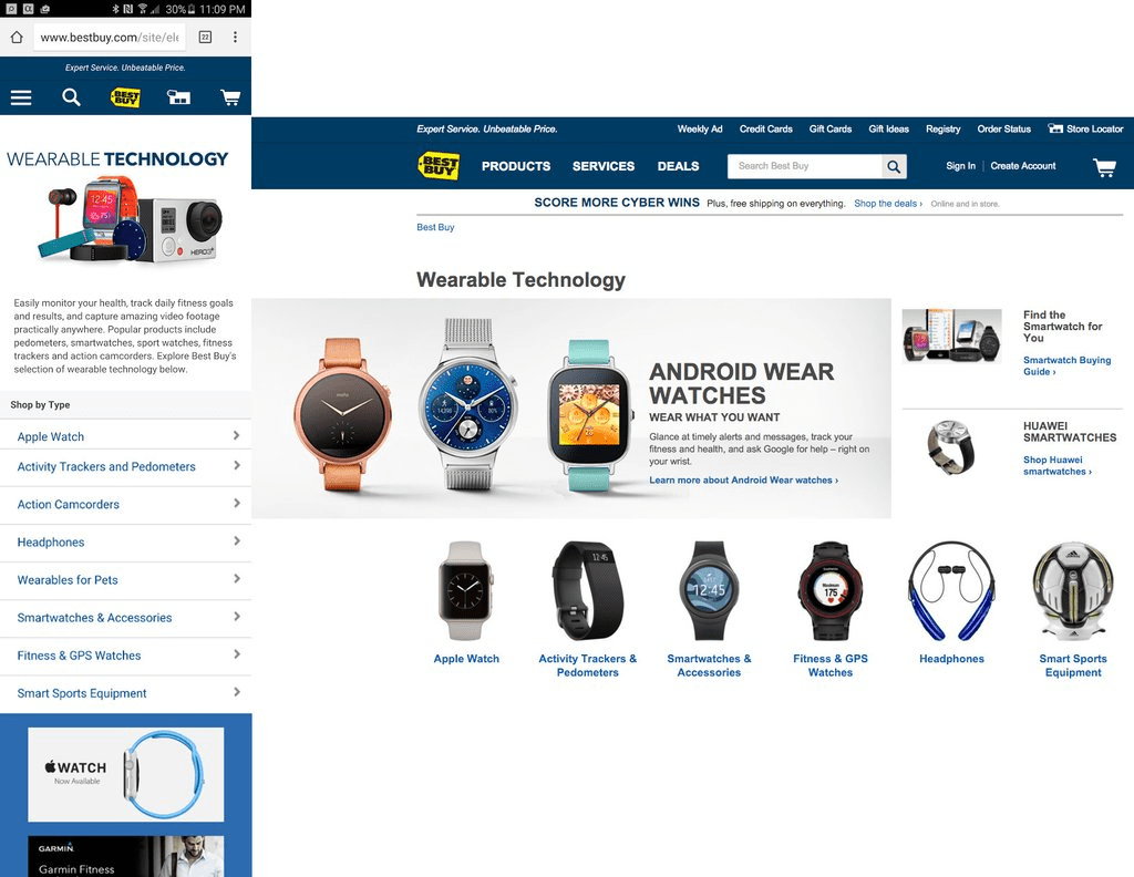
Make sure your eCommerce landing page mobile version is simplified. Increase the size of fonts and call-to-action buttons so people can quickly read and tap on the screen. Forget all the fancy sliders and other effects as it only makes your website heavier and can lead to lost business.
You can’t afford to ignore mobile traffic as Google says that “more Google searches take place on mobile devices than on computers in 10 countries including the US and Japan.”
Test your landing page on various devices and use Google Speed Insight to discover how you can enhance your store’s mobile experience.
6. Precise, Outstanding Call To Action
Call-to-action (CTA) is one of the most important elements of your landing page. Whether you’re trying to capture an email address in order to market to the lead with your email sequence or you want to try making a direct sale, your CTA button is the single most important thing your visitor must see and click on. Call-to-action button tells users what they should do next, it guides an user along the way and reaches the final goal. That’s how it optimizes Shopify conversion rate. Let’s see an example:
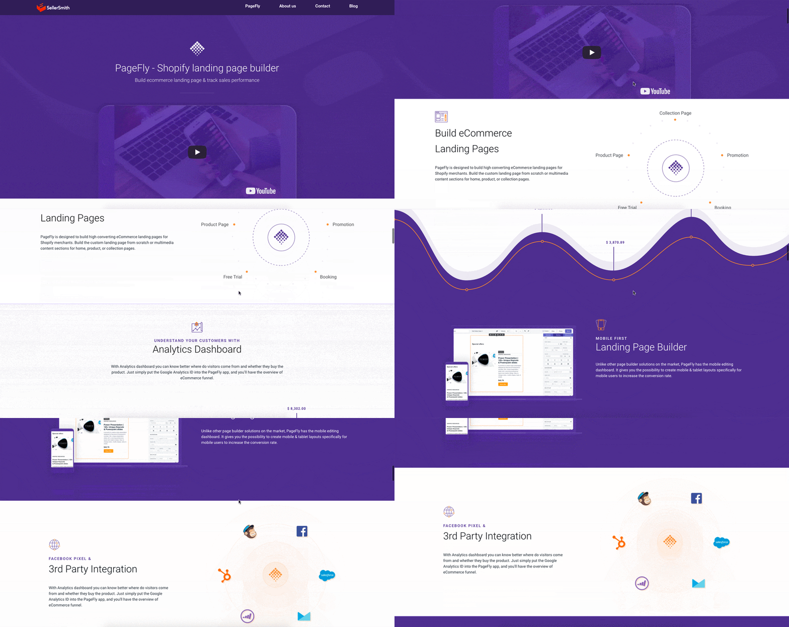
Ok then! This is a landing page is talking about PageFly - Shopify Page Builder by PageFly Team. The value is clear, the brand name is also clear. So what next? “I don’t know!”. The customers have no idea that they should click on the banner to find out more. So let’s fix it:

Now that you know what to do next. Click on the button and get a free trial. This is how a small button makes Shopify landing page works.
Avoid generic language such as “click here.” Use power words in your CTA button copy. Choose “my” instead of “your.” CTA is also useful for creating urgency, so add words like “now” or “don’t miss.” It’s a good practice to repeat your CTA button. Include it above the fold area, then after each and every section that adds credibility. Put it after product description, features, reviews, and testimonials areas and in the footer as the last opportunity to capture the visitor. Another solution makes it sticky so the user always sees it.
Tips: You can encourage shoppers to fill their cart with more products just by adding A "Continue Shopping" Button
7. Make Your Landing Page Easy To Follow
When entering an eCommerce landing page and find anything difficult or confused, there will be 2 types of reaction. Some people try to call or chat with the provider to figure it out. But some other drop to find another website. It’s really a big loss of traffic. To avoid that, your Shopify landing page should be so easy to understand and follow.
The mistake of many marketers is adding too much information. The more information added, the harder for s to follow so it’s your job to put short and essential information on the landing page.
8. Create Your Shopify Landing Page With A Little Urgency
People like the idea of buying things that are rare or hard to come by. If something is marketed as a “limited time offer” people will rush to buy it as they will feel a sense of urgency and fear of loss or “get something before you lose it forever”. Here is some idea for you to optimize your Shopify landing page.
Add a countdown clock
When there is a present of a countdown clock on the discount items, we feel that the time pass and we are going to lose this discount in a couple of minutes. A countdown clock for discount items may push people to buy as it is running out of time, they really feel the need to hurry up.
Seasonal or limited product
At the beginning of a new season, I go to Zara website first. Zara does not have the best item, but the seasonal best items. After a season, all the item will be all replaced by the new ones and never be sold at Zara again. This is the reason that people will feel hurry buying item from Zara before the season pass. This great strategy of Zara really increases conversion rate, especial for a Fashion eCommerce.

Impending Out-Of-Stock Announcements
You are planning a honeymoon trip and find a really lovely hotel room on Booking.com. Great! You add it to wishlist and come back later. But wait, only 4 rooms left! People are fearful of what they lose more than love what they are given. Especially lose for other people. Impending Out-Of-Stock Announcement makes people feel the rush and can be a way to optimize Shopify landing page.

9. Highlight Social/Authority Proof In Your eCommerce Landing Page
Online shoppers are exposed to a lot of fear. They are afraid of losing money that did not receive the product or the quality is not as promised. A lot of fear that prevents them from buying. Shopify landing page optimization includes removing customers’ fear. You can really do that by providing trust!
Review/rating
Human is a social creature so that people would love to hear from the society, what other people are talking about.
The number of online consumers who read and trust online reviews is increasing. According to a survey by BrightLocal, 88 percent of consumers trust online reviews as much as a personal recommendation—which is astounding, considering most online reviews are posted by total strangers. The same survey found that only 12 percent of the population did not regularly read reviews for consumer products. Let's have a look at how SellerSmith do

What this means is that offering user reviews (or consider them as a potential marketing opportunity) is a way to optimize your Shopify landing page.
Trust badge
Beside society, it’s not god, but the big and famous organization or expert, influencer that people trust in. You can make people trust you by using the mark or signal of getting authorized from these organization. That’s how trust badge helps you optimize landing page of your Shopify store.
10. Test Everything
The essential thing to win eCommerce battlefield using Shopify landing page is tracking and testing everything. You cannot know either big button or small button, either long text or short text will be better for your landing page. You should test everything at every time to find the best practice for your landing page.
Google optimize is a really good, free tool to help you optimize landing page

How To Make a Sales Page on Shopify For High-Converting Store
You can easily make a Shopify landing page with a lot of Page Builders. I really recommend using PageFy Page Builder:
- Easily create Shopify landing page with 20+ page templates of all categories
- Deeply understand your Shopify traffic with Analytics Dashboard
- Build better mobile first landing page with Mobile editing
Have a look at PageFly intro video:
Shopify Sales Page: Standalone And Separated Landing Pages
The landing page will be the last sale point, in which we need to convince people to buy. A Shopify with links to other parts of your Shopify store can result in losing traffic. Customer tends on click to other links on the landing page to discover around your Shopify store and get lost among multiple of pages.
It is better that you exclude all the link that direct customer to other parts of your Shopify store, even header and footer also, which can definitely be done when you create Shopify landing pages with the landing page builders such as PageFly App.
In this video tutorial, I would show you how to remove theme header and footer to achieve completely separated Shopify landing page.


