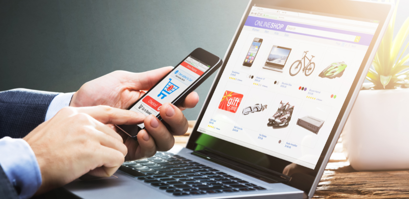
E-commerce is different from how we previously thought about it. Customers want to feel as though they are still receiving the in-store experience when they shop online. It has evolved into a dynamic and cutting-edge online buying environment that reflects the wants and needs of the customer.
The newest eCommerce developments include cutting-edge technologies like virtual reality (VR) and artificial intelligence/smarter chatbots, as well as innovative product visibility and improved online security.
Customers now want to interact with cutting-edge technologies through their favorite brand websites. So, adopting these technologies and creativity empowers the brand to use eCommerce to meet this consumer desire from their point of view.
In this blog, we’ll look into some of the eCommerce design trends brands are leveraging to personalize their brand experience for their customers in 2024.
Why Is It Important To Keep Up With Design Trends?
eCommerce design trends can have a major impact on the success of an online business. A well-designed website is one of the most important aspects of an eCommerce business since it is the face of the company and the first impression a customer has of the business. It should be attractive, easy to use, and optimized for mobile devices.
Keeping up with eCommerce design trends is important because it helps keep your store modern and up-to-date.
- New trends can improve the user experience, make the store more accessible, and increase conversions.
- Staying on top of design trends ensures that your store is competitive with other eCommerce stores utilizing the latest trends and remaining competitive in the ever-changing digital world.
- Staying ahead of these design trends can help ensure that your store is compliant with any new regulations or standards that may come about.
- Utilizing the latest trends and technologies can make your website more user-friendly and easier to navigate.
- A good UI/UX eCommerce website design can help improve your website's conversion rates by making it easier for customers to find what they want.
- Following the latest trends in eCommerce design will help ensure that your website looks modern and keeps up with the competition.
- Providing customers with a modern, up-to-date website can increase customer satisfaction and help ensure that they have a positive experience when shopping on your website.
If you don't keep up with the latest eCommerce design trends, you could miss out on opportunities to improve the customer experience and capture more sales. Additionally, you could be missing out on potential customers who prefer more modern designs and features which help them with a smoother online buying experience. It is important to remember that as design trends come and go, staying on top of the latest trends will ensure that your website remains relevant and attractive to customers.
>>> Get more ideas for art business names!
Top 13 eCommerce Designs Trends in 2024
1. Immersive Web Animations

Image Credits: vibor.it
In 2024, immersive web animations will be more popular amongst eCommerce websites. Web designers sometimes use them to enhance the "cosmetic" quality of their work, provide customers with a more immersive shopping experience, zoom in on product details, deconstruct objects, and make other amazing transitions.
Vibor showcases an excellent example of creative web animation. They've chosen stunning animation that boosts readability and engagement with stealthy techniques like hover. They have also highlighted their products, which are sensors used in the automotive industry, as the hero through these animations. The crucial point to keep in mind is that flare and spectacle are not overused.
This type of design also allows customers to easily find what they are looking for and quickly move through the checkout process. It also encourages customers to make impulse purchases, as they are engaged in the product's visuals and descriptions. Immersive web design is essential for creating a great user experience, which is key to ensuring customer satisfaction and repeat purchases.
These animations enhance engagement but can slow down your site. Using a page size checker regularly ensures your website remains visually engaging without compromising on loading times.
2. Interactive Product Visuals

Image Credits: cricut.com
Consumer expectations are increasing as eCommerce brands become more and more important to the brand experience of customers! Brands that go above and beyond to provide more entertainment are increasingly valued by consumers, who value any chance to make positive memories.
Consumers will expect to be able to interact with products and explore them from all angles before making a purchase. These animations draw users' attention to important product details or features. 3D animations, augmented reality, hover animation, and 360° product views, are just a few ways to make your product page creative and stand out.

Cricut's website features an animated scroll design to explore their products and highlight how users can simply use their two fingers to close the machine while it's working (emphasizing that it is lightweight).
3. Multidirectional Layouts

Image Credits: dribbble.com
The multidirectional layout will be an interesting eCommerce UI trend in 2024 because it allows businesses to present their products in a more user-friendly and interactive way.
This kind of layout also allows customers to compare products side-by-side to make more informed decisions when making a purchase. Users can now scroll and move not just up and down but also diagonally, left, right, and in other ways.
A design becomes much more pleasurable and aesthetically pleasing when such an intuitive connection exists. This e-commerce design trend is timely since it covers mobile-first design and interactive shopping experiences. It can help businesses to increase their conversion rates by providing customers with a more engaging and immersive shopping experience.
4. Creative Page Transitions

Image Credits: zero.nyc
Animated transitions are another name for page transitions. These clever page transitions include elements used to create a more engaging user experience. They usually emphasize a page change or transition by animating elements as the page loads.
You can add a layer of interactivity to the page, providing a more enjoyable and memorable experience for the user. Although it is an optional addition, it is a fantastic way to enhance the user experience. If used properly, this will liven up the website and make it easier to navigate.
For example, Zero, a branding studio in NYC, uses image effect transitions with creative page transitions and a side navigation menu. This will be noticed by online customers, who will appreciate them. More time is spent on your website as a result.
5. Vaporwave Aesthetics

Image Credits: chrometattooparis.com
Vaporwave aesthetics in eCommerce is a design trend that draws inspiration from the cyberpunk subculture. It is characterized by a futuristic, often dystopian, visual style that combines vibrant colors, high-tech elements, and glitchy touches.
Vaporwave features elements from the 1980s and 1990s, like psychedelic font, neon pastel color schemes, and gradient color blending. It has rapidly evolved into a new pop culture that embraces the contemporary web.
For a fascinating and cosmic-feeling user experience, Chrome, a tattoo parlor in Paris, crams its design with glitchy sparks, futuristic images, and old computing visuals and typography.
This aesthetic is often used to create a sense of intrigue and anticipation, encouraging customers to explore the product or website further. This kind of design is mostly used when the store wants to bring an antique look to their products and their brand. If you think the look is too daring, pick a few components and alter them to fit your e-commerce business.
6. Neutral & Pastel Colors

Image Credits: llsupply.ca
Pastel and neutral colors on a website create a calming, inviting environment for customers. It can make it easier for customers to focus on the products and services offered rather than being distracted by bold colors. This can help create a more professional and organized look and feel, encouraging customers to trust the website.
The L/L Supply homepage's colors help tell the story of its brand by supporting it with a white background and earthy neutral tones, creating an experience that extends to the product pages and beyond.
Keep in mind that applying pastel hues can be challenging; if done incorrectly, your website will appear washed out. So that you can achieve the ideal mix of tones and colors, you might engage a web designer.
7. Attractive Typography With Contrast Colors

Image Credits: zara.com
Colors and typography are two of a web design's most persuasive elements. Catchy and chunky typography on an eCommerce website features bold, eye-catching fonts that are easy to read and contrasting colors that make the text stand out. For example, a website might feature a bold, sans-serif font in white against a dark background or black text against a light background.
Additionally, the text should be spaced appropriately, with good line and letter spacing, to ensure it is easy to read. Using different font sizes and weights can also help create a hierarchy of information, making the most important information stand out. It is also important to use colors in harmony with the website's overall design to ensure a cohesive look.
For instance, by using non-traditional models to display their unique fashion designs while using Neu Helvetica font on a contrasting background, Zara portrays an offbeat sophistication. It features a straightforward, contemporary vibe ideal for high-end e-commerce designs for the apparel industry.
8. Mobile-First Design Approach

Image Credits: dribbble.com
Around 45% of global consumers shop using their phones at least once a day to purchase goods and services, so it is important to ensure that your website is optimized for mobile devices. Mobile-first design is a philosophy that prioritizes the mobile user experience when designing a website or application.
Mobile-first design takes into account the limited screen size and other constraints of smartphones and other mobile devices and emphasizes designing for mobile users first and then adapting the design for larger screens. This approach allows for websites and applications to be optimized for mobile devices, resulting in better performance, faster loading times, and a better overall user experience. It also increases the visibility of your website on search engine results, as Google and other search engines now prioritize websites optimized for mobile devices.
To create mobile-responsive Shopify pages, watch the video below. This tutorial will guide you through the process using PageFly.
9. Catchy Product Page

Image Credits: masterdynamic.com
Advanced interactive visual design techniques, including virtual reality (VR), augmented reality (AR), and 3D photography, have been popular since 2021, and they'll continue to mark their presence in 2024. This technology aids consumers in comprehending the goods they are looking to buy.
Product pages are one of the most important aspects of running an online store. Having attractive visuals that draw customers in and showcase the product in an eye-catching manner can make all the difference in driving sales and conversions. This includes everything from product photography, to product descriptions, and even the way it's presented on the website. To stay ahead of the curve, take inspiration from the best Shopify product pages that set the standard for effective design and functionality.
Let's take an example of the Master and Dynamic product page here. As you browse through the product page, you learn more about the headphones' meticulous design, including their materials, advanced functions, and control methods. The floating Add to Bag bar at the top of the page serves as a continual reminder that you may personalize these headphones without detracting from the experience. If you want to buy them, you don't have to go all the way back up and break the experience.
If you are looking for more such inspiration for product landing pages, then be sure to check out this video:
10. Page Hybrids

Image Credits: casper.com
One of the most common page hybrids you can spot online is a landing page and product page hybrid. The page typically contains product information, an attractive call-to-action, and a product demonstration video. This kind of page is often used to promote a new product or to increase the visibility of an existing product. The goal is to create an informative and persuasive experience, with the ultimate goal of converting visitors into customers.
11. AI & Chatbots Features

Image Credits: dinarys.com
AI & chatbots are becoming increasingly popular as an eCommerce design trend. They can provide an efficient and personalized customer experience for online shoppers by providing accurate information, suggesting products, and helping customers find what they’re looking for. They can also be used to provide personalized recommendations, answer questions, and provide customer service. Smart AI & chatbots can also help to streamline the checkout process, allowing customers to purchase products quickly and securely.
12. Storytelling Approach for Product Pages

Image Credits: thesill.com
When it comes to product pages, storytelling can be an ideal approach to describe the product and its features in a way that resonates with customers. It can also be used to illustrate how the product can be used in real-world scenarios, highlighting its benefits and uses.
The website of The Sill exudes a very clean, straightforward, and happy impression thanks to its pleasing colors. The Sill and its online shop both hold the view that plants bring happiness to people. The entire website is clean, energizing, and has a lovely natural vibe.
You can even use visual graphics to communicate a compelling brand story and give life to your product. It helps create an emotional bond between consumers and brands through storytelling to increase brand credibility and gain consumers' confidence. You can reorient the purpose of your content through stories from selling to assisting customers with their problems. Your information can become considerably more interesting using this approach.
13. Unconventional Page Filters

Image Credits: dribbble.com
Fun page filters are an innovative eCommerce design trend that takes the traditional page filtering system and adds a creative twist. This trend provides customers with a unique user experience that differs from the standard page filtering system. Instead of a simple drop-down menu, unconventional page filters can include such features as sliders, toggle switches, and other unconventional interaction elements. This trend also allows for the use of more visual elements such as icons, illustrations, and color coding to help users quickly identify their desired products.
How To Choose The Best eCommerce Design For Your Website
There are going to be plenty of eCommerce website trends that are going to make your eye pop in 2024. But how do you choose the best one for your online store? Let's be honest; it's better not to mix up multiple designs that can only lead to chaos. So before choosing the best eCommerce design trend out there, keep in mind the following.
- Understand your goals: Before you start designing your eCommerce website, it's important to understand what your goals are. Your goals may include increasing website traffic, improving conversions, increasing sales, or providing a better customer experience. Understanding your goals will help you determine which design features are most beneficial for your website.
- Analyze your audience: It's essential to understand your target audience so you can create a design that they'll find attractive and easy to use. Consider their age, gender, interests, and buying habits when choosing colors, fonts, and layouts.
- Choose a design that's easy to use: It's essential to create a design that's easy for visitors to navigate and understand. Ensure all the necessary information is presented clearly, and that the checkout process is simple and secure.
- Pay attention to your responsive design: In today's digital world, having a responsive website for different devices is essential. A responsive design will ensure that your website looks great on any device, allowing customers to shop on the go.
- Test your design: Before you launch your website, it's important to test it. Test the website on different devices and browsers to make sure it works properly. Test the checkout process to ensure it's secure and easy to use. After the testing process is done, you can even proceed to the eCommerce ads stage which you will put the design of choice display in the paid search.
- Take advantage of eCommerce tools: Take advantage of the eCommerce tools available. These tools can help you simplify the checkout process, manage inventory, and more. If you are on an eCommerce platform such as Shopify, then don't shy away from the many different apps they have in their app stores, such as a landing page builder that can help you with your eCommerce store themes and more.
Shopify’s theme store is another added advantage of using Shopify as your eCommerce platform. It comes with free and paid themes that are apt for your store’s purpose. You won’t need coding skills, as you can drag and drop sections and blocks to create custom pages in your store. In addition, you can check out what each theme is best suited for to make the best use of it.
Conclusion
By 2024, eCommerce design trends will have evolved to a higher level of sophistication, enabling businesses to create an even more engaging and interactive experience for their customers. With the help of advanced technology and new web design trends, businesses can expect to benefit from an improved user experience, increased sales, and greater customer loyalty. Therefore, online businesses must stay up-to-date with the latest eCommerce trends in order to remain competitive and maximize their success in the digital age.



![14 Profitable Small Food Business Ideas for 2025 [Real Numbers]](http://pagefly.io/cdn/shop/articles/1_58b587d2-13db-4aa6-8c19-e40f5c88d3eb.jpg?v=1758255771&width=4460)
![Art Business Names: 350+ Ideas + Free Generator [2025 Updated]](http://pagefly.io/cdn/shop/articles/art_business_name_e94a54e9-d325-4ba3-94ab-7b4297952312.png?v=1760062968&width=1640)

