User Interface is a hallmark of an eCommerce website success. No matter how genuine your products are, it is your website's appearance that will turn your business into a success. While several Ecommerce website design sprung lately, only a few managed to survive and go big. One part of the equation is user experience; the other is a better digital marketing and a consumer-friendly interface.
I. What Is An Ecommerce UI?
User Interface (UI) in eCommerce decides the overall website appearance and how it occurs to the user visiting your website. Moreover, your eCommerce site UI also takes care of the overall website functionality, and design aesthetics and simplifies navigation for users through CTAs, and dropdown menus.
For an eCommerce site, a sustainable UI reduces bounce rates, increases customer conversion, and offers a chance for brands to stand out from the crowd. The more USPs a UI has, the more visitors a business can expect. Moreover, a net UI eCommerce web design helps create trust among new consumers while improving overall business productivity.
UI and UX are complementary rather than substitutes when it comes to building an eCommerce website. While UI defines how a user interacts with your eCommerce site features, UX makes sure your website is highly optimized as per the needs, wants, and frustrations of a user. With an appealing e-commerce web design, a visitor sticks through your product from the hoard; the user experience helps business owners retain customers, build a seamless experience, and enhance brand image.
II. Top Tips For An Ecommerce UI
A neatly drafted eCommerce web design works miracles- a wide and loyal customer base spreading word of mouth publicity, minimal developmental waste, low failure streaks, and a skyrocketing revenue boost.
Here are some latest trends businesses can follow to craft an intuitive eCommerce UI:
01. Personalization goes a long way

Today's consumers love customization so much that it's been taking shape as a rising business vertical. In the meantime, creating some user personalized funnels in the site's UI won't bother you much. It is one of the easiest and sure-shot ways for business owners to maximize conversions. A neatly personalized feed with matching content, a particular landing page, offers, and targeted ads can give a necessary boost to an eCommerce website.
02. Understand your customer (and the data that follows)
Your best teacher is the user itself. The eCommerce UI created can be impressively appealing, but if the visitor still feels frustrated navigating, then businesses might need to rethink their overall UI strategy. Granular and predictive analytics can help enterprises capture user feedback and how they react to a particular UI feature. More data helps eCommerce platforms visualize user likes, dislikes, and how to move forward for acquiring new customers and offer a better shopping experience.
03. Creating a user-friendly content experience
High performing content has already helped several businesses to go big. Additional AI integrations can monitor the target audience and tailor content per your community's needs. The appetite for enriching, witty content is growing, and it's time for a business owner to unlock it via custom, relevant campaigns. Your content strategy should be holistic- add short-form content, vlogs, how-to guides, and interactive elements; the technique produces multiple exposures and revisits.
Prioritizing concise product descriptions and landing pages, well-crafted CTAs, FAQs on the main page, and clear return and shipping policies should also be a part of your online store's content strategy. Clarity is essential- users must always know what's happening.
04. Minimizing abandoned carts and seamless checkouts
Checkouts are complicated. Think about it - a user ready to buy items, something snaps, and the user starts feeling alienated from your design, and aesthetics and might abandon the cart. The best way to reduce cart mishaps for your online store is to let shoppers buy products without signing up. Express checkout is another alternate eCommerce site can ponder over. To avoid user distractions during checkout, minimize sharing product pages and social icons. Give users the liberty to share their purchases after checkout, not the other way around.
05. Going to the extra mile with hassle-free order deliveries and constant updates
Once a user checkouts, the actual job starts. Ensure the purchaser has all the details beforehand- order confirmation, delivery updates, customer support options, and feedback mechanism. The process is critical to improving repeat customer rates, offer an unforgettable shopping experience and a higher ROI for your online store.
06. Clear The Clutter
Remove all active distractions, even if they are visually pleasing. Ad-bogged websites, slow crawling, and load speed might prevent the user from ever coming back to shop with you. Ensure a frictionless transaction, guide users through steps, and have them do the minimum.
Another UI strategy to soar online conversions is through real-time verified reviews, especially from influencers displayed at the top of your product page, along with creating urgency around a product that interests particular shoppers- sales, running discounts, and when they are expected to get sold out.
Design Your Own Shopify Store With No Limit
Fully Customizable. 100+ Templates and 50+ elements
Completely Free/ No Trial. Optimized for Fast Speed.
07. Regular SEO audits

A higher SEO rating helps a platform to stay relevant on search engines.
SEO helps businesses to understand the popular nomenclature that interests users. Improve the product page's crawlability and visibility by making in-page SEO a part of your UI strategy. Another way to optimize SEO is by deploying SEO tools and designing best-in-class illustrations: suggesting similar goods and services that have attracted users in the past.
08. Make your UI strategy mobile-friendly
Gone are the days when shoppers used desktops to go online. More than half of eCommerce traffic comes via mobiles. So, it is vital that your UI also supports mobile experiences the same way as big-screen ones.
III. Ecommerce UI Design Process

We can't judge a book by its cover, but it does pivot our choices if other variables are absent. Designing an eCommerce site is not just about selling products but ensuring a flawless impression on users' minds so they come back at your online store. As per estimates, consumers make online purchasing decisions as fast as 50 milliseconds, and an attractive UI design can help your business sail through the time window.
Here are some key designs ideas for creating a stunning UI:
01. Follow the brand identity
The UI, aesthetics, and design vectors should follow the same patterns and colors as your brand. The brand experience should be consistent across verticals- online, in-person, desktop, or mobile. The idea is to create a solid consumer-brand relationship.
02. Minimalism is the new web standard
Overdesigning can be detrimental to your brand's image. Be super careful about font size, font type, colors, and extra content on your website. Moving vectors look pleasing to an extent, but after a while, it might slow down the website's loading speed. Ensure the content looks clear and adopt a visual hierarchy where content/product is placed as per its importance, with the most sought-after item on the top. Use easy-going symbols and provide labels wherever required.
03. Make the product visible
Your UI should have a straightforward search function for users to find items on the go. Put a search bar on each page- the norm is to position the box at the top right, center, or inside a dropdown menu. The search option should be sorted in a way to incorporate all query types: item names, tags, color, and attributes. Once a clear search field has been established, add an auto-complete function to help shoppers with purchases and suggest alternatives. Establish a 'quick view' for products so users won't have to scroll much through the website's content just for one look. Don't forget to add the 'Save to Wishlist' and 'Buy Now' buttons.
Website designing is complex and requires constant supervision and updates to stay in trend. While crafting a UI design, enterprises must also understand how a particular strategy can impact the user experience. Creating harmony between the two is the key to building a successful digital presence today.
Moreover, enterprises need to understand that just like every brand story is different, so as their design requirements. What worked for Amazon didn't work for eBay or Walmart, and the design ideas that helped Shopify scale weren't suitable for headless eCommerce stores. Ponder over how exactly you want to convey your brand story, try to templatize the designs, make a content funnel, and you should be good to go.
IV. Responsive Ecommerce Website Design
Design Your Own Shopify Store With No Limit
Fully Customizable. 100+ Templates and 50+ elements
Completely Free/ No Trial. Optimized for Fast Speed.

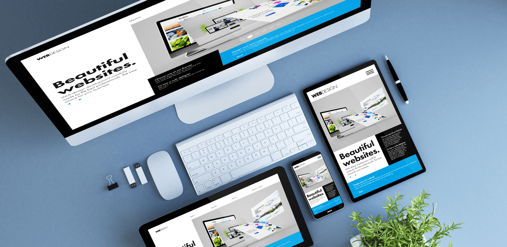
Responsive design ensures visitors access perfectly sized webpages irrespective of devices and screen size. The idea of being responsive is that a user must feel equally empowered to shop on mobile devices as on a desktop. A study by Morgan Stanley revealed that 91% of users keep their mobile devices within an arm's reach 24*7. In such a mobile-first world, enterprises cannot afford to lose behind just because the website's display orientation is unsuitable for pocket devices.
Responsive design is a synonym for consistency in user experience at every touch point. A responsive website optimizes elements based on the access device by creating a grid layout and rearranging content into boxes fitting a particular display size.
A significant challenge with responsive design is orientation: wide displays are suited for desktop machines, while mobile devices offer vertical displays with smaller dimensions. That's where the next phase of responsive designing comes into the picture: adaptive design with a fixed-breadth format.
Now the obvious question is how eCommerce sites can make their websites more responsive for an optimal viewing experience. The trick is to use moving, fluid images, and flexible server-side components. The gridding should be done on a relative basis, unlike using absolute percentages and pixels. If your website has a headless feature, then a server-client component integration is the best way to move forward. The combination reduces the website's loading time while maintaining rich functionality.
A responsive website ensures you don't lose user traffic to your competitors easily. Today, having a website with compatibility across devices isn't a USP but a necessity. A responsive design comes with better management, admin flexibility, and significant cost-cutting from managing multiple duplicate websites across devices. Moreover, mobile-friendly websites have higher sharable content for social media handles, while desktop websites have not had much success in translating user visits into a social event. Even Google favors eCommerce responsive websites that already have a higher rating in terms of user shopping experience as they are interactive, sharable, and have higher discoverability.
V. Best Ecommerce Websites With Great UI For Your Inspiration
01. Bliss

Bliss uses a pastel pattern for its branding and has managed to stay minimalistic through all market turbulence. The company is into pharmaceuticals and manufactures care products for all skin types. Bliss' idea of a neatly crafted UI is imbibing a joyful aura around the brand- the content, a carefully defined product page, images, and fonts with bright colors; all point towards a happy-go-lucky vibe. Bliss maintains the same ambiance through large photographs, light colors, and well-organized buttons. The enterprise went with online store hosting for fast loading.
02. Hebe

Hebe's USP is the photographs it puts to amuse users. Since digital experiences cannot fully replace the idea of holding a physical product, HD, quirky pictures are here to make some difference. As an apparel store, Hebe has mastered product readability with a striking aesthetic.
03. Moreporks

Moreporks is an inspiration for brands looking to tell a story through designs. Grandiose outdoor pictures, artsy shots, oversized photos- everything on the list worked well for Moreporks. The site homepage is linked with Moreporks' minimal store, and another link routes to journals guiding users through porks' products.
04. Boohoo

Just like the name, Boohoo has sent out a boho, hippie vibe through its UI design. Boohoo has an interesting CrossFit branding mechanism with a higher degree of personalization for consumers. A background video on the landing product page introducing Boohoo's culture works wonders for random visitors to become actual users. Boohoo has pinned sale alerts on its website and managed to run promotional messages without distracting users from main items. The visuals are what we call awe-striking!
VI. Parting Note
UI/UX determines the success of your digital business, and a design checklist can help sail through every product stage- from initial visitors to consumer retention, product purchases, till the item reaches the final customer. UI done right offers a solid base for the growth of your eCommerce setup, while a poor design strategy can result in a slow death, even for the most visionary idea.
Investments in scaling an eCommerce UI can tremendously grow your overall ROI while offering easy navigation and great user experience for today's audience. Once a UI hits the highest standard of user-friendliness, the revenues are set to move up.
An intuitive eCommerce UI is the need of the hour and requires consistent refinement, team ideas, and consumer feedback.



![14 Profitable Small Food Business Ideas for 2025 [Real Numbers]](http://pagefly.io/cdn/shop/articles/1_58b587d2-13db-4aa6-8c19-e40f5c88d3eb.jpg?v=1758255771&width=4460)
![Art Business Names: 350+ Ideas + Free Generator [2025 Updated]](http://pagefly.io/cdn/shop/articles/art_business_name_e94a54e9-d325-4ba3-94ab-7b4297952312.png?v=1760062968&width=1640)

