

![[Tutorial] How To Make Your Shopify Themes Responsive With PageFly](http://pagefly.io/cdn/shop/articles/Make_your_Shopify_Themes_Responsive_with_Pagefly_1ea6c452-7625-4c17-b51f-76eb29547b0a.jpg?v=1743063076&width=1640)
Choosing the right responsive theme Shopify can significantly enhance the user experience on various devices. Using a responsive theme Shopify ensures that your store looks great on both desktops and mobile devices.
💡 We meticulously evaluate Shopify themes and apps based on our hands-on experience. Read more about our comprehensive review process and methodology.
In this guide, we explore the best responsive theme Shopify options available. From its customizable design elements to its built-in SEO optimizations, discover why the Responsive theme could be the perfect fit for your online business.
What is Shopify theme?
A Shopify theme is a customized template that, when in use, will define how your online store appears and impacts user experience, especially if it's a responsive Shopify design.
Each theme is designed to satisfy a specific need for its user. For example, if your store is selling yoga equipment, you will want to pick a theme with simple and elegant design toward a relaxing in-store experience for your customer. Or, if you are selling boxing equipment, you will need a more dynamic theme which leads toward an adrenaline-based aesthetic for your customers.
>>> Read more about Expanse Shopify Theme

Purchasing a theme may bring its own costs, but there are also several free themes offered on the Shopify theme store, many of which follow the principles of responsive shopify design

You can find the main theme store of Shopify by clicking on this link or via Google. Outside of the Shopify theme library, there are many other websites, such as Theme Forest or Template monster, that sell Shopify themes and various platform themes on their online stores.
For more in-depth Shopify themes reviews, check out:
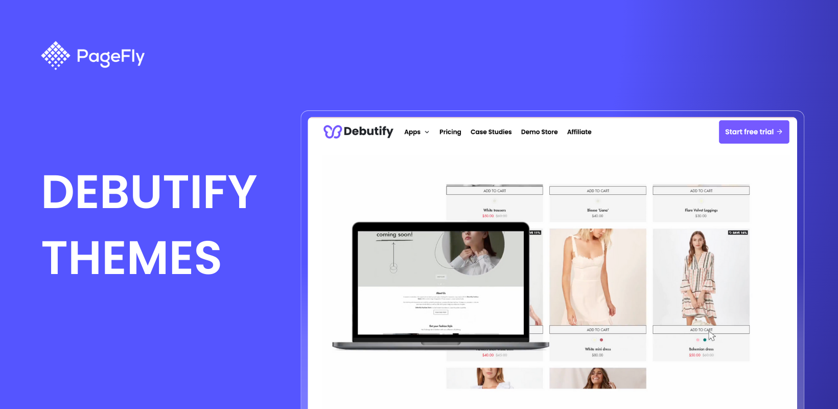
- Prestige Shopify theme: A great start for your online store
- Get Your Shopify Store Ready With Debut Theme
- How To Build Your Shopify Store with Debutify Theme [Tutorial]
What does Shopify's responsive theme mean?
A Shopify responsive theme means that it has been optimized to look good and work on all digital devices, such as desktop, mobile and tablet devices.

A theme may look good on one device, but may not be compatible when viewed on other devices, which is why it's important to use Shopify responsive themes.As a result, adjustments need to be made in order to make the theme outlook compatible with all devices, achieving a fully Shopify responsive design. Only then will the theme be considered as a responsive theme.
How to make your Shopify theme responsive with Shopify
Choose a Responsive Theme
- Select a Shopify theme designed for responsiveness, such as Blum, Electro, Shine, Minimal, or Venture. These responsive shopify themes automatically adjust to different devices.
Customize Your Theme
- Liquid Templates: Ensure your Liquid templates use flexible grid layouts and media queries.
- CSS: Use responsive CSS techniques like flexible grids and media queries.
- Images: Implement responsive images using CSS or HTML attributes like
srcset.
Test on Multiple Devices
- Use Shopify's preview tool and external tools like BrowserStack to test your theme across various devices and screen sizes, ensuring a responsive shopify design.
Optimize for Speed
- Optimize your theme for faster load times by minimizing CSS and JavaScript files, optimizing images, and leveraging browser caching to maintain a Shopify responsive design.
Use Shopify Apps
- Consider using Shopify apps that enhance mobile responsiveness, such as PageFly, which offers drag-and-drop design functionality.
By following these steps, you can ensure your Shopify theme is responsive, providing a seamless shopping experience for all your customers.
Make Your Shopify Themes Responsive With PageFly

PageFly is a Shopify App Store application specializing in creating stunning landing pages with pre-built templates. It allows merchants to customize every aspect of these templates and preview their stores across all devices before publishing. This ensures that your Shopify theme is fully responsive and looks great on any device.
You can explore PageFly's responsive templates here
6. Enhance Your Store with Shopify Mobile Responsive Design
Making your Shopify store mobile responsive is crucial for reaching customers on any device. A Shopify mobile responsive design ensures that your store looks great and functions well on smartphones and tablets, providing a seamless shopping experience.
To learn more about how to achieve a Shopify mobile responsive design, check out this helpful video:
This video provides step-by-step instructions to ensure your store is optimized for mobile users. Implementing a Shopify mobile responsive theme can lead to higher conversion rates and improved customer satisfaction.
Summary
We hope we’ve answered what is a Shopify responsive theme and how you can create a responsive shopify design on Shopify.
We hope you’ve gained valuable information in this article and can continue growing your own business. For more option, you can also check this list of top-rated Free Shopify themes right away, including some of the best responsive shopify themes.
Explore more Shopify Theme Reviews:
Shopify Themes Responsive FAQ
A responsive theme Shopify is a template that adapts seamlessly to various devices, ensuring your store looks great and functions well on desktops, tablets, and mobile phones.
Responsive Shopify themes improve user experience by providing a consistent and optimized shopping interface on all devices, leading to higher engagement and conversion rates.
A responsive Shopify design includes flexible grids, media queries, and adaptable images, ensuring that your store's layout and functionality remain intact across different screen sizes and devices.
Having a Shopify responsive store ensures that your customers enjoy a seamless shopping experience on any device, which enhances user satisfaction, reduces bounce rates, and boosts sales.
To make your store Shopify mobile responsive, choose a responsive theme, customize it with flexible design elements, and test it across multiple devices to ensure optimal performance.


