London’s West End, Tokyo’s Shimokitazawa, The Hunger Game's District 7: there are plenty of intriguing, colourful districts in the world, but how many of them help you increase your conversion rate?
Just one, District Shopify Theme.
With over 9,000 downloads and a staggering 100% satisfaction rate on the Shopify Theme Store, it’s fair to say that Shopify District Theme is in a league of its own when it comes to district themes. And themes, for that matter.
Here at PageFly, we’ve got a passion for professional layouts. Come with us as we take a deep-dive into Shopify District Theme; including what it does, who it’s for and if it’s worth it.
💡 We meticulously evaluate Shopify themes and apps based on our hands-on experience. Read more about our comprehensive review process and methodology.
Introduction to the District Shopify Theme

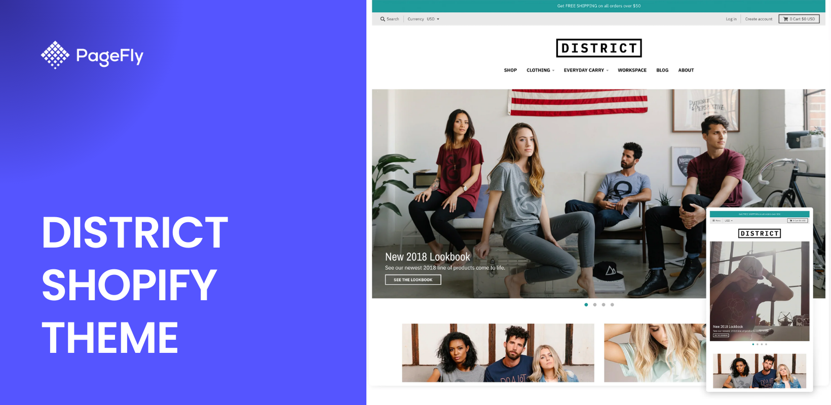
Shopify District Theme is one of the many full-website templates that Shopify features on its Shopify Theme Store. The template has been designed by third-party developers Style Hatch, Inc and is exclusive to Shopify.
District by Style Hatch features a professional layout of elements across homepage, collection pages, product pages, blog pages and many more. It uses a wealth of elements with pre-set parameters, meaning that all you have to do is fill in the content boxes with your own text and images.
Let’s break down the Shopify District Theme stats:
- Price: $220 US
- Downloads: 9,000+
- Live websites using the theme: 6,000+
- Reviews: ~ 684 (with 100% satisfaction)
- Support: Live chat, email support and an online help database by Style Hatch.
- Included styles: 3
Alternatives to District Shopify Theme:
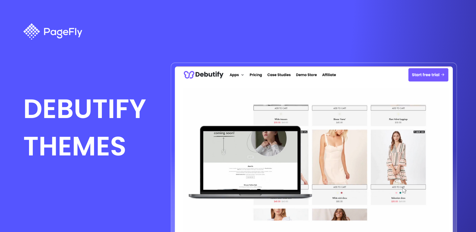
- Weighing up Shopify Debut Theme: Pros & Cons
- Shopify Motion Theme: Tutorial and Review
- Shopify Prestige Theme: How To Use It For Your New Store
- Shopify Impulse Theme: Pros, Cons and Everything In Between
Overview of Styles Available in the District Shopify Theme
The 3 styles of Shopify District Theme each have their own appeal. Though their central vibes are very similar, their actual layouts differ between colour, background, arrangement and spacing.
If you want to take a look at the key features present in all styles of the theme, skip down here.
District

District Style
District’s eponymous, District style is simple but effective. It focuses on whitespace, smaller text and classic fonts to come across as a professional Shopify theme.
It has fantastic colour swatches, allowing store visitors to swap fluidly between product variants and see real pictures of how that product looks in different colours. It’s also got some pretty neat product zoom animations on its homepage that entice the viewer for a closer look.
Energy

Energy Style
Bolder colours and an immediate collection gallery are the first things you’ll notice in the Energy theme. It has many of the same features as District, including image animations when hovering and similar font and button styles, but it lacks the attractive circular colour swatches, opting for word boxes instead.
One great thing about Energy is its inclusion of a map at the bottom of the homepage. If you have a brick-and-mortar store, then having a map of your location can be a great addition to your store. The map on Energy even offers directions to the store from the customer’s location, provided via a link to Google Maps that’s clickable on both desktop and phone.
Read more: Bringing Your Store Online: Yes, No and How To Do It
Coast

Coast Style
Lastly, we have Coast, which is a well-put-together combination of both District and Energy styles. It’s back to placid tones and circular colour swatches on this one, but with some new features that work well in the fashion, jewellery or beauty niches.
The first such feature is a product page that’s built into the homepage, which is great for if you want to promote a featured product on your store. The next is a blog preview at the bottom of the page, which offers snippets of content from your most viewed blogs that can have great sway in the niches we mentioned above.
Read more: How to Build Your Online with Shopify Parallax Theme
Target Audience for Shopify District Theme

Like many of Shopify’s professionally developed themes, District is targeted at beginner store owners who are feeling a bit overwhelmed by the daunting prospect of building their own website.
The vast majority of the work that has been put into Shopify District Theme is simply in its element arrangement. There is nothing particularly fancy or technical about it; it acts mostly as a tool for new merchants who are short on time.
Despite its predominantly novice audience, there are some benefits to Shopify District Theme that everyone can profit from:
- Optimised for mobile - It’s well known at this point that the future is mobile. A store needs to be great-looking on mobile, but it’s an aspect that many new store owners tend to overlook. Shopify District Theme is just as well-designed on mobile as it is on desktop, meaning you don’t need to fiddle around with the parameters to make sure everything fits.
- Free updates - Any updates that are introduced by Style Hatch are immediately applied for free to all users of Shopify District Theme. Not only does that mean that you don’t have to chase down updates to ensure your store works properly, but it also means that SEO and usability is kept at a consistently high level.
- Multi-level support - This one is especially valuable for new store developers in inevitable need of a helping hand. Style Hatch provide a comprehensive database of articles to answer general queries and also offer live chat and email support to all users. Reviews from their users have rated the customer service very, very highly.
Step-by-Step Guide to Building Your Online Store with Shopify District Theme
Check out our video below as we explore the elements of the Shopify District Theme homepage. This will give you a better idea of what each element does and how it can be used on your store.
Read more: Shopify Theme Checker Tool: What Shopify Theme Is That?
Key Features of the District Theme

The 6 key features listed on the Shopify Theme Store.
The Shopify Theme Store names 6 key features for District Theme, present across all 3 of its styles. Let’s take a look at these six features across 6 real-world examples of Shopify District Theme in action.
Quick check: Shopify Supply Theme: What To Expect From Shopify's Most Popular Free Theme
Promotional Banner

Courtesy of A Gift Personalized
The promotional banner allows you to make a big announcement right at the top of your store’s homepage. Usually you’d use this to promote a sale or a new product, along with an attractive shipping policy and a big call-to-action button.
Promotional banners are easier to make than a standalone landing page, and less invasive than a pop-up. Big text and big images are the way to go with these.
Slideshow

Courtesy of Merriam Books
When you’ve got multiple things happening on your store, a slideshow is a good way to have multiple title elements at once. You can add however many slides you want, set up automatic scrolling, change the scrolling speed and much more.
Slideshows are great additions to any homepage, but they’re not complicated to set up without the help of Shopify District Theme. Shopify has tools to make setting up this kind of element simple.
Read more: Blum Shopify Theme Review: Should You Purchase This Theme for Your Fashion Brand Store?
Marketing Popup

Courtesy of Elevated Vaping
Marketing popups are those little boxes that show up after a certain amount of time a visitor has spent on a page, or after a certain amount of scrolling that they have done. They encourage a visitor to take an action, whether it's clicking through to a discount page, checking out a limited collection or signing up for email offers.
District Shopify Theme includes this surprisingly effective element on your page, but it’s up to you to maximise its conversion potential by adding countdown timers, bold text, attractive images, trust badges, etc.
Collection Gallery

Courtesy of Momentary Ink
A collection gallery is an element that draws attention to the collections of products you have in your store. Usually they’re heavy on the images, with some interesting fonts and clear call-to-action buttons.
Again, this is another element that can be added with just the click of a button. It’s pretty much a feature of every Shopify store, and to be honest, it would be very strange to find a store without one.
Homepage Video

Courtesy of AbsoluteXtracts
Like this example from AbsoluteXtracts, you can use the video as a captivating and concise ‘about us’ section for your store. Alternatively, you could use it on your product page to offer another sales angle for your product, be it an entertaining ad, product review or a simple ‘how to use it’ video.
Colour Swatches

Colour swatches are little visual buttons that let you see the different colour variations of a product. They’re one of a number of high-converting features that some of the best product pages use to give visitors a sense of choice in their purchase, which can lead to better conversion rates.
The swatches featured on the District Shopify Theme are clear and compact, meaning that visitors can quickly see a different colour variant of the same product. If any of the variables, such as name, price, available sizes etc., are different between different coloured variants, the swatch will make sure that these variables are shown on the screen without loading a new page.
Bonus Content: How to create Shopify Landing page in PageFly | PageFly Tutorial 2024
Real-World Examples of Successful Stores Using the District Shopify Theme
In addition to the 6 examples we’ve just shown you, here are 3 more full-website examples from users of District Shopify Theme. Take a look at how you can adapt any of District’s styles to make a fully functioning, fully professional store.
Mexicali Blues
https://www.mexicaliblues.com/

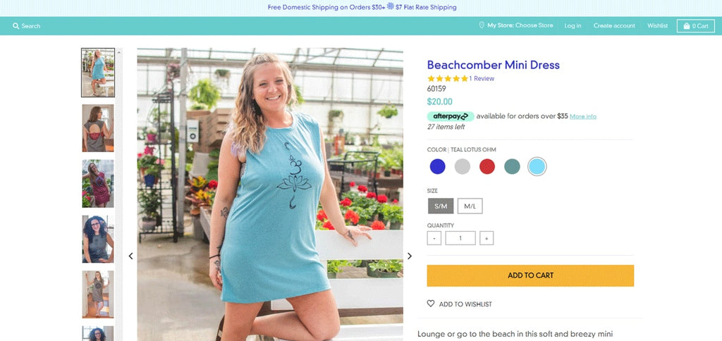
Mexicali Blues took the District Style and gave it a bit of a Coast style twist. Blue colour and plenty of whitespace gives them a great Mediteranean vibe, which suits the custom font with which they’ve replaced the title font (we recommend that you replace the title font, too!)
Further down the homepage they’ve replaced the ‘lookbook preview’ section with a featured customer review, as well as the ‘shop the look’ section with an integrated social feed from customer uploads to their Instagram account. Both of these are great for boosting social proof.

On their customer page, they’ve kept much of it from the original District Shopify Theme - same selection boxes, same swatches, same image zoom and same social sharing buttons. However, they’ve made a bolder call-to-action button (the huge yellow ‘add to cart’ button) and added a product review section, again, in the interests of social proof.
Snarky Tea
http://www.snarkytea.com
Snarky Tea made some killer adjustments to the District Shopify Theme, using the ‘featured grid’ section to promote their featured products on the homepage. They also personalised the marketing popup so that it scrolls in from the side after a certain amount of exploration on the homepage.

Further down, you’ll find their best-selling teas in the ‘featured collection’ section, as well as the blog (aligned vertically rather than horizontally), just underneath. Above these sections there’s a full ‘featured product’ section, a la Coast style, which promotes the product they most want to sell.

There’s a lot of personalising that’s gone into the product page and it doesn’t bear much resemblance to the one from the original theme. The selection boxes, image layouts and ‘similar products’ section are the same, but there’s a different font, colour, set of icons and review section below. It’s a great example of how you can personalise the District Shopify Theme to your needs!
Read more: How To Customize Shopify Product Page

Smack Apparel
https://www.smackapparel.com/

If Snarky Tea is a great example of how to personalise Shopify District Theme, Smack Apparel is a great example of how to have a great store without a huge amount of customisation. Their homepage is essentially a mixture between District and Energy styles, with all of the main elements rearranged, but largely left the same.

The ‘shop the look’ and the ‘featured collection with text’ are very much the same, as are the blog, video and ‘featured grid’ sections. The adaptations they’ve made are in the image animations and, most notably, in the cute sports icons that accompany the header menu items.

Like the homepage, Smack Apparel’s product pages are very similar to the template. The selector boxes, social buttons, colour swatches, quantity counter and alternative image library are the same. Still, they’ve added a review counter below the title and altered the ‘add to cart’ and ‘buy it now’ buttons, along with a full review section below.
Pros and Cons of Using Shopify District Theme
Let's examine the key advantages and potential limitations of the District Shopify theme to help you make an informed decision for your online store.
Advantages:
- Design Versatility The District theme offers three distinct styles (District, Energy, and Coast), allowing merchants to choose a layout that best represents their brand identity. Each style maintains professional aesthetics while providing unique visual elements.
- Feature-Rich Integration Built-in promotional tools, including marketing popups and dynamic banners, help drive conversions without requiring additional apps. The theme's native features reduce the need for third-party solutions.
- Mobile Optimization The responsive design ensures seamless shopping experiences across all devices, with carefully optimized layouts for both desktop and mobile views.
Limitations:
- Learning Curve New merchants might need time to fully understand and utilize all customization options. The extensive feature set requires initial setup time for optimal results.
- Resource Management High-quality images and videos are essential for maximizing the theme's visual features, which may require additional content creation resources.
- Performance Considerations While generally fast-loading, enabling all features simultaneously (video backgrounds, slideshows, etc.) might impact page speed on slower connections.
Shine vs District: Which Theme Converts Better for Your Store?
The Shine Theme is designed for fast-growing D2C brands that focus heavily on promotions, flash sales, and high-converting product pages. Built for health, beauty, and lifestyle merchants, Shine combines sophisticated visuals with energetic sales-driven layouts that guide shoppers toward fast purchasing decisions.

Shine’s sales-focused elements include countdown timers, promo banners, sticky add-to-cart buttons, and advanced filtering—making it ideal for merchants who frequently run campaigns and want to maximize conversions while keeping the storefront elegant and mobile-optimized.
In comparison, District Theme offers strong product discovery tools for smaller to mid-sized catalogs. It emphasizes clean layouts, homepage videos, slideshows, promo banners, and social media integrations, making it a great option for stores that prioritize product presentation and featured collections rather than aggressive sales tactics.

While District focuses on clean promotion and merchandising, Shine is a better alternative for merchants running constant sales events who want stronger conversion features built directly into the theme’s structure.
| Feature | Shine Theme | District Theme |
|---|---|---|
| Best For | Health & Beauty, D2C, Promo Sales | Fashion, Lifestyle, General |
| Catalog Size | Medium to Large | Small to Medium |
| Sales Features | Countdown timer, Promo banners, Sticky add-to-cart | Promo banners, Slideshow, Homepage video |
| Filtering | Advanced filtering | Basic collection filtering |
| Visual Style | Sophisticated, Energetic | Clean, Balanced, Visual |
| Target Audience | Sales-driven, frequent promotions | Product-focused, lifestyle brands |
| Price | $210 | $220 |
| Shopify 2.0 Support | Fully Supported | Fully Supported |
> View Shine theme demo and install to your store
> Check Shine details in their landing page
Conclusion: Is the Shopify District Theme Worth It?
The District Shopify theme proves to be a valuable investment for merchants seeking a versatile, feature-rich solution for their online store. With its robust customization options, mobile-optimized design, and built-in marketing tools, District delivers excellent value for both new and established businesses. While considering your specific needs and resources is essential, the theme's combination of professional aesthetics and conversion-focused features makes it a strong choice for merchants aiming to create a distinctive online presence. For those willing to invest time in proper setup, District offers the foundation needed for a successful ecommerce venture.
Explore more Shopify Theme Reviews and Alternatives to District Shopify Theme, check out:
Shopify District Theme Review And Tutorial FAQ
The District theme on Shopify typically costs $250 as a one-time purchase. This includes lifetime updates and support from the theme developers. Be sure to check the Shopify Theme Store for any updated pricing or discounts.
You can identify the theme a Shopify store is using by viewing the store’s source code. Right-click on the store page, select **View Page Source**, and search for "theme" or "Shopify.theme". This may reveal the theme name, though some stores use heavily customized themes that might not be easily identifiable.
To start a theme on Shopify, go to **Online Store > Themes** in your admin dashboard. Browse the Shopify Theme Store or upload a custom theme. Once you’ve selected a theme, click **Customize** to tailor it to your store’s branding and functionality needs.
The best theme for Shopify depends on your business needs. Popular options include **Debutify** for its ease of use and conversion features, **Impulse** for visually-driven stores, and **Dawn** as a free, versatile Shopify 2.0 theme. Choose a theme that aligns with your niche and supports your desired functionalities.
Yes, Shopify 2.0 themes are generally faster and more optimized than older themes. They feature improved architecture, better performance, and enhanced customization options, ensuring a smoother user experience and better loading times for your store.


