Should you use Shopify’s Supply theme for your store?
Choosing the right theme for your Shopify store should be one of the initial steps. Why? Because it goes with your branding plan and affects the whole layout of your website in the long run.
By understanding which theme is suitable for your brand, industry and budget, the process of building and maintaining your online store will be painless and fruitful.
Note: For people asking "what happened with Supply theme", unfortunately, the Shopify Supply theme is discontinued on the Shopify themes store. Hence, you might want to check the other theme reviews:
- Best Shopify themes
- Shopify Dawn Theme
- Debut Shopify theme
- Sense Shopify Theme
- Boundless Shopify Theme
- Shopify Venture Theme
💡 We meticulously evaluate Shopify themes and apps based on our hands-on experience. Read more about our comprehensive review process and methodology.
In today's article, we are going to give you a thorough review of the Shopify Supply theme, which is one of the most popular free Shopify themes on the Shopify Theme Store.

You can take a glance at the Supply theme demo here.
What is the Shopify Supply theme?
Supply theme is officially created by Shopify, and it's a FREE theme. Merchants can easily search for it and install it from the Shopify Theme store.
If you take a look at the demo of Supply, the name truly says it all. It’s basically a theme for vendors who are selling a large number of products and many collections. There’s a simple header with a product search bar, as well as a shopping cart to the navigation bar with drop-down menu items and full of collection lists and product categories on the homepage.
With Supply, you can make your store like a small version of huge eCommerce marketplaces like Amazon or eBay.

Similar to Shopify Minimal theme, Supply is popular for its clutter-free and simple web layout, which creates more space to display an array of products at the same time across a straightforward and clean storefront.
However, what makes Supply theme different from Minimal theme is that it’s more suitable for large inventory stores. You can add more than 50 products and up to 6 collections right on the homepage.
Who is Supply theme ideal for?
Although it depends on personal style, brand scheme and industry characteristics, Supply is a great choice for:
- Merchants with a small budget looking for a free theme.
- Shopify beginners looking for a simple and basic theme to start with.
- Merchants who need a theme that can support a huge number of products and collections.
The 2 Supply theme styles
With Supply theme, you have two options with the style: Blue and Light. Both have the same features, however, Blue style is designed with a more solid and complete header in dark blue, which fits well with gadget stores.
Meanwhile, Light style evokes warmer sentiments with its grayish red color, and a horizontal menu below the header. This fits with many stores that are in the jewelry and accessories industry.
Blue style

Light style

What features does Shopify Supply theme have?
Following the minimalist style, Supply theme can make your store as simple as it could be. However, it doesn't mean that the theme doesn't allow you to customize your store with flexible attributes.
So, let's take a look at the key features of Supply theme:
1 - Built for large catalogs: Yes, yes, it’s obvious. As mentioned from the beginning, merchants who are selling a large number of products and having diverse catalogs would love to use the Supply theme.
You can organize your catalogs by creating drop-down menus on the navigation bar, which helps customers explore the variety of product ranges you can provide.
Right on the homepage, you can display up to 6 collection lists, and more than 50 products under the featured collections. Merchants can show a maximum of 5 rows and 5 products per row in each collection.

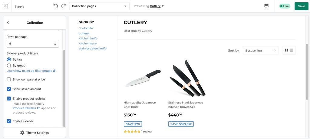
2 - Collection filtering in sidebar: This function is a plus point of Supply theme because with collection filtering, people can easily sort out products they want to find by brand, price, or other customization options. The sidebar menu can be filtered by tag or group.

3 - Slideshow: Having a slideshow on the homepage is a good way to leave an impression on visitors when they enter your store. Beautiful and captivating hero banners should be on the list of your branding plan.
It's important to pay attention to the quality and resolution of your slideshow images. Also, the theme can let you set the running time for the slides, so you can set up a enough time duration to catch people's attention and achieve your marketing goals.
4 - Featured collections on the homepage: It's the main factor that builds up the meaning of Supply theme. If you pay enough attention, most of the stores that are using the Supply theme would utilize this feature to showcase their lists of items on the homepage so that visitors can quickly have a glance of what the stores are selling, and can directly get the products they want.
How to create a Shopify store with Supply theme?
General customization
Before actually going to build your Shopify store with the Supply theme, you can change the general settings according to your business plan and brand scheme.
If you don't want to use the default color of the theme style, you can alter the whole theme color palette in the theme settings. It goes the same with typography, favicon, cart, social media, checkout, etc.
Also, having a well-designed logo is great for brand awareness in the long run. Supply theme support adding a logo in the header to showcase your brand, which helps ingrain it in people's minds right after they land on your site.

Protip: Use a smaller value pixel of your logo to reduce the height of your header. It’s best at 400px wide.
Homepage design
Slideshow images
This one is all about the 5-second rule. Leaving a good impression on visitors to your store in just 5 seconds will help retain them on your web store for longer. Because in a short period of time, if people can understand what the purpose of the page is, what your store is selling and how to navigate it, they wouldn't mind staying.

Adding a slideshow is a great visual tactic to spark people's interest and curiosity. The quality and size of images in the slideshow should be taken into account, because it's not only about aesthetics, it affects your site speed as well.
A minus point of Supply theme is that it doesn't support text or CTA buttons on the image slide. In which case, if you want to have text on the slideshow, the best solution is to design images with text beforehand.
If you can capture cool photos of your product with many angles that can show its outstanding functions or features, don't hesitate to put them in the slideshow.
Protips:
- Pay attention to the image size: the width of the image should be 1000px and all slides should have the same image width x height.
- The transition time should be longer if your slides have more text (it's ideal to be 10-12 seconds).
Dropdown menu
Creating a dropdown menu is pretty necessary for large inventory stores, in order to avoid too many menu items, which is hard for navigation. If you have too many types of products that can't be sorted into a specific group, you can utilize the “More" menu.

Protips:
- Try to give the navigation bar maximum 5-6 items and use a dropdown menu to list more pages under
- Use shorter words for each link. For example, FAQ instead of “Frequently Asked Questions”
Featured collections and collection lists
List your best collections and products on the homepage. Show visitors the wide range of products and items you offer so they have more choice.
If you look at the Supply theme homepage, there's a section called “Shop for", which displays collection lists right under the slideshow. This helps customers choose the collection that most interests them.
For featured collections, it's better to show “saved amount” or “compare at price" in the prices of the products, so that people can make a quicker decision to purchase your items.

Also, you should consider the number of rows and products per row according to your available product numbers.
Footer menu
With Supply theme, you can organize your footer using quick links with a horizontal menu. You should add document and information pages like “About Us", “Contact Us" or FAQ, Shipping and Refund policies, etc.
Add social media icons at the bottom corner of the footer to let people know other channels that they can reach you. Also, payment icons are crucial because many customers would like to know if their payment methods are acceptable at your store.
Other content sections
If you want to decorate your homepage and talk more about your brand, you can add “Rich text", “Image with text”, “Video", “Map" sections to give viewers a bit more content and information about your business.
Perhaps the opportunities for customization in Shopify’s Supply theme are not so prevalent, but it depends on merchants' personal tastes or business plans to custom-make their web store. Besides, if you choose to display a considerable number of products right on the home page, the advice is not to add too many content sections, because it may slow down your site speed.
Product page optimization
With product pages, Supply theme gives you plenty of scope to present product information and descriptions.
You can use the image zoom effect to let customers inspect products more closely when they hover their mouse on the images. It’s better to show the “saved amount” or “compare at price” of the product as well.
Protip: Product image size should be 1024 x 1024px.
A cool thing about the Supply theme is if you install the free Product Review app from Shopify, you’re able to show reviews from customers about your service and products, which helps visitors establish trust.
Collection page settings
In the collection page, utilize the sidebar to help customers find products by tags or groups. If you are sorting the products in a collection by tags, make sure you do keyword research to be aware of customers' needs, and what they’re searching for to find that product.
For group filtering, Shopify already has a detailed document tutorial to help you.
Like with product pages, you can choose to show product prices with customized options, and even review stars under each product image if you install the Product Reviews app.
What do we think about the Supply theme?
On the whole, we do like the Supply theme. Still, there are also some weak points that we need to mention.
What we like:
- It's very simple and clutter-free. This is good because it avoids distracting people from unnecessary elements.
- The theme brings a very organized and clear-cut look.
- It supports displaying great numbers of products on the homepage, and is very suitable for retail stores.
- You can filter and sort out your products in many ways: by tag, group, brand, price, etc.
- It's a Shopify theme, so it has detailed support documents with many tips and tutorials. Also, you can contact the Shopify team through direct chat if you have any problem with the theme. The response time is usually under 5 minutes.
What we don't like:
- It doesn't have so many features to advance your store’s appearance. If you want to “spice up" your store in a more dynamic way, Supply is not the one. For advanced modification, you can install a 3rd-party page builder app like PageFly, for example, to help you customize your pages flexibly without coding knowledge.
- The slideshow section doesn't support adding text or CTA buttons, which is a big loss because having a captivating heading and CTA button on the banners can help improve the conversion rate of a site.
- Some content may not be full-width. For merchants who want to get a full-width slideshow or content, they may have to edit the code, because the default layout of the theme has space on both the left and right sides.
- With Supply theme, Shopify will help with just basic performance improvement. If you want to adjust your store (ex: navigation, full-width layout, etc.) with more coding involved, Shopify’s support advisors often aren't able to do it.
You have to reach out to Shopify Experts or, in a quicker way, look up discussions in Shopify Community about Supply theme. Many people might have the same problems that you have.
For more in-depth Shopify Theme Reviews, check out:
- Shopify District Theme: Is It The Perfect Theme For Fashion Niche?
- Booster Theme Review: Is It Worth The Price?
- Shopify Minimal Theme: Pros, Cons & Everything In Between
- Parallax Theme Shopify: Deep-dive Review and Tutorial
- Shopify Warehouse Theme: Breakdown, Review & Tutorial
What do merchants say about Supply theme?
Supply has 60% positive reviews on the Shopify theme store. People mainly love it because it's free, very easy to set up, and delivers clean and simple web layout. However, a couple of merchants complained about the theme not working with browsers like Internet Explorer, as well as advanced customization issues.
But, as you can see, the main problems with merchants' stores are slow loading speed or mobile responsiveness.

The thing is, a website's loading speed depends on many factors, such as images, network, user devices and so on. Besides, with large inventories stores, merchants using Supply theme must pay attention to image sizes and the navigation menu, because it does affect the speed of a site.
So in our opinion, it's not really an issue that’s down to Supply theme. If you’re comfortable with reading code, you can use Shopify Theme Inspector for Chrome to identify which code line from your theme is affecting the loading speed and find a solution for it.

Read more:
- Shopify Impulse Theme: Is It Desirable or Just A Name?
- Ella Theme: Features Review, Pros & Cons and Tutorial
- Shopify Pipeline Theme: Clean, Pretty and Perfect For Lifestyle Products
5 store examples using Shopify Supply theme
Since Supply is one of the more popular Shopify themes, we can find many merchants and companies that are utilizing its features to run their Shopify stores.
If you look at the store examples below, they all have several common things. The homepages are very basic and simple with only just slideshows, and focus on displaying many products and collections. They are selling a great number of products. Their menu bars often have 5-6 links with drop-down menu items.
1 - Roll & Hill

2 - RamCity

3 - Daily Juice Cafe

4 - Da Bomb

5 - Cenegenics

Our verdict: Is Supply theme for everyone?
Shopify Supply theme is a free theme, and very easy to use for beginners, but it's not for every store. If you want more than just a basic theme with customizable sections and an energetic web look, Supply is probably not the choice for you.
For those who love clarity and simplicity, and those who need a theme that can support large inventories, Supply can be a great addition.


