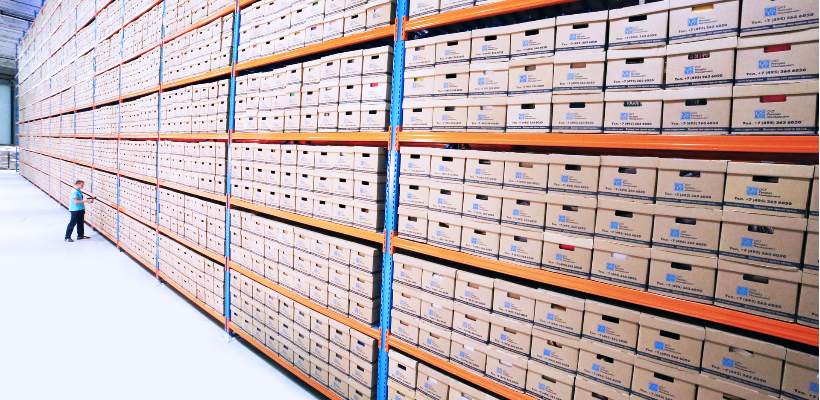
Despite the popularity of the Supply Shopify theme, Maestrooo studio still decided to launch a similarly Warehouse Shopify theme, charge $180 for it! This costly Warehouse Shopify theme is based on the same concept as the free-to-use Supply theme: displaying a large collection of inventories.
What makes Warehouse worths the money is these two selling-points: feature-rich customization without sacrificing perfomance.
💡 We meticulously evaluate Shopify themes and apps based on our hands-on experience. Read more about our comprehensive review process and methodology.
A quick look at the Warehouse Shopify theme
The Warehouse Shopify theme is developed by Maestrooo studio, a well-known Shopify Plus Partner. They have been featured in the Shopify Partner blog, as well as the Shopify Academy case study. Furthermore, Maestroo studio is one of the few Shopify Plus Partners doing client work as well as creating themes and apps.

According to Maestrooo, their themes and apps' inspiration comes mostly from their own struggle when working with large corporates. You can see this mindset in Warehouse's design philosophy. In this theme, Maestrooo addresses many caveats that a company having plenty of collections has. As a result, the Warehouse Shopify theme provides customers with both a sleek, robust design and a conversion-driven user experience.
Obviously, this experience does not come cheap. Like most of the premium themes on the Shopify Theme Store, its price is $180 for a one-time purchase. Therefore, before rushing to the buying decision, take a look at our in-depth review regarding the Warehouse Shopify theme.
Who Would Use Warehouse Shopify Theme?
- Established businesses that own a long product list
- Function-driven, Variant-driven industries like online retailers, FMCG industries, Wholesales, etc where the demand for displaying many categories of products is more appreciated than need for bespoke imagery.
Theme Styles
Shopify Warehouse Shopify theme comes in 3 styles: Metal, Wood, and Fabric. Each style brings you different kinds of feelings and fits well with different stores and industries.
1. Metal

The Metal style has a Best-Buy-like vibe, which is a good thing. This style gears toward electronic retailers with long titles, specification-focus products.
2. Wood

The Wood style is a furniture-focus style. The layout is quite similar to the Metal style. However, New arrival and sales/promotion elements are more distinctive.
3. Fabric

The Fabric style is tailor-made for apparel brands with large collections. As a result, this style lays its emphasis on product images. This is an effort making the theme more appealing with fashion stores. Nevertheless, if your brand design focuses on bespoke image, the Warehouse Shopify theme layout does not have the minimalist aethestics which make the picture stand out like Impulse or Showcase theme. Moreover, uploading plenty high-quality images may significantly affect your page loading time. We wrote a tutorial on how to reach the balance between visual-striking images and Page speed.
Main Features in action
Predictive search
Predictive search is a great feature and it fits with the needs of customers that have large inventories. It can help visitors find the products they want easily. The theme will display the products in real-time, without needing the users to hit enter. On the metal style, the search bar expands across the header by default, making it prominent for users to see. On the mobile version, depending on user behavior, you can also enable a sticky search bar. Simply go to the header section, turn off minimize search. This method, though diminishing the overall design, could help users from jumping between products easily. Not only that, you also don’t have to spend extra money on 3rd-party search apps like Doofinder.

Products searching experience on Warehouse Shopify theme is top-notch
Card for trust badges
As the consumers process to cart & checkout steps, trust and security are the most vital factors. In action, Warehouse provides dedicated trust badges in two areas: right below the description area on the product page, or below the checkout button on the cart page. These placements ideally improve trust and provide assurance before users hitting that sweet checkout button!

Warehouse provides dedicated trust badges in the product page
For the product pages, you can upload the trust badge image (800x200px is recommended) and adjust the width of this element, as well as edit the badge heading. For the Cart page, the process is a little different. The trust badge is now just an icon size, you can upload your own icon, or use Warehouse’s pre-made icons. You can edit the heading, and now you can enter the body text to build more trust and link your commitment to your policy page.

Exit popup
Exit popup is a great way to grab users' attention before they navigate from your current page. Please note that this mechanism works by detecting when the cursor is about to leave the screen, so it’ll just work only on desktop.

Exit popup works only on desktop
Alternatively, Warehouse Shopify theme provides a traditional pop-up function that triggers when users first visit your site (you can change the trigger conditions in the settings). You can use these popups to obtain newsletter signup and urge buying decisions.

You can use traditional popup to obtain newsletter signup
However, these popups is quite bare-bones. Signing up for a newsletter is the only option the Warehouse Shopify theme provides. For more customization, like adding background images, displaying promotional news, etc you might want to try a 3rd party app.
Custom promotion
Custom promotion tile is a must-need feature since large merchants, especially retailers, run promotion campaigns on a daily basis. Business owners or marketing teams can run a promotional campaign on the front page without designing skill. Overall, the design of these tiles is the most eye-catching one. For conversion rate optimization's sake, I recommend placing these tiles right after the slideshow.

Custom promotion tile helps business owners or marketing teams run a promotional campaign on the front page without designing skill
Stock level indicator
I recommend using this element wisely. If you're on your Season-end promotion campaign, using this feature might be a good idea. Otherwise, the stock level indicator might not create enough urgency.

How to build a Shopify store with Warehouse Shopify theme?
General customization
As most Shopify themes, Warehouse provides some general changes to match your brand design
- Color properties: you can access it via theme settings -> Colors
- Typography
- Social media account addresses
In addition, Warehouse also provides a host of advanced customization that merchants would much appreciate.
- Config Product grid image ratio: Depend on the product types, you can select your preferred aspect ratio. Normally, for apparel, which depends heavily on the product images should be larger
- Announcement bar on top of the header. This non-intrusive element is a great way to introduce your newsletter, shipping policy, etc
- Color swatch selection: Adding a color swatch selection is a much-needed feature that Shopify does not provide natively. Luckily, you can easily add this option using Warehouse Shopify theme
Homepage design
This is where the Warehouse Shopify theme flexes its muscle by providing a wide range of elements. Most of them also include robust customization. Compare to Shopify Supply theme, Warehouse’s elements are superior in term of quality (customization) and quantity (18 vs 11). For example, the slideshow elements of Supply only allow upload images and attach links, while Warehouse provide separate desktop and mobile image, adding overlay, heading, etc
Warehouse homepage elements
Collection elements
| Image elements
|
Text
| Blog elements
|
Link
| Product
|
Promotional
| Store Information
|
Video
| Advanced
|
For normal stores, these elements would be enough. However, for merchants that have a lot of collections, conversion rate, not a beautiful design, is their main goal. Chances are these types of merchants use a lot of 3rd parties apps to optimize their conversion rate. In that case, they need a more robust way to customize their homepage, like using a page builder app.
Product page and checkout cart are designed with conversion in mind
The product page is the most important page on an e-commerce site. It's easy to understand the reason. This is where one decides whether to buy your product or not. Therefore, Warehouse provides many elements that urge buying decision. We've talked about the trust badge and the stock level indicators before. They are some great ways to improve the conversion rate. Adding a reviews section is another good way that builds trust, and the Warehouse Shopify theme indeed supports it.

You’ll need to install a review app to enable the review feature
Additionally, the "recently viewed" section and the "product recommendations" section are other great tools for upselling, cross-sales between products. We have these sections on both product pages and cart pages.


One drawback of Warehouse’s product pages: you cannot change the aspect ratio of product images on these pages like the product grid element. Therefore, resizing the image before uploading is a good idea.
Collection pages
When it comes to the collection page, having large categories of inventories can make it cumbersome for viewers to search for products. Warehouse Shopify theme solves this problem by providing a host of ways to find products like a filter, display option, sort option, and viewing layout. As a merchant, you can config the default viewing option with Warehouse. Protip: according to Bayard Institute, "Grid View" is great for visually-driven products, like apparel, cosmetics. "List view", on the other hand, is more suitable for spec-driven industries.

Viewing configuration and filter option are useful features on Warehouse’s collection page
Regular page/Landing page: the disadvantage of Shopify Warehouse Shopify theme
Regular page/Landing page has always been the low-point of all Shopify themes. The Warehouse team does attempt to improve the situation by premade templates for About Us, Contact, and FAQ pages. Nonetheless, if you want to create a unique landing page without coding experience, take a look at PageFly. PageFly helps you build a custom landing page with a friendly drag-n-drop mechanism.
 |  |
PageFly (right) is more superior than Warehouse Shopify theme in term of landing page building
Get More Sales And Save Time
With PageFly Free Page Builder
Trusted by 60,000+ Shopify Merchants.
Fully Customizable with 50+ Elements. 40+ Free Templates
Mobile Optimization
Like other themes in the Shopify Themes Store, Warehouse Shopify theme is mobile optimized. By default, the mobile layout is taller and optimized for vertical screens. While in the desktop version, the layout brilliantly displays multiple sections at the same time, the mobile version of Warehouse focuses on displaying one element at a time. Therefore, the homepage creates an immersive experience when viewing on the phone. In addition, users can navigate throughout your site via both vertical and horizontal swipe gestures.

Warehouse Shopify theme is mobile optimized
Another great point of Warehouse is slideshow images are separated for desktop and mobile versions.

Separate slideshow for desktop and mobile versions
Support
Maestrooo provides support for Warehouse Shopify themes via email and FAQ documentation. The FAQ does address some of my questions about adding the swatch variants or remove the “Power by Shopify”. For the sake of this review, I also try to email them and ask about the exit popup mechanism. The studio replied to my question within 24 hours as promised. The question was short, simple, yet informative.

The studio replied to my question within 24 hours as promised
Performance
Warehouse Shopify theme doesn’t affect Online store speed when measuring by Shopify. Before and after scores remain the same. (27 points).

Online store speed using Brooklyn theme

Online store speed using Warehouse theme
Switch to Google PageSpeedtest. The Warehouse Shopify theme is actually performing better than the Brooklyn theme that we use. The former scores 31 in the mobile version, and 85 in the laptop one, while the latter scores 17 and 66 in respect. This shows that the team behind Warehouse has not only put their effort into the design but also the performance, hence the praise that it receives in the review section.

PageSpeed on desktop using Brooklyn theme

PageSpeed on desktop using Warehouse theme

PageSpeed on mobile using Brooklyn theme

PageSpeed on mobile using Warehouse theme
What do merchants say about Warehouse Shopify theme?
Warehouse Shopify theme receives much credibility from the Shopify community. This theme gets 88% positive feedback from 162 reviews, which is not much, but it's something to consider. Merchant praise Warehouse due to their first-class support, and the amount of customization the theme offers, and how well-coded it is. This actually matches our experience with the theme. I also love how they reply to these reviews. Honest, authentic, and informative.

I guess they have improved a lot the customer support from their experience with previous complaints. Most negative feedbacks are from 1 year ago. Bad reviews are usually about the inferior support team. Obviously, Maestrooo has improved a lot of the support since then.

3 real stores using Warehouse Shopify theme
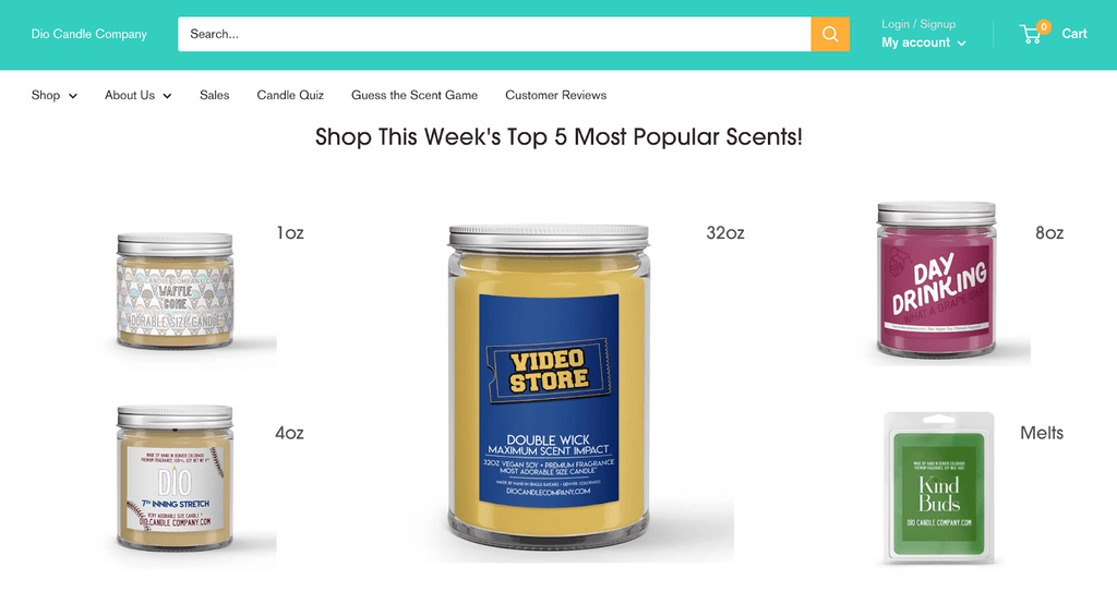


Warehouse Shopify theme vs Supply theme: the absolute winner
Both warehouse and Supply themes are created to serve merchants who have large categories of products. However, the differences are day and night. Warehouse Shopify theme costs $180, while Supply theme is free to use. The former delivers a lot of features as well as robust customization options to increase conversion rate, while Supply theme is quite bare-bones. You will need to heavily rely on other applications to customize your website, which can increase your billing rapidly in the long run, as well as affecting the load speed. Therefore, unless the initial investment is a matter to you, or you prefer the robust features of 3rd parties apps, I highly recommend purchasing the Warehouse Shopify theme over Supply.
Our thoughts about the Warehouse Shopify theme?
Pros
- Ideal for display a large number of collections, products
- More flexible customization than Shopify’s Supply theme.
- Provide a lot of advanced features like promotion titles, exit pop-up, announcement bar, easy to customize elements,...
- Build by reputed developer with conversion-rate focus mindset
- Great pagespeed performance while displaying a large collection of images
Cons
- Like most paid themes on Shopify Themes Store, Warehouse is expensive
- Warehouse Shopify theme has limited capability with creating the custom landing pages for promotion campaigns.
- We cannot config image ratio on the product page.
Conclusion
Warehouse Shopify theme is built to display large collections of products without overwhelming customers. It also provides a lot of advanced functions that merchants usually need 3rd party apps (eg: real-time search suggestion, pop up dialog). However, this theme is not really suitable for stores with limited products, or priority large, bespoke imagery, such as niche perfume stores, or high-fashion brand.
Alternatives for Warehouse theme for B2B
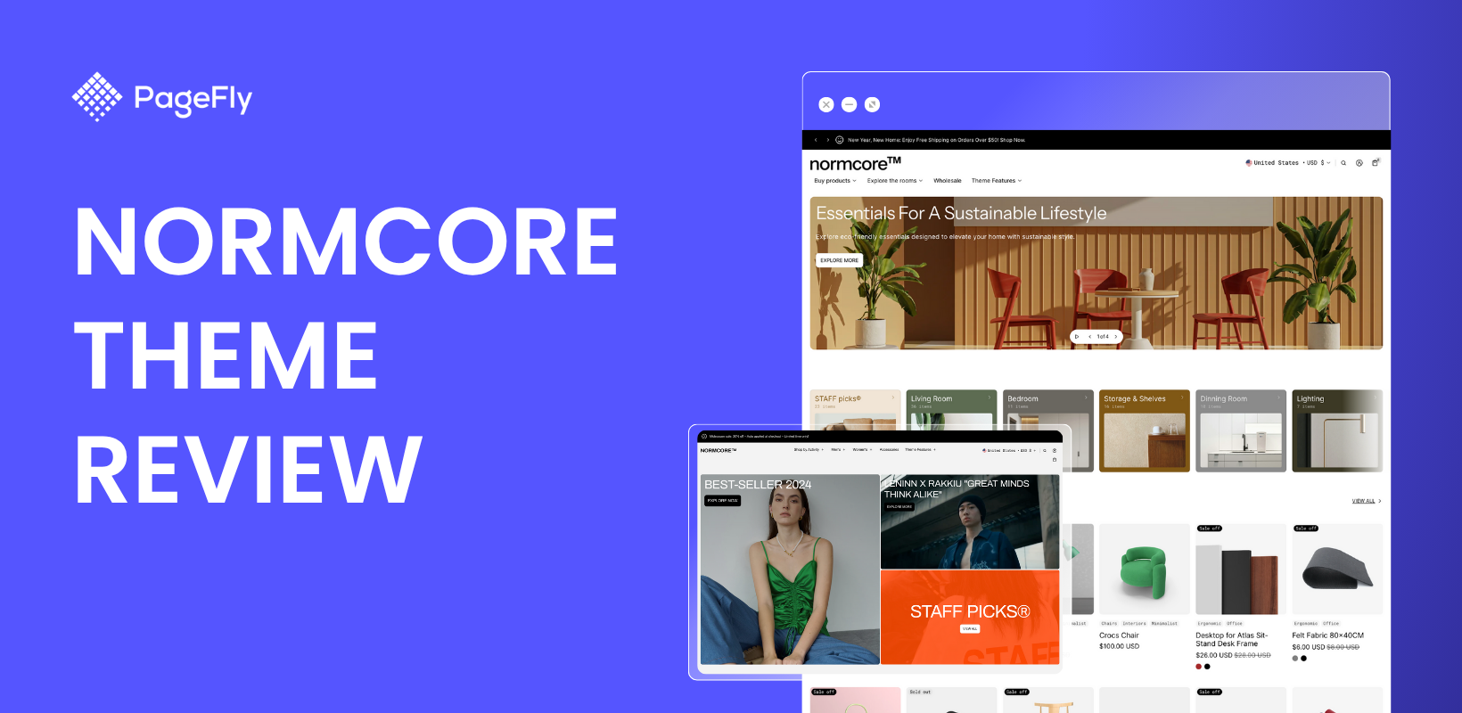
If you're searching for an affordable and more visual-stunning theme for large stores, Normcore is definitely a great choice. Normcore is a robust Shopify theme designed for large catalog and B2B stores. It handles thousands of products with ease, offering advanced filters, quick ordering features, and clean layouts that support bulk purchasing. Perfect for high-volume sellers who need speed, clarity, and efficiency.

> View Normcore theme demo and install to your store
> Check Normcore details in their landing page
Explore more Shopify Theme Reviews:


