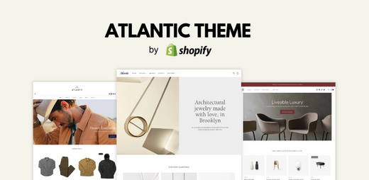
The Shopify Atlantic theme is a popular theme for those looking for a simple and elegant template for their e-commerce store. Don’t let the simplicity fool you though – because the Atlantic theme packs a powerful punch when it comes to features and capabilities that will help you elevate your ecommerce store to global standards.
💡 We meticulously evaluate Shopify themes and apps based on our hands-on experience. Read more about our comprehensive review process and methodology.
In this article, we will be analyzing the things that make Atlantic a very compelling theme and we will leave no stone unturned to provide you with an in-depth and honest review.
Atlantic Theme Overview
The Atlantic theme is built by experienced web developers from Pixel Union. They are the ones responsible for other capable Shopify themes such as:
- Editions
- Startup
- Pacific
- Grid
- Launch
- Empire and
- Tailor
All themes built by Pixel Union are compatible with Online Store 2.0 – which means that merchants who are using these themes can implement more flexibility in website design. As a result, themes that are compatible with OS 2.0 can be designed with more capabilities and better customer-focused functionalities.
Price
The Atlantic Shopify theme is by no means cheap. Priced at $280, it demands a substantial investment, and thus, consumers expect more from it.
It sits in the mid-high spectrum of theme prices. Except for the free themes, the cheapest theme (Frame) sits at $170, followed by Effortless, Influence, and Capital priced at $180.
On the other hand, the most expensive theme priced at $380 is Honey.
Since it sits at the higher end of mid-priced themes, it raises the questions:
- Does it have the essential features to run a large Shopify store like those of the more expensive themes?
- Did the developers cut corners in developing the theme so they can price it this low?
- Is it capable enough to be considered value for money?
- How does it perform in real-world applications?
Throughout this article, we will put the Atlantic theme through speed tests and we will discuss its highlight features in order to answer these questions one by one.
Features
The Atlantic theme has four (4) unique theme styles that visually differ from one another. These styles are called Chic, Modern, Light, and Organic. We will tackle each one of these in the next section.
What’s important to know is that whatever theme style you want to implement in your store, you won’t be missing out on any of the features listed below:
Cart And Checkout
- Cart notes
- In-store pickups
- Quick buy
- Slide-out cart
Marketing And Conversion
- Age verifier
- Blogs
- Countdown timer
- FAQ page
- Product badges
- Product reviews
- Promo banners
- Quick view
- Recommended products
- Store locator
Merchandising
- High-resolution images
- Image galleries
- Image rollover
- Image zoom
- Product options
- Product tabs
- Product videos
- Size chart
- Slideshow
Product Discovery
- Breadcrumbs
- Enhanced search
- Mega menu
- Product filtering and sorting
- Recommended products
- Sticky header
Four (4) Different Faces Of Atlantic
As mentioned, Atlantic provides users with four (4) different theme styles. But unlike other Shopify sub-themes that all look alike albeit with different color palettes, the sub-themes of Atlantic look differently from one another.
Totally different theme styles that are best suited for different types of businesses and taste in design. You can tell that Pixel Union did spend a lot of time in developing the theme to provide their users with as many choices as possible in one theme package.
So, what’s the fuss all about with these theme styles and why is it such a big deal for us that they don't look alike? Because this means that e-commerce entrepreneurs will have more freedom when customizing their store when using the Atlantic theme.
Let’s take a closer look at these theme styles one by one:
01. Chic
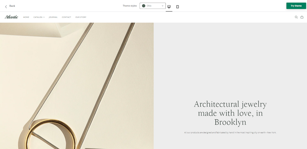
The Chic theme style makes use of the entire screen real estate to provide room for wider sections and to make space for larger product images. Although at times, this may seem visually overwhelming especially when you have to scroll past an entire section to see more details about the website.
The menu bar is located at the left right next to the logo – which is unconventional when compared to today’s standards where menu bars are mostly at the middle of the screen.
Additionally, it implements a nice blend of pastel colors and white background to portray a simple yet modern design. The typography used in this theme style is also a nice touch contributing to its elegant feel.
Chic is best used for the following e-commerce stores:
- Jewelry
- Handcrafted accessories
- Summer outfits
- Perfumes
- Ladies’ products
02. Modern
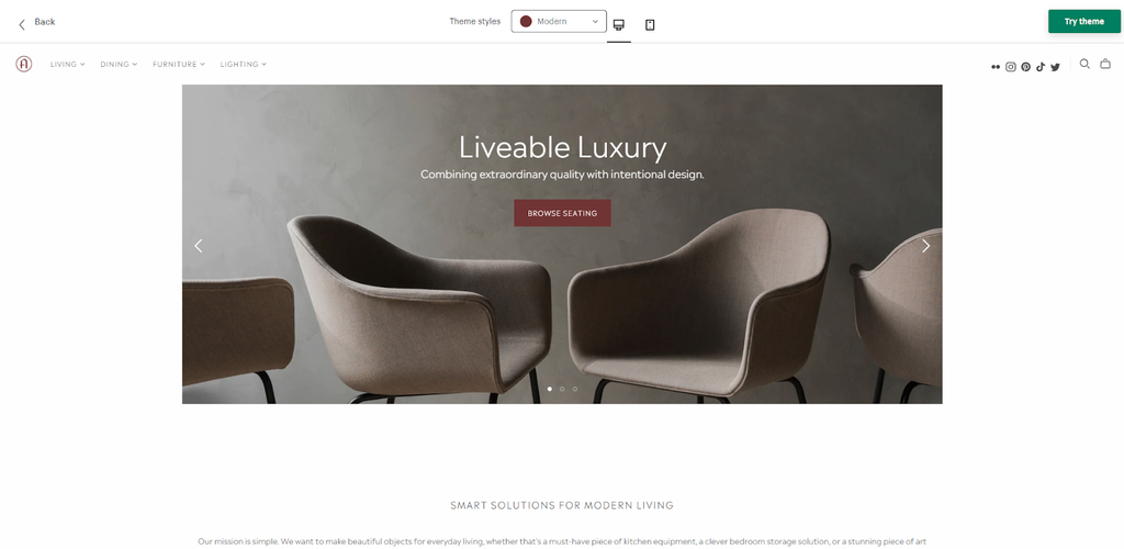
Unlike Chic, the Modern theme style does not use the entire screen width in its sections. Instead, it implements narrower sections for those looking for a non-visually overwhelming web design.
The menu items, though, maximizes the screen width. Similar to Chic, they are located at the left side of the screen next to the logo.
The colors here are more muted and mostly white background. Thus, if you decide to make use of Modern, most of your colors will come from the images that you will use.
Modern makes use of simple typography which nicely blends in with the white background to be visible and not to be very visually strong.
Modern is best used for the following ecommerce stores:
- Luxury furniture
- Designer bags
- Haute Couture
- Men’s bracelet
- Leather products
03. Light
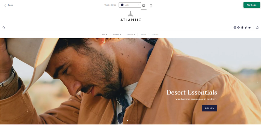
The first thing you’ll notice with Light theme style is that the positioning of the menu items are moved to the middle of the screen. The logo now has its own section atop the menu bar, thus, giving more room for businesses with larger logos.
Light maximizes the entire width of the screen in its section to provide richer imagery – giving a more appealing overall look to the website. It does not veer away from the use of white background.
Just like Modern, most of the colors here originate from the images. As such, it is crucial that when using this theme style, the color of your images should be harmonious to one another to provide a visually pleasing appeal.
Out of all the theme styles, Light is the best one to use in telling your brand’s story.
Modern is best used for the following ecommerce stores:
- Adventure oriented products
- Men’s products
- Leather footwear
- Leather accessories
- Handcrafted clothing
04. Organic
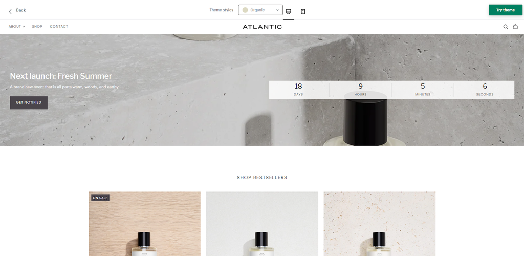
Organic is like a hybrid of Chic and Modern. This is evident in the placement of its menu items on the left, and the logo at the middle. However, the logo is located in the same section as the menu items, thus, putting a bigger image might offset the balanced feel of the menu bar.
Just like Chic and Modern, Organic makes use of the entire screen width in its section. However, the sections are shorter compared to the other two. In our opinion, this is the perfect balance when sizing a section. It is not visually overwhelming yet it still provides enough space to put text and other information.
Out of all the Atlantic sub-themes, Organic is the one that hit the right spots in its color choices. Hovering over menu items reveal a dropdown with a nice gray undertone.
If there’s one thing that needs to be adjusted, it would be the font size because they are too small by default and they can be easily drowned even by the white background. Also, increasing the font size will contribute to a better user experience.
Organic is best used for the following ecommerce stores:
- Perfumes
- Cosmetic products (men or women)
- Luxurious but inexpensive watches
- Minimalist themed clothing products
- Journals, diaries, stationeries
Speed Test Using Pagespeed Insights
The probability of bounce increases 32% as page load time goes from 1 second to 3 seconds (Google).
As such, in choosing a Shopify theme, the visual characteristics should not be your only criteria. It is important that you pay close attention to the speed of a given theme so as to know if it has the capacity to convert visitors into customers.
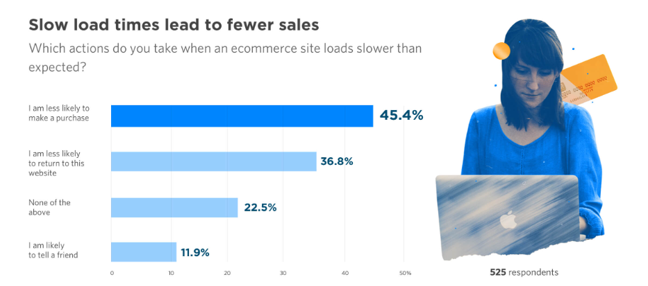
In a research conducted by Unbounce to 525 respondents, 45.4% of them said that they are less likely to purchase from an ecommerce store that loads slower than expected.
What’s worse is that 36.8% of them said that they are less likely to return to a slow ecommerce website.
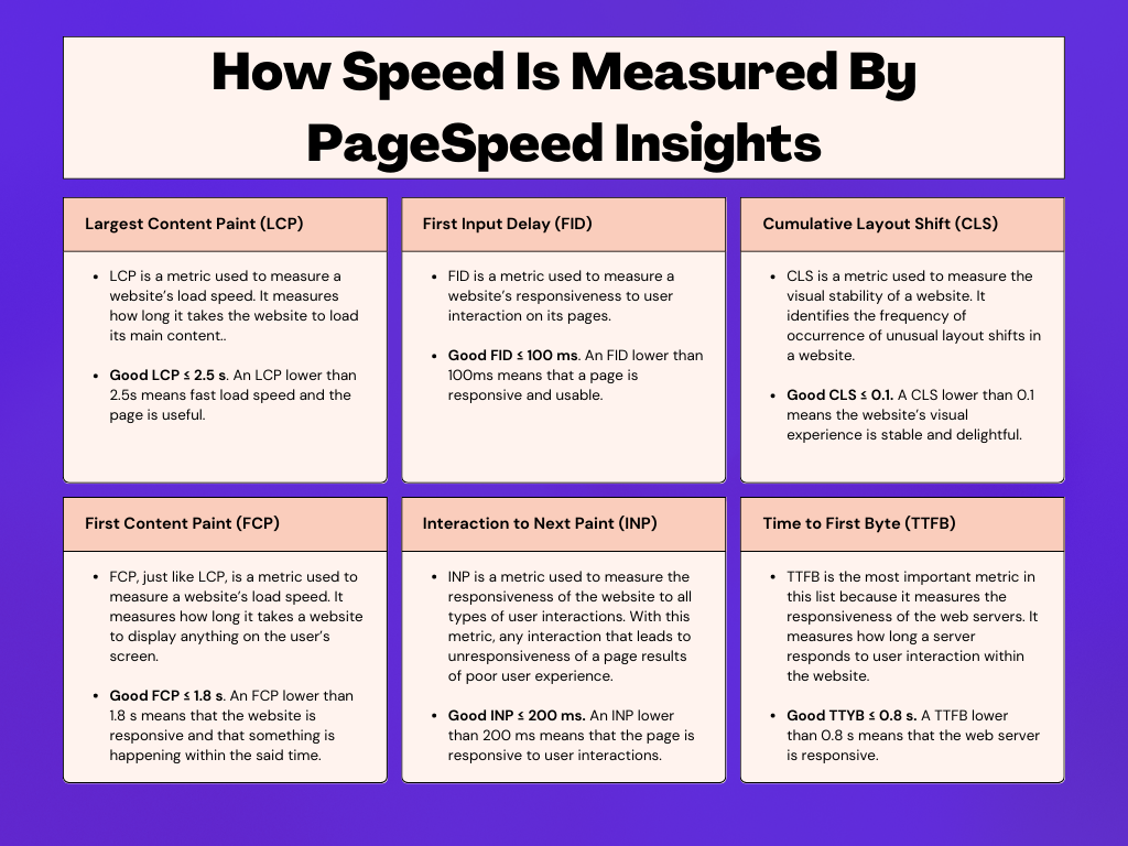
Now that we’ve discussed the four theme styles of Atlantic, we now see for ourselves if it is indeed a capable theme that can meet the heavy demands of your online store. As such, the best way to do this is by testing the theme via PageSpeed Insights using the following metrics:
- Largest Content Paint (LCP)
- First Input Delay (FID)
- Cumulative Layout Shift (CLS)
- First Content Paint (FCP)
- Interaction to Next Paint (INP)
- Time to First Byte (TTFB)
To see what these terms mean and how they affect the performance of the website, take a look at the table below:
Since Organic is our favorite amongst the four (4) theme styles of Atlantic, we will be using it to test the demo store.
PageSpeed Test 1: Demo Store (Organic Sub-Theme)
In speed testing demo stores, it is important to note that results are not an absolute representation of the themes’ speed and capability in real-world usage. The results will highly differ depending on the overall design and optimization of your ecommerce store.
Testing demo stores, however, will give us an idea of the general capabilities of a specific theme.
To provide a nice contrast between speed tests, we tested a few live Shopify stores using the Atlantic theme over the next section.
Mobile speed test results

The FID, CLS, and FCP results of the demo store fall within the acceptable parameters. However, the LCP is a bit slow at 2.8 s; this means that the main content of the pages takes 0.3 seconds more to load.. Furthermore, the INP takes an additional 22 milliseconds to respond to any interactions done on the website. Lastly, the TTFB yielded the biggest disparity over acceptable parameters – taking an additional 0.4 seconds for the server to respond to user interactions.
Although only half of the parameters passed the test, the other half failed at a very small margin to the point of becoming negligible.
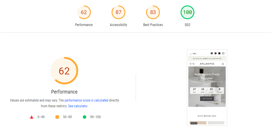
Overall, the mobile version’s performance score is only at 62. Not impressive at all but also not poor.
Desktop speed test results

Where the demo store shines in the PageSpeed Insights speed test is on its desktop version. It passes all six (6) of the parameters with flying collars and a lot more to spare. Where it shines most is on the FID which yielded a 3 millisecond result. This means that the website has an instantaneous response to user interactions on its pages.
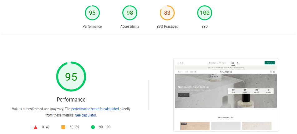
The performance score of 95 sums it all up. Truly impressive for a demo store.
PageSpeed Test 2: Real Shopify Store (Casa Febus)
Now, let’s take an actual Shopify store that uses the Atlantic theme. We will put it to the test to see if the theme fares well in real-world use.
Our choice of store for this example is Casa Febus.
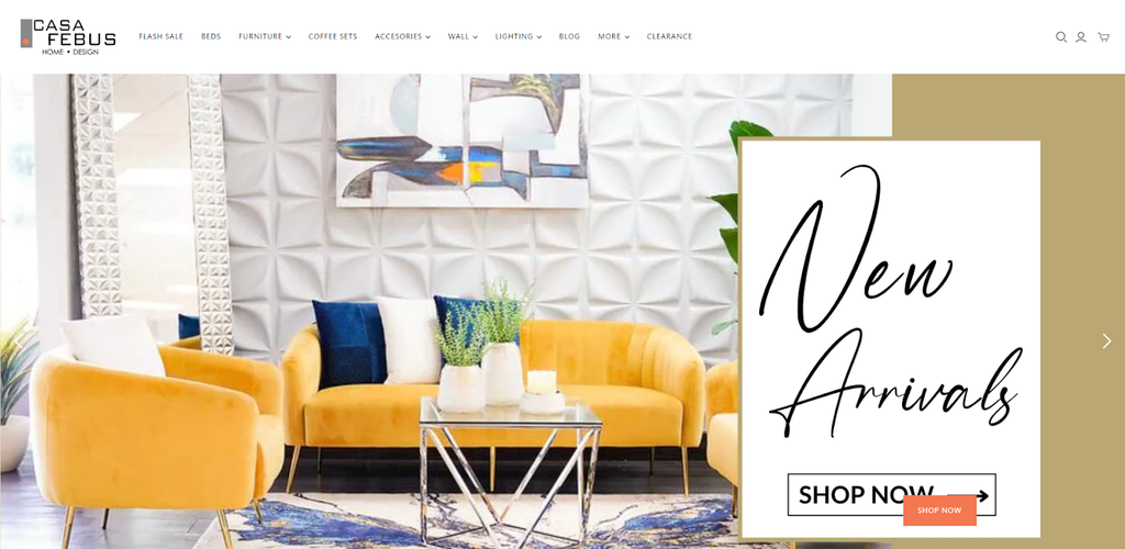
Casa Febus is an ecommerce store specializing in home furniture and decor. They have a huge inventory in their online store ranging from beds, tables, coffee sets, vases, lights, and everything in between. Additionally, they have an online store dedicated for their customers in the US and Puerto Rico.
Let us take a look at how it performed on the speed test.
Mobile speed test results

Casa Febus passed the FID, INP, and CLS test, with the latter experiencing a 0.07 points lower than acceptable parameter. However, it is evident that it performed poorly on LCP, FCP, and TTFB.
The ecommerce website is 1.4 seconds slower in LCP meaning that the main content is slow to load. It is 1.5 seconds slower in FCP which means that it is slow in displaying any type of content on the user’s screen. Lastly, it is also 1.5 seconds slower than acceptable TTFB parameters, which means that the server takes an extra 1.5 seconds to respond to user interactions.
As mentioned above, 32% of users abandon the website for every second of delay that they experience. In today’s mobile-first internet, Casa Febus is missing out on a lot of conversion opportunities because of their mobile website’s poor performance.
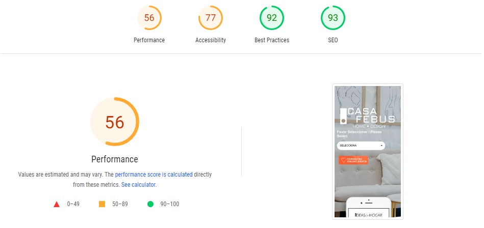
Overall, their mobile website scored 56 points in performance.
Desktop speed test results
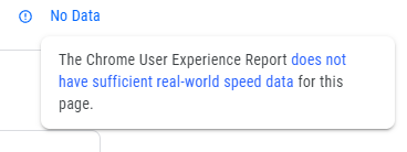
PageSpeed Insights failed to gather real-world speed data for the desktop website of Casa Febus. However, it still managed to provide a performance score down below.
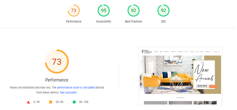
It was able to yield a performance score of 73 which is on the good side. A huge leap compared to its mobile version.
We tried browsing their website to see if there is a noticeable difference compared to the browsing experience using a mobile phone.
Clicking on different menu items, the website changes its pages in a snap but it takes a little while (less than a second) to load up the images.
With everything considered, the desktop version is significantly better than the mobile version.
Note: PageSpeed Insights follows the Lighthouse Performance Scoring where the parameters do not carry the same impact on the overall score.
Speed Test Takeaway: Shopify Atlantic Theme Needs Improvement In The Speed Department
The speed test results of Shopify Atlantic Theme were truly underwhelming. In the ecommerce industry where page load speed could make or break the business, truth be told that Atlantic falls short in this department.
But this does not mean that the Atlantic theme should be avoided at all cost.
This only means that right out of the box, it needs a little tweaking in its codes. Apps like Flash: Page Speed Optimizer can be used to remove unused JavaScript codes in order to lighten up the website. However, this entails additional costs.
User Reviews
Let us now look at how entrepreneurs using the Shopify Atlantic theme feel about their choice for their online store.
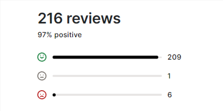
Despite getting an unimpressive score in our speed test, 97% of 216 reviewers were happy with their purchase. This goes to show that actual user experience trumps algorithmic tests when it comes to user satisfaction.
What do these happy customers have to say about the theme?
- Hoist & Halyard highly recommends the Shopify Atlantic theme. The theme did everything they expected it to do and they are also very delighted by the ability of the support team to solve difficult problems.

- Lior Tac has been using Atlantic for two years now without any complaint. They are incredibly satisfied with the support team’s reliability.

- Peggy Porschen Cakes Lts has been using this theme for five years now and just like every review, they talk highly of Pixel Union’s quality of service. The clean look of the Atlantic works well for them, too.

- Aldo Sohm is pleased with the styling of the theme and very satisfied with the customer support team.

- Saratoga Tea & Honey, Co. were also impressed with the clean UX design and very satisfied with the responsive customer service.

We dug deep into their customer feedback and looked for the reviews of dissatisfied customers.
The oldest negative review we found dates back to 2014:
- The Garden Tool Company had an issue that wasn’t resolved.

- SULUO feels that the Shopify Atlantic theme is similar to other free themes in Shopify. They weren’t pleased by the customizability of it.

- KAOHS had the same sentiment as SULUO when it comes to the customizability of the theme. They feel like the theme requires an understanding of Liquid to implement high-level changes.

- The newest negative review goes way back in 2021 which concerns the mobile responsiveness of the website. Pixel Union responded with a fix.

Takeaway: User Reviews
In choosing a Shopify theme, it is important to take into account the user reviews – both positive and negative. As you can see in Shopify Atlantic theme, the newest negative review dates back in 2021. Thereafter, there is nothing but positive praises regarding the design and customer service.
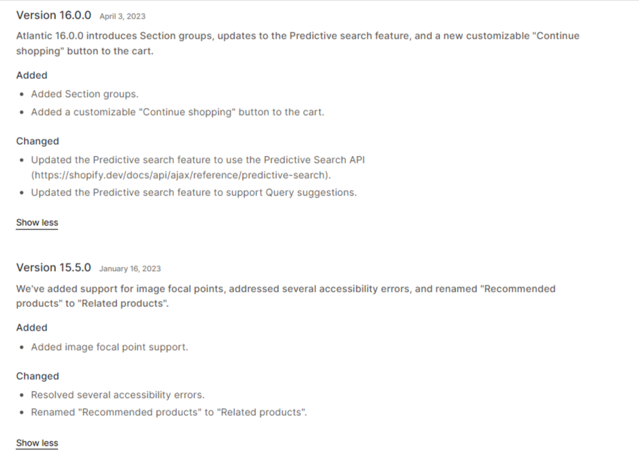
In addition to that, Pixel Union regularly updates the theme for better user experience. This year, the Shopify Atlantic theme has been updated twice – in January and April.
Thus, it is safe to say that their team is in continuous pursuit of improving the theme.
Atlantic Theme Highlights
Here are the features of the Atlantic Shopify theme that makes it standout:
01. Modular Style Homepage

A modular style homepage allows web designers to add sections in a homepage and add further elements within the section. Such as an image and a story (text) on the side or a video section with a signup section on the other side. You can also add featured products that link straight to your collection pages.
02. Customizable Header & Mega Menu
Since the Atlantic Shopify theme is built for business with large catalogs, it is just fitting that it has a customizable header and a mega menu. A customizable header like multi column menus and mega menu are an important element in an ecommerce store with large SKUs to enable customers to easily navigate the website right off the bat.
This enables your customers to browse collections with a single click from the homepage. Or they can jump straight to a certain product via the mega menu – also with just a click from the home page.
03. Blog Posts

The Shopify Atlantic theme enables users to write blog posts on their website. In a competitive ecommerce space, establishing authority is the name of the game. Blog posts are great at establishing brand awareness and expertise, as well as organically growing your monthly visitors by taking advantage of search engine optimization or SEO.
In the example above, Notizie used the blog section as a canvas to journalize their business.
04. Quick Buy

With the Atlantic theme, you can enable customers to buy your products directly from your homepage. By adding your fast-moving products in your homepage and enabling the quick-buy function, customers don’t have to search your entire collection.
05. Slide-Out Cart

If your customers are on an online shopping spree on your website, the last thing you want to do is to take them away from your product pages. Taking them to a check-out page every time they add a product to the cart could be annoying.
With a slide-out cart, customers can add as many products as they want in the cart and check all their purchases in a click of a button. This makes it easier for them to make fast purchases.
06. Enhanced Search

If you have a large collection in your store, customers have a tendency to get lost navigating your website. This might make them think that you don’t have what they are looking for – which leads to them leaving your website or worse, abandoning their cart.
With enhanced search, you give your customers the power to find what they have in mind. With Atantic’s enhanced search, products and prices are displayed while you type.
Our Take: The Good and the Bad
After careful analysis of the theme by conducting speed tests and experiencing it ourselves, here’s what we honestly think about the Shopify Atlantic theme:
Pros:
- The Atlantic Shopify theme is a great theme in terms of visual design that is worth considering for those looking for a minimalistic ecommerce design.
- The option to add blog posts is a welcome addition to the theme which can help establish thought leadership and brand authority.
- Atlantic enables users to add checkout cart sections in the homepage which can help increase conversion if high-demand products are displayed. Additionally, the mega menu makes navigating the theme relatively easier.
Cons:
- Since it is built for large catalogs, customers can easily get lost in the website when browsing for multiple products. A slide-out cart or a cart drawer would have been helpful in keeping customers on track of their purchases. Unfortunately, the Atlantic does not have it.
- The lack of tag filtering seems to counteract the theme’s design for large SKUs. Tags help customers easily find items with similar tags with a simple search within the website.
- The Atlantic theme lacks swatches which enables customers to choose sizes or different variations from the product page.
Should You Purchase Atlantic?
The Shopify Atlantic theme could have been perfect if not for a few missing functions that contribute a lot to an ecommerce store's goal – sales conversion.
With that said, before purchasing the Atlantic theme, you should consider looking at other alternatives within that price range:
More Stores Using The Atlantic Shopify Theme
If you want to see how other entrepreneurs make use of the Atlantic theme in their ecommerce stores, here are some examples. Check out their websites and the store pages to have a better feel of it.
01. Lior Tac
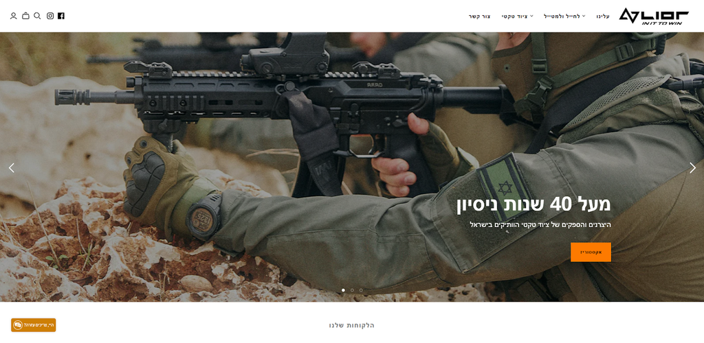
Lior Tac sells tactical gears such as suits, gloves, and other survival tools such as ropes and multi-use pliers. Truth be told, seeing an ecommerce store that caters to action-loving customers is the last thing you’ll expect using the minimalist Atlantic theme. But they made it work.
02. Moonlistic
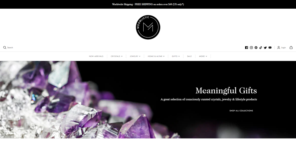
Moonlistic sells jewelry and other items such as candles, pendulums, incense, and more. They also sell different kinds of crystals like black obsidian, rose quartz, and selenite.
03. Saratoga Tea & Honey
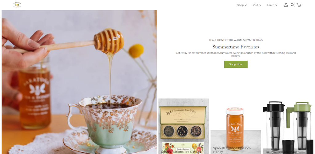
Saratoga Tea & Honey sells fresh honey and different kinds of teas. To complement these, they also sell other products such as tea infusers.
04. Penney & Company
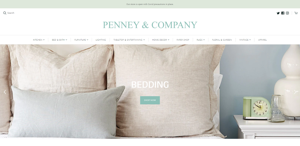
Penney & Company is an ecommerce store that sells bedroom and dining furniture. Additionally, they have lined, tableware, vases, and rugs.
05. Aldo Sohm
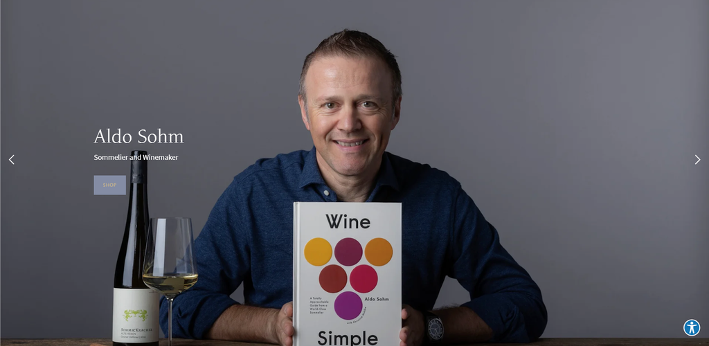
Aldo Sohm is a sommelier and winemaker. On his website, he sells high-quality wine glasses for every occassion. He also sells wine bottle openers, decanters, and books about wines.
The Verdict: Is Shopify Atlantic Theme For You?
The Atlantic Shopify theme is for you if you are looking for a simplistic theme for your ecommerce store. However, it is hard to recommend it to ecommerce stores with large catalogs because of the aforementioned missing functions.
Shortlist it for now and check out the other alternatives that we provided. Since it commands a hefty price of $280, it is important that you do not rush in choosing it yet. Read its complete list of features and compare it with other themes to see which one is best for you.
Explore more Shopify Theme Reviews:


