Setting up a Shopify store is nerve-wracking. Just hold on, you’re still in good hands with us! Let’s begin the ecommerce journey by going through the ultimate basic lesson of all time: Landing Page vs Website. At the end, you should be able to see which one is more suitable for your store at present and how you can apply to help your business “blooming".
Please be noted that throughout this article, Landing Page and Website will only be demonstrated in the context of running a business with Shopify.
I. Landing Page vs Website: Key Differences
No more wasting time. Hereby, we get straight to the point and help you clarify the core difference you need to remember between Landing Page vs Website.
| Name | Landing Page | Website |
| Definition | A type of web page | A set of web pages |
| Purpose | Created for a unique marketing plan with a specific outcome | Show your store and express the brand without limit. |
| Duration | Short-term campaign asset | Long-term brand asset |
| Specification |
|
|
Landing Page is a type of web page, standing alone and being used in many stages of customer journey. It has long been known as a powerful tool in boosting conversion rate thanks to its focused design and content. Therefore, when working on Landing Page, you must be very selective in which and how information will be shown to avoid distraction, making it easier to take actions.
On the other hand, consider Website as the digital version of a “brick and mortar" store where visitors can wander around, get to know the details of everything and make purchasing decisions as they wish. To fulfill that complicated customer flow, Website must contain several web pages to deliver different values - which will be discussed later on.
Wait, is Landing Page a single page Website?
Visually Yes. All content is demonstrated into one page only and works just fine as a single page Website.
Technically No. Always remember the most unique thing about Landing Page is how focused the content is and the goal is very specific. Whereas a single page Website can include from A to Z things about your store.
To prevent mistakes in utilization, we believe it's better to differentiate clearly 2 terms: Landing Page vs Website.
Do Shopify merchants always need to build a Website?
When referring to Website as “a full-stack online store” that enables selling products, the answer is No.
Shopify is a commerce platform for both online & offline merchants. Whatever sales channels you have, either a physical or Facebook/Instagram shop, you still can work with Shopify to grow your business. Make sure you understand about Shopify and their features HERE.
However, Website can serve more than a place to sell.
It can be an online space for guests to research products before buying them; get to know, communicate and engage with brands leading to more sustainable relationships; etc. Therefore, we highly recommend you make use of Shopify hosted online stores to build web pages.
Learn more: Tools & Apps To Build A Great Sales Funnel For Your Online Store
II. A Better Understanding Of Landing Page
Create High Converting Mobile Landing Page With These 7 Tips (6 Examples Included)
01. Perfect Timing for a Landing Page
Landing Page is a strong marketing asset, yet requires a huge amount of time and effort to make full use. The next question is when should you start building one?
Launch a promotional campaign
Marketing campaigns are strategic efforts that focus on a specific goal, with one triggering object, aiming at a group of customers.
- Specific goals are what your business wants to achieve/improve. They can be raising awareness, encouraging trials or giving a motivation to purchase orders.
- Triggering objects are what makes people feel hooked. They can be the newest products, free-ship codes or sale-off discounts.
- Targeted audience varies tremendously. It might be a vast segment such as all men and/or women in the US. Or very niche like this profile for example: 16 - 20 years old, Gen Z young girls, using Tik Tok on a daily basis, having interest in natural make-up.
Take a look at Shopify Landing Page.

Shopify 14-days Free Trial Landing Page
You may notice immediately that their goal is encouraging visitors to start building stores just by entering emails. The triggering object is a 14-days Free Trial offer, accompanied by some key features of Shopify for more convincing value delivery. Target audience is anyone who is looking for a commerce solution and has never used Shopify before.
During a campaign, Landing Page is often a must-have to minimize distraction. It helps separate your campaign from other sources of information to assure effectiveness as well as track the end result without too many variables.
Have more than one product, traffic source or customer segment
In case there is no campaign, Landing Page is also an ideal option for businesses with:
- More than one SKU (Stock Keeping Unit). Especially if there is hardly any relevance among these products. A Landing Page will better illustrate their specifications, explain in more details to people who really care about them.
- More than one customer segment. Especially if the difference is difficult to resolve on the same page. For example, country languages or local cultures.
- More than one traffic source. Once ads reach customers and they click onto it, the display should match their taste when using the channel. For instance, Instagram lovers will prefer a rich-image and well-organized page to full-text ones.
Related article: Get The Best Shopify Discount Code In 2022
02. 8 Most Popular Types of Landing Page
2.1. Squeeze Page
Squeeze Page is a type of landing pages with such a piece of persuasive content that customers are willing to provide us with their email addresses. These data will later be used, especially in lead nurturing, turning them into end users.

Squeeze Landing Page by Neil Patel
Yet email is one of the most personal things people won't spill it out easily. What makes Squeeze Page content so appealing?
The answer lies in what value you can bring to customers in exchange for their interest in subscriptions. The most common format of Squeeze Page is gated content or a prompt to enter an email address to receive:
- Ebooks
- Templates
- Recipes
- Design package
- Courses
- Discount codes
- etc.
Therefore, be certain to introduce the incentive straightforward, include an enticing Call To Action enough to collect their email address. Don't forget to care for the browsing flow, make it simple for people to exit the page and return to the information that drew them to your website.
2.2. Splash Page
Just like the name of it, Splash Page comes and goes in a “splash".

Splash Page by Variety
It doesn’t really serve the main business goal. Simply, some marketers use it as a transit when customers click onto a campaign link. Instead of sending visitors directly to the destination, we let them visit an intermediary page.
The content may vary to suit the campaign. Such as asking for preferred languages, making an up-to-date announcement, giving a small head-up or clarifying privacy policy before proceeding.
2.3. Lead Capture Page
A lead capture page is similar to a squeeze page, but it typically gathers more data.

Lead Capture Page by Hubspot
This time, you and your campaign need to collect information, including but not limited to:
- Name
- Company
- Email address
- Job title
- Working industry
- etc.
The information you require is determined by the goals of your sales and marketing teams, as well as the customer's position in the funnel. One important reminder: stay away from the eight-lined form if your lead capture page is at the top of the funnel. It will just make them have a bad impression that your brand is so needy.
On the other hand, if your customer arrives at your lead capture pages after displaying genuine interest in your product/service (for example: successfully downloading ebooks), you should be able to request further information to assist, qualify and steer them.
2.4. Long-form Page
Time is precious. If given several web pages, customers might just quickly read between the lines and skip the most important points.


Long-form Landing Page by Grammarly
Long-form Page is a type of landing pages that focuses on sales by giving a much more concise brief of your product and brand. It helps fasten the purchasing process, reduce the exploration time and avoid customers’ frustration caused by confronting too much information.
To craft the best Long-form Page as possible, pay attention to what customers are thinking rather than what you want to show. You can start by answering these questions:
- Who are targeted audiences? (Pain Points/Demand)
- Why choose your brand/product? (Key Features/Unique Selling Point)
- Who has benefited from this? (Testimonials)
- When is the due date? (Sense of Urgency)
- What are frequently asked questions? (Solutions to Barriers)
- etc.
It seems to lack minimalism right? Calm down, it's still a Landing Page of which goal is to close the deal. You do it basically by simplifying the customer journey, tackling the right issues at the moment.
Learn more: How To Build A High Converting Sales Page (+ Templates)
2.5. Click-through Page
Every marketer understands that before asking a customer for money, you must first deliver value. Click-through pages give your customer that benefit without bombarding them with a "Buy Now" Call-to-action before they're ready.
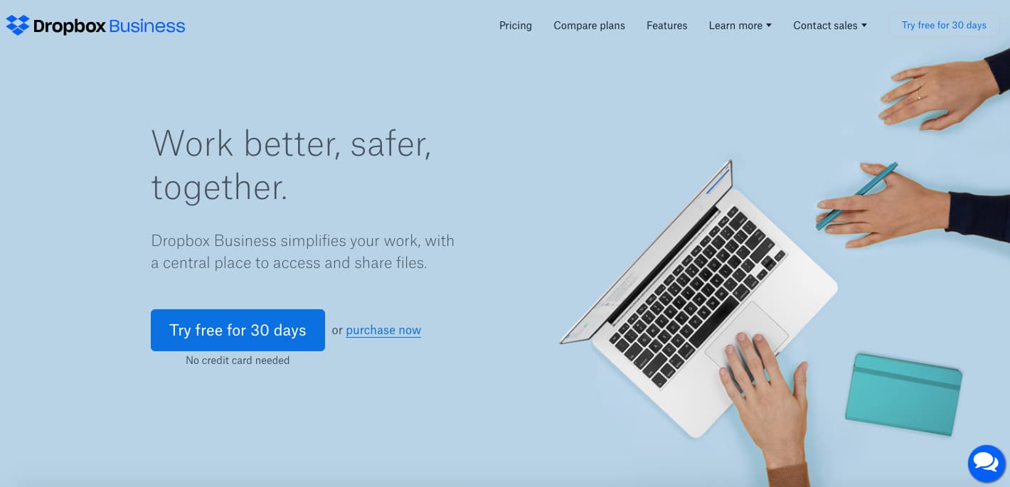

Click-through Landing Page by Dropbox
A landing page that presents the benefits and features of your product/service, together with calls to action inviting your customer to join a free trial, is a common example. When users click that button, they're brought to another page with pricing and payment information needed to start the trial.
However, by the time your customer reaches this page, they've been primed and informed on why they should continue with the trial. The click-through landing page is seen below, followed by the payment landing page, which clients are directed to when they sign up for a free trial.
2.5. Thank-you Page
A “Thank You” page, all too frequently, serves no meaningful purpose. It informs what customers already know like "You've successfully placed an order".

Thank you Page by Hubspot
However, don’t waste this chance to give them an “Aha!” moment. Include additional offers or prizes or simply send them some lovely personalized message. You have added values to a highly driven, already interested consumer, making it more likely that they will come back next time.
2.7. Coming-soon Page
Are you about to launch an exciting new product but aren't ready to unveil the entire offer — or the unfinished landing page? Instead, create a basic "Coming Soon" page.

Coming-soon Page by MiEvent
Tease your offer, include a launch date if one is available, and include a CTA that asks for their email information in exchange for an email reminder whenever your product or service is available.
III. Landing Page To-do Checklist
Pick the right one
No one can succeed without a clear objective. You might have heard it a million times but it is still true. Define your campaign goal and why you need a Landing Page. It would be silly to invest time building a Thank-you page if you want to convert more leads right?
Define the page flow
You can break up your page into pieces, but keep it to one page. Another reminder, most visitors won't read all the way to the bottom of a landing page, don't forget to keep crucial content above the fold, such as your CTA.
Prepare your page assets
Preparation always makes a good start. Even if it's just a Landing Page, less complicated than a whole Website, the amount of data/information may surprise you. Check the source, make sure everything is up to date and best fit the page goal.
Make an irresistible copy
Your landing page is all about your target audience, not about you. Instead of merely stating what the offering is, concentrate on how it will help them.
At the top of the page, use a striking headline. Visitors should be able to comprehend what you're giving in seconds, why it's beneficial to them, and how to join up.
More importantly, choose a CTA wisely that is brief, direct and action-oriented. This is a tough competition, where you must be a strict judge of every single word, image, etc to figure out what works best for your Landing Page.
Design a powerful visual
Use attractive and memorable visual components like photographs and video to capture your audience's attention.
Although smart graphics are important for a successful landing page, avoid cramming too many photos, phrases, boxes, buttons, symbols, clip art, movies, and other elements onto the page. To make your material easier to read and digest, leave lots of breathing area around the pieces on your page.
Don’t forget to add social share buttons to encourage visitors to spread the word. When others share your page on their own social media feeds, you get even more exposure.
Pay attention to human touch
Imagine customers are your dinner guests, how would you treat them? A warm greeting, a thoughtful question about their preference and a sincere gratitude for their presence, … will definitely make their day.
The same goes for your store Landing Page. In the end, we are all human looking for a real connection.
Testing again and again
It's very rare that anyone can succeed in one shot. With Landing Page, you can create many versions of it, whether different content/design or customer segments. Don't hesitate to try, to fail and start all over again. Practice makes perfect, you know that!
III. A Better Understanding Of Website
01. The Perks of Having a Store Website
If you are selling with Shopify, offline or/and online, having an online presence will definitely give your business huge advantages.
Fully digitalized shopping experience
The “You-Know-Who” pandemic has forever changed the world market landscape as well as consumer behaviors. It’s a true fact that no one can ignore, from local business owners to multinational companies.
Therefore, it’s not sustainable to consider a Store Website as a temporary solution. In the long run, Website is a must for consumers, no matter how they purchase your product with a laptop or at a mall. Digital customer experience has become part of your daily tasks. Start on building a Store Website as soon as possible, invest time and effort and never stop updating about it, you will give yourself a great kickstart.
Unlimited ways to show your brand
We have just learnt that Landing Page’s strength lies in how focused it is, with ultimate minimalism for the best attention span.
Whereas Store Website outweighs everything else in its ability to be diverse and abundant with no limit in creativity. It helps you showcase your product/service, express the brand and give customers an one-of-a-kind impression. Moreover, having a good Website certainly proves your business legitimate credibility.
Better tracking and conversion rate
Problems are caused by lack of insights and solved by choosing the exact insight.
Wasteful execution plans are triggered by assumptions and solved by utilizing the data wisely.
By creating a fully digitalized shopping experience, you are able to cover from top to end of the customer journey, track what happens in each stage and come up with solutions on time.
02. The Basic Structure of a Store Website
To help you better visualize, hereby we proudly present Store Website built by PageFly customers as examples.
2.1. Home Page
A home page (or homepage) is the main web page of a website. It is an important tool and frequently acts as the first impression to potential customers.

Homepage by Nitori
What makes an excellent homepage?
- Define Your Purpose
First and foremost, you must be clear about who you are and what value your company offers. This information must be communicated clearly and quickly so that visitors can be confident that they are in the correct location within seconds.
- Communicate to Your Potential Customers
It's not enough to portray your company in the best light. Visitors must be engaged, and you must assist them in understanding your beliefs, mission, and unique selling points.
- Superb User Experience
User experience (UX) is critical in online design for attracting and impressing visitors, lowering bounce rates, and increasing return visits. The user experience is improved when websites are clear and easy to read and browse, and potential buyers will correlate this with the items or services supplied.
- Changing on a regular basis
Your website must be updated, that’s an important reminder. As a result, your homepage can be directly responsive to the changing problems, needs, and queries of your target audience.
What Is The Key Difference Between Homepage and Landing Page?
Homepages often focus on building trust and telling shoppers who you are and what you do, while landing pages emphasizes on conversion or user acquisition.
2.2. Product Page
A product page is a web page that assists clients in making purchasing decisions. It provides a variety of specifications and features to answer inquiries, provide reviews, compare products and make the purchasing process easier.


Collection & Product Detail Page by Engel Coolers
How can you optimize the product page?
- Produce professional-looking product photography.
- Add rotational, detailed or zooming views.
- Show product recommendations that are related.
- Using virtual reality or 360-degree images to simulate a virtual try-on.
- Include detailed instructions for using your product.
- Give real and authentic testimonials from your customers.
2.3. Blog/News Page
Originally, blogs used to be a hub for people to share information such as opinion, journal or knowledge. Nowadays, businesses make use of Blog Pages as part of their website to implement Inbound Marketing. So can you!

Blog (Recipes) Page by Lyfe Fuel
Why is it highly recommended to post blogs regularly?
- To improve your company's search engine ranking.
- To become an industry expert by sharing information on a specific issue.
- To bring people to your site and convert them into leads.
- To build an online community and interact with a target audience.
2.4. About Us Page
Last but not least, we have About Us Page or sometimes people call it Brand Story Page.


About Us Page by Workout Meals
The major goal of your site's About Us Page is to present information about the company and what it can provide. Beyond the essentials such as vision, mission, services, it’s an opportunity for you to connect with viewers through inspiring content, bringing your brand to life.
Therefore, when crafting About Us Page, don’t feel too pressured about any optimization thing. Care for the feeling, the voice and the true story.
03. Shopify Store Website To-do Checklist
Learn The Essential: How to Start an Online Store with Shopify
If you are a complete starter, be patient with yourself and slowly get familiar with the Shopify platform first. From setting up an account to creating products/collections. And then move on to build your online store.
If you have already played with everything, check up again. Since Shopify Unite 2021, there are a lot of interesting things to update.
Level Up Your Store Design: Page Builder Suggestions
A Shopify page builder app is a third party plugin that helps you to design new web pages for your store. These apps have more features than Shopify's default page builder and are less constricted than the platform's pre-built themes.
Learn more about PageFly and other page builder apps on Shopify HERE.
The More The Merrier: Extra App Recommendations
Shopify is not just a platform to build online stores. There is a universe of apps which are free and paid ecommerce plugins to grow business and improve Marketing, Sales and Social Media Strategy.
Conclusion
Whew, that was a long ride!
In general, most businesses these days have both Landing Page and Website, for both short-term and long-term plans. Nevertheless, in the future, the question about Landing Page vs Website will still be a tricky one for Shopify merchants. In that case, slowly get back to the basics and ask yourself what needs prioritizing at the moment.
Are you running a marketing campaign and having a specific business goal? Or are you trying to build the foundation of your business? We hope that you have the answer and are ready to get things done today!



![14 Profitable Small Food Business Ideas for 2025 [Real Numbers]](http://pagefly.io/cdn/shop/articles/1_58b587d2-13db-4aa6-8c19-e40f5c88d3eb.jpg?v=1758255771&width=4460)
![Art Business Names: 350+ Ideas + Free Generator [2025 Updated]](http://pagefly.io/cdn/shop/articles/art_business_name_e94a54e9-d325-4ba3-94ab-7b4297952312.png?v=1760062968&width=1640)
