

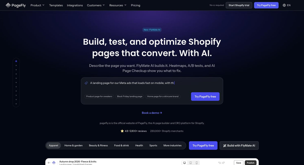
I'm not a developer, and I'm not a designer. On September 21, 2026, I started rebuilding the pagefly.io homepage with Claude. The new page went live on September 22, on the same URL, with three times more internal links than the old one.
This is the full workflow, with the numbers and the mistakes. If you run a Shopify store or build pages for clients, you can reuse most of it.
Updated October 14, 2026: after I shared this on LinkedIn, two experienced web people in the UK ran their own checks on the live homepage. Both found real problems my workflow had missed, one on accessibility and one on cookie consent. What they caught, what we fixed, and the rules we added to the spec are below.
TL;DR
- The flow: Claude audits the old page and writes a spec. Claude Design turns the spec into a layout. Claude builds the real page in PageFly through the PageFly connector for Claude. I review and publish.
- The time: two working days, from the first audit on September 21 to a live page on September 22.
- The result: 13 sections became 10. Word count dropped from 2,396 to 1,635. Page weight dropped from 620 KB to 410 KB. Body internal links went from 11 to 33, all returning 200.
- The SEO guardrails: same URL, every old link audited, the old page kept as an unpublished rollback, structured data and a new meta description added the same day.
- The rule we kept: AI drafts and builds. A person decides and clicks Publish.
- The update: the page passed our SEO checks but failed on accessibility and cookie consent, because neither was in the spec. Both are fixed, and both are now spec lines with a check before publish.
On this page
- Why our homepage needed a rebuild
- The workflow: from spec to live Shopify page
- Before vs after: what changed on pagefly.io
- How we protected SEO link value
- What I'd do differently: 8 traps we hit
- What readers caught after launch
- How to try this on your own Shopify store
- Build your next page with Claude and PageFly
Why our homepage needed a rebuild
PageFly today is an AI Page Builder with CRO tools built in. Our homepage still told the older drag-and-drop story.
Claude's audit of the live page, measured on September 21, found the gaps fast:
- 13 sections and 2,396 words. Too long for a five-second read.
- Zero body links to our 7 newer feature pages. Pages like heatmaps and AI Page Checkup got no link value from our strongest page.
- A 56-image template carousel that repeated the same 4 templates.
- Inconsistent proof. One section said 5,000+ reviews, the hero said 5,600+.
- One leftover lorem ipsum paragraph.
None of this was visible at a glance. All of it showed up once an AI read every section and every link.
The workflow: from spec to live Shopify page
We split the job into five steps. Each step had one owner and one output file.
Step 1. Claude audits the old page and writes the spec
I asked Claude, running as an agent in Claude Cowork, to audit the homepage. It read all 13 sections, checked 128 links pointing to 99 unique URLs, and confirmed the 44 internal links all returned 200.
The output was a written spec in a shared doc: an audit of every section, a link map of about 34 internal links to keep or add, around 40 reusable images already on our CDN, and a 9-section outline. I left comments on the doc. Claude revised it to 10 sections and moved customer proof up to section 3.
Step 2. The spec becomes a Claude Design prompt
Next, Claude turned the approved spec into one prompt for Claude Design. The prompt fixed the rules before any pixel moved:
- 10 sections, in order, each with a job ("Hero", "Proof", "CRO funnel built in"...).
- Hard word caps per slot. H1 up to 11 words, section H2 up to 9, CTA up to 3, whole page up to 1,600 words.
- Only real images. 40 CDN image URLs, each checked live. No placeholders, no invented screenshots.
- Our design tokens. Two background colors, one type scale, one content width of 1,200 px.
- Every link written out, so nothing from the SEO audit got lost in design.
Step 3. I fine-tune in Claude Design
This was my part. I reviewed the layout and made the calls the AI shouldn't make: which CTA to use, where the family app slot goes, which proof points go first.
Before the build, Claude ran a voice audit on the design file against our tone-of-voice rules. It flagged 6 red issues, including a review count that didn't match our App Store listing, a missing "(Beta)" label, three lines that suggested AI replaces people or publishes on its own, and a customer logo we hadn't cleared permission for. The fixes went back into Claude Design as a prompt, before anything was built.
Step 4. Claude builds the page through the PageFly connector
With the design approved, Claude built the page inside PageFly using the connector. It created a new, unpublished page, then added the 10 sections one by one. Headings, text, buttons and images went in as native PageFly elements, so they stay editable and testable later. Only the animated demo pieces went in as custom HTML.
Claude then opened a preview, measured the layout, and fixed what didn't match. I reviewed the same preview and sent two rounds of feedback.
Step 5. A person publishes
The connector creates a regular page. Setting it as the homepage and pressing Publish happened in the PageFly app, by me. The old homepage was renamed and kept unpublished, so we can roll back quickly if we need to.
Before vs after: what changed on pagefly.io
| Metric | Old homepage | New homepage (live Sept 22, 2026) |
|---|---|---|
| Sections | 13 | 10 |
| Words | 2,396 | 1,635 |
| Page weight | 620 KB | 410 KB |
| Internal links in the page body | 11 | 33 at launch, all returning 200 |
| Links to the 7 feature pages | 0 | All 7 |
| Structured data (JSON-LD) | none | Organization + SoftwareApplication |
| Leftover "lorem ipsum" | 1 | 0 |
| Time from audit to live | n/a | 2 working days |
The new homepage is 34% lighter and carries three times more internal links in the body, measured on the live page on September 22, 2026.
How we protected SEO link value
A homepage is the page with the most link equity on most stores. Losing it in a redesign is the real risk, not the design.
Here's what kept it safe:
- Same URL. We built a new page and assigned it as the homepage. Nothing to redirect.
- A link map before the design. The spec listed every internal link to keep. The design prompt carried the full list.
- A live check after launch. Claude re-crawled the live page and found one loss: the redesigned "page types" section had dropped links to 5 use-case pages and our free CRO resources. Claude added them back as a "CRO guides" row the same afternoon.
- Structured data and meta. Claude added Organization and SoftwareApplication JSON-LD, and a new 147-character meta description.
What I'd do differently: 8 traps we hit
These are the real mistakes, in the order I'd guard against them next time.
1. Review the design at your visitors' screen sizes
Claude Design gave us a 1,440 px canvas. In a GA4 sample of about 99,000 pagefly.io users, that width fit only about 25% of desktop visitors. The most common screen was 1920×1080, at 38.5% of human desktop traffic. Check at 1920, 1536, 1366 and 390 px before you sign off.
2. Don't call it done until the build matches the design
Claude's first report said "desktop pass". It had checked colors, fonts and spacing tokens. It hadn't compared the page to the design picture. I found five visual mismatches in preview: the hero wasn't centered, blog images cropped their text, card titles wrapped to two lines, videos didn't open, and a button row touched the mockup. The fix: compare each section to the design, one measurement at a time.
3. Centering and image ratios get lost between tools
Max-width and auto margins from the design were dropped on containers, so blocks stretched to full width. Images were forced into a 16:9 crop, which cut the text on our blog thumbnails. We set fixed widths and "contain" sizing instead.
4. Write card titles for the real column, not the canvas
"Password & coming soon" fit on the canvas and wrapped in a 5-column grid. The one-line rule we now use: about 15 characters for a 22 px title in a 5-column row. It became "Launch pages".
5. Keep edits small
Rewriting a whole 65 KB section by hand dropped digits in icon code, which broke icons. Small, targeted edits keep element IDs and don't break what already works. We now keep custom HTML blocks under 2,000 characters so they can be edited in place.
6. Watch encoding details
An encoded "&" inside custom code showed up on the page as the word "undefined". SVG icons that referenced a shared sprite came out blank. Plain "&" and inline icons fixed both.
7. Re-check spacing after every full-section update
After replacing a whole section, gaps between blocks sometimes reset to 0. Text-style link buttons also came in with 12 px by 24 px of padding we didn't ask for. After every full update, we now scan the page for both.
8. Carry over what the old page did
The design showed play buttons. The old page opened each video in a pop-up. That behavior wasn't in the design, so it wasn't in the first build. Before you rebuild, list every click interaction on the live page.
What readers caught after launch
The 8 traps above came from the build. The next four came from readers. About a week after launch, two web professionals in the UK ran their own tools on the live homepage and posted what they found in the comments. Both were right.
My spec covered sections, words, images and every link. It said nothing about accessibility or privacy. So Claude didn't build for them, and Claude's checks didn't test for them. The AI did exactly what the spec asked. The spec was the gap.
9. Make accessibility a spec line, not a cleanup job
The first reader ran an accessibility checker and posted the result. We re-ran it with axe and Lighthouse. The problems were real:
- The viewport tag blocked zoom on mobile.
- The page had no main landmark, and no doctype, so browsers rendered it in quirks mode.
- Footer social icons and some menu links had no accessible name. A screen reader just says "link".
- Menu icons on every page carried the alt text "Custom SVG", which describes nothing.
- A few labels in the hero mockup were too light to read against their background.
Most of these lived in the theme, not in the new page. The rebuild inherited them, and our audit never looked. After the fixes, Lighthouse accessibility on desktop went from 82 to 96.
The spec line we added: zoom stays on, one main landmark, every link and button has a name, every image has a real alt text (or an empty one if it's decorative), and text contrast is at least 4.5:1, the WCAG 2.2 AA level. Then run axe or Lighthouse on the preview before you publish, the same way you check links.
10. Check what loads before a visitor says yes
The second reader looked at privacy. From a server in Europe, before anyone clicked anything, our analytics, ad and session-recording tags were already loading and setting cookies. The cookie banner had Accept and Manage, but no Reject. The page asked for the visitor's location on load. Fonts came straight from Google's servers.
We confirmed all of it with Webbkoll, run from a server in Sweden. Then we changed it:
- Nothing that tracks loads for visitors in the EU, UK and Switzerland until they accept.
- A Reject all button, the same size and weight as Accept.
- No location prompt.
- Fonts are self-hosted, or served from a privacy-focused font CDN in the EU.
- Shopify's own customer privacy setting now follows our banner, so Shopify's cookies wait too.
The same Webbkoll check now shows 6 essential first-party cookies before consent, down from 17, and no trackers.
11. A site-wide fix needs a site-wide test
Our first consent fix went into the theme's main layout. Some pages use a different layout file, so they never got the new consent code, and on those pages analytics and live chat stopped working. Nobody noticed for more than a week, because the homepage looked fine. Before you ship a theme-level change, list every layout and template your pages use, and test one live page of each.
12. Decide the measurement cost of privacy on purpose
Once tracking waits for consent, visitors who don't accept don't show up in your analytics. Our website numbers for Europe dropped sharply right after the change, and most of that drop was measurement, not visitors leaving. We kept the strict setup and now read European demand from Shopify App Store installs by country. If you sell in Europe, decide how you'll report on it before you turn consent on, not after the dashboard scares you.
Still on our list: the chat widget sets its own cookie on page load, and our privacy policy needs a rewrite to match what the site loads now.
The spec checklist, updated
| Spec line | Check on the preview, before Publish | Free tool |
|---|---|---|
| Keep every link | Re-crawl the page, every old link present and returning 200 | Claude, or any crawler |
| Real screen sizes | Compare to the design at 1920, 1536, 1366 and 390 px | Browser dev tools |
| Accessibility basics | Zoom on, main landmark, named links and buttons, alt text, 4.5:1 contrast | axe, Lighthouse |
| Consent first | Zero trackers and no third-party cookies before Accept, Reject as easy as Accept | Webbkoll from an EU server |
| Every template | One live page per layout or template after a theme change | Same checks, per template |
Thanks to both readers. They knew more about this than I did, and the site is better for everyone because they said so in public.
How to try this on your own Shopify store

Connect PageFly to Claude from its Claude Directory listing.
You don't need our internal agents to use the same pattern. Here's the short version:
- Install PageFly from the Shopify App Store.
- Connect PageFly to Claude from its Claude Directory listing. The setup guide walks you through it.
- Write the spec first. Sections, word caps, images you already own, the links you must keep, plus accessibility and consent rules.
- Ask Claude to build it as a new, unpublished page. It creates the page and adds sections (the connector's
create_pageandadd_sectiontools), then gives you a preview link (preview_page). - Review on real screen sizes, run an accessibility check and a cookie scan, then publish yourself.
Prefer to stay inside Shopify admin? FlyMate AI in PageFly's AI Page Builder builds a page from a text prompt, and you edit it in the visual editor. After launch, heatmaps, A/B testing and the CRO Center show you what to fix next. You can also start from one of our templates or see how merchants use PageFly in our case studies.
Build your next page with Claude and PageFly
PageFly is rated 4.9 stars from 5,895 reviews on the Shopify App Store, and it's in the top 3 results for "ai page builder" in App Store search (checked September 25, 2026). Install it, connect it to Claude, and start with one page you already want to improve.
Already have PageFly? Open the app and go to the AI Page Builder. Or see the AI Page Builder first.
Shopify Homepage Rebuild Claude FAQ
Yes, with the PageFly connector for Claude. Claude creates a page in your PageFly account, adds sections, and shares a preview link. You review it and decide when it goes live.
No. I'm not a developer. You do need to review the result carefully, on the screen sizes your visitors use.
It doesn't have to. Keep the same URL, map every internal link before you design, keep the old page as a rollback, and re-check links on the live page after launch.
We used Claude Design to turn a written spec into a visual layout we could review and adjust before anything was built in PageFly.
Only if you ask it to. We kept the page unpublished, reviewed the preview, and published it ourselves from the PageFly app.
Not automatically. The AI follows your spec and your theme. Add accessibility and consent rules to the spec, then run axe or Lighthouse and a cookie scan such as Webbkoll on the preview before you publish.