


Shopify cart page vs drawer vs mini cart: your cart is a checkpoint, not a destination. What /cart does natively, and how to edit it.
Baymard Institute puts the average documented cart abandonment rate at 70.22%, averaged across 50 separate studies (last updated 22 September 2025). Every merchant knows that number. Almost nobody knows which of their three cart surfaces is doing the damage.
Because you don't have one cart. You have a /cart page, probably a drawer, and possibly a mini cart in the header — and most stores never decided which one is real. Your cart is a checkpoint, not a destination. Its job is to confirm, reassure and move on. When it behaves like a destination — a page reload, a dead end, a place to sit and reconsider — it costs you orders.
/cartis a real theme template (templates/cart.json), not a Shopify-controlled page. You can edit it in the theme editor like any other page.- The drawer doesn't delete the cart page.
/cartstays reachable, indexable and linkable — abandoned-cart emails and ad links land there. Drawer, mini cart and slide cart are three names for two ideas: a panel that opens over the page, and a summary that hangs off the header icon. - Sticky add to cart is a mobile behaviour first — it's about the product page, not the cart, and it's the cheapest of the five fixes here.
- 40% of non-browsing abandonments are "extra costs too high" (Baymard). Shipping and tax clarity beats any cart redesign.
- Cart upsell moves AOV, not conversion rate. Judge it on revenue per session, never on add-to-cart count.
On this page:
- What is the Shopify cart page?
- Cart page vs drawer vs mini cart vs slide cart: the decision table
- What Shopify gives you natively on /cart
- How to edit the Shopify cart page, step by step
- Shopify cart drawer: when the panel wins
- Shopify mini cart: the header summary nobody designs
- Shopify slide cart: the same thing, sold by apps
- Sticky add to cart and the Shopify sticky cart on mobile
- Shopify cart upsell: what actually lifts AOV
- Test before you rip anything out
- Where PageFly fits on a cart project — and where it doesn't
- Shopify cart page FAQ
What is the Shopify cart page?
The Shopify cart page is the storefront page at /cart that lists everything a shopper has added, with quantities, line-item prices, a subtotal and a checkout button. In theme terms it is rendered by the cart template — templates/cart.json in an Online Store 2.0 theme — and it reads from the Liquid cart object (Shopify.dev).
That distinction matters more than it sounds. /cart is your template, not a Shopify-managed screen like checkout. You can add sections to it, reorder them and style them, exactly as you would a landing page.
The second thing merchants get wrong: turning on a drawer does not remove /cart. The URL still resolves, still gets crawled, still takes traffic from abandoned-cart emails and "view cart" links. A store running a cart drawer usually has two cart experiences live — a designed one and a neglected one — and only ever looks at the designed one.
If you've landed here cold: PageFly is a Shopify page builder. It does not build the /cart template — that lives in your theme — but it does build the pages that fill the cart, and a section near the end sets out exactly where that boundary sits.
The /cart template itself lives in your theme, built from reusable sections, so most of the work below happens in the theme editor rather than in an app.
Cart page vs drawer vs mini cart vs slide cart: the decision table
Before you touch anything, decide which surface is your primary cart. Running all four half-heartedly is worse than running one well.
| Surface | What it is | Best when | What it costs you | Who it hurts |
|---|---|---|---|---|
Cart page (/cart) | Full page at its own URL, rendered by templates/cart.json | Large baskets, B2B, wholesale, configurable or made-to-order products, anything needing notes, upload fields or delivery dates | A full page load and a context switch away from browsing | Impulse and single-item stores — you've made a one-item purchase feel like paperwork |
| Cart drawer | Panel that slides over the current page, cart stays in context | Repeat-purchase, small baskets, mobile-heavy traffic, stores where browsing continues after add-to-cart | Vertical space — long carts scroll awkwardly, and complex line-item properties don't fit | Multi-line or high-consideration carts; anyone comparing 6 variants side by side |
| Mini cart | Small dropdown or popover hanging off the header cart icon | You want confirmation of "it's in" without interrupting the page | Almost nothing — but it also does almost nothing on its own | Nobody, unless it's your only cart UI and shoppers can't edit quantities |
| Slide cart | Vendor name for a drawer, usually an app with upsell, free-shipping bar and rewards built in | You want cart upsell and progress bars without a developer | A monthly fee, third-party JavaScript on every page, and a theme-update dependency | Speed-sensitive stores; anything already carrying heavy app JS |
| Popup notification | Small toast confirming the add, no cart UI at all | Very high-velocity add-to-cart flows where you want zero interruption | No cart review at all before checkout | Stores where shoppers need to verify what they added |
Read that table as a set of constraints, not preferences. The decision falls out of six variables: average basket size · line-item complexity (notes, engraving, file uploads) · mobile share of sessions · theme capability · app budget · whether you sell subscriptions or pre-orders. Answer those six and there's usually one sensible answer left.
The honest caveat: cart layout is not why most people leave

Exclude the 42% of shoppers who abandoned because they were "just browsing / not ready to buy", and Baymard's remaining reasons are led by 40% "extra costs too high (shipping, tax, fees)", then 20% "delivery was too slow" and 19% "didn't trust the site with my credit card information". None of those are fixed by moving from a page to a panel. They're fixed by showing the real number earlier — which all four surfaces can do. Cart surface is a second-order lever on your conversion rate; the two highlighted bars are cost transparency, and together they are the brief.
What Shopify gives you natively on /cart
More than most merchants think, and the gap is usually knowledge rather than capability.
The template is a JSON template with sections. In Shopify's reference theme the cart is assembled from main-cart-items.liquid and main-cart-footer.liquid, wired together by templates/cart.json (Shopify.dev cart template reference, linked above). Because it's a JSON template you can add and reorder sections and app blocks in the theme editor without touching code — the same Online Store 2.0 sections model you use everywhere else. Newer themes including Horizon follow the same architecture.
Cart notes and line-item properties are native. A <textarea name="note" form="cart"> captures a cart note, an input named attributes[Delivery date] captures a cart attribute, and line-item properties set on the product page render on the cart by looping item.properties (same reference). Gift messages, engraving text and file uploads work without an app — and they're cramped in a drawer, which is a real argument for keeping the full page.
The Cart Ajax API updates the cart without a reload. /cart/change.js and /cart/update.js let a theme change quantities in place (Cart API reference). Paired with the Section Rendering API — specifically bundled section rendering, where a cart-change request returns freshly rendered section HTML in the same response — you can rebuild subtotal, shipping bar and line items in one round trip. That's how a cart page feels as fast as a panel. Two gotchas: the API renders a maximum of five sections per request, and a section that fails comes back as null inside an HTTP 200, so custom cart code has to handle nulls.
What is not native: upsell recommendation logic, free-shipping progress bars, gift-with-purchase rules, rewards tiers. Those need an app or development work. Be clear about which column you're in before you budget.
How to edit the Shopify cart page, step by step
Six steps. Nothing here requires code, and you should do it on a duplicated theme. If your theme is Horizon or any other Online Store 2.0 theme, the flow is the same.
- Duplicate your live theme first. Online Store → Themes → the
...menu → Duplicate. Cart changes break quietly, and usually on mobile only. - Switch the preview to the cart template. In the theme editor, use the page-type dropdown at the top and choose Cart. Cart sections only appear once you're previewing that template — this is where most merchants get stuck, because an empty cart previews as an empty page, and until that dropdown is switched from Home page to Cart the sidebar is still listing the home page's sections.
The cart page is assembled from two sections, not one locked screen
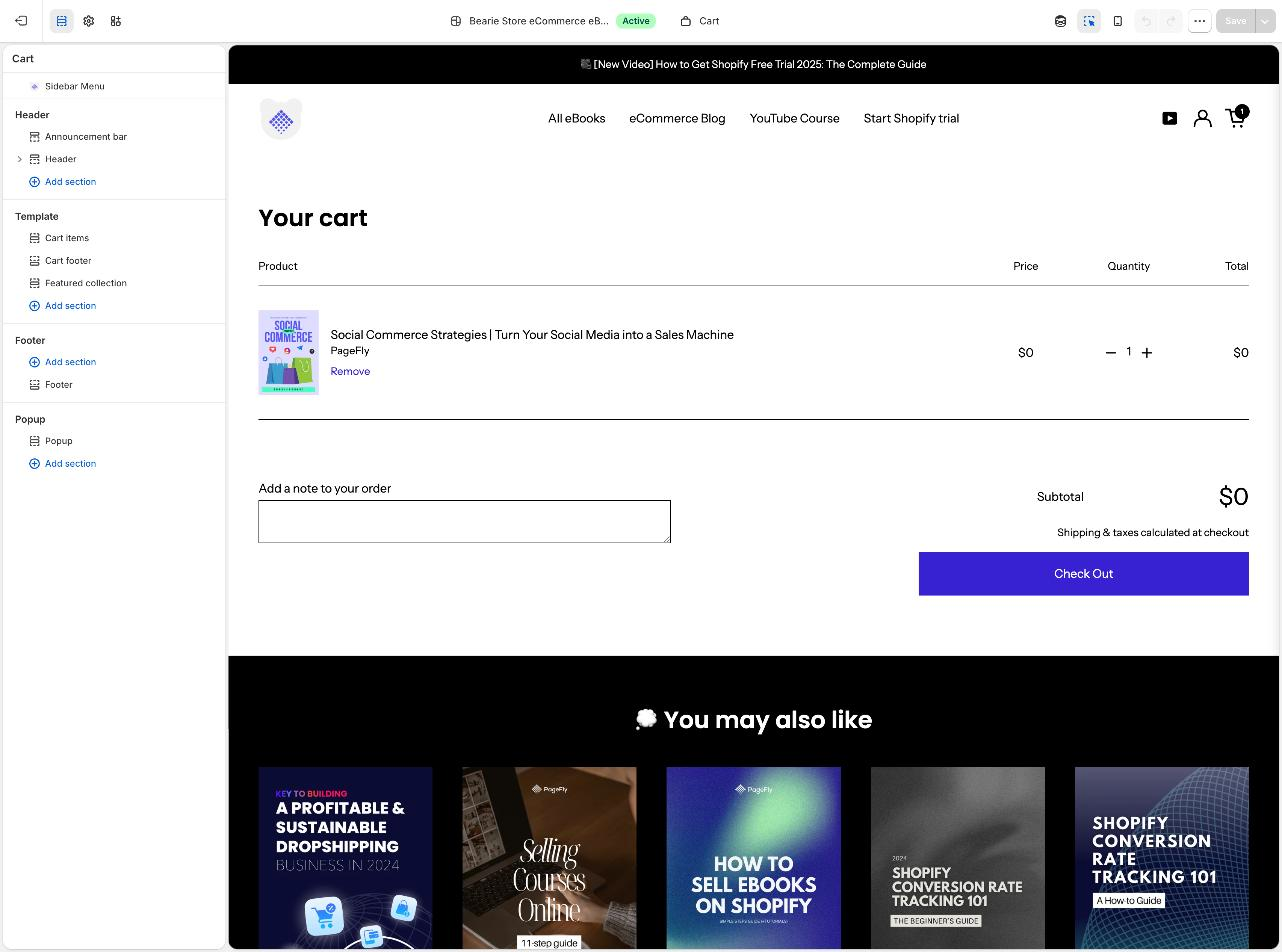
Two sections do all the work: cart items controls what each line shows, and cart footer controls the subtotal, the tax and shipping messaging, the note field and the checkout button — both reorderable, exactly like any other 2.0 template. Screenshot taken first-hand by PageFly on a live Shopify store.
- Add an item to the cart in the preview. Open the preview in a new tab, add any product, then return. An empty cart hides the line-item section and makes the next steps impossible.
- Edit the cart sections. Click the cart items section for what each line shows — image size, vendor, variant, line-item properties. Click the cart footer for subtotal, tax and shipping messaging, the note field and the checkout button. Reordering these behaves exactly like reordering a landing page.
- Add the blocks that answer objections. This is the part that pays: shipping-cost clarity, the returns window, payment badges, and a link to whatever your product pages promised. Baymard has 12% of shoppers abandoning because they "couldn't see / calculate total order cost up-front" — say the number before they have to ask.
- Set your cart type. In Shopify's reference theme this lives in Theme settings → Cart, with Drawer, Page and Popup notification as the options (Shopify Community). Because it is a theme setting, switching it changes nothing about your Shopify account and everything about what happens after add-to-cart. Paid themes vary, and Horizon exposes its own version of this — check what you're running before hunting for a setting that isn't there.
Then walk the whole path on a real phone before publishing: product → add → cart → checkout. If the theme editor can't reach a setting you need, that's a scoped brief for Shopify development services, not a replatform.
Shopify cart drawer: when the panel wins
Short version, because this one has its own guide.
A drawer wins when the cart is a confirmation step rather than a review step: small baskets, familiar products, repeat buyers, traffic that keeps browsing after adding. It loses when the cart is where real decisions happen — many lines, variant comparison, engraving fields, delivery scheduling.
Switching from cart page to drawer is a theme setting, not a rebuild
Source: "How To Create Cart Drawer in Shopify (2026 Tutorial)" — Smind Build Your Store Quickly, YouTube, 2 February 2026. Third-party channel, not produced by PageFly or Shopify; it takes the theme-settings route described in step 6 above rather than installing a slide-cart app.
The full walkthrough — how to turn one on, what belongs inside it, and the drawer-specific mistakes — is in Shopify cart drawer: how to add one that actually sells. Read that if the panel is already your primary surface. Come back here for the part it doesn't cover: even with a drawer live, /cart still serves real traffic and deserves the same six steps above.
Shopify mini cart: the header summary nobody designs
A mini cart is the small summary that drops from the header cart icon — a short list, a subtotal, two buttons.
Functionally it's a reassurance device, not an editing device. It answers "did that work?" It shouldn't be the only place a shopper can change a quantity, because on mobile there's often no hover state and the pattern collapses into a tap that behaves like a drawer anyway.
Four names, two ideas

Cart page, drawer, mini cart and slide cart are sold as four choices. Structurally there are two: a URL a shopper can land on, and a panel that opens over the page they are already on. Everything else is naming.
The practical rule: if your mini cart has a "View cart" button, /cart is still in your funnel and still needs to be good. If it doesn't, the mini cart is your cart and now needs quantity controls, a discount field and error states. Pick one — a mini cart that can't edit and can't be escaped is the most annoying cart pattern still shipping, and it's worth an A/B test before you assume it's harmless.
Shopify slide cart: the same thing, sold by apps
Slide cart is not a distinct Shopify concept. It's the phrase most cart apps use for a drawer, generally bundled with upsell blocks, a free-shipping progress bar and sometimes rewards tiers.
Which is fine — just price it honestly. A slide cart app buys you merchandising logic Shopify doesn't ship natively. It costs a monthly fee, third-party JavaScript on every page, and a dependency the next time you change themes. If your theme already has a competent drawer and your basket is one or two items, you're paying for the upsell logic, not the panel.
Verify one thing before installing: whether the app replaces your theme's drawer or stacks on top of it. Two cart panels bound to the same icon is a real bug that usually only appears after a theme update — run a theme detector so you at least know what you're layering onto.
Sticky add to cart and the Shopify sticky cart on mobile
This is the term in the cluster that has least to do with the cart page.
A sticky add to cart is a bar pinned to the bottom of the viewport on a product page, carrying price, variant selector and the add-to-cart button, so the button is reachable however far the shopper has scrolled. A sticky cart usually means the same bar, or a floating cart bubble that follows the shopper around the store.
It is a mobile behaviour first

On a phone a product page is a long scroll — gallery, title, description, reviews — and the add-to-cart button sits near the top, out of reach for most of the session. The sticky bar deletes that scroll-back. On desktop it's largely redundant, which is why the best implementations show it on small viewports only.
Three notes before you install anything:
- Check your theme first. Several paid themes ship a sticky add-to-cart toggle in product-page settings; adding an app on top gives you two bars. A theme detector settles it in a minute.
- Don't let it cover the price or the reviews. A bar that obscures content while the shopper is still evaluating trades an easier click for a worse decision.
- Keep variant state in sync. The bar must reflect the selected variant or shoppers add the wrong size — the failure mode that generates returns. Pair it with a visible size chart if you sell apparel, the way the best Shopify clothing stores do.
Sticky add-to-cart is the cheapest change in this article and the most measurable, because it moves add-to-cart rate directly. Ship it before you redesign anything — it's a product page job, not a cart job, and a product-page template is where you'd build it.
Shopify cart upsell: what actually lifts AOV
Cart upsell means offering an additional or upgraded product at the cart step — a complementary item, a bundle, a size upgrade, a subscription swap. It's the most requested cart feature and the most frequently mis-measured.
Measure it on revenue per session, not on how many upsell items got added. An upsell that adds a $12 accessory while pushing a shopper past a decision threshold and out of the flow is a loss you'll never see in an "upsells accepted" counter.
What tends to work, in rough order:
- Progress toward something they already want. A free-shipping threshold bar is technically an upsell but reads as help. It also lands on Baymard's number-one non-browsing abandonment reason: extra costs.
- Genuinely complementary, low-price add-ons. Batteries, refills, a case — small enough not to reopen the decision.
- An upgrade of the item already chosen. Larger size, annual instead of monthly, the subscription version of a one-off.
- Pairings driven by actual cart contents — where a well-organised catalog and a clean search and discovery setup pay off somewhere you didn't expect.
What fails: unrelated bestsellers, a grid of four options, and anything that pushes the checkout button below the fold. The good implementations offer one thing, once.
One newer reason to keep the cart legible. AI shopping assistants and agents decompose a request into hard filters and drop candidates missing an attribute rather than ranking them lower.
In agentic commerce, a cart stating shipping cost, tax and delivery window explicitly is machine-readable. One hiding them behind "calculated at checkout" is not — the same argument that lands one step later on your checkout page.
Test before you rip anything out
The prize downstream of your cart is bigger than the page-versus-drawer question. Baymard estimates that a 35.26% increase in conversion rate is available to large ecommerce sites through better checkout design, and that the average US checkout flow shows 23.48 form elements by default against an ideal of 12–14 (Baymard, cart abandonment statistics). Counting form fields rather than elements, a separate Baymard study puts the 2024 average at 11.3 fields across a 5.1-step flow, against the 8 fields most checkouts actually need (Baymard, checkout form fields).
Sequence it: cost, then surface, then upsell

Measure each step as an A/B test with a real sample-size calculation rather than eyeballing a week of data, because cart-level changes produce small effects on noisy denominators. Theme-level cart changes usually need a theme-side test or a staged rollout; page-level changes are easier to split cleanly, which is the subject of the next section.
Track three numbers before and after, per device: add-to-cart rate, cart-to-checkout rate, revenue per session. If conversion rate moves but revenue per session doesn't, you traded AOV for volume. That's a decision, not a win — make it deliberately. If you are building a repeatable testing habit rather than a one-off, our conversion rate optimization resources cover how to size and sequence these.
Where PageFly fits on a cart project — and where it doesn't
Start with the boundary, because most page-builder articles blur it. PageFly does not build your /cart template. That template lives in your theme, it is edited in the theme editor with the six steps above, and no page builder replaces it. If you came here looking for an app that redesigns /cart, the honest answer is that Shopify already shipped the tool and it is the theme editor you already have.
Where the theme ends and a page builder starts

What PageFly owns is the page layer on either side of the cart: product pages, collection landing pages and campaign pages. It renders those as its own templates, assembled from drag-and-drop sections, without editing theme files.
That is not a cosmetic distinction — it is why a page can ship on a Tuesday afternoon while a theme change waits on a duplicate, a review and a publish window.
What the cart template genuinely cannot do is vary. templates/cart.json is one layout for all traffic: you can't give a Black Friday campaign a different pre-cart page and leave the evergreen one alone, you can't serve a second version to half your visitors, and every edit you make is an edit to the live theme every shopper sees. A purpose-built page does all three, because it is a page and not a template. That is also where the cart's biggest lever actually sits — Baymard's 40% "extra costs too high" is a promise you break at the cart but make on the product page. Shipping threshold, returns window, delivery estimate: state them upstream and the cart has less to defend.
Live today: the page builder, the section and template library, and A/B Experiments, which splits live traffic between two variants of a page and reports the result with its significance. Not in scope, and worth saying plainly — PageFly does not add a drawer, a free-shipping progress bar or cart upsell logic to your theme. Those are theme or cart-app territory, and the sections above are the honest guide to them.
And the honest caveat: if your problem is genuinely inside /cart — line-item properties, a drawer fighting your theme, upsell rules — a page builder is the wrong purchase. Go back to the six steps or brief a developer. PageFly earns its place when the pages feeding the cart are what needs to change, and change often.
Shopify cart page FAQ
Can I edit the Shopify cart page?
Yes. /cart is rendered by your theme's cart template (templates/cart.json in Online Store 2.0 themes), so you can add, remove and reorder sections in the theme editor, or edit the section Liquid. It is not locked like checkout.
How do I remove the cart page and use a drawer instead?
You can't remove /cart — the URL always resolves. You change the theme's cart type setting, which controls what happens after add-to-cart. Shopify's reference theme offers Page, Drawer and Popup notification under Theme settings → Cart.
What's the difference between a cart drawer, a mini cart and a slide cart?
A cart drawer is a panel that slides over the current page. A slide cart is the app-store name for the same thing, usually bundled with upsell features. A mini cart is the smaller summary dropping from the header cart icon, typically read-only. Two patterns, three names.
Does a cart drawer convert better than a cart page?
It depends on basket complexity, not fashion. Drawers suit small, familiar baskets and mobile traffic; full cart pages suit large baskets, B2B, and products needing notes, uploads or delivery dates. Run it as an A/B test on your own traffic before switching.
Why is my Shopify cart page empty in the theme editor?
Because the preview cart is empty. Open the storefront preview, add a product, then return — the cart items section only renders when there's at least one line item.
Can I add upsells to the Shopify cart page without an app?
Not the recommendation logic. Shopify natively supports cart notes, line-item properties and section-based layout on /cart, but recommendation rules, free-shipping progress bars and gift-with-purchase logic need an app or custom development.
Can a page builder like PageFly rebuild my /cart page?
No. PageFly builds product, collection and landing pages as its own templates; the /cart template stays in your theme and is edited in the theme editor. What a page builder changes is the pages that fill the cart, and how quickly you can test them.
Pick one cart surface and make it the real one. Cost transparency first, layout second, upsell last — and test each change on your own traffic before you believe it. If the pages feeding the cart are the actual problem, start with the landing page instead.